Poll results
Save to favorites
Add this poll to your saved list for easy reference.
Which picture do you like best?
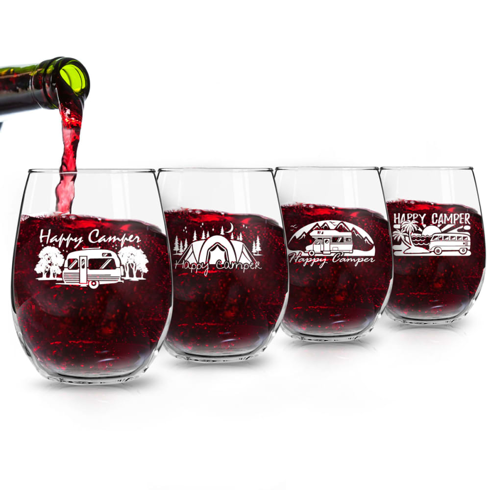
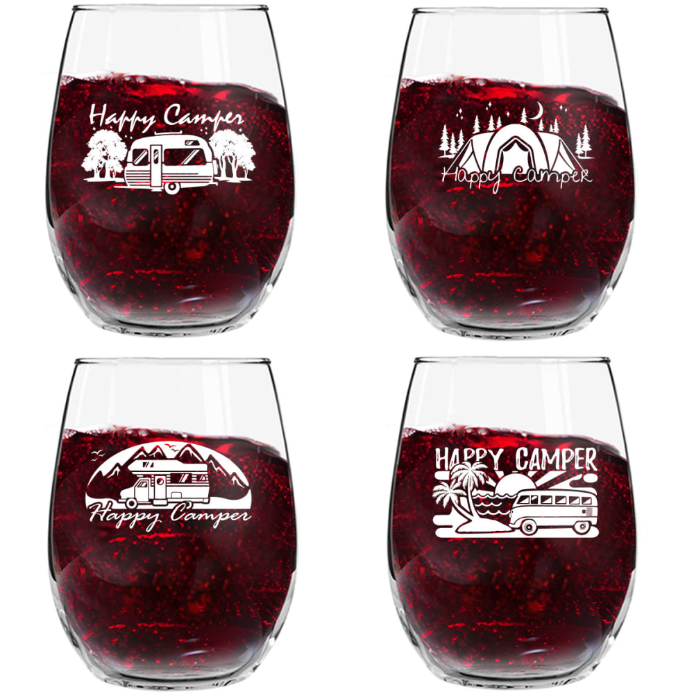
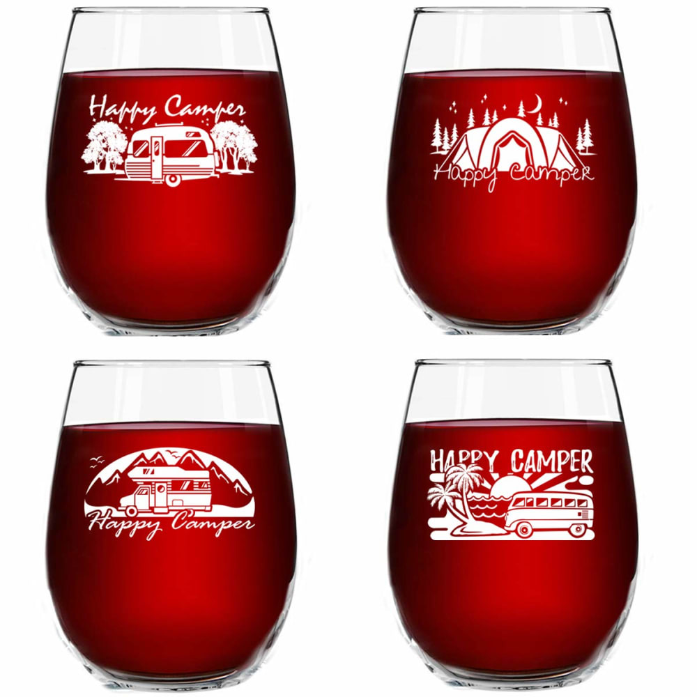
Option A won this Ranked poll with a final tally of 27 votes after 2 rounds of votes counting.
In a Ranked poll, respondents rank every option in order of preference. For example, when you test 6 options, each respondent orders their choices from first to sixth place.
PickFu requires a majority to win a Ranked poll. A majority winner differs from a plurality winner. A majority winner earns over 50% of the votes, whereas a plurality winner earns the most votes, regardless of winning percentage.
If an option does not earn a majority of votes, PickFu eliminates the option with the lowest number of votes. The votes from the eliminated option are reassigned based on each respondent’s next choice. This process continues in rounds until a majority winner emerges.
Scores reflect the percentage of total votes an option receives during the vote counting and indicate the relative preference of the respondents. If there is no majority winner, look to the scores to see how the options fared relative to one another.
| Option | Round 1 | Round 2 |
|---|---|---|
| A | 50% 25 votes | 54% 27 votes +2 |
| C | 40% 20 votes | 46% 23 votes +3 |
| B | 10% 5 votes | Eliminated 5 votes reassigned |
25 Responses to Option A
I think it looks nice seeing the wine poured, the last choice looks more fake
I like the first image best with the wine bottle for perspective.
A is definitely the best because of the pouring of the drink which looks it far more appealing. Between C and B, I prefer C's brighter and thus more lively color.
Option A is the most memorable for me. It's more interesting with the wine being poured and the overall layout of the design I like better. While C and B are the same in layout, C is easier for me to assess the decals on the glasses. The liquid in B looks odd without seeing it being actively poured.
Option A is much more appealing because of the angle the glasses are at as well as the wine being poured. I found the bright red of my 3rd pick not very realistic.
I like the bottle being poured out into the glasses.
I like Option A because I love the way the product is being presented and I think that the wine being poured in looks really good. Option B and C are similar in the way that it's being portrayed with the exception of the color. I just think both are really basic and doesn't catchy my attention as much which doesn't appeal to me. As a result, I like Option A a lot more than the other Options.
I really enjoy option A because it shows the act of pouring the liquid into the glasses which adds an extras aesthetically pleasing layer to the photo.
I like this picture the best because I enjoy seeing the wine being poured as well as the color of the wine. I feel it's more relatable and gives the feeling that the image and product are enjoyable with a sense of need.
Seeing it poured adds an action element that looks good. When still, the lighter wine looks better
black red looks like wine. The last one looks like juice. Bottle adds feeling of taste.
The glasses in A are more visually appealing. I like the staggered look as it's more appealing to me than just a head on shot of four glasses like the other two examples. I also like seeing the wine bottle being poured into one of them. The liquid in B is more appealing to the eyes than in C.
I like the cascading view of the cups here with the wine glass pouring.
The picture of the bottle pouring into the glasses is much more attractive.
I would definitely choose option A with the image of the wine bottle being poured into the glasses.
looks more realistic
I prefer option A, I like the dimension better. Option C would be my second choice, because it is more uniformed and not slanted in the liquid.
A - I like seeing the pour. B - I like the way the liquid looks compared to C
I like A best because you can see the wine being poured. Option C just seemed odd given the other two were a different color.
I chose a first because I like that it's a dark color liquid in t he glass so you can see the pictures well. I like that the pictures are spread out so you can see them better. I chose B next because it also has a dark liquid and the images are spread out, just not as much as a. I chose C last because I don't like the look of the light colored liquid in the glasses.
Option A looks more appealing, there is actually wine movement going on which catches the eye. There is also depth in the image which is also attractive to the eye.
I like that the wine is being poured in A. It give the image some action and makes it more exciting. I like the color of the wine in C more than I do in B. The wine in B is too dark.
I like the deep or rich beverage color. It also helps that the pour makes the picture less freeze frame
Option A provides a nice visual and display that is attractive. The glasses shown in a vertical pattern and the images on the glasses can still be seen quite clearly. The wine being poured adds to the artistic display Option B and Option C are my second and third options because they don't provide the stimulating visual that Option A provides. Option A is definitely above the other two images by a greater degree.
I liked Option A the best because it was symmetrical and stylish. The pouring of the liquid seemed real and the whole thing was appealing and likeable to the eye. The other 2 options were nice enough but too close to the camera and the layout was boring.
5 Responses to Option B
I like the design of the cups. I like how they have the etchings on the glass. I prefer the darker color wine.
Choice B - The different designs on the glasses are clearly seen. The bubbly red liquid is inviting. Choice A - Seeing the size of the glasses compared to the bottle the liquid is pouring from is different from other view points. The designs are easily seen against the dark color of the liquid. Choice 3 has the holiday red liquid but looks almost as if the liquid color is a part of the design of the cup.
I think B and C showing the glasses facing forward in a square shows them better. Like the color on B better, looks more appetizing.
I like the equally spaced layout because it's easy to see the designs, and I prefer the darker red color
I ranked the image that I liked the most
20 Responses to Option C
I like the color of A best, then prefer seeing the wine poured.
The red makes it pop better than the darker red, I don't think you need the wine bottle in it.
I like the first two options the best, especially the first option with the light red background because you can see what the logo on the glasses look like up close.
The liquid looks the most attractive with the light shining through it.
I like C best because that wine looks most delicious and eye-catching. I chose A next because it looks cool with the bottle pouring. And I chose B last because it is boring.
I think the lighter colored beverage gives the best view of the images on the glasses.
Picked C first because of the brighter red wine color and clarity of the images on the wine glasses.Picked A next due to them showing it being poured and the positions of the glasses (would have picked for number one if the red wine color was the same as C). And B last due to not liking the way the wine unevenly is sitting in glass. Looks completely fake!
I like C best, I think the images on the glasses show up the best in C. B is my second choice - you can see the images in the glasses quite as well as in C, but better than in A. I think the look of movement in the wine and gradient of different colors in it is distracting to the eye and makes it harder to discern the different images. A is my least favorite. With how the glasses are arranged, it's harder to see what the different images all are, and the pouring wine is somewhat distracting. Also it has the same issue as B with the darker wine in a gradient of different colors making it harder to discern the images on the glasses.
The glasses have four different logos on the front. For me, its much easier to see the logos in C and B
I like option C the best. The lighter red color works much better.
I chose C first because the beverage inside of the glasses look more refreshing than the others. I chose B secondary because it maybe clear that it was wine inside the glasses and not Jello.
I liked choice C the most because the liquid was clear and this put the focus of the picture on the designs of the glasses which is the most important part. B was my second choice because even though the liquid was darker, making it harder to see the designs there was no bottle in the picture. Choice A was my least favorite choice because I felt the bottle in the picture took away from the designs on the glasses.
The color of the substance in the glass is a little brighter and cheerier, I like that
Color choices in C makes the red pop. Much nicer than in the other two pictures. The 2nd choice gives a clue that its a kind of liquor. Better than the last one
Picture one is the simplest and easiest to process. It is also very appealing and it stands out a lot.
I feel Option C gives a clearer view of graphics on the glasses.
In C, you see the designs on the glasses most clearly because of the liquid in the cups and how the cups are spaced. B has the right spacing but I don't like the liquid in the cup, its distracting from the design. With A, the liquid is still distracting and then how the cups go back make it harder to see the design.
C shows the graphics best, I think the wine is too dark in the others. I also A how it shows the wine being poured because it gives you a sense of scale and how big the glasses are.
I think the lighter color wine makes the illustrations on the glasses easier to see. I like that it is brighter and the wine looks more natural.
The first and the second choices I made are the best
Explore who answered your poll
Analyze your results with demographic reports.
Demographics
Sorry, AI highlights are currently only available for polls created after February 28th.
We're working hard to bring AI to more polls, please check back soon.

