Poll results
Save to favorites
Add this poll to your saved list for easy reference.
Which picture is more appealing?
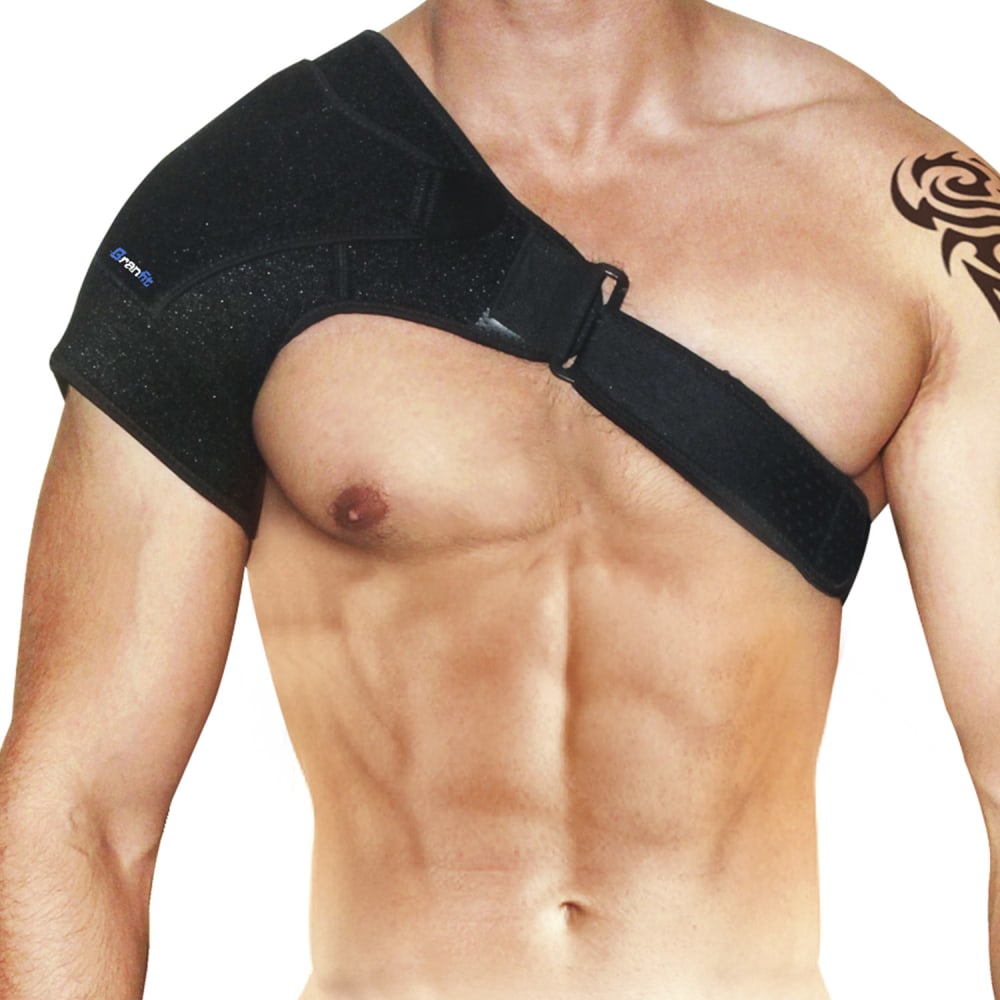
39 Responses to Option A
it is zoomed in and closer up
simple and shows off the product
Up close shows more detail on the product.
better closer tight crop of the item versus zooming out to see more of the upper torso
After carefully studying both images, I chose Option A as the more appealing image. My reasoning is solely based on the fact that there is less tattoo image exposed in the picture. I feel that both images were actually very similar.
closer up easier to see
Option A was chosen because it has a closer picture to the item, it showcases how it fits and where it should go. No need to see more of the body, just the targeted area.
See less of the trashy tribal tattoo
It draws more attention to the product. I don't need to see his whole frame, and honestly the tattoo is a little distracting because it's the only other notable feature
Just more of a focus on the product. Giving me more of the model's lower torso doesn't add anything.
A is more appealing, I like that's its slightly closer up
Option A. Hard choice, the model is distracting. But the closer image of the product to better. I'm shopping for the brace and the details are clearer on A.
The close up is better but it is weird because it makes the man's nipple stick out.
It does a better job of showcasing the product with the more zoomed in photo. You aren't distracted by the rest of the man's torso.
I chose choice A because it shows less of his tattoo and doesn't show his underwear.
A is up close and personal and I like that better than B, but be careful here, both photos look completely fake and photo shopped in the waist area but way more noticeable on B
I like seeing the product on the man closer up. Also I like that it really focuses on just the brace instead of the mans entire body like the other one.
I prefer option A because the picture appears to be closer to me. I feel like I can get a better idea of the product closer than further away.
seem bigger than b
I feel that it is more focused on the body and has a better picture overall. It is less distracting and more complete
A shows more detail about the product and less tattoo
I like this one. I like that the body is more upfront.
The more zoomed in shows how the brace fits on the body better than in B
Neither one. A is only better because there is less of the tattoo is showing. But both of these are not appealing
Choice A looks more realistic to me.
Option A shows the medical device more close-up, gives a better idea of placement on the body, and hides the distracting tattoo. Tattoo should be airbrushed out.
The close up with higher resolution is the better photo. I like the design on the shoulder support and this looks better up close. Option A as the top choice here.
I choose option A as I like that's it shows a closer angel of the product.
Choice A gives a better view of the under arm fit of the shoulder support and the Velcro chest strap. Choice B is a further view of the fit and does not show the rubbing or fit of the shoulder support as Choice A does.
I honestly couldn't find a difference.
The white light at the bottom of picture B is distracting.
closer chest shot is more appealing
I chose A because the slightly zoomed angle shows more product detail.
its a little closer up to see area coverage. And abs =)
I think A is more appealing because it's closer up so you can see the product better. I like that the arm with the tattoo is cropped out a bit too.
this gives a closer up view of the brace
I chose option A because its a closer up version and easier to see the product.
i like seeing it up close rather that the other picture. The body of the guy doesn't really matter to me.
I think A is a more appealing product photo, as it is a more close-up shot. This allows potential customers to focus on the product, and see the details of it, the aesthetics, and how it works. A shot from the back would be good as well.
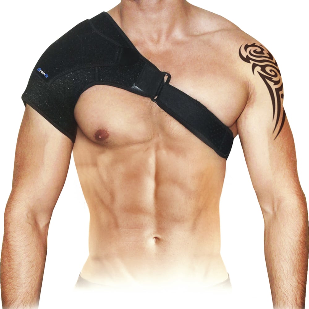
11 Responses to Option B
this one doesnt feel like parts of the pic are being cut off
The model/gear is displayed better in this one.
gives a better idea of how the product looks
eludes to the rest of the picture
Picture A looked to close to the model. You get more a sense of what the sling is trying to do in picture B.
I think this one is more appealing because the person is centered and the other picture doesn't provide any more details than this one.
Seeing the entirety of the body provides a better frame of reference. Otherwise, it's the same between both options.
I think option B is more appealing because it's not so close up. It's further back so you can get a better idea of the size of the product and how it sits.
This picture is more compelling because it is more of a wide angle view and you can see the product better in terms of the overall fit.
A is a little to In your face and distracts from the product
I think the second one is a little to close and the eye goes right to the nipple since it is so large and I am not sure that is what you want with this. It distracts from the product.
Explore who answered your poll
Analyze your results with demographic reports.
Demographics
Sorry, AI highlights are currently only available for polls created after February 28th.
We're working hard to bring AI to more polls, please check back soon.

