Poll results
Save to favorites
Add this poll to your saved list for easy reference.
Which picture make you more likely to buy this product?
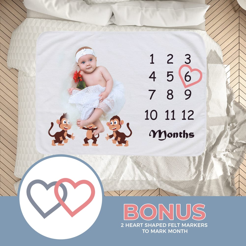
27 Responses to Option A
This one makes the product appear as though it's in a real world setting as opposed to a white backdrop
The overall presentation of the product is more enticing and appealing. I wouldn't actually buy the product but I would definitely choose this one over the other because of the way the image is designed.
I choose A because it has more definition to the image of the product. Also it is easier to read the bonus it comes with.
I like Option A because I love the design and it looks more attractive. I also think that the baby is cuter which appeals to me more. As a result, I like Option A a lot more than Option B.
I like A better,. While the baby hides some of the image, and you can't see the monkeys fully, you can see the estimates size of the sheet in comparison to a bed. I also like that it showed the pink marker on there as a little pop of color.
Picture A. is the one that I would pick, because it shows the picture much closer and it is a nicer looking picture.
It is warm and adorable. The product is well developed
I picked this option because it illustrates a great way in which the product can be used. I also like the pose that the baby is in and think it gets a person's attention more easily.
A is more realistic in presentation and the bonus is more obvious
I like the different color background it makes the baby stand out more. It also has the bonus as bigger and more noticeable.
The baby is cuter than the other one.
A looks better
I'd be more likely to buy this one because the picture is more attractive and the bonus info is easier to see and read.
Love the band on the baby. Adorable.
Option A shows the bonus which is much more appealing.
Seeing it on a bed makes me see how big it truly is.
Choice A has more props and that make sit more appealing. We all enjoy dressing up our kids and making the pictures more appealing. I also enjoyed the flowers, the added bed comforters.
I like the picture around item making it look like it is in a crib rather than the plain white background
The larger "BONUS" is easier to read.
this one has more going on in it, so i feel like it's more impactful and dynamic. i feel like i am seeing a baby right at home and not so much posed for an ad.
This shows the value of the product more
easy to see how product scales to bed
looks better in blue
It looks more home-y and less sanitized
Option A because the logo and the wording are larger so they stand out more.
There's more color to it and you can see the size comparison better
I chose "A" because I like the bigger hearts in the ad. It seems to appeal to my inner instincts of warmth and comfort more - especially with the picture of an adorable baby!
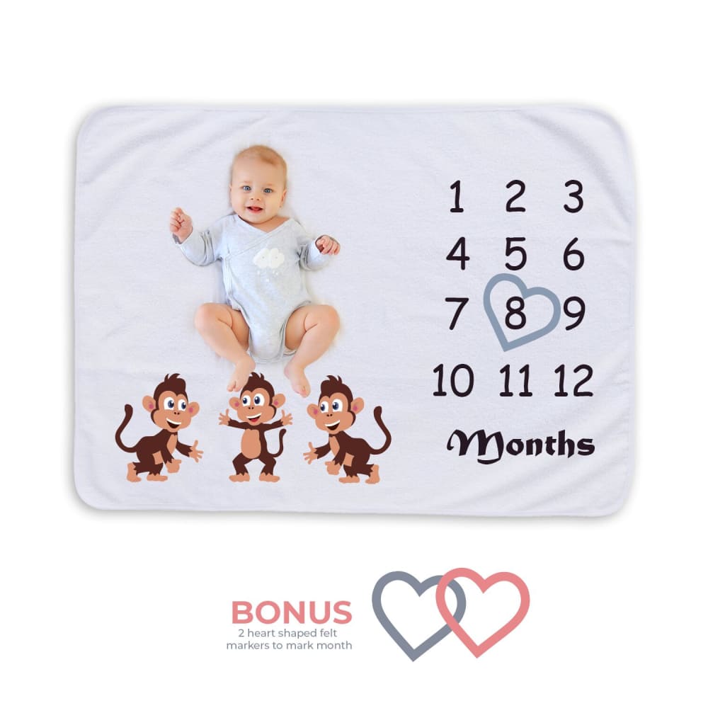
23 Responses to Option B
I like the design of B a little better.
This image just looks a lot cleaner than the other one.
The monkeys aren't as covered by the baby.
I really don't like the fact that one of the monkey's faces are obstructed by the baby's foot.
The image is a lot central to the ad, the items are a little bigger for better inspection and the colors are vivid. Also the angle in which the photo is presented is more pleasing to the eye. I can see what I am getting much better on "B".
The photo quality was a little bit better.
looks more realistic.
The baby is so cute. I could picture myself using it. It was easy to understand the product and it's use.
I like the white background better. Looks more professional.
They both are really good pictures
Option B is better. Option A is very poorly photoshopped, shows the baby totally out of proportion on an adult bed for some reason, and the baby has a weird doodad on its head which I always find unattractive and pointless on an infant. Option B is simple and shows the product by itself with a baby on it, end of story.
I would not use the blanket on the bed so it looked a bit odd to me.
I like the version in option B as it is less cluttered in the image. I would use that as the primary image for the product and it is easy to understand what you get with the product here. The photo is more clear.
The image of the baby looks like it belongs there. The other image, while having a nicer background, seems to have the baby image just plopped down there and it looks slightly out of place.
I'll be honest, I don't like the headband thing on the baby. I always feel like those are dated and in this instance, makes me think the product is dated and not very contemporary. It also doesn't make sense laying on the bed (if that's what that is). Option B is perfect, though the picture is tilted and causing a distraction.
Option B is brighter than Option A and it looks very cute.
I like B better; it is a more complete image.
The baby on B is cuter.
I chose option B because the image of the baby looks more realistic. Option A looks too photoshopped to me.
I like the smiling baby and the simpler layout of the entire picture. Graphic A has a half naked baby with a flower, which I don't like at all, plus the baby's legs are covering one of the monkeys which is distracting.
I like B a little better but I like them both.
Super cute B gets my pick for simplicity; A looks framed and the baby boxed in--boo!
This image is cuter.
Explore who answered your poll
Analyze your results with demographic reports.
Demographics
Sorry, AI highlights are currently only available for polls created after February 28th.
We're working hard to bring AI to more polls, please check back soon.

