Poll results
Save to favorites
Add this poll to your saved list for easy reference.
which position do you prefer the product in?
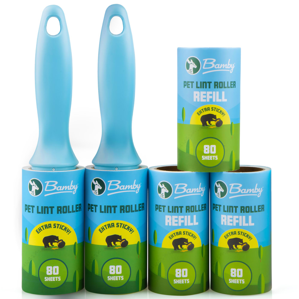
13 Responses to Option A
I like thi one , i want more
I like A better. It makes more sense logically because you use the first two and then the refills. It looks more organized.
Centered like that looks like amateur design. Off to the right is slightly better.
option A looks the most appealing to me
The image is much more interesting when the rollers are not symmetrical. They just look more grab worthy to me.
I think option eight looks more organized, and that is how I would store it. So I find this image more relatable.
I feel it looks more uniform. It is easier to take in than option B. The product seems confined to one space whereas option B is wider and requires more roaming of the eye.
This feels more natural. The other option feels odd because it is perfectly in the middle. This is better.
It looks more professional in option A.
Option B was chosen because the colors are more vibrant and the placement of the rollers all on the left gives the appearance of more items than option A. This is because there is less open (blank) space in the middle of the photo. The photo appears more full of items and more organized.
Option A has the better shade of blue. Either one is really good though, but Option A is the best.
The layout in A appears to make more sense. I felt it was "right" and easy to process and understand. B bothered me; I felt it unnatural and phony.
Putting the lint rollers together allows consumers to easily see how many lint rollers there are and how many refills there are. Putting them in their own stack makes it easier on the eyes.
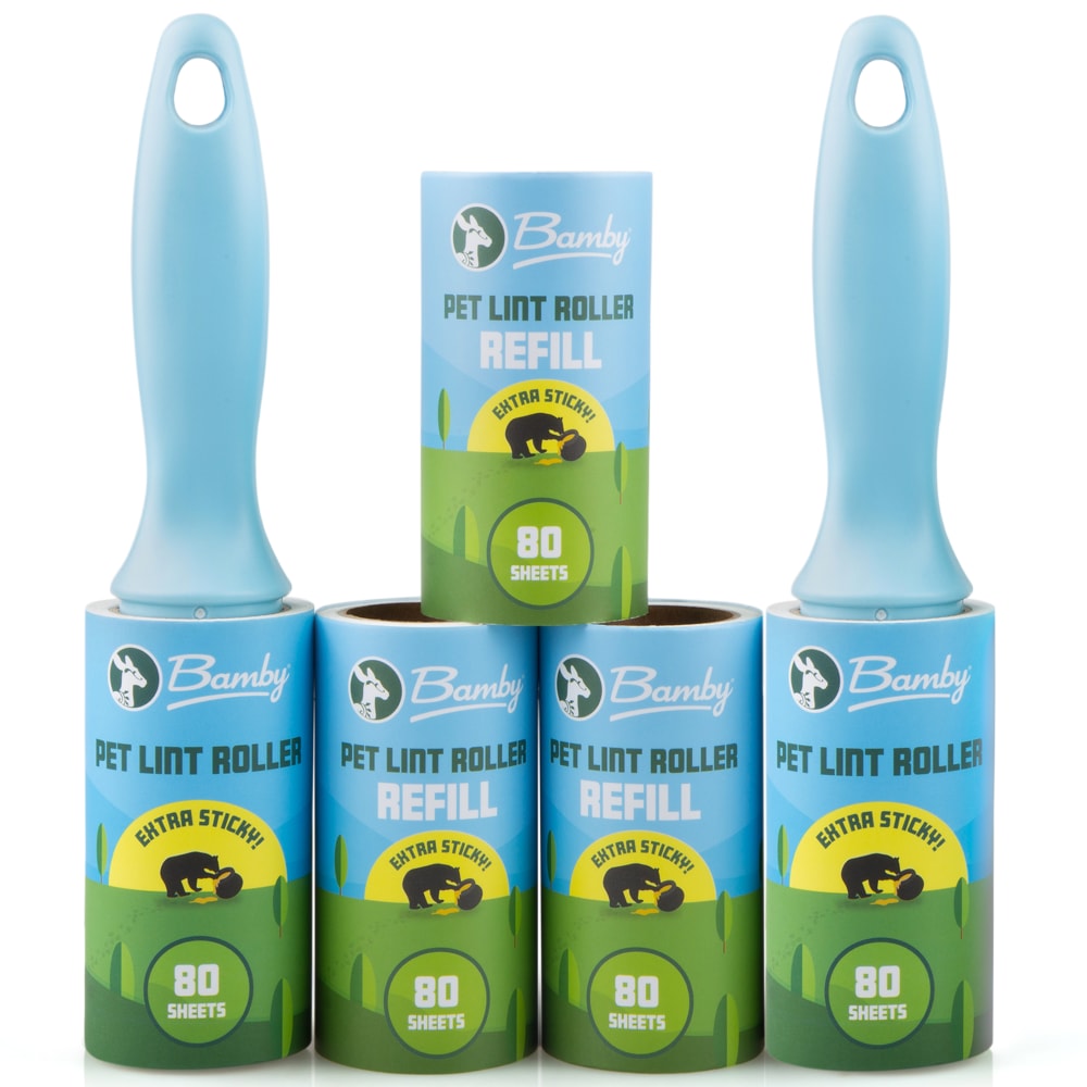
37 Responses to Option B
B just looks better with it in the center instead of it being on the right.
B is symmetrical and looks better
I choose B because it looks better centered and as a result more appealing to the eye
I prefer option B over option A because I like way the roller is situated in the middle facing forward on the top layer. It is symmetrical and feels comfortably right.
I prefer the symmetry of the presentation in option B though they are both good and the preference is not too strong, it has a more balanced look which is preferable.
I prefer option B because both of my eyes are draw to product setup at the same time looking at the product set up in option A my eyes are strained because of the awkward placement of the 5th refill for the lint roller. It is uncomfortable to look at.
I enjoy the more symmetrical stack of products, looks more orderly and therefore more attractive.
Option B looks more organized and structured which is very appealing to someone who maintains a clean home
They are both pretty good. But the more symmetrical layout appears more artistic and appeals to me a little more.
I chose B because the products look cimetrical and clean.
This one stands out to me more.
I prefer Choice Option B because this position satisfies my inner OCD; If I'm honest. I find this layout to be neat and orderly. While the other, choice option A, looks kind of random or that there wasn't a lot of effort put into the arrangement.
B looks more even and symmetrical then A.
Choice B just looks more balanced with the rollers on each side and the extra refill in the middle. Choice A makes my head hurt a little bit looking at it because it's not symetrical.
The image is More Symmetrical and that symmetry is more appealing.
Middle of the stack its where the eyes naturally go first
B is more semetrical and looks cleaner
I prefer option B because I think the symmetrical design looks better.
Option B is more aesthetically pleasing , everything is symmetrical and looks really freak with things stacked and organized evenly.
I like the balanced look of B. It looks just right. The other choice looks a little awkward to me.
you notice the exact one right away
I like choice B because it looks much more organized than option A.
i like it to be centered, that looks nice
I prefer option B as it seems to be more balanced and visually appealing.
I prefer B because it is so much more symmetrical
its more symmetrical therefore it is more appealing because we are symmetrical creatures
I like the symmetry of option B better.
I think that this one looks a bit more balanced, and is just a nice configuration.
Option "B": The symmetrical nature of the photo grouping arrangement in "B" is more pleasing to me aesthetically.
prefer slightly the way product is displayed in B
I like this position because it draws my eye right to the center and I immediately notice the brand name of the product which is good to get a sell.
It looks neat and uniformed.
B feels more centered and feels more orderly
I would choose B. I like how the rollers with the handle are both on the sides.
Option B looks more centered in my opinion
I chose choice B because I like the middle because it makes it visually symmetrical and pleasuing than choice A which it is off center.
This layout of the lint rollers look more symmetrical and appeasing to the eye.
Explore who answered your poll
Analyze your results with demographic reports.
Demographics
Sorry, AI highlights are currently only available for polls created after February 28th.
We're working hard to bring AI to more polls, please check back soon.

