Poll results
Save to favorites
Add this poll to your saved list for easy reference.
Which poster would you rather buy on Amazon.com for 14.99?
Option B won this Ranked poll with a final tally of 29 votes after 2 rounds of votes counting.
In a Ranked poll, respondents rank every option in order of preference. For example, when you test 6 options, each respondent orders their choices from first to sixth place.
PickFu requires a majority to win a Ranked poll. A majority winner differs from a plurality winner. A majority winner earns over 50% of the votes, whereas a plurality winner earns the most votes, regardless of winning percentage.
If an option does not earn a majority of votes, PickFu eliminates the option with the lowest number of votes. The votes from the eliminated option are reassigned based on each respondent’s next choice. This process continues in rounds until a majority winner emerges.
Scores reflect the percentage of total votes an option receives during the vote counting and indicate the relative preference of the respondents. If there is no majority winner, look to the scores to see how the options fared relative to one another.
| Option | Round 1 | Round 2 |
|---|---|---|
| B | 44% 22 votes | 58% 29 votes +7 |
| A | 38% 19 votes | 42% 21 votes +2 |
| C | 18% 9 votes | Eliminated 9 votes reassigned |
19 Responses to Option A
I like the white background the best.
I prefer a plain white background for a clean, easy to read look.
The lighter colored backgrounds make the poster easier to read.
Option A has a nice simple and clean look that would go best in many different backgrounds and rooms.
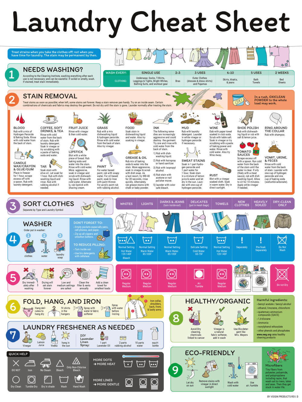
I like the white color which seems cleaner and looks good as the most contrast. The instructions are great and the product looks excellent. Think it is a good cheat sheet and a great way for folks new to washing to use in one place.
The background in A makes it easier to read. The background colors were the primary reason for my choices.
I like the white background on my first choice. It makes all of the other text look better
Option A has a white header background, thus easy to see the header from a distance and in low light. Option B has a pinkish background tone that is feminine and nice to associate with cleaning and cleanliness. C has a bluish tone background that is masculine and less associated with cleanliness.
These had better colors on the top banner.
I would NEVER pay that much for this poster. But if I had to, I prefer the totally white background. It looks cleaner
A is the easiest to read for me because of the background white color makes the text pop and I can easily find information I need. I would buy this one because of this.
this is pretty busy as is, so I think the plain white background works best
I've spent almost 5 minutes on this and don't see any differences between the three? I do like the poster and would think about buying it to hang in my laundry room.
A is the best. The poster is cleaner. I actually like the background color in B the best. I don't like C as much as the background looks dirty.
We are talking laundry, so we want things to look pristine, clean and white to seem like it works effectively. The bright white background option looks like the cleanest and most put together option. The second option that looks like bright wood seems okay, but it is too much. The truth is, this poster is super busy as it is, so when you add a colored or textured background to it, it makes it even busier and more confusing. Sticking with a clean simple white background is the best.
I like the white background because it's easier to see and looks cleaner. The grey one looks dingy and the peach one is unattractive.
A has the white background that I prefer, B is the second most appealing with the pink background and C the third most appealing with the gray.
The lighter the background color the easier it is for me to read.
I like the white background best - it represents order to me. Gray is second because it is not to far from a dull white. I hate cream color and it makes me feel like Im in a retirement home
22 Responses to Option B
plain white backgrounds are boring and *B* has a nice dark pattern so i can read the text better
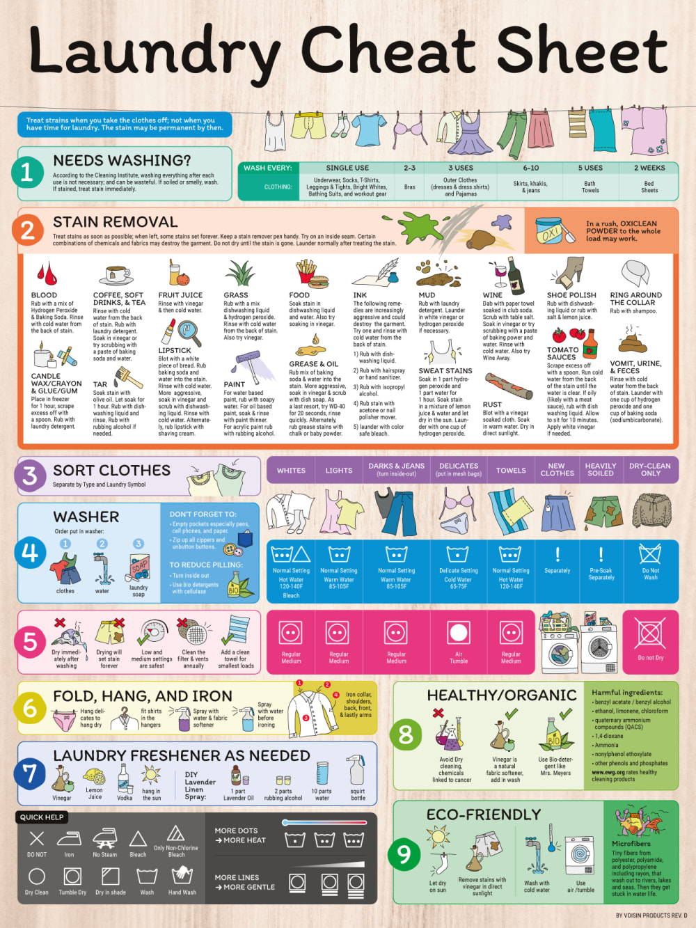
Even though all the sheets say the same thing and have the same information on it, the only difference is the title and the cover behind it. I liked B the best because it stood out and caught my attention first. Plus the color scheme would go best with my laundry room decor. I didn't like the all white at all because i would think it would get dirty.
I prefer some sort of color on the top. I like green more than pink
I think the coloring of the background is appropriate for dirty laundry - B is the dirtiest then C then A - so B is best for a laundry hint sheet.
They honestly all look the same
I least like the blank color white with option 3. It would be difficult to distinguish between the wall, which I assume could highly likely be white, and the poster.
I like the uses of natural wood colors in the background best. I like B best because the natural tones suit my style better
I like choice B the best since the background looks the most colorful and pleasing to look at. I like the brightness of the background and it gives the poster character other than just plain white background.
I believe background color will give this marketing piece a visual boost so I say the brighter neutral color is better.
I think the two I've chosen first seem more like posters and the last one just seems like I printed it at home. Not as fun.
I would choose option B. it looks the best.
I like brighter colors.
There are all the same but I like this background better
They all look pretty much the same and pretty helpful info but I would not pay that price for any of them. Its to easy to pull out your phone and look the info on the poster up for free. Drop the price to a few dollars and it would be worth it to hang on the wall.
I preferred the choices with colored/textured backgrounds. The white one was simply too bland for my tastes.
I like the more colorful backgrounds more, the orangish color feeling most substantial. Definitely makes me feel like the poster is more valuable.
The white one has too much contrast and is too basic.
I don't like Option A, which has a plain white background. It's boring and looks more like someone made it on Photoshop than something professionally put together.I selected Option B because I like the colored stripes (though I hate the color orange so I probably wouldn't buy it, if it was orange; I prefer teal or lavender or even a dusty pink), but the brown stripes (Option C) was too boring for me. As I said, I would like the striped pattern in a color that isn't orange or brown, something pretty.The prices is a little high for me. A reminder poster, in my opinion, should be between $5-$10. I would not pay $15 for a poster, especially when I (or my photographer mother, artist sister, or animator brother-in-law) could actually make something close to identical on photoshop and have it printed at Kinko's for less than that.
I really like this wooden background, specifically the color in B.
It looks more like a surface and would make a good addition
I picked Option B for my first choice because I personally like how the background color of this image for the poster makes the foreground images pop out more for me.
I prefer the background of B over the others so it will be noticeable in the laundry room and I'll remember to use it for a reference.
9 Responses to Option C
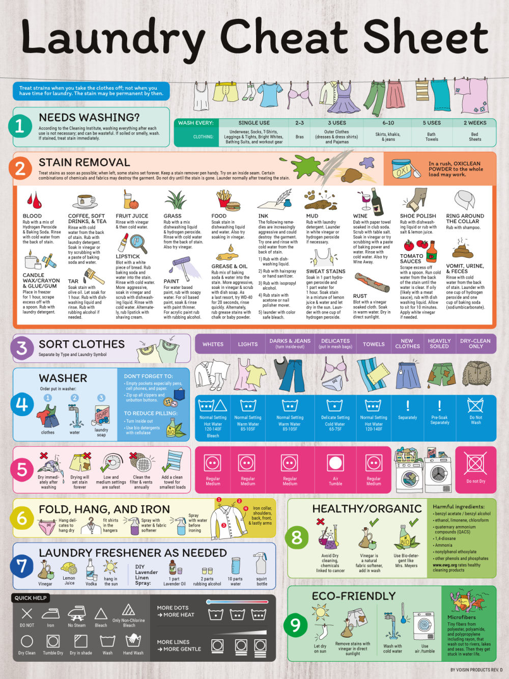
I like option C the best due to the grayish background. I think it blends everything together much better than the wood color and white. Plus I think it would be easier to put on a wall and not look like it clashes.
I think the background color in C would match my laundry area better, and it wouldn't show stains as much as the white would if it got splashed.
For one, there is absolutely no way I would purchase this for 14.99... 9.99... maybe. Anyway, The colors are just more appealing in 1 and 2. The white looks horrible.
Guys I'm so sorry but I couldn't find any difference between all 3 pictures. They look identical.
White is easier to read, but I do like the grayish background a lot.
A is the most bland with a white background, whereas the purple and pink give it a more clean and positive mood
I like background colors of c&b better than the plain white of A. C is my favorite because my laundry room is grey
The patterned background makes the poster look more “finished”
I like a little color in the background
Explore who answered your poll
Analyze your results with demographic reports.
Demographics
Sorry, AI highlights are currently only available for polls created after February 28th.
We're working hard to bring AI to more polls, please check back soon.

