Poll results
Save to favorites
Add this poll to your saved list for easy reference.
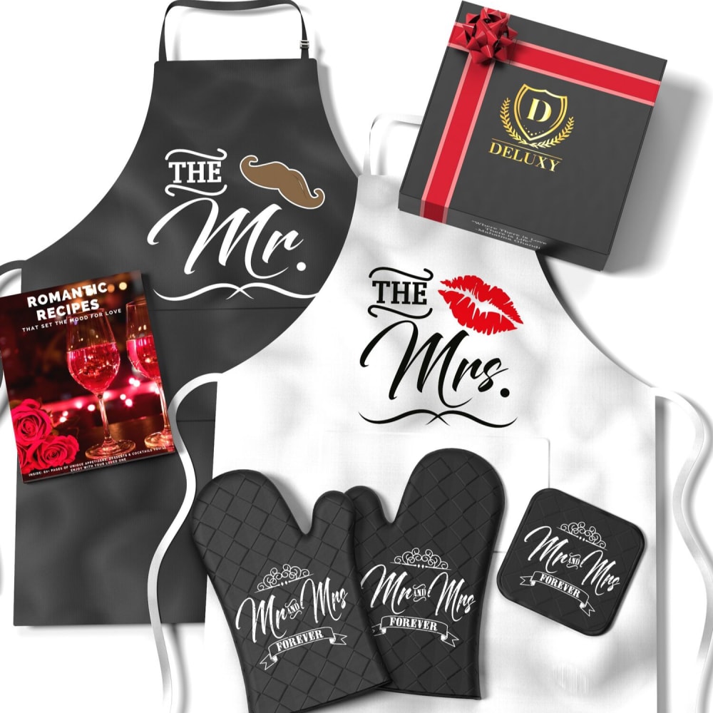
Which product image looks better for Amazon main listing image?
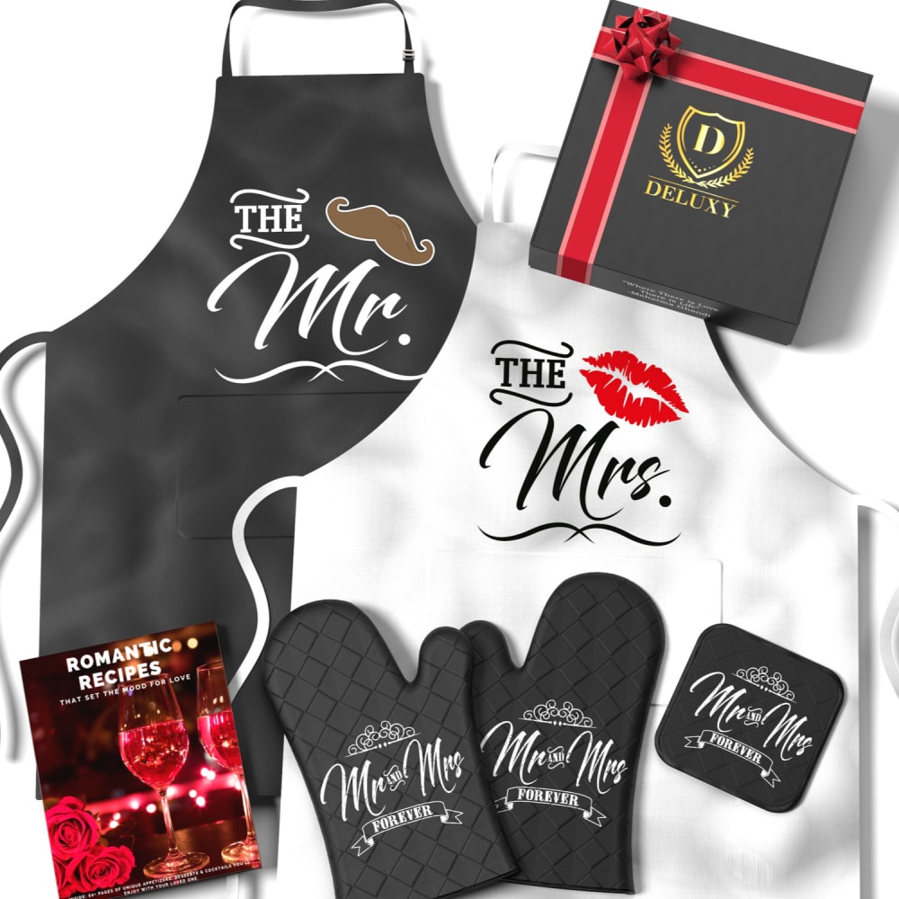
23 Responses to Option A
I prefer A because I can see all of the products more clearly than B. However, the difference is really small.
you can see that book easier and know thats part of the set
Visually the space at the bottom is taken up and looks more full
i like it very much
These both look exactly the same to me. I can't tell a difference between the two.
honestly these are so close you could use either. But maybe the one with the flyer lower is a slight bit better
I think this looks better because of how spread out everything is.
Having the book at the bottom takes up some of the blank space and also allows me to better see the apron.
B just tooks too busy...can see the book easier in A
PREFER THE WAY PRODUCT IS DISPLAYED IN A
A is better the book looks less out of place alongside the mittens and not covering the apron. Other than that a very nicely balanced product image.
The placement of the book looks better here
I like the placement of the book at the bottom. It seems to line up better there. It does look like a fun gift set. Good couples gift here.
For some reason it just fits better. The book at the bottom makes the picture look more symmetrical. It also balances better with the red image in the top right corner.
It looks more organized and arranged unexpectedly.
the romantic recipes takes up some space that would otherwise be left white. It gets lost when it's partway up the apron.
I feel the book near the bottom really helps fill the space and show off all the individual items.
The positioning of the recipe book is much more obvious in A. It looks awkward in B
The book isn't in the way of the "Mr." apron
I liked A better because by moving the recipe book into the corner makes the image feel less cluttered. It also serves the purpose of filling the white space in that corner.
You can see more of the product in this picture
the romantic recipes book is placed in a better spot here.
The composition/configuration/placement of the items is more balanced in "A".
27 Responses to Option B
This is a more efficient use of space
I like B. I like the book up towards the middle left. It makes everything look evenly spaced
The layout looks better in this one instead of the other one
stands out a lot more
"B" makes the recipe book seem to be part of the package. "A" makes it appear that it is somewhat separate.
I like option B better as the book up a bit higher creates a better picture. In the other option, everything just kind of lies across the bottom. This one is a bit more dynamic.
I like the way that everything is positioned in B. I prefer the book in the middle.
I honestly didn't see much of a difference at first, they both look pretty good, but with the difference of the location of the recipe book, I think it looks more appealing in Option B. It looks too clumpy lined up at the bottom of the photo with all of the other pieces included in the listing.
This one covers slightly more of the blank space on the apron so it looks neater
I like that the products make your eyes flow from right to left. With image A i feel that my eyes are all over the place.
Choice B provides better balance with the recipe book moved up on the apron. The bottom of the other choice is too "heavy" with the four items and draws my attention away from the remainder of the image.
B looks like the apron is more white, which I think looks better.
I like that it is organized so everything is a bit away from each other and not just hanging out at the bottom
It's more eye catching and looks more balanced with the recipe book up more towards the middle of the image.
Looks better with the recipe book more towards the middle vertically.
I chose option B because I feel that, although the cookbook is in both ads, I like the placement of it in option B. I feel it flows with my sight of vision. I also love the concept behind the entire collection
Placing the recipe book higher up on the image is more appealing, more eye-catching and just better layout overall.
This image just looks better.
I like B because the recipe guide is more in the middle of the display. I think it highlights it more.
The book on the apron looks a lot better as it gives the eyes more room to breathe and not be bombarded with things on each of the corners.
I like the location of the Romantic Recipes in Option B because I think it highlights the sexy nature of the set. I also think it creates a nice symmetry with the Deluxy box in the upper right corner.
This is more eye-catching and appealing
easy to see full apron design
The three things on the bottom of A are cluttered
Like the placement location of the recipe book in A better than in B, is more visually appealing.
The recipe book isn't as noticeable at the bottom with the gloves.
The both look really really great.
Explore who answered your poll
Analyze your results with demographic reports.
Demographics
Sorry, AI highlights are currently only available for polls created after February 28th.
We're working hard to bring AI to more polls, please check back soon.

