Poll results
Save to favorites
Add this poll to your saved list for easy reference.
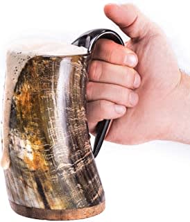
Which product looks more appealing to you?
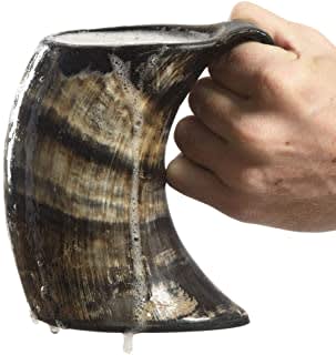
6 Responses to Option A
I actually like the coloration of B better. The glare in the picture though takes away from the mug. I had to choose A because of this as it is much clearer. Though i would have it without the foam dripping
I like the more natural shape of option A. Option B is too bright and fake looking. It doesn't look like real wood or horn.
I don't really care for either but B looks like it's dirty so I didn't choose it.
I LIKE THE SHAPE AND COLOR OF THIS MUG BETTER
The darker color looks sleeker and nicer. Cool product!
I think that the image in option A is more appealing. The color and lightning seems more realistic and it is more eye-catching.
44 Responses to Option B
I prefer the more bronze color
Option B's lighting is better
option b is more appealing because it does a better job of showing off the product
I think this one looks better, better color overall.
B catches my eye more, makes me more likely to click on it.
I like the coloring on this one the most
looks less photoshopped in the picture, clear image of the mug, brighter, more welcoming and less drab and unwelcoming
The yellows mixed in makes it stand out more
This picture looks more appealing because of the brightness of the photo.
brighter and seems more comfortable to hold
Choice A because at least one can recognize what this is (beer mug). On the other image one cannot really tell what it is supposed to be.
The colors in A are dull compared to B
I liked seeing the beer pour over the edge of the cup. It looks more exciting.
The lighter color is my preference.
prefer B, i like the gold highlights
Definitely B. I love the design and the color of it and how it looks with a beverage inside of it.
I really like the lighter color.
i like the slightly less curved mug in B. It looks more practical
B is more unique
B looks brighter and cleaner and like it's meant to be a growler/mug
This product is most appealing to me. I like the bright undertones.
I like that B seems to have more variation in the color. A looks drab.
I like N better because it is shinier and brighter, and I like the colors better.
option B looks more appealing and the lighting looks better making the product more attractive looking.
It looks less like an animal horn because of the shine.
this looks brighter and shinier
The ad looks more interesting
The different tones of colors in this product appeal to me more.
I prefer the brighter colors that are on the mug. It has more of a shine to it.
OPTION B: The beer dripping from the mug blends into the background too much. I had to give it a second look to determine it was dripping and that the mug wasn't a different shape. There is also possible a vertical reflection on the photo. Regardless I still choose this one of the two.OPTION A: I actually prefer the darker colors of this product. However, the drips at the bottom look gross and slimy. It's not appealing at all.
With the colors and the foam it just looks dirty and unappealing.
very nice and good
I like this picture better because it is brighter and I can see it more clearly.
if the product is good and quality is best.
The colors are much more appealing. A looks more like a movie prop.
I think B does because the way the person is gripping it makes it easier to see the product. I also like the colors on B better.
love the color, the design, fits the hand with comfort.
The picture brightness and colors are well taken and not so messy.
The product of Option B looks more appealing because the quality of the picture is much better as well as the color of the product. Option B caught my attention way more than Option A.
this one looks like it has a better grip and handle.
I prefer B because I like the colors of the horn a little better in the image, and the way the person is holding it looks more comfortable to me, which makes it look like its a little easier to hold than A. B also looks like it's being held somewhat more naturally, the person's hand holding A looks kind of tense and clenched up in comparison.
I like the way the color and striations look in option B. I also think it shows the size a little better. The product photographs well!
I chose Option B even though neither looks very appealing. But at least option B is a little cleaned up looking. It's shiny, looks more petit and the overflowing beer looks better. Also they way it's photographed makes it seem more inviting.
like the brightness, ability to understand the product I am looking at
Explore who answered your poll
Analyze your results with demographic reports.
Demographics
Sorry, AI highlights are currently only available for polls created after February 28th.
We're working hard to bring AI to more polls, please check back soon.

