Poll results
Save to favorites
Add this poll to your saved list for easy reference.
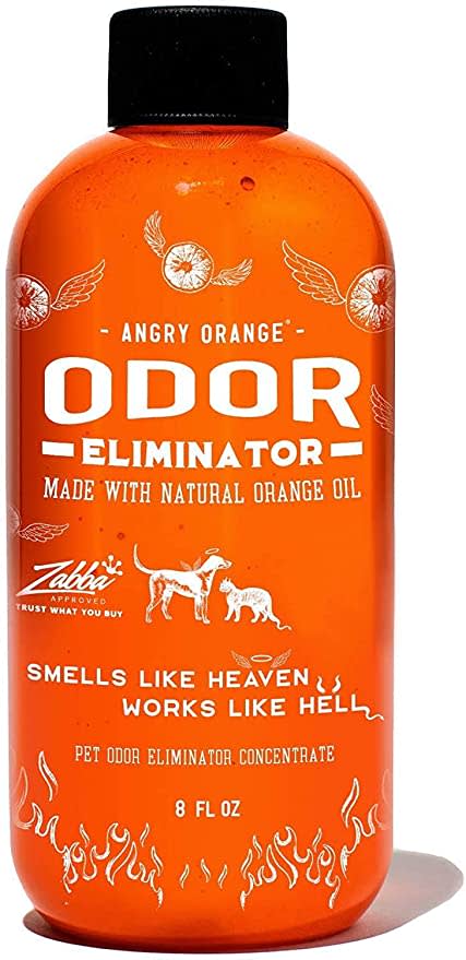
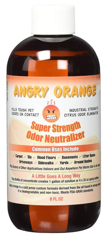
Which product packaging do you prefer for this pet deodorizer?
Age range
Dog owner
Education level
Gender identity
Household income range
Options
Personal income range
Racial or ethnic identity
35 Responses to Option A
The orange fire that is used for the bottle is neat here and it looks kind of cool the orange and white outline here
Option A looks more like a newer, more reputable brand to me.
A looks more eye catching given the vibrant orange as well as more professional and modern. B looks dated and generic. I enjoy the angry face in B, but there is too much text on the bottle which makes the design look noisy.
Can't really miss that bottle. That bottle would stand out from all the way across a store. If I was on an Amazon page, that bottle is the very first thing I'd notice.
The all organge is really unique and really goes with the brands name
This label just looks more professional. I don't think I would consider B at all, it just looks too, I hate to keep using the word, but unprofessional. Just seems lower quality.
I like option A the best because I love the orange colored bottle with the graphics on there that are really catchy to my eyes due to the flying orange slices and the flames at the bottom representing the tagline "Smells like heaven, works like hell".
I like the bright bold color of this on it grabs your attention faster
The one with the angry face is off-putting.
I prefer the all orange bottle without the angry emoticon. The angry emoticon feels too aggressive and out of place and makes me think the product will just make me angry because it doesn't work.
I don't care for the angry emoji in the other option.
The other design is just awful
A looks like a more professional branding than the other one
I think this label is far better looking. B looks so boring in comparison. All the printing on B is overwhelming in appearance. Option A is actually attractive and desirable.
The vivid orange color is both eye-catching and modern in appearance.
I like the color orange. Thus my top choice. I find the color, design and look of it more appealing to me.
The orange bottle makes me look at it right away and it seems like a serious product.
It looks way more classy and professionally-designed
I prefer Option A because the bottle does not let the light in and I think that is important for the liquid to stay better for longer.
I liked choice A since the label looks to flow better and is more eye catching. Choice B looks to plain and not as eye catching.
This option felt more engaging to me since it featured brighter colors.
The orange bottle looks better. Text is easy to read. And no gimmicky angry face
Option A's bottle design clearly outweighs Option B's. The bright orange allows the bottle to stand out and it uses a much more modern graphic design than compared to Option B's-- which looks incredibly outdated.
Other option looks cheap. Low quality fonts and images.
Option A simply looks more professional designed and made to help fix the problem it intends to fix. Option B looks too much like a cartoon or caricature/snake oil of an actual product.
I think the colors are more eye catching, I like the animal image, and feel it is both easier to read and more informative
Choice A is a more attractive name.
Option A is better because the bottle is all orange and it looks like modern packaging. The other bottle looks old school. Option A font and designs on the front are easier to read and see.
Just based on the label alone, A looks like it is the higher quality product.
A feels a bit more professional so I think it would be more likely to work and be effective.
The color is very vibrant and the picture says it’s purpose clearly
I like option A. THat angry face on option B causes me anxiety. I am angry usually, when I find out that my poor old dog had an accident, but I don't need the reminder on the bottle of stuff that I am going to use to try to get it up. Option A is calmer and is a cheerful orange color. I could do with out the flames at the bottom, but the orange bottle would be easy to find on my big shelf in the laundry room.
I really like option a It’s bright and colorful it looks good.
I like the orange color and design its very appealing to my style.
I like the colors used and the images are detailed.
15 Responses to Option B
Its much easier to read and looks like a higher quality product overall, plus it lists what it's safe to use on.
Option B looks more natural because of the clear bottle and looks healthier.
I prefer option b because it is unique and fun. This label is more interesting over A because it has something different to it that sticks in my mind.
I think Option B is Hilarious. I love the angry smiley face emoji on the label. And it's full of information on the product.Option A wasn't so bad. Being fully orange though is just kind of an eye sore to me.
I prefer B to A because the container is transparent and makes it easy to see the content inside it
I prefer B, I like that the bottle is transparent and on the front it shows a lot more of the products information.
More straightforward. I appreciate that it listed all the uses (floors, carpet, etc.) on the front. The other option was too old-fashioned, didn't like the motto, among other things.
I prefer the option B product label and packaging because the color is much less distracting and the black and orange text much easier to read than the white on bright orange text used in the option A product image.
Option I chose has labeling that is much more clean and easier to read then the second option making at the best option in my choice
I think the angry emoji would show me that the cleaner meant business and worked really well for what I needed it for.
I like that the label tells more about the product.
I like Option B because it has a ton of useful information that I can see immediately upon looking at the product.
I chose panel B. I am very familiar with this product as I have used it for many years. However, I like the B label as it has so many uses that I just didn't know about.
I like this packaging because it is simple and the text is easy to read.
I like the label design on the other one better but I chose this one because it lists all the surfaces you can use the product on
Explore who answered your poll
Analyze your results with demographic reports.
Demographics
Sorry, AI highlights are currently only available for polls created after February 28th.
We're working hard to bring AI to more polls, please check back soon.

