Poll results
Save to favorites
Add this poll to your saved list for easy reference.
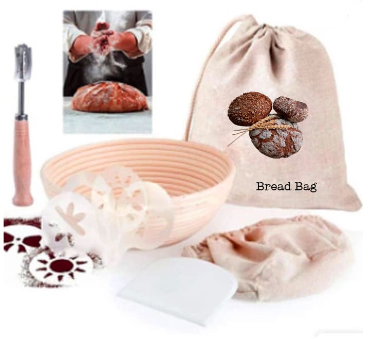
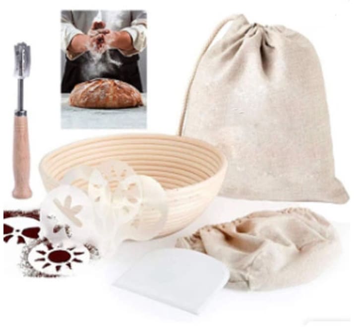
Which product would you buy?
Age range
Amazon Prime member
Education level
Gender identity
Options
Personal income range
Racial or ethnic identity
18 Responses to Option A
I think having the description of what the bag is intended for is better because then I know exactly what the bag is when I have it at home.
I think having the logo adds to the validity of the product, so I much prefer the bad with the food on the cover.
i like the image with the bread on the bag
I like that it showed a variety of what loaves could look like on the "bread bag"
More colorful and the image on the bag makes it look better
I don't need a label.
The illustration on this bread bag is very helpful. It also is richer in color which makes me feel this is nicer.
I like the bread bad label. It is helpful.
Bread Bags are something I've never heard of and I guess i like the labeling of it more with the words and image makes it a little less bland.
Choice A seems more vibrant and homey. Choice B is a little too sterile looking.
I think the label is useful because it will help me remember what the product is. The other choice looks too generic.
I picked A as my top choice as it tells me a lot on what I can put inside that bag.
I would buy choice A because the bag in Choice B just looks empty with the picture and words that choice A has.
I like seeing the image of the bread on the bag itself. Makes it very easy to know what the bag is for.
I would vote for A because or the bread bag picture as I like creativity vs. just a plain bag or anything else. Aside from that the product image is pretty much exactly the same so I would hope most people go with a designed bag over a plain one.
This presentation is the better one to me overall
Choice A is my pick because I like how it has the picture and the words on the bag. That way you are able to remember what the bag is for and what its purpose is. It also just looks better then having a plain bag and adds some character to it.
I like the picture of the loaves on the outside. then there is no mistaking what the bag is for
32 Responses to Option B
I dig seeing it without the word Bread Bag on it.
The bread is a little ugly on A to be honest.. Bag looks a lot nicer in B.
The added graphics on the bread bag add nothing useful and look a bit amateurish, implying that the workmanship on the rest of the set will also be poor.
I don't need a silly picture of bread on my bread bag. Maybe a small embroidery logo or something but the picture isnt super classy
The item without showing it is a bread bag is better quality to me
I chose B because I prefer the inset in this option to the other.
The 'bread bag' label seems both unnecessary and the quality of the graphic design seems below the rest of the image. I like it simpler with the component not labeled.
A has a poor photoshop job on the bag. It looks awful and makes me not want to trust the product.
I like option B better because it is simpler and more neutral. I can tell the bag is a bread bag and don’t need a convenient picture and label to inform me of the product so find that unnecessary and cheap in option A. I think B looks cleaner and more professional.
I feel that the image of the bread does not really help and is a poor image quality. I prefer the bad without the image.
This looks much more appealing with it unlabeled
The photo in option A has a poorly edited element (the bread). It makes it look cheap.
A saying that it is a "bread bag" looks to be a bit redundant.
as I can use the bag for something else in the future
I am just a fan of the lighter colors for this company.
I think I would go for choice B because I can obviously tell the one thing is a bread bag and the text is unnecessary.
I don't need things labelled, it looks silly.
I like the plain bag of Option B. I would worry about the logo wearing out and peeling. The product harkens back to simpler times and doing baking by hand so it is okay for the bag to be plain and simple.
I prefer Option B. I don't like the image of the bread on the bag in Option A and this allows me to use the bag for things other than bread.
B is preferable because i doesn't have the poorly photoshopped photo of bread on the bag, unlike A.
The bread in A looked nice on it's own, but because the quality of the photoshop made me laugh because it was so bad I could not pick it. B is plenty fine with the bread in a picture on it's own to the side.
I chose B because the advertisement's design is cleaner. Photo A has a poorly photoshopped picture of bread atop the bag and it makes no sense. B has a more successful appeal because the bread inside the bag is implied and not shown.
I do not like the insert image of the other one. It looks like blood and meat that the guy is handling.
I really do not like the graphic of the bread loaves on the bread bag in image A, I prefer the plain version which is in B. Also the bread and the person in the image in the top left look more natural when it comes to coloring.
I would prefer it without the image, the image makes the product look kind of cheap.
I like option B because on option A the image and font look fake, like maybe they are photoshopped on the bag. That makes it look fake.
would prefer the bag without the image on it
I don't like the bread image on option A. It looks kind of gross.
The redness in A is something that I don't particularly like.
I don’t really like the holes in the other product. It looks strange and I think B is nice and simple
I like the clean sack look. Option A looks photoshopped and gives a poor impression.
Labeling the bag with a photo like that makes it look pretty cheap in my opinion.
Explore who answered your poll
Analyze your results with demographic reports.
Demographics
Sorry, AI highlights are currently only available for polls created after February 28th.
We're working hard to bring AI to more polls, please check back soon.

