Poll results
Save to favorites
Add this poll to your saved list for easy reference.
Which product would you rather buy?
Option A won this Ranked poll with a final tally of 51 votes after 3 rounds of votes counting.
In a Ranked poll, respondents rank every option in order of preference. For example, when you test 6 options, each respondent orders their choices from first to sixth place.
PickFu requires a majority to win a Ranked poll. A majority winner differs from a plurality winner. A majority winner earns over 50% of the votes, whereas a plurality winner earns the most votes, regardless of winning percentage.
If an option does not earn a majority of votes, PickFu eliminates the option with the lowest number of votes. The votes from the eliminated option are reassigned based on each respondent’s next choice. This process continues in rounds until a majority winner emerges.
Scores reflect the percentage of total votes an option receives during the vote counting and indicate the relative preference of the respondents. If there is no majority winner, look to the scores to see how the options fared relative to one another.
| Option | Round 1 | Round 2 | Round 3 |
|---|---|---|---|
| A | 29% 29 votes | 32% 32 votes +3 | 51% 51 votes +19 |
| B | 36% 36 votes | 43% 43 votes +7 | 49% 49 votes +6 |
| C | 24% 24 votes | 25% 25 votes +1 | Eliminated 25 votes reassigned |
| D | 11% 11 votes | Eliminated 11 votes reassigned |
Age range
Education level
Exercise frequency
Gender identity
Hobbies and interests
Nutritional supplement use
Online shopping marketplaces
Options
Personal income range
Racial or ethnic identity
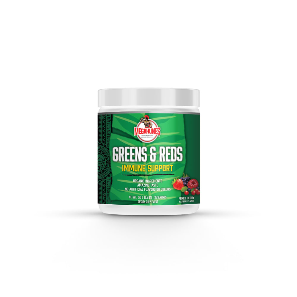
29 Responses to Option A
I like the green labels best and I like seeing "Immune Support" along with the name of the product.
The green label looks the best and the text in A is the easiest to read
I prefer option A because under the main label is "Immune Support" clearly labeled so I know what the product is intended for.
I definitely prefer the labels that have a green background. This makes me think that the product is healthy.
It’s smart to emphasize the green in the background, as it is to get “immune support” underneath the product name; thus, Option A wins first place.
I like options A/c because of the packaging. It's visually appealing and makes the product look professional.
I would rather buy the product in option A because it looks the healthiest to me
To me, A and C are the two best options for this supplement, given the name of "greens and reds". I find that the label is fitting for the product being advertised and sold. To me, B and D are alright, but the label colors in these options do not really match with the product.
The green background of Options A and C really make the product stand out. I favor Option A as the name "Greens and Reds" are on one line meaning they are of equal importance. It is also easier to read as it occupies one line in the center of the label. The brand name pops with the red color as does the Immune support being yellow. It is a well balanced and well thought out label design.Option B is okay, but the more or less solid black color gives a negative feeling to the product. Taking your greens and reds daily is suppose to be an uplifting experience, but the black label makes you feel just the opposite. The black does not make the product feel exclusive... just the opposite.Option D is the wrong color scheme as the label is difficult to read from a distance.Option A looks great, is very easy to read, is memorable and is very easy to spot on the shelf. Attention on the shelf means increased sales for the product.
The green jar is appealing on A. Most importantly I can see right away that its for "immune support" because it's in big letters. The name of the product alone gives me no indication for what it's about.
I like the logo, the picture of the berries, and the name - those are present in all of them. I think 'Greens & Reds' makes more of an impact in one line as opposed to two, so A and B are my top choices, and I think the green background looks more inviting than the black, so A. I'm not too fond of D - without reading what it is, I would assume it's coffee based on the design, not a nutritional supplement.
D is last because it is hard to readA & B are easiest to read and also look pretty sleek, with a slight preference to the green over the black
I made my choices this way based on which design I feel really draws me in and makes me want to buy the product. I feel that the green and dark colors make me think more of a high quality natural product.
I chose option A because the green jar makes the most sense. It goes with the name and is easy to see
My choice is based on my preference over the color and graphic design of the product that looks attractive.
A I like the layout of the words and the green labelC Same reason as C except I prefer the way the words are laid out more in AB is third as I prefer the black background more than the one in D
The labels for A and B fit the product the best, but the yellow letters for immune support stand out more and give more detail. B is too boring, while D is difficult to read.
A and B are pretty much equal in my book. A is a little better though, I like the Ampersand. I think B is too dark, but D is totally uninteresting so I put it last
Option A is my favorite, followed by Option B, since they both clearly state that they're for immune support. Option A is ranked over Option B because of the green color, which I find very eye-catching. Options C and D are too text-heavy, with Option D ranking last due to the background color of it, which is a bit plain.
A is my first choice because of the green background, and because I like that the 'Immune Support' stands out with its yellow letters.C is my second choice because it's very similar to A and I like the green background (just the words Immune Support aren't visibile here).B is my third choice because it doesn't stand out as much as A and C but is still somewhat eye-catching.D is my fourth choice because it's just a bit too hard to read this one.
I love option A the most because it has the most natural vibe making it the most attractive to me.
Looking at the products here, I like the one in Option A because it looks really trustworthy and I perceive that it'd be very efficient.
First pick is A because it looks good on green and the text is printed nicely in a stylish way. Second pick is C because I liked the green but the text looks strangely positioned. Third pick is D because I liked the look of the print but not the brown label. Fourth pick is B because the black doesn't look good on this product.
Definitely Option A because of the accurate color to words used and it says exactly what it is in bold. Thank you.
I voted A as first because I liked the design and that it said immune support on it. I voted B as second because it was a simple design that told me that it was also good for my immune system. I voted C as third because I liked the colors of the design. I voted D as fourth because I didn't like the text and the colors of the product.
This is very bold and noticeable and very readable and the colors make eit stand out to me
The green label is easier to read on option A. The words ", immune support" are larger so that it is easier to see the purpose of the product.
The green tub with more fruits and veggies in it makes more sense. I don't like the brown tub.
I like the branding with "immune support" on the front, as that descriptive language is eye catching and effective. I prefer the green color in the branding as well.
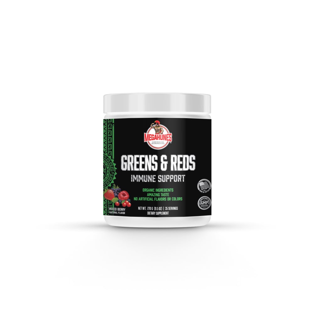
36 Responses to Option B
I like B because I think the black label with the white font looks sleek and attractive. It gets my attention and stands out over the other ones.
B has the best looking label and makes it clear that it is an immune supplement. If I saw D at a grocery store, I would think it was a cooking spice, bad label
I ranked the options based on how eye-catching and appealing they were and how easy they were to read.
Between the four different options, I decided to choose option b as my absolute favorite. This option was my favorite because I really enjoyed the black background. I thought that all of the different colors including the white, green, and red ended up looking really nice against the giant black background. Second, I decided to go with option A as my next choice. What I really liked about this one was the green background in the photo. I thought that not only was the photo very professional looking, but that the text and all of the different colors ended up working really well against this green color. Third, I decided to go with option c as my next choice. What I really liked about this one was the dark green and also the light green together and how they worked in the background of the product. There was a really nice collection of different colors in this picture and I thought that everything ended up working really well together. Finally, my least favorite of all of the different pictures was the one that had all of the different colors and was option d. While this one was still nice, I had a little bit of trouble reading the product itself and what it was trying to say on the label and I think that this was because I just did not think that any of the colors really went well together. There was just too much happening. I would have suggested doing a more solid color in the background, either orange or possibly black.
I like the black label best. It feels right, I like the immune support being easily read because Greens and Red's doesn't immediately tell me what I'm looking at. A is good but I just don't really love the green. C is lower because the immune support isn't easily seen. Lastly, D is just weird and I don't like the design
B is easiest to read and most appealing. The rest are ranked on the same metrics. Option D is too hard to read and not appealing.
I prefer the black can it really shows the berries on the side. I like C because the font is all the same color. I do not like A with the yellow font. Can d looks cheap
Option B looks more professional. The black background gives the product a sense of power.
B is the best because it is made in the USA. D is the second because it is organic. A is the third because it mentions immune system. C is the last because it is nothing in particular.
I like the black and green in choice B. The fruit really pops off the black background
I like the boldness of the white on black label that makes the info stand out the most.
I like "Greens & Reds" on one line as its easier to understand. I think the white letters stand out on the black background better than the green. Option D is very hard to read with the green and red letters on the gold/tan background.
i think the black cover is quite superior plus it looks like a very high quality and luxurious product I also think that the green packaging makes it look like a healthy product, which is why it would be my second and third option.
I like the black label of b best. Easiest to read too. Of the greens I like the font style of c better than a. And d I’m not a fan of
Prefer Option B. The black color serves as the best background to highlight the name and other distinguishing details. It's simple, clean, and looks solid. Option D color combinations do not work well.
Option B shows a seal of approval from a governing authority, gives peace of mind product is safe/effective.
I think I like B and C because there is a good contrast between the text, and the packaging that it's easy for me to read the label, and what it contains.
My top label choice makes the font easiest to read from far away. I also prefer black labels in general for supplements
I chose B because the black background makes it easier to read the text superimposed on it. Furthermore, it is a sleek and professional-looking package, which I like.
i arranged these from the most professionally designed to the least with option B looking the most trustworthy
I prefer this option from the group. This ad emphasizes the immune support aspect of the product which is a major selling point. This is a winning product label.
Based on the different packaging of this dietary supplement, my rating would be as follows:Option B is ranked 1 because the solid black background, green side border, font styling, and content orientations are better than other designs.Option D is ranked 2 because the light beige color background, font styling, and overall packaging design look impressive.Option A is ranked 3 because the green background, product title, and subtitle look nice.Option C is ranked 4 because of the green background and because the overall font asymmetry and design can be improved.
Because option B design color and caption looks more attractive and gives a better impression, all the other options are ranked similarly as per the design.
The product label looks unique and healthy. I like the concept of this product.
I would rather purchase option B, the label and colors are much more attractive than any of the other options. I think the use of the dark colors along with the lighter green contrasts well and is more eye-popping than any of the other designs. The text is also easier to read on option B than any of the others.
The packaging design is more attractive and appealing to me. The inscription on the package is clearer and easier to read
Love how black integrates with every color shows authenticity
I like option B the most because the dark color of the packaging looks best to me. I like options C and A equally because the packaging is dark but not as quite as I would prefer. Option D looks bad to me because the packaging feels chaotic.
I like the sleekness of option B the most. I like the black background and how it highlights that immune support is an added factor in the product. Option A is second, because I like the green but the leaf in the background makes it look a little busy. Option C is 3rd because it doesn't not highlight immune support. Option D is last because the colored text over the tan background feels a bit outdated.
I generally prefer the darker backgrounds I think they highlight the information a lot more and just generally look better
I like option B the most because it is the most masculine.
I like the design of B the best followed by A, C and then D.
The one I chose first is the easiest to read, and it catches the eye because there is good contrast between the letter colors and background colors. I also like the one I chose second a lot with the more noticeable native looking image down the side and natural coloring, but it is very hard to read. I would make the yellow lettering black and enlarge the other letters under it. I really like to see the words "Immune Support"
Option B looks like the most high end product with better ingredients.
I like option B for the labeling coloring makes it easy to read and to standout against the other options.
I like the black design of the bottle in option B, I think it is a very professional design that makes me trust the product.
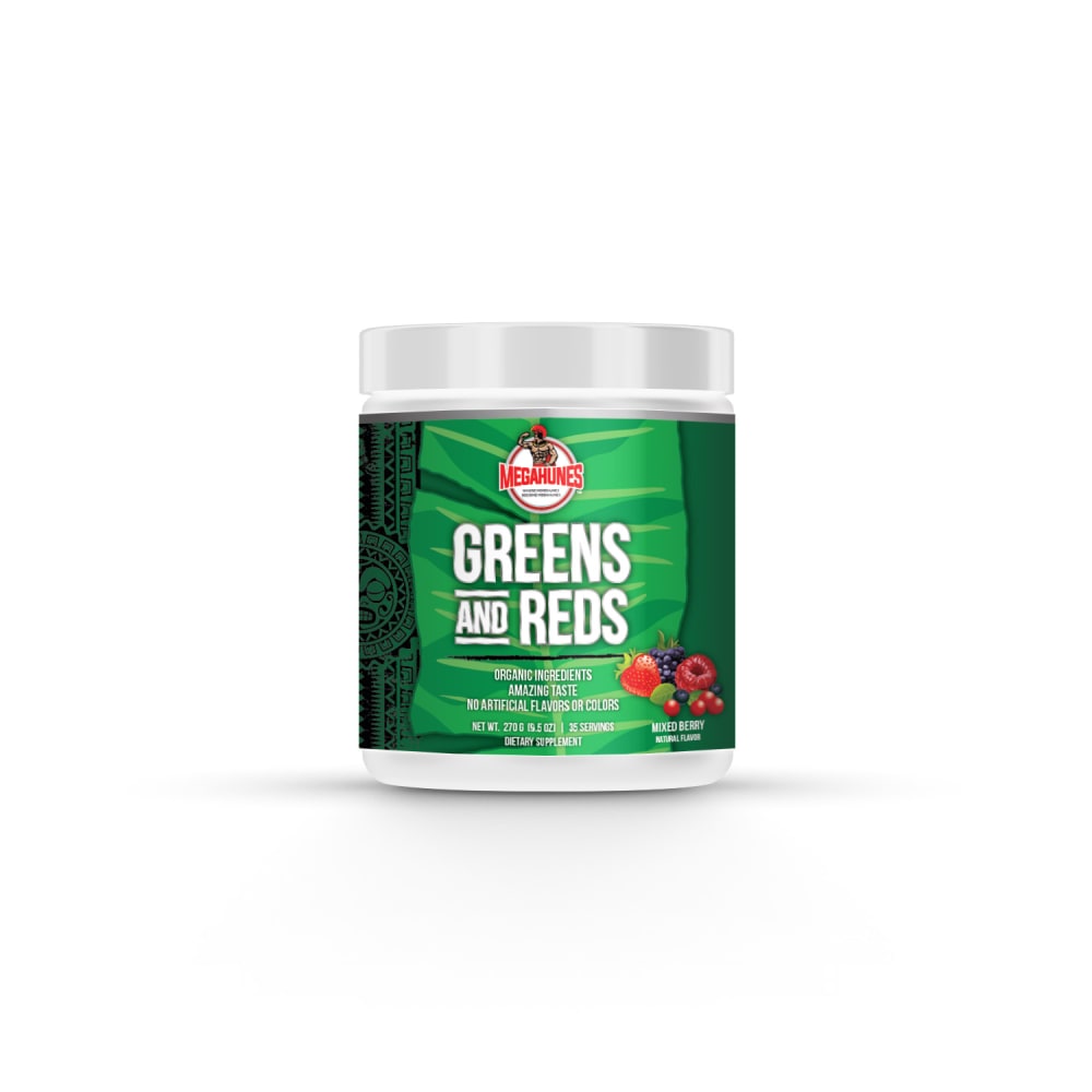
24 Responses to Option C
The colors on C were the most bright and vibrant. B's colors were depressing and D's were too dull.
I like C the most because the label looks the most sleek and modern.
The green package labeling is the best. I like that a lot here. The text on top of each other is more fun and puts a lot more emphasis for this. I like option C as the best look. The black label is okay in option B. Option D is too confusing and too contentious to read.
I like C because it looks healthier and smarter.
The green product labels were the best, but option C had the best layout of the package label text.
C and A have a nice green label that makes me think that they are a natural product. I also like that they have mixed berries on the label. The black does not look as good but the name is still easy to read on B. D does not have a professional looking font nor is it easy to read.
I prefer the option C dietary supplement product image because I like the large white text for the green and reds label with the green background color the most. I chose options A and B second and third because I like the green background color more than the black background color on these product labels. I chose option D last because I do not like the fancy font and background style design of this product label much at all.
I like the brightness of c and a, with the white text on the green background. This reminds me most of health. B is too dark. D looks more like a plant fertilizer.
I think option C is the easiest to read due to the font, easiest to see due to the colors, and I like the placement of the graphics. All of which combined makes me the most likely to buy
C's green elements and fruit are more attractive than the other options. I don't like the yellow text in A, which is why I chose B second.
D looks like Xmas. B is too dark.
The green packaging is more indicative of a natural supplement, and the formal/professional font is better to use with a supplement that it is not clear what is in it.
With a product name like greens and reds I'm expecting to see a lot of greens and reds on the label as well. That makes options A and C my favorite and I give the edge to option C because it has a more consistent label with white text and the focus is on the green and red color unless having the yellow included under the text label
These look healthy and a delicious addition to my routine :) I would try these asap. Voted in the exact order that I would pick them up off of a shelf, and that I thought the art work was appealing.
I don't like having immune support in the title.
the last one initially caught my eye the most but i couldnt read the name at all
I ranked option D as the first option because of the color of the tin which compliments what is being sold
I prefer option C as my first choice to buy because of the way they can is displayed on the front
Choice C and the simple use of font and graphics makes it the most appealing and attractive option. It is the one that is clear in defining the product as well.
I think the bottle of Greens and Reds should actually be green and red. C and A are interchangeable in my opinion. No preference. As for the other 2, B is much more easily readable than D.
The name seems more bold. Also this one has more green and red in it. Due to these, this is my top pick
I like the green and red colored labels and the words are stronger with C.
I ranked them based on how easy it was to read from the labels alone about the product. I also ranked them based on design, color schemes of the label and overall appearance because the label will allow the buyer to decipher in a few seconds if this is the product for them.
I like the lighter green ones. The others don't look like they're for an edible product.
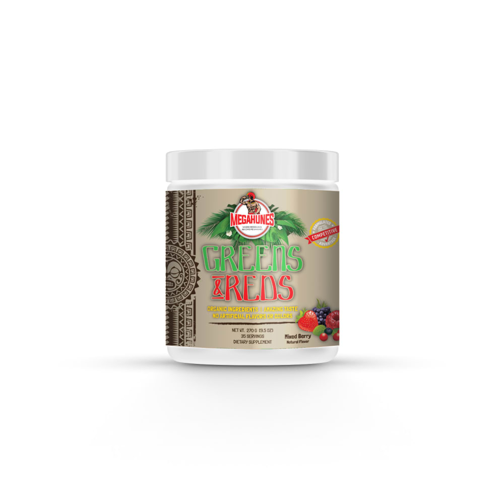
11 Responses to Option D
I like the more dynamic looking packaging
I am really drawn to D because I love the unique colors of the bottle and how it feels natural but the design and words still pop. From there, I like A and C because I love the green color since it's natural. I love the details on A a lot more so that is why it is first. B is last because it feels a bit bland to me and typical.
I think the silver is the most distinctive and looks like a supplement to me. The black is also good but not as eye catching as the silver. The other two, in green, look like the plant fertilizers I buy, like miracle gro. Not something I'd want in my house, for that reason.
My first choice is option D because I think this packaging is the most unique and special of them all, and the most different from other similar products. I think the tan color and font of the writing convey a naturalness about the product which is important for greens and reds. My second choice is A because I think that having 'Greens & Reds' in one line is more preferable than option C where it spells out 'and' and has green and red on separate lines. I think that the green label in option A also conveys a naturalness and cleanliness about the product as well that is enticing. My third choice is B because I think the black label of the same style as A is preferable to the label in C as you get less important information at first glance. I think that the black color is still relatively nice compared to other products on the market like this one, and option C feels more cluttered and puts less emphasis on the benefits of the product than other options, making me less inclined to purchase it.
The mostly green ones (A+C) looks generic and plain. I like D the best because the font catches your eye
D looks festive, Christmas-like, and unique. The other options look more generic.
option D i like the label its very unique and creative and fits the name
I chose option D. I think if I were browsing, I would notice the gold label with the colorful green and red on it and want to learn more about it.
I will choose D' because it has an amazing design labeling with nice colors.Option B' also looks good, I like the packaging it is very attractive.I also prefer A' I like the colors that was chosen for for the packaging looks very appealing.C' is my last choice, I will buy t because it looks very enticing.
I chose D. The Mayan ( Aztec? ) theme makes it stand out from the rest. A and C have nice colors. B is perhaps too dark.
I chose option D because I like that in the name the color of GREENS and REDS are green and red. I think it looks good and I think it is approprate for the name.
Explore who answered your poll
Analyze your results with demographic reports.
Demographics
Sorry, AI highlights are currently only available for polls created after February 28th.
We're working hard to bring AI to more polls, please check back soon.

