Poll results
Save to favorites
Add this poll to your saved list for easy reference.
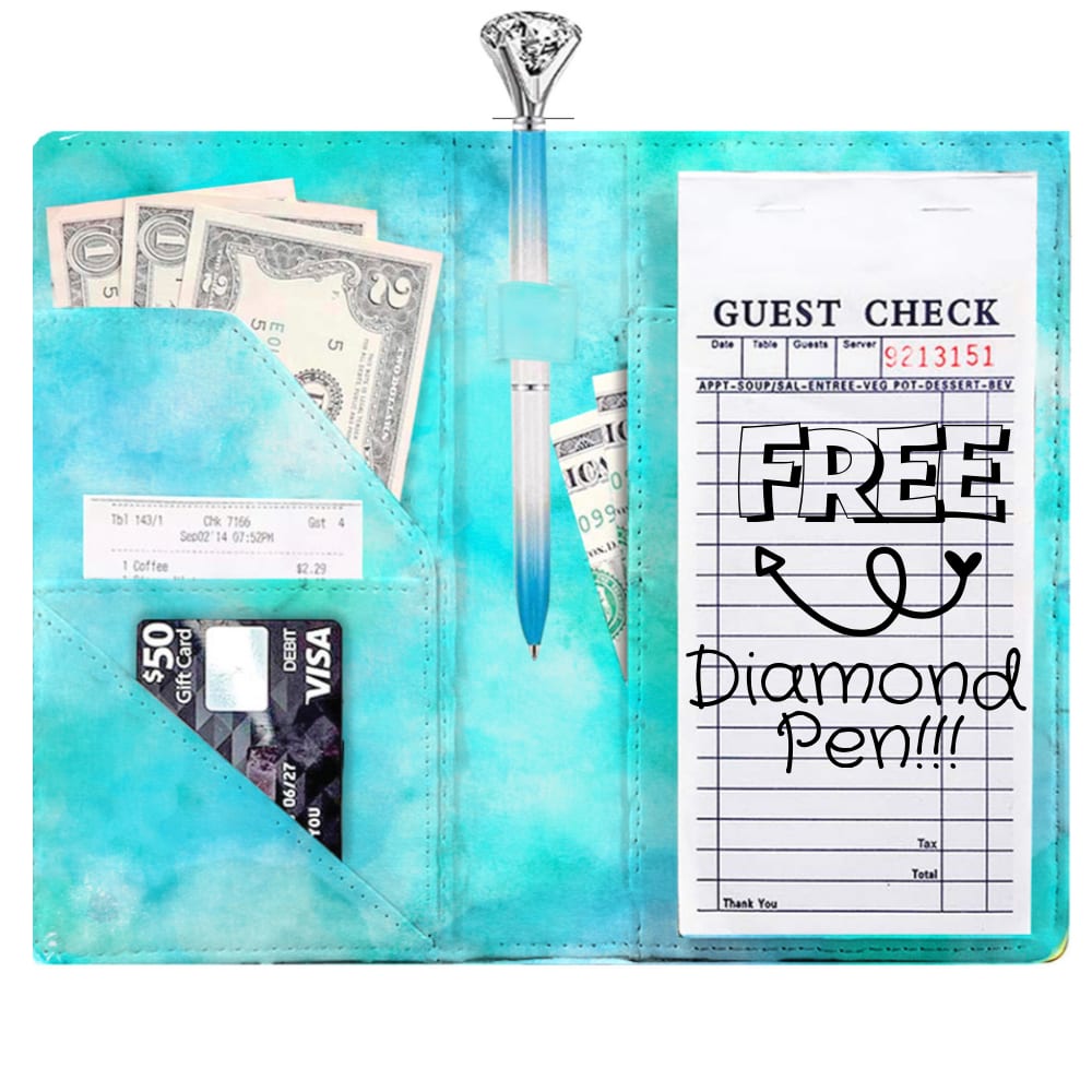
Which Server Book for Waitress would you buy?
Option A won this Ranked poll with a final tally of 27 votes after 5 rounds of votes counting.
In a Ranked poll, respondents rank every option in order of preference. For example, when you test 6 options, each respondent orders their choices from first to sixth place.
PickFu requires a majority to win a Ranked poll. A majority winner differs from a plurality winner. A majority winner earns over 50% of the votes, whereas a plurality winner earns the most votes, regardless of winning percentage.
If an option does not earn a majority of votes, PickFu eliminates the option with the lowest number of votes. The votes from the eliminated option are reassigned based on each respondent’s next choice. This process continues in rounds until a majority winner emerges.
Scores reflect the percentage of total votes an option receives during the vote counting and indicate the relative preference of the respondents. If there is no majority winner, look to the scores to see how the options fared relative to one another.
| Option | Round 1 | Round 2 | Round 3 | Round 4 | Round 5 |
|---|---|---|---|---|---|
| A | 18% 9 votes | 20% 10 votes +1 | 24% 12 votes +2 | 34% 17 votes +5 | 55.1% 27 votes +10 |
| C | 20% 10 votes | 22% 11 votes +1 | 26% 13 votes +2 | 36% 18 votes +5 | 44.9% 22 votes +4 |
| E | 26% 13 votes | 26% 13 votes | 30% 15 votes +2 | 30% 15 votes | Eliminated 15 votes reassigned |
| B | 16% 8 votes | 18% 9 votes +1 | 20% 10 votes +1 | Eliminated 10 votes reassigned | |
| F | 12% 6 votes | 14% 7 votes +1 | Eliminated 7 votes reassigned | ||
| D | 8% 4 votes | Eliminated 4 votes reassigned |
9 Responses to Option A
A was fun, large, and not too pink. B was similar but the colors were more muted. F was completely utilitarian. C looked very elegant
I loved the bright colors but the pink sparkles was great. Would love a blue sparkle option. Also the open photos were more appealing.
I made my choices based on color. Which color I liked the most. I loved the teal.
I choose A because the color appealed to me and the diamond pen is really cute. Again I like the color so i choose F as number 2. C is cute and I like the pen being inside rather than on the side. The basic black inside of E is good and no frills look. The outside is a pleasant floral.
I liked A the best because it's cloud-like and ethereal' the pockets appear from the background of intense color. I choose B as @2 because its a paler version of A. C is the pink version of A and D is a textured pink version of A
Option A's color and pattern is soft and not overwhelming. It's very light and simple,but very pretty.
I started with the teal colors because they're closest to the color blue. I started with the tie dye looking options followed by the solid colors. I also really liked the pink glitter option. I wish there had been a teal or blue glitter option.
I like the aqua blue color it makes it stand out in Option A over other choices. C was my second choice because of the pink color and it makes the product look useful. Option B was my third choice because of color and use. E was my last choice because the flowers added a nice touch.
The first three looks slim and well organized
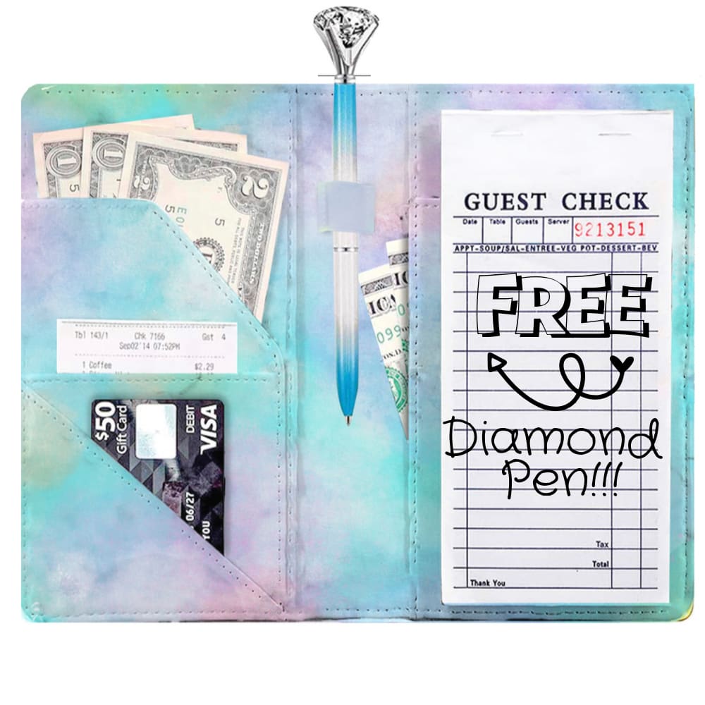
8 Responses to Option B
I liked option A because it has a bright coloring and looks trendy. I picked option B because the rainbow looking color is nice and the design is sleek. I picked option D because I like the glitter and pink design and it looks organized. I picked option C because it looks very clean and not very distracting.
Option B is the prettiest. It has a nice blue and pink tie dye feeling. It's relaxing and reminds me of a cloudy sky at sunset. It's very Southern California. I would comment on it to my server. "That's pretty!" Option D is also pretty but it's my second choice. It reminds me of a vintage banana seat cover on a bicycle. Very retro! Pink is always good. Options F & A are 3rd and 4th choice just because they are appealing blue colors. They could use some texture or pattern.
I like them they are cute
I chose my options based on the order of how much I liked their colors and patterns. Option B was my first choice because I like the blue and purple tie dye best. Then I chose option A because I like the plain blue tie dye. I chose option D third because I like the sparkles and think they look luxe. Option E was my final choice because I thought the flowers were okay, but not my favorite pattern. I didn't choose the remaining options because I couldn't see the pattern as well.
I love the dreamy design, the use Of purples pinks and blues is such a hit! Plus you get a diamond pen with the first 2 choices. 2nd i picked because it was missing the purple undertones,
The first two are a tie for me, I love pastel colors and I love when the turquoise turns to green. Equally amazing, equally something that expresses my personality, all have the same functionality capabilities. The third one is just straight my favorite color without tie-dye and then I like the fourth one because of the glitter, which makes it more unique and more me.
I chose them in order of color preference after order of which colors would be most pleasing to the customer.
I chose B because I liked how the pen showed at the top. The other three choices, C, D, and F were chosen because I liked the style and design.
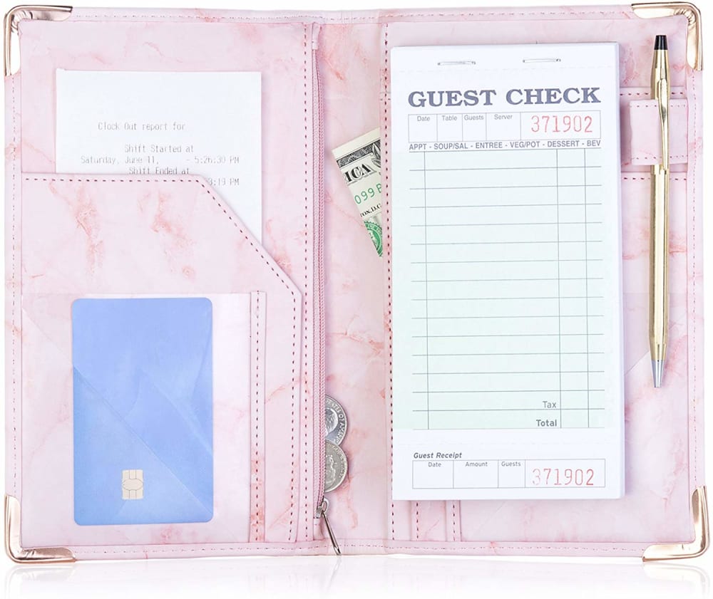
10 Responses to Option C
Pink one by far is my favorite love the pen holder, think the teal one is great color a lot of little compartments, love the pink glitter one, the black one is nice not fond of the flowers on outside, the last one is ok
I like the corner protectors on my first choice.
I would purchase option C as a server book because it has the most simplistic design.
I like the pretty pinks. I don't like Option E as much because it's dark and super crowded with a lot of flowers.
I think Options C and E are the best because they are the most basic looking. I don't feel like anything too extravagant should be used at a job.
This order is reflective of the cutest layouts on the products.
I would buy bright color eye-catch server book because it is easy to spot during the busy hours.
The first choice is because I like the light color of pink and looks professional compared to the other three. I also like the gold trim and the gold pen. The second choice is because I like the tye-dye effect on the server book, makes it look fun, although I much prefer the pen being on the side of the guest check instead of the middle. I just feel it's easy to grab a pen on the side then on the middle. For the third choice I choose one that's plain color but still looks professional, I like how everything is well organized and there there is a zipper to keep my money safe, something I don't see on option B. For the final choice I choose another tye-dye design, even though the blue does appear brighter to my eyes, but it doesn't have a zipper and the pen in the middle of the server book instead of beside the guest check. I like to grab pens from the side and not the middle since I feel I'm wasting arm movement.
The insides are important. Professional layout is pleasing to me. In this order I like the layout . Color is secondary.
C is my favorite this morning for a woman. F for a guy. The colors are simple but make a statement. D, the glitter is a good choice. And then the flowery black one. It would be more traditional if it wasn't for the flower cover. The stitching seems good in C and F, not just glued together. Again, this is more a personal choice. They are all nice, just depends on a person's choice.
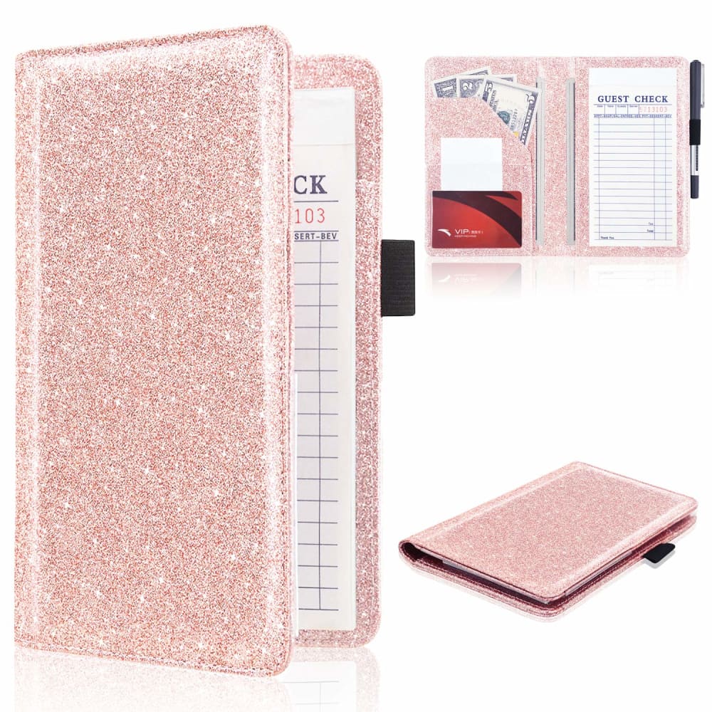
4 Responses to Option D
i love the pink glitter, but after that the blues are some fun colors.
I like the colors more
I tend to like pink sparkly things so liked D and C the best. B is pretty also.
I was trying to pick the most gender neutral and professional looks possible. Black is almost always the preferred look but that was not an option without those flowers in E. I went for pink first because although pink is not gender neutral, it seems the most professional in appearance. Then I went for the turquoise ones which are less "neutral" in color if you will (F,A). My last choice was the tie-dye (B).
13 Responses to Option E
Option E A C and F is better than others
primarily chose the black option as it will be resistant to stains and other color damage while still looking nice and not too girly. From there i was just trying to choose the most simple options- it shouldnt be too busy when its coming with your food check.
i love the first one because i love black florals, so it's the best one for me. the second one is nice as well because i really like the colors, same with the third one. the last one is okay, though i'm not really a fan of the boring flat color.
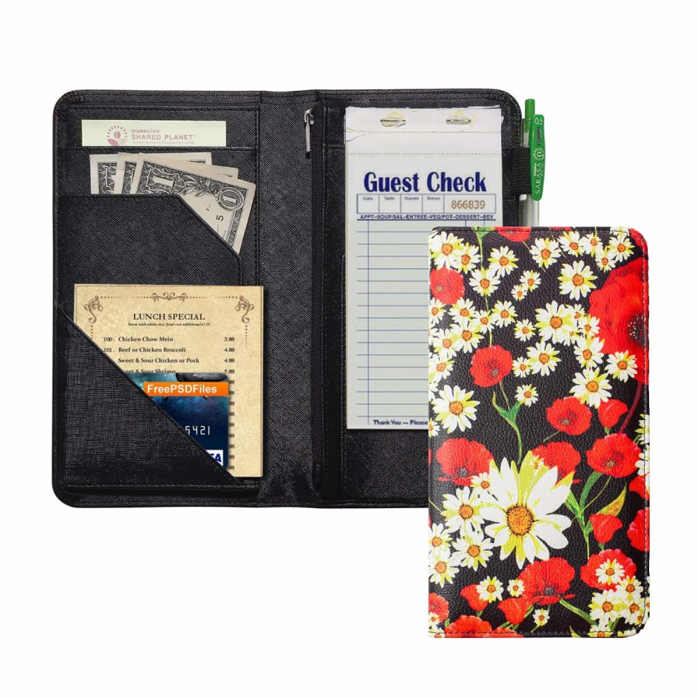
E is my favorite - I like the floral artwork, and the floral design combined with the black background seems sophisticated and elegant yet cheerful. B is my second choice - I like the watercolor effect of the design on it and think its very attractive, just not quite as much as E. C is my third choice - I like the gold pen and the gold and pink combination of the book, it seems elegant and attractive, just not quite as much to me as E or B. A is my fourth choice - the brighter watercolor design is somewhat attractive, just not quite as much to me as E, B, or C. I felt like the pink glitter design of D was too over the top, and the plain teal color of F just wasn't as interesting or appealing, and kind of looked cheap in comparison to the others.
e is the most elegant color
I like E the best because it is more of a classic look, being black, but is still pretty, and not too in your face. F, A, and B I like the colors of in that order, but are less traditional. I really like the solid, beautiful color of F. A and B are fun, but I don't love the tie dye, and I hate pink so did not choose the others and preferred A over B.
E seems happy and has compartments for all currency/receipts. A and B also colorful with compartments. C is pretty and has enough compartments
The flowers are a classic pattern and would look nice at most restaurants. The watercolor backgrounds are light and airy looking. I like the whimsical look.
I like the floral one with black interior the best out of the bunch. I then prefer the blue server books. I don't care for the pink sparkly one but that's just my preference. They all look pretty useful!
Black interior is the most professional looking
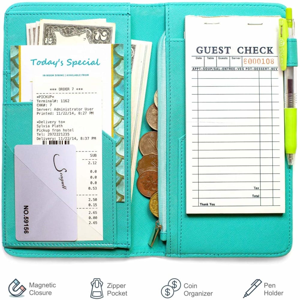
Option E- has an extra slim wallet. Option A- Has a slot in the middle for a letter opener or pen. Option F- Has a built in coin pouch. Option D- Love the color and it looks shiny
I really love my first pick the floral design is always a winner with me and it is a neutral looking and Wii go well with any fashion. The last three are of a blue look these also are very beautiful and my second choice b comes with a free diamond pen which is awesome and has a little pink in the color which is nice. The last two have lots of blue in it which is a winner with me and I'm sure would be a number one choice with many because blue I think is a favorite color with many.
I like choice E the most. I like the color black and the floral design. I think it would go well in any restaurant as well as many clothing choices and/or uniforms. I also think it is not too loud so it would not bring too much attention from guests and/or supervisors. My next choices are B & A which are almost identical. I prefer the color on choice B, the purple adds more of a pop. I like the design and both include a free diamond pen which is very interesting. My last choice D is the loudest of them all but the color is pretty and it definitely shimmers. All choices are good but do depend on the atmosphere of the restaurant as well as the individual. Overall, I prefer option E. I believe the color and the design are would blend in well with many restaurants.
6 Responses to Option F
I picked based on aesthetics and pictures that showed the interior design
lie fun colors
I wish the black one were plain. The teal looked the least offensive.
I preferred the ones without the "diamond pen" because it looks tacky, in my opinion.
Option F was my favorite choice because it lists the options that come with it. A zipper pocket and coin organizer are very helpful, and it also closes magnetically. Turquoise is one of my favorite colors. It seems to be the most helpful to keep things organized as a Waitress. Option C is nice because of the zipper on the inside and has a luxe look. Pink is my favorite color. Option D is very attractive to the eye, and I love pink and glitter. Option E seems sensible and basic but still has a zipper. These are all also helpful because they have pen holders.
F is the most practical. I like all the pockets. / The inside of E is great, but I hate the outside pattern. C Is pretty cool, but I figure it will get dirty. B sucks. It's fugly. Plus, you'd lose that pen in a minute.
Explore who answered your poll
Analyze your results with demographic reports.
Demographics
Sorry, AI highlights are currently only available for polls created after February 28th.
We're working hard to bring AI to more polls, please check back soon.

