Poll results
Save to favorites
Add this poll to your saved list for easy reference.
Which set of stickers do you prefer, and why? Is there anything you would change?
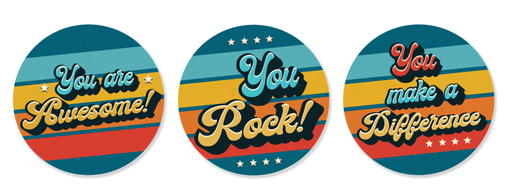
16 Responses to Option A
consistent coloring is nicer
I just really dig the set I chose.
I prefer set A because I am not at all a fan of the dark background in set B. That would keep me from buying set B.
No black makes it more uniform
I like the consistent color pattern section, I found the orange and black to be distracting and not as nice looking.
I like that they all have the same background base. It makes it so the words really stick out and it looks professional.
The blue in the backgrounds is attractive.
I really do not like the brown in the middle on of B. I like the right one on B though. A is more uniform and appealing to me overall.
I like the color choices as they seem solid and the shade of blue is really pleasing to the eyes. No changes are proposed here as I feel the stickers are fine they way they are in their present form.
I much prefer the coordinated colors in A. It looks like more of a set and I'm not wild about the color schemes in B.
I like the blue background, I think it looks best with each of the three messages. It has a nice bright look that stands out
It seems to me that option A looks clearer
I like the colors in choice A best
I like the consistent background colors of option A look better. I don't think the 2nd and 3rd colors of B look any good and they look very retro
The colors just mesh better in A. I don't think there is any other differences.
The blue backgrounds look better than the orange or black ones.
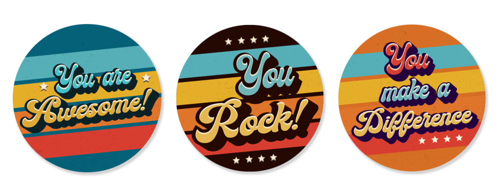
34 Responses to Option B
I like the colors that are used in these buttons and the contrast is better for this color pallete shown here
the sharp contrast in colors really make the stickers stand out, pop when they are stuck on anything, especially clothing to get the message out
i like that there are different color combos
The black and orange backgrounds look better, but the orange of the third button is too close to the color of the writing so that should have more contrast
I like this set of stickers more because they all don't have the same background colors. I wouldn't change anything about them, they are great.
I prefer option B because the sticker set as a greater variety of colors so that each sticker does not look the same. If I was to change anything, I might replace the black color in the middle sticker with something a bit more vibrant.
I prefer Option B. I do not like how the stickers in Option A all have the same color scheme. I think the different color schemes in Option B make them stand out more.
I like the way the black background makes the lettering pop out in option B.
I like the black background of the "You Rock" sticker on the Option B.
I like the variety of option B as the three stickers in A looks the same minus the words written on it. I also like the use of the color black in the middle sticker for B.
i prefer this one, they dont all look the same which is a plus. i wouldnt change a thing
Both are good. However, I like the variability of the colors in Option A.
I like I get a variety in color options and variations in this one. The other one looks all too similar
I like the color variations in B. With A all the stickers look essentially the same. I like the variations in B
I like the color format better in option B
Option B has a wide variety of color. I see a blue sticker, a black one and an orange one. Option A appear to be all blue and they resemble each other. Consumers would like to pay money for a product that has variety. This makes them feel as though they are getting more for their money.
I like B better because each sticker has stripes of a different color pattern. In A, the colored stripes are all the same so it's more boring.
I really like the black background on the center sticker it makes the design pop.
I PREFER HOW THE BACKGROUNDS POP WITH THE WORDS ON OPTION A BETTER THAN THE COLOR SCHEME OF OPTION B
I prefer this set and if I did change something I might use less green/teal
I like that this set of stickers has more of a variety of colors
I prefer B as the black color looks more elegant
I like the different shades of color. The black in the middle really helps make it different.
I prefer the variety in color because even the option that is all the same color is not entirely uniform. If the star patterns will have a variety, then the colors should come in a variety. I love the sunny colors.
I strongly prefer the black background on the "you rock!" button. Similarly, the orange background on the "you make a difference" button is much more vibrant. Option B is the clear winner.
I prefer the variety of patterns and colors that B has
I would choose B for my sticker choices. I like the slight color variations. I think it makes them more eye catching and fun. I like the overall art style and font, but I do think the differences between the three sticks, especially the black and orange make the stickers in B better.
It is darker colors and above and below more better
I prefer B because it mixes it up a little more with the colors, adding black instead of blue on the enter sticker. I prefer that more varied look.
i like this picture because of the variety of colors . the other one is good if you like blue but i prefer the choice of different colors
I like having different color choices to choose from honestly
I like this set more because there is a variation in the colors, so if you wore them all it would look better and not just look like the same 3 buttons.
B is my preferred choice because of the simplicity of the sticker and the display content, the sticker looks good and attractive and will call more attentions to it, it a beautiful color design on the sticker and it is pleasant to the eyes
the color of the sticker looks more beautiful and enticing
Explore who answered your poll
Analyze your results with demographic reports.
Demographics
Sorry, AI highlights are currently only available for polls created after February 28th.
We're working hard to bring AI to more polls, please check back soon.

