Poll results
Save to favorites
Add this poll to your saved list for easy reference.
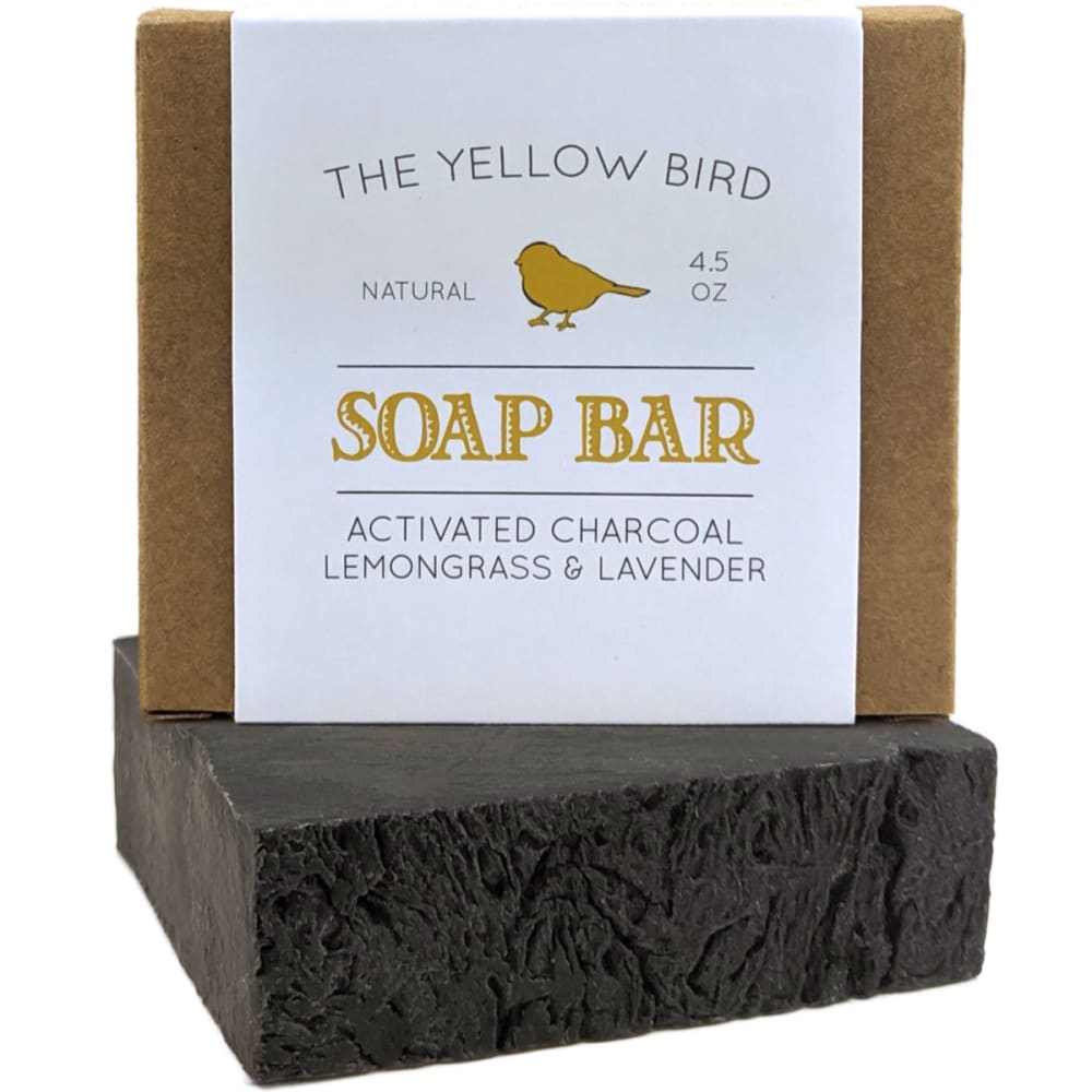
Which stock photo layout do you like better? (Please ignore color/contrast differences)
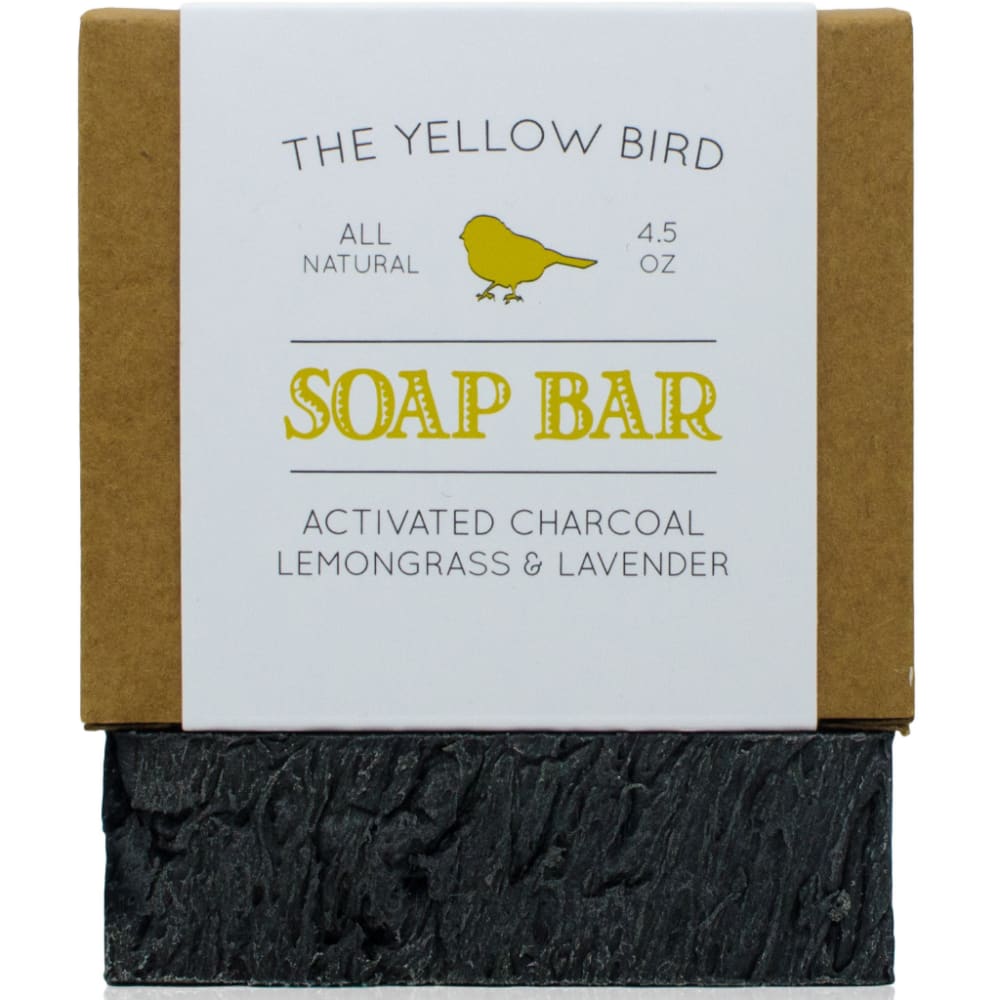
14 Responses to Option A
the bird looks more yellow so it pairs up with its brand name better
I prefer the layout in option A because the font size appears bigger, easier to read.
The wording looks better and little bigger.
PREFER THE YELLOW USED ON THE PACKAGING IN A
i like more this option look more organized
A grabs my attention more with this layout, because of the larger font and All natural caught my eyes first. I try to use all natural products so that is what caught my eyes first.
I like the front on image
The brighter font gets more attention
Option A has a closeup view and thus I can inspect the product better to make a wise purchase decision as to its quality.
I vote for option A the lettering is more bold and bright and easier to read.
I like A - it's a little brighter and more cheerful than B.
Choice A is bigger, more up close and gives you a better look at the product.
The font that is more yellow and less orange seems to fit better with the brand name
I like "all natural" better than just "natural" because a lot of products advertise as "natural" while still containing sulphates and parabens and other unwanted ingredients. "All natural" makes me think the product will not contain unwanted ingredients at all.
36 Responses to Option B
I prefer this option because of the angle which the product is displayed. It allows you to get a better sense of what you will receive when you order the product.
I really like B. I like the way that it is sitting. Lemongrass in one of my favorite soaps and smells.
The staging is more artistic.
The yellow color in B is softer and more attractive imo
b looks beter, the slight angle makes it more attractive
The angle of the soap in option B is better. Gives you a more 3D look of the product you'll receive. I would much rather see that image there if I was buying a natural soap product. Looks good otherwise for a charcoal soap.
i think b gives the product a little bit of depth
Like this layout more.
B allows you to see what the soap looks like. A looks like a 2 dimensional box underneath
I THINK THAT OPTION B IS A BETTER OPTION BECAUSE IT LOOKS MORE REALISTIC, AND LOOKS LIKE SOMETHING THAT WOULD BE MORE NATURAL.
You can see the soap more
I pick B because the writing looks to be a little clearer.
I like that it is angled because then I feel like I can see the whole bar and what to expect from it. Cute product.
I like that the bar is placed at an angle.
the font on this one makes it look better, not so cartoon ish
The image is a lot closer to real life, the items are a little bigger for better inspection and the colors are vivid. Also the angle in which the photo is presented is more pleasing to the eye.
I think A is in your face too much. B has a better color than the bright yellow as well.
I think the positioning of the bars on the first option are more eye-catching than the second one. I'd be more likely to click on B than A if I saw the two listings
I chose B because I like the way the soap is positioned better than A. It looks more appealing and 'natural'.
i like this one best. shows the product a lot better
the block its sitting on looks better at that angle
B is a better photograph. The quality looks better. The angle makes it look more professional, and the colors look more true.
I like the photo in option B. I use a soft very similar to this and the darker text works good.
the slight angle is more dynamic. Both items being straight on in A looks rigid and boring.
This option has the best design for an ad listing and its design lets me clearly see the message that is placed there on this stock photo and of course once I put a photo there, it seems that it would look good.
It looks nicer with the soap bar at an angle.
The tilt gives it depth and you can see how big the product is.
It is easy to define the product, and it looks more natural
I like the angle on choice B a lot more. You can see it better. Additionally the label looks brighter in B, perhaps because of better / different lighting.
The color really pops. The other one it is sort of hard to have your eyes adjust to the advertisement. It hurts my eyes.
I like it better because it shows it at an angle.
The angular display here I find appealing. It's almost as if this was taken candidly rather than having the soap bar be posed for a photograph.
I like this layout better. It's more dimensional and makes me feel like I'm looking at the product in a store.
The angled view of the sop bar is a nice touch
I like the look of the product and how it is at a different angle than what it is resting on. It stands out more. I can't tell what it is resting on in image A.
The picture with the soap bar turned sideways really helps it to stand out.
Explore who answered your poll
Analyze your results with demographic reports.
Demographics
Sorry, AI highlights are currently only available for polls created after February 28th.
We're working hard to bring AI to more polls, please check back soon.

