Poll results
Save to favorites
Add this poll to your saved list for easy reference.
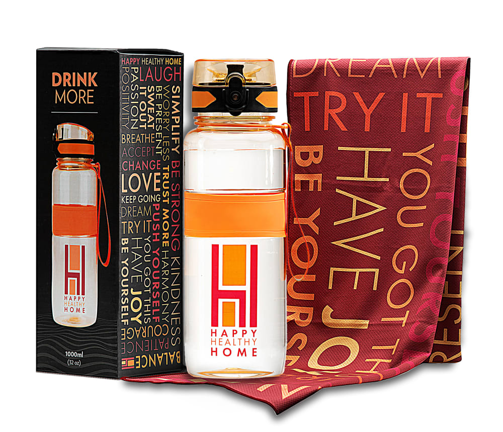
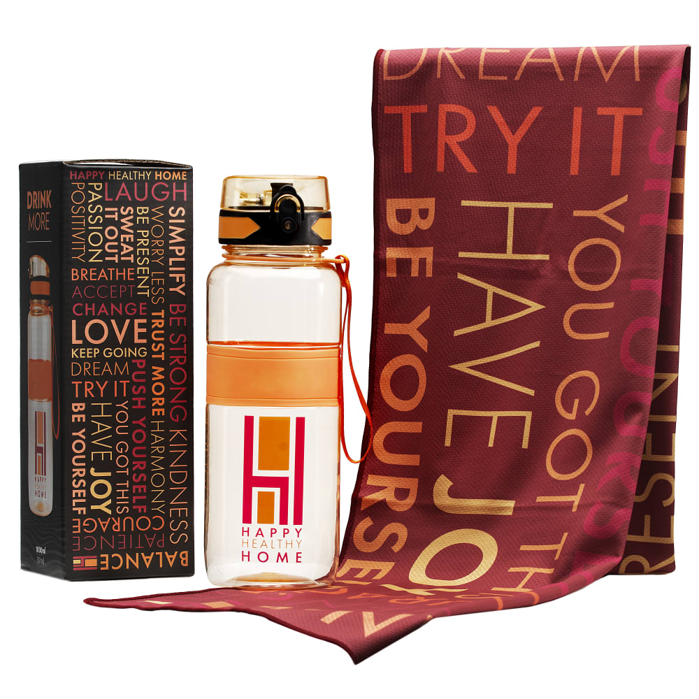
You are wanting to buy a Workout Towel on Amazon. Which of these photos makes you want to purchase the product? Also, Do you believe this product bundle is more for men, women, or both equally?
Age range
Education level
Gender identity
Options
Personal income range
Racial or ethnic identity
22 Responses to Option A
more life size demonstration and style
I like the image in A better simply because the image is no as "blown up" as the other. Image B is a bit too large for me and it is a bit intrusive. I would definitely characterize this as a product bundle for women. Not many guys want a water bottle with "Happy Health Home" or a fancy gym towel.
The composition of this photo is more even and more professsional
the products seem more in proportion with each other in A. In B it appears that the towel was enlarged, which is false advertising.
Choice A is cleaner and put better together, B looks weird with the spacing between each item
I like the more compact presentation in Option A. I think that this item is relatively gender neutral.
I like Option A because I like the way the products are being displayed. I like how it's evenly spaced unliked Option B which I feel like is spaced out too much. I think that this product is more for women because of the colors but could be intended for everyone
Option A does because the package shows a better angle of the workout bottle on it. I also believe it's more for women because it seems a bit feminine in the colors.
I like everything the same height, it’s more uniform and pretty
I get a close up read and see what is in the box.
I like option A. I think the layout of the product looks great. The box is nice and I would notice it while shopping.
The presentation of option A is much more appealing and would definitely be my choice.
I think the image flows better with everything the same height
This option looks more like a full package
I like the one with the box showing that the product its offering is actually that bottle, otherwise I might expect 3 items before clicking the picture which might leave me disappointed. This looks like a family product however I can't picture a single man ordering this for himself leaving me to conclude its probably a bit more feminine than masculine.
It's made for women or gay men.
The angle of the box gives more information to the consumer.
The product is a little overshadowed by the cloth in B
I like because the picture is the clearest. I think it is equally for men and women.
I like that you can see more of the box in A, it looks like it could be for either sex
I choose a because the image is more bright and I can easily read what is on the bottle and towel. I think this could be for a woman or man, but more for a woman.
I think the bottle is more central in choice A and gets lost in choice B. The bottle should be the focus. It looks like a product for women not men.
28 Responses to Option B
I prefer the display of products in option B. I think the product looks more geared for women than men.
B, the products are not crowded together. That makes me understand the ad better. I think this is for a woman by the wording on the objects.
i like how they are spaced out in B. I like it looks less cluttered. I believe this is more for women than men
Option B is best because it shows the items more to scale. If I bough Option A, I would be disappointed on the size of the objects.
This image looks less fake. I like that the items are not so jumbled or right on top of each other. The image looks like they were photoed together and not individually and then edited together. Its more clean and looks more real.
the layout is just more visual appealing than the other one
I think the bigger the better for a towel, and that makes it look bigger.
The items are displayed too close together in A.
I think this product is more for a woman because of the positiveness of the words and it reminds me of words on home interior items, which makes me think of women not men.
The overlapping of the bottle and cloth leads to a clash
I like B because you can see the individual items better because they aren't so close together. I think this product would be more for a woman because it says things like love and dream and that seems like it would appeal more to a woman than a man.
The greater amount of space between the three items gives me a better more positive feeling. All of the positive and inspiring words on the side of the box also contribute to happy positive feelings. I dont need to see the full picture of the water bottle on the box because the bottle is already very well exhibited by being in the center of the picture, between the box and the towel. This product is for both men and women equally. I also like the positive, inspiring messages on the towel.
I think I personally choose option B if I was going to buy the product also. The set up in option B looks nicer in my opinion than the one in option A. The towel is front and center in option B and if you were looking for the towel I think that is the one anyone would choose. I also think the product is geared more toward a woman than a man. I have a husband and two sons and I know neither of them would use this product.
I like the image with the pieces a little bit apart so I can see it all. I do think it is a little masculine. The heavy warm tone of the product feels more masculine.
i can see the towel more clearly in this image and i most certainly think it is geared towards women.
I like the perspective of the photo better, it makes the towel seem larger (which is handy!) and I also think it is definitely geared towards women; men don't tend to like printed words or motivational designs on their workout equipment.
this one has better colors and presentation in the display
good and nice
I like that the scarf is bigger and more prominent
I prefer the look of B. This bundle could be for men or women, slightly more targeted to women.
good and very nice
THE SLIGHT SEPERATION OF EVERYTHING IN THE PACKAGE DEAL IS ATTRACTIVE
It's very touchy/feely so I think it's more for women.
I like how the blanket is larger in B.
shows off the product and it's packaging well
Its more detailed and looks bigger. It also looks like this product is more geared towards women.
I can see more of the product in this image but it looks like it is made more for women
I like B better because I really like the design of the water bottle box, and this option makes it easier to see. I think this could be intended for either men or women, but I see women being more drawn to this due to the inspirational words.
Explore who answered your poll
Analyze your results with demographic reports.
Demographics
Sorry, AI highlights are currently only available for polls created after February 28th.
We're working hard to bring AI to more polls, please check back soon.

