Poll results
Save to favorites
Add this poll to your saved list for easy reference.
Which Amazon A+ Content makes you more interested to learn more about the product and do a purchase?
Age range
Education level
Gender identity
Household income range
Options
Personal income range
Racial or ethnic identity
17 Responses to Option A
A overwhelms me less, making it easier to work through the info.
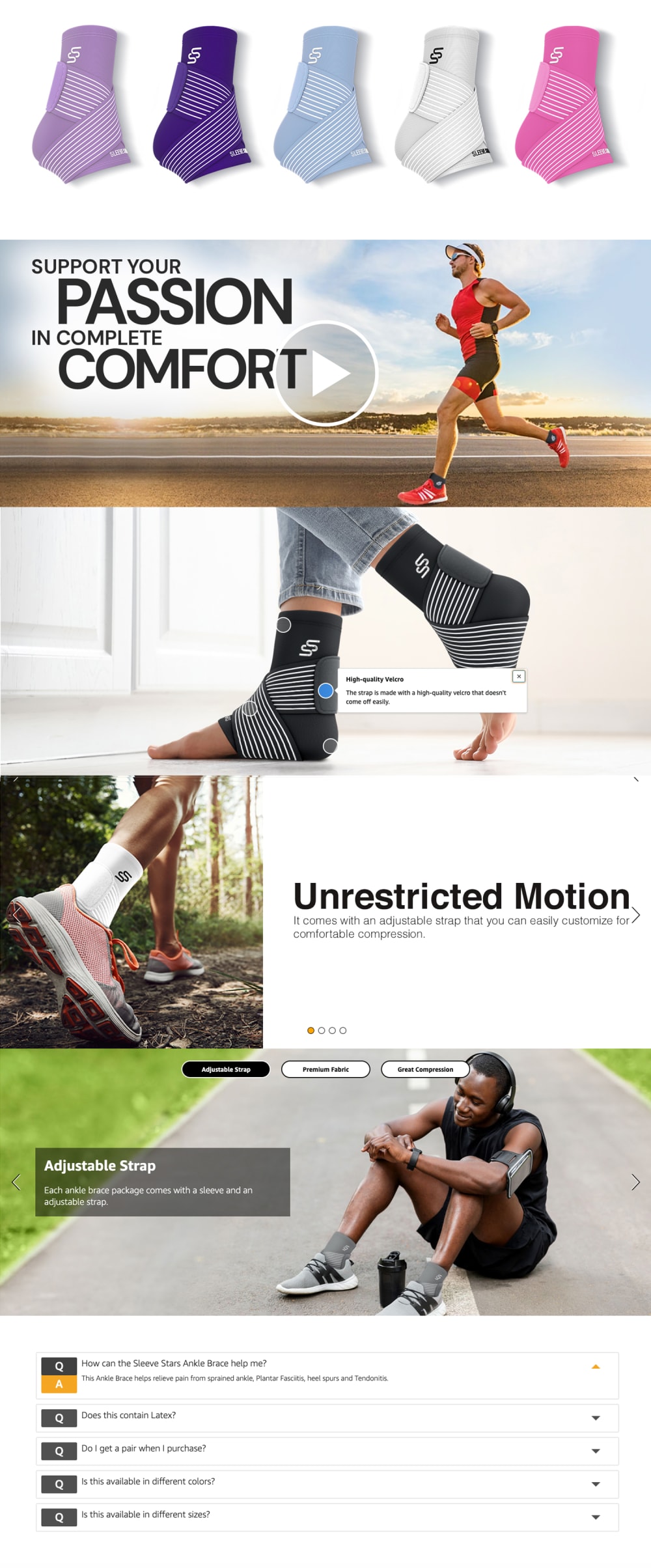
Shows the product by itself right at the top, plus it has a video.
THE MORE COLORFUL TOP AND LACK OF COMPLEX CHARTS MAKES ME WANT TO LOOK AT THIS PRODUCT MORE
The colorful line of product at the top really catches my intention on this option
Shorter, concise, and I like the variety of socks
I LIKE THAT OPTION A COMES IN SO MANY DIFFERENT COLORS. IT GIVES A UNIQUENESS TO THIS COMPARED TO OPTION B
I like that option A has a video that I could watch which would give me more of the information that I like to receive. Option B gives a lot of information, but I'd rather see the product more in action than just have pictures.
The colorful braces at the top immediately grab my attention. Also, B just has too much content; I prefer A because it's easier to read and more easily digested.
I get more out of quick images and information like on A. B seems like it is overloaded with information and the ending with the graph doesn't really even help me learn about this product, gives all the other products in the line.
I liked choice A since the image flows better together looks more eye catching while being easy to read. Choice B looks like it has too much information which isn't appealing.
I like the information in the other version, but the first thing I see here really sticks out to me. It shows the product in a nice and organized way so that I can analyze it.
I like the colors and look in Option A more. I think that Option B gives more details that I like, though.
Easily A. Starting off by showing me the product lets me instantly know what it is about, and I thought it was a more compact presentation and cleaner. Better though would be to take the overall design of A but try to put bullet points the gleans the most pertinent info from the table in Option B (or something similar, but in the right sized font--Option B's information is hard to read).
Showing the color variants of the item is a good fit for me.
option A shows an image clearly of the product, colorfully and at top. theere's also a video...the graph below is a bit information intensive for a simple product.
The colors are eye-catching. I love the close up of it, it seems really comfortable and seeing the man have it on while wearing sneakers lets me know it will be comfy like that too.
Option A makes me most interested and wanting to find out more about the product, especially because several different colors are offered.
33 Responses to Option B
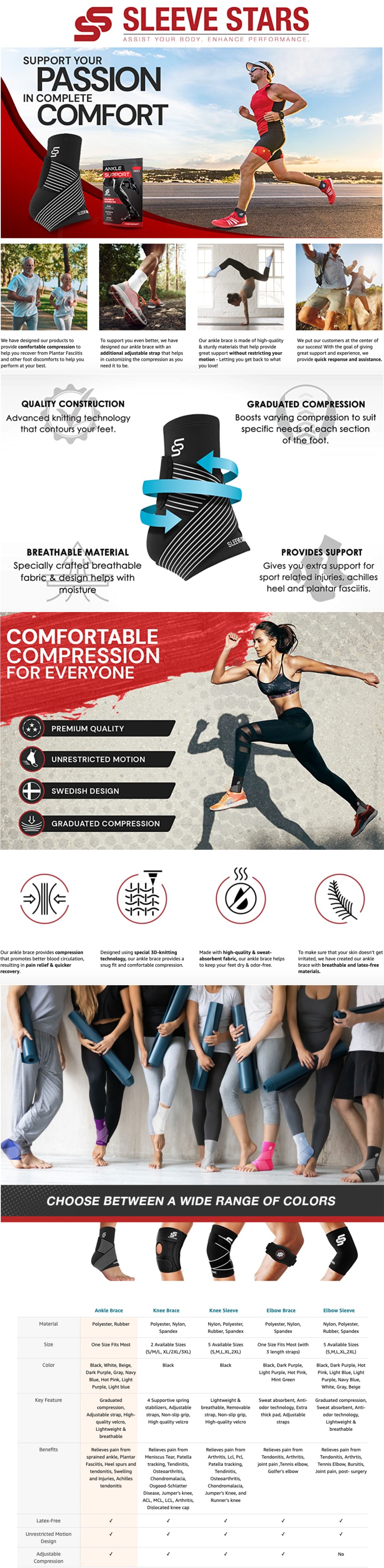
I really like the comparison chart and the exciting photos.
This is way more informative to me do it’s easily the one I would chose.
I prefer option A because the model looks like she can stretch her leg much further.
I like the details offered in option B. This gives me more information to make a decision with.
It gives more information so I'd like to skim it and see what the product is all about.
Because it provides me much more information to give me an informed decision.
Has better graphics and a lot more detail about the product
This makes me more interested because I like all of the information and pictures of the braces in use. I like how active and healthy everyone is acting. I also think the information is more organized and easier to follow
I find these set of images to be more appealing and informative. Thus I want to learn more from it.
Choice B makes me more interested because it gives me more information about the product and I especially like the chart at the bottom.
i like the content in option B more because it is so detailed and exciting to me
Option B makes me more likely to want to learn more and potentially buy this product because I think that it is a more interesting, informative, and overall a more visually appealing product image.
B shows information about the footwear, knees and elbows. I like the comparison guide with all the information that appears at the bottom of B.
honestly neither i would like to learn more about, I am neither active nor a runner. so this product makes no sense for me.
There is just so much information and images from people and athletes that I would choose this one. It also shows so much more detail about the product and the specifications that I would definitely go with this one
Option B, the content is more detailed and descriptive.
i like how this one shows the other colors and styles at the bottomalso i like the color and style better, i think that is less distrcating.
Option B feels the most informative, flows the best which makes it the easiest to follow, and is the most attention grabbing which makes me the most likely to buy
I rather prefer the option B ankle support sleeve product image set because I like the more active motions displayed of the people in this option B image set and how the option B image set shows the benefits and highlights the different colors with an image of people wearing the sleeves unlike the option A product image set.
I like that B focuses more on how the product would benefit you with how it's constructed, the fit, and the material.
B has way more detail and information. the graphics are appealing and stand out.
B has a lot more information and I like that it has no video to watch
This is presented better and I like how the information is displayed
I chose B because it looks more exciting and makes me want to be involved
B is most comprehensive with the chart at the bottom. On amazon, I always look at the charts to be able to quickly compare products.
B is much more descriptive and the red on the ad caught my eye right away. Choice A is more concise but leaves out a lot of attractive product benefits.
I feel like Option B flows better as a wave of information and it has a nice variety of how the information is displayed. Option A feels more generic in its format with simply some pictures and text intermingled.
"B" gives more information, especially the graphic with the winding arrow that describe what it does.
I am more receptive to info that doesn't include a video.
I like the presentation of B and find it more logical from top to bottom. I feel I have a better understanding of its design and purpose.
Option B had the best overall product presentation and very appealing images.
B offers a lot more information on the product and seems to have a better overall flow as well. It does a better job of highlighting all its attributes.
Option B looks better as the information looks more cohesive and well put together
Explore who answered your poll
Analyze your results with demographic reports.
Demographics
Sorry, AI highlights are currently only available for polls created after February 28th.
We're working hard to bring AI to more polls, please check back soon.

