Poll results
Save to favorites
Add this poll to your saved list for easy reference.
What lab test results would you prefer to receive? Plain & simple? Or detailed graphs with historical context over the past year?
Age range
Education level
Employment status
Gender identity
Household income range
Options
Personal income range
Racial or ethnic identity
Small business owner
42 Responses to Option A
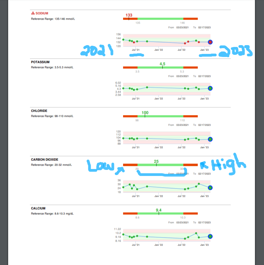
I would like to see it detailed and the trends from the last several years. I also like to know what is considered 'normal' and where I fall in there.
Honestly think both are equally good. It really depends on what is being measured. Is it a one time problem that needs diagnosed to where a simple numerical answer will give you the details you need (too high of iron) or is it an ongoing health concern, like cholesterol?
Having graphs makes it easier to understand how numbers have changed over time, especially for patients who are not in the medical field.
Option A - I like and prefer this type of result better. The graph is more explanatory and descriptive of the information. It is more understandable, clear, easy and less wordy.
A visual representation makes it so much easier to understand the information faster. Also, it is pleasing to look at as well.
Definitely option a. I think this is a really cool idea. Especially if you’re working on trying to get certain blood markers and levels at a certain place. For example tracking your cholesterol. I think that this would be really awesome to see how things change over time whether they improve stay the same or get worse. I think it gives you more information than just option B because it allows you to see your history very easily rather than having to pull paperwork or blood results from the past.
i am more of a visual person so i choose A because using colors makes it more appealing to read and breaking it in parts makes it easier to understand.
For someone without any medical background or training, I feel like the annotated graphs with comments and explanations would be the best to receive, as it would be easy to see what I needed to pay attention to, and what my different levels meant. It also gives me confidence that a human actually reviewed my results, as they made notes on them, and if there was anything concerning, I would feel like it would receive attention from my doctor or another office staffer.
The visual features of the graph make it easier for me to compare results. The chart is useful but doesn't immediately make comparisons easy.
Seems to be more up to date and modern for me, overall it seems more appealing and stands out the best to me
The visual information in A is very helpful. It's easy to see the changes over time and what the ranges are. I would much prefer to have A as it's easy to comprehend.
I liked choice A since I can see the differences over time is more important and appealing. I find choice A more easy to understand and is more informative than choice B which looks too simple and plain.
I would like the one with the graphs because I think it would be easier for me to read and I like the option of seeing how well my various numbers are doing over time, but I'm also in a science field and used to dealing with graphs and blood panel numbers in general so I might not be the most representative person to ask.
I’d like to receive the one with the graphs. It shows a trend better than just text but also has a better interpretation of an acceptable range. In other words, it’s a lot easier to interpret a graph than a series of numbers which i wouldn’t know were good or bad
I like statistics. I think seeing your historical information can be very useful. I like how simple the other version is, but I think this additional information is worth the time spent reviewing it.
I really like the graphs as even though detailed give me greater insight into my health and information
I think a clear visual would help make the patient understand it better as opposed to the cluttered data in option B.
I prefer the information in text and visual form -- in other words, I like graphs and think they provide more context.
Option A would be much better, as the graphs help to make the information more accessible. It also allows the person to see their progress/changes in their levels. It's much clearer while also providing more information. For the normal person, they'd be able to understand it much more than Option B, which is too "medical-like."
Detailed graphs with colors, far and away. The other one looks old school, like it’s from the 1990s. It’s been a while since I’ve had my blood checked, but I believe the company also used a sliding scale to demonstrate good and bad ranges.
I don’t think the amount of information is too large, but the presentation does seem a bit overwhelming at first. Maybe the info could be presented in an app where it can be similar to the default lab report then clicked and expanded into the more detailed graphics shown in A.
Option A gives the same information in an easy to read manner plus information on past tests. It's very helpful to see, on one graph, how you've been doing on your tests. It's great for a regular person that doesn't necessarily understand all the information in the text on B. Option A still tells you what your results were and what's considered high and low which is exactly what you need to know. Plus the past is a little extra knowledge.
I think this one is more helpful, especially the green and red which would call my attention to good areas and bad areas.
A is super helpful because the graphs make making sense of the information very easy to someone who isn't versed in the data and terms in B. the trendlines are useful, the color shaded high/low bar is easy to understand, and written notes (such as the blue script) can help orient & call out information easily.
I would prefer graphical visualizations of the health data. It is easier to see how my health has been over the time
I prefer "A" much more. It certainly seems to have more information. This information is not confusing and actually makes more sense to me than just some numbers on a page. It is easy to read and shows the progress(or not) over a time period. "A" is more helpful, it just seems to convey more information, and has more meaning than the basic printout of "B".
I'm a scientist and I always like to see a trend of things over time. A giant wall of numbers and text is borderline unreadable. For me A is clear because it shows the various things being measured and gives a clear trend of results over time. It shows when you are in a proper range and when you fall out or range. B is just a mess and I wouldn't like to try to decipher anything on there.
I chose option A because thr graphics help me to understand the range I am in and how I compare with where the numbers should be.
Much prefer A. Easier to understand and more information.
I prefer option A because you can still your current results but the historic data helps you to see how things have change over time which will help to determine if you need to make any changes to your lifestyle or medicine.
It always depends on the purpose, of course, but for most things I'd want not only the data, but the context. This would allow me to do a deeper analysis and find more facts than just the raw, unadorned data. Of course one must be careful of the source of the annotations - is that person reliable? But If I know where it's coming from I'll always want more rather than less.
I think the report results in A is way better then the one in B. There are a few reasons. First, figures and charts are much easier to read. Second, the presentation in A provides a time-based analysis for the customers. It is very useful for customers to understand how the condition is changing from time to time. It provides great insights on how to maintain health conditions for the customers.
I prefer the option A lab test results format because I like the detailed graphs and how the colors are used to illustrate how the lab test results have changed much more than the single lab test result with the extra text seen in the option B lab test results format. I would like the current number to be shown more prominently in the option A lab test report rather than kind of hidden on the red and green bar limits for each value.
Assuming that the overall design, interface, and aesthetics of the historical lab report would be significantly polished and refined, I would prefer option A since it provides much need historical information and context which would allow patients to get a better idea as to how significant any present lab abnormalities might be. Moreover, it's important to know whether any current lab abnormalities are persistent abnormalities or potentially outliers that might not be as serious as one might initially suspect
I like to see the trend information, it helps to get more information at a glance and understand how I am doing overall
I think these look a lot more detailed. I would want my results as detailed as possible. I like the graph that they come in
Option A would be more easily understandable for the average patient.
I think charts and graphs are easier to understand, especially if they color coded. I think I’d be able to read and understand these results much faster than seeing just a bunch of numbers.
Option A is amazing overview that really appeals to me. It allows me to be analytic and understand how I would be doing in my progress. Option B was very hard to interpret and causes my eyes to skim the data. It also doesn't really tells me much especially with medical terminology. I can't see the big picture. Option A on the other hand, allows me to know what actionable I need to take to better my health. It is also very easy on the eyes and makes a lot of sense.
I would chose A as I want to know if my labs are getting better or worse over time.
I love the idea of seeing a trend so I can figure out when my scores were best. I also think I would be impressed with the clinic.
I would much prefer option A. It is easier to gauge the levels within a historical context to increase or decrease where necessary.
8 Responses to Option B
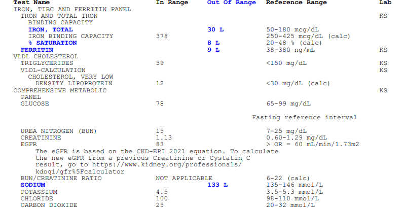
The graphs are too complex and complicated; I'd prefer to get the information in a more straightforward, concise manner.
I voted for option B, I do think that option A may be a bit too much info and I don't think I could interpret it anyway. My results are something I would want to discuss with my provider and I am certain they could guide me through the numbers, what they mean, and how I can fix/maintain them.
I prefer the text over graphs. The text is straightforward and easy to interpret
Between the two different options, I definitely decided that I would much prefer option b. Based on the presentation alone, it just looked like option b was much easier to read in my opinion. I really did not like option A and specifically, I just did not like to see the trending information as well as the blue marking, which ended up looking like they were handwritten and I really did not like that. In the complicated world of medical results as well as lab information, things can be very difficult in the first and I thought that option A only added to this with the trending graphs as well as the handwritten text.
Option B clearly mentions wether thevpatienthe patients lab work shows in range values/ readings or not, WITH A CLEAR REFERENCE. The pictorial representation with the years marked in Option A are very helpful but Option B feels invaluable. I prefer this. It seems the cholesterol is in range, sodium and iron need looking into.
I would go for the one that is type written as it looks more trustworthy. It should be explained more though to be clearer what KS means and that for example items in blue are the patients out of range items so it is clear.
Oh my days! Like the diagnosis isn't enough? Just tell me what the medical 'jargons' are and I'll take my leave, it's enough I've been tested, just let me know what it is, I don't need ant boring explanations, not like I can read or interpret it perfect than you can. I just want to know, tell me in few details-plain an simple.
easier to read and understand
Explore who answered your poll
Analyze your results with demographic reports.
Demographics
Sorry, AI highlights are currently only available for polls created after February 28th.
We're working hard to bring AI to more polls, please check back soon.

