Poll results
Save to favorites
Add this poll to your saved list for easy reference.
Which App Icon do you prefer?
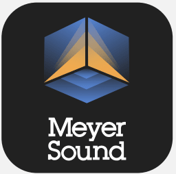
Option B won this Ranked poll with a final tally of 31 votes after 4 rounds of votes counting.
In a Ranked poll, respondents rank every option in order of preference. For example, when you test 6 options, each respondent orders their choices from first to sixth place.
PickFu requires a majority to win a Ranked poll. A majority winner differs from a plurality winner. A majority winner earns over 50% of the votes, whereas a plurality winner earns the most votes, regardless of winning percentage.
If an option does not earn a majority of votes, PickFu eliminates the option with the lowest number of votes. The votes from the eliminated option are reassigned based on each respondent’s next choice. This process continues in rounds until a majority winner emerges.
Scores reflect the percentage of total votes an option receives during the vote counting and indicate the relative preference of the respondents. If there is no majority winner, look to the scores to see how the options fared relative to one another.
| Option | Round 1 | Round 2 | Round 3 | Round 4 |
|---|---|---|---|---|
| B | 38% 19 votes | 40% 20 votes +1 | 42% 21 votes +1 | 62% 31 votes +10 |
| A | 24% 12 votes | 28% 14 votes +2 | 30% 15 votes +1 | 38% 19 votes +4 |
| C | 24% 12 votes | 24% 12 votes | 28% 14 votes +2 | Eliminated 14 votes reassigned |
| D | 8% 4 votes | 8% 4 votes | Eliminated 4 votes reassigned | |
| E | 6% 3 votes | Eliminated 3 votes reassigned |
Age range
Education level
Gender identity
Mobile device
Options
Personal income range
Racial or ethnic identity
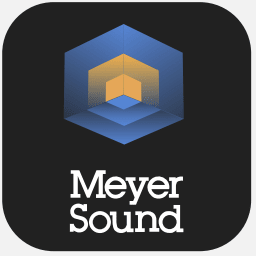
12 Responses to Option A
I like this logo is most preferred
Since i don't know what Meyer Sound is exactly, i just went with what app icon i liked and some of the designs were a little odd but i really liked the color pattern that all of them have and judged the app icons accordingly.
I liked Option A the most because I can see the movement of the sound through this design. I think it is the most creative of the options.
I like the shape within a shape look of choice a the best, followed by the same idea in choice b. I just like the inner shapes in a better. I don't really like the steps in c and d. it doesn't seem like it aligns at all with a sound app, though they're better then the m3d in choice e which doesn't catch the eye or seem to mean anything.
Less text, the better. And I like the more "complex" of the logos, the ones that make you do double takes. That's reflected in the ranking of A > B >C (seriously just happened to be ABCDE, this was not filled out randomly, this is how I truly ranked them)
D looks a little random in the shaping. E does not really look like an app icon. A looks the most polished and professional followed by C and C. I like the options with more geometric looking shape icons.
I think E with the initials is not very appealing so E 5. I think the hexagon is the best and I prefer the symmetry of A to B so A 1 and B 2. I find D more visually appealing so D 3 and C 4
I love the gradients in Option A. They look very new and trendy, different than old school design.
I like the hexagon shape of option a. I like the depth perception of the layered inner triangles in option b. I like the angle of the stack above the company name in option c. I like the 3d effect of the squares in option d. I like option e the least. lacks the graphics.
the font looks much nicer
Choice A looks professional and clean. Choice B the app icon is complicated. Choice D it is not appealing. Choice C not interesting enough. Choice E it is boring and plain.
I like the balance and symmetry of option A. The colors are subtle and looks very natural. The logo size and the Meyer Sound text are the perfect compliments compared to the rest of the icons. I can totally picture this on my phone.
19 Responses to Option B
I think the first two look like sounds waves and are clean. The rest are bland and outdated.
I like the images which are a nice blend of a bold font along with the icon as well. Neither one should overwhelm the other.
B is very exciting and cool looking. A looks kind of exciting and cool, but not as much as B. C is somewhat attractive but not as exciting or cool looking as A or B. D seems a little boring compared to my first three choices. E seems very boring compared to all my other choices.
THE LOGO OF THE APP WHICH IS MORE SIMILAR TO THE APP NAME AND ITS FEATURES AND ATTRACTIVES MADE ME CHOOSE THIS RANKING.
I find the choice B the most interesting in a visual way. The other choices are just okay.
Modernized design and the first two are reminiscent of sound waves from different perspectives. The final choice looked like an app from 2007.
B and A were ranked highest because the logo is simple and feels contemporary.E was ranked last because the logo "M3D" does not make sense and I do not see how it is related to Meyer Sound.C and D look like "L's" to me so they appear less relevant to the brand name. If the Meyer Sound had the letter L then I would understand how it is relevant, but they don't.
The colors are nice. I like objects that have symmetry, roundness, and balance.
B seems to express the movement of sound. C also expressing movement of sound but not as well as B. C is cool but doesn't express much. D is dull and E just sucks. I don't like the letter number thing at all.
The first two are particularly good because they make me think of sound.
They are visually pleasing and has the most innovation.
Options B and A have nice designs to the logo. It's sleek. The 3D Graphic looks better than the 3D words. Then there is the boring fifth design.
This logo is unique and colorful. I like the font and overall design.
option B has the best logo and looks modern
I think this is some type of audio app for my phone that should allow me to experience better audio. I looked at all 5 of the app icons and placed them in order based on how much I liked the icon. I think the icons that looked like an unique listening experience were placed higher in my list. I felt the M3D icon didn't inspire me that much, so I placed it last.
I chose B as the best logo because it has a very modern graphic that looks very intriguing and eyecatching. A is similar but seems a little less unique than choice B, and not as memorable. C was my third because it still has a nice graphic with a striking color scheme and expresses dynamic movement. D is my fourth choice because it looks almost like C but looks like an 8 bit version so not as modern/advanced. Choice E was my fifth and last choice because it didn't have any sort of graphic shape that could make it more memorable. It just looks wordier which gets more lost and doesn't stick in my mind if I try to remember it later.
I like option B the best because it looks the most professional and modern over the other designs.
I think option B is very professional and interesting looking. Option A is also very nice to look at. C is somewhat interesting but a little too simple. Option D id very strange looking. Option E is just boring.
I find these logos more eye-catching and would be willing to click on these to learn more
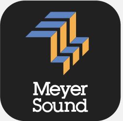
12 Responses to Option C
I think options C and B in particular look really nice and unique. They were the ones to stand out. Option D and A weren't bad either however I did not really enjoy option E.
I would choose the logo in C.
The creative icons do well to get users motivated to try out the app because the ideal logos have the power to attract the eye.
I like the boxy ones those stand out to me but they are all very eye catching.
I'm not a fan of the big lettered logo. All of the other ones make sense and fit, though.
these are all okay but I actually like the one earlier with the equalizer in it the most but whatever
Option C is the most clear and concise, I prefer the more simple design
My first choice is C because it has the 3 D look.Second choice is D because it also has the 3 D look but not as attractive as C.Third choice is B because of the transparent illusion but not as bold a C.Fourth choice has the transparent illusion but I like B better.Fifth is E because it only has letters.
I like how C capitalizes on the negative space. I don't understand the design though.
I like option C because the image looks a little like waves, and you can even see an M and and S in them if you start at it long enough. Option B and option A are nice too, like sound waves emanating from the center. I don't really connect with options D or E at all.
C - This design best goes with the company's name. The graphic looks like an M and is very clever. B - The cube design looks cool. Almost as if it's a theater with two screens facing the audience. A - Also has this same look except too "cubey". Not as on the nose. D- I didn't know what to think of this design. Didn't really stand out. E - Looks too basic as if it was made in mspaint.
My top choice was option C, I thought the design was the most eye catching of all the icons. My second choice was option B, it was a little more of a clean but modern design. Option A, D, E felt a little more basic.
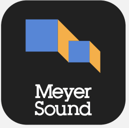
4 Responses to Option D
D is the most aesthetically pleasing then C. E is ok. A and B look too old fashioned
I like choice D the best, because this design looks very futuristic and innovative to me. I think it really stands out.
I like in the order I selected based on sleekness.
There's a certain retro quality to the first couple choices that I really like.
3 Responses to Option E
I picked the ones the logos that seemed more logical first.
the logo alignment matters a lot so its the consideration
I like the words are big and there is no design, if have design I like the ones that catch my eye and draw me to the ao.
Explore who answered your poll
Analyze your results with demographic reports.
Demographics
Sorry, AI highlights are currently only available for polls created after February 28th.
We're working hard to bring AI to more polls, please check back soon.

