Poll results
Save to favorites
Add this poll to your saved list for easy reference.
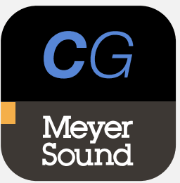
Which app icon do you prefer?
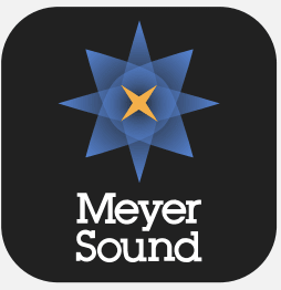
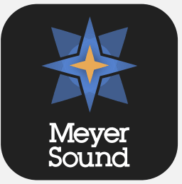
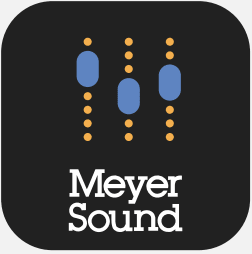
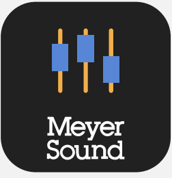
Option B won this Ranked poll with a final tally of 27 votes after 4 rounds of votes counting.
In a Ranked poll, respondents rank every option in order of preference. For example, when you test 6 options, each respondent orders their choices from first to sixth place.
PickFu requires a majority to win a Ranked poll. A majority winner differs from a plurality winner. A majority winner earns over 50% of the votes, whereas a plurality winner earns the most votes, regardless of winning percentage.
If an option does not earn a majority of votes, PickFu eliminates the option with the lowest number of votes. The votes from the eliminated option are reassigned based on each respondent’s next choice. This process continues in rounds until a majority winner emerges.
Scores reflect the percentage of total votes an option receives during the vote counting and indicate the relative preference of the respondents. If there is no majority winner, look to the scores to see how the options fared relative to one another.
| Option | Round 1 | Round 2 | Round 3 | Round 4 |
|---|---|---|---|---|
| B | 28% 14 votes | 28% 14 votes | 44% 22 votes +8 | 54% 27 votes +5 |
| D | 22% 11 votes | 24% 12 votes +1 | 28% 14 votes +2 | 46% 23 votes +9 |
| C | 24% 12 votes | 26% 13 votes +1 | 28% 14 votes +1 | Eliminated 14 votes reassigned |
| A | 22% 11 votes | 22% 11 votes | Eliminated 11 votes reassigned | |
| E | 4% 2 votes | Eliminated 2 votes reassigned |
Age range
Education level
Gender identity
Mobile device
Options
Personal income range
Racial or ethnic identity
11 Responses to Option A
the fonts are perfect and beautiful arrangement
i like this types of order
A looks cool with the multiple stars within itself. B cool looking star. C,D,E good looking, but not much interesting.
I am more drawn to these icons, I would be more apt to click on this order to see what they are all about
My top choice was option A, I liked the more star shape it was eye catching. Option B, was a close second I liked the star theme but preferred the look of option A. I liked that option C and D Incorporated the more sound aspect, but it looks a bit less impactful compared to option A and B. Option E, I thought it was the most basic hence I ranked it last.
I would choose A. I like the look of the logo.
I have voted for A because i think the design with the star is smooth and attaractive to look at, then I have voted C becauseit looks good, the design looks simple and appealing, then I went with D because, the design is okay ,it looks like C but less appealing, Then i voted B because,the star design is not as appealing as the first star, The E, it is not attarctive at all and does not look catchy.
I am preferred this ranking is more likely
Choice A it is flashy and eye-catching. Choice B It is more complicated. Choice C it is not attractive. Choice D not appealing. Choice E uninteresting app icon.
it looked more interesting and appealing
My first choice would be A because it has a see through illusion with a 3 D appearance.Second choice is B because it has a slight 3 D appearance but not the see through look.Third choice is E because it has large letter on the top.Fourth choice C because it is a replica of sounds.Fifth choice is D because it a replica of sounds but really plain.
14 Responses to Option B
E is the worst - you dont need text on both. BDCA ranked based on prference to the logo (B's is the clear winner)
Would like to pick option B is the best design which is more attractive and awesome
B and D stood out the most to me out of all five. They give a better description of what Meyer Sound is all about, especially with D.
Ill start with what i dont like. A has too much going on with the start. D looks too bland without the dotted line. E just looks boring. B i really like the start design. If your going with the mixer its much better with the dotted line inC
The app icon of option B is more appealing, the design of the icon and the color used for the design of the icon makes it to be more attractive.
I really like the logo/symbol of option B and it hooked me right away to it. Option D and C are interesting and unique and are also pretty good. Option A is decent and than lastly I did not really like option E.
I chose the starred, i.e. with stars, options 1st and 2nd because the star appears to be button prompt. A simple button prompt appeals to me because that is likely all it is. I prefer less the two options with simulated equalizers because they suggest one can manually adjust the equalizer, but I doubt one can with the button, or even on the next screen. The button with "CG" I ranked last, because I don't know what CG means and I should have to go to any trouble to figure that out.
I find the one with the two initials CG not very catchy so E 5. My favorites ones are the ones with the star. I think the star design in B is minimalist and visually appealing so B 1 and A 2. D and C are very similar as well but I think the design of D is more appealing so D 3 and C 4
Made my choices based on what logos best stuck out and caught my attention.
B and A are cool because the are unique looking stars. D and C are also cool but the stars of B and A slightly edge out the sliders because of uniqueness. E is kinda ugly but definitely boring looking.
I like that Option B looks super professional, with the star design perfectly centered. I think with this design having the black line darkened around the star makes it look better too, which is why I ranked the other star photo further down. With option C and D, it gives a fun look at controls of a soundboard, but the dots are a neat element, so I put that one higher than the other with the lines.
Choices B and A were by top two picks because I like the tiered star logo shape that they both had. Choice B was ahead of Choice A because I like how it has a more defined and bordered look to it. Choices C and D were my next two picks because I liked them better then Choice E. I had Choice C ahead of Choice D because I liked the dotted look on the lines better then the solid approach. Choice E was last because it is just two letters and I have no idea what they mean or stand for.
I think option B is the most eye catching and grabs my attention the most because of the colors and the design.
The app icons that contain a nice, decent-sized image with text that is bold and clear will get my vote over those with less desirable attributes.
12 Responses to Option C
I think choice C looks simple, but kind of fun. It's unique.
The volume sliders look dynamic and fun! And the star design is alright. My last choice, the "CG" letters, is kind of boring...
I like the rope design used on C. I like the meter design used for D. It looks nice.E looks very generic and safe.A and B look pretty bad. Looks like a star with an eye in the middle. I don't think that this icon would be a good fit.
I like icon C the most. it is most attractive among the other ones.
C and D are bu far the best in my opinion then B A and lastly E
I prefer the logos with the mixer dials because they are more indicative of what the prodcut is. I think that's important for helping your customer visualize what your company is about.
They all look good but C and B stand out the most to me.
I like the graphics because they are simple and seem to make sense with the company name. A is also cool to look at.
The levels make for a good icon with the simple design and easy to remember look and feel of these here
I chose the sharpest image first because it was bold in colors. Then I went with the second best image to the last choice which I thought the initials were much less descriptive than the graphics.
i choose this order as i felt them to connect more to the product
In general, I ranked higher the icons which either better conveyed the app's use, or would be more memorable. Option C seems to me to be the most memorable, while also effectively communicating the app's intended function, where Options B and D both only satisfy one of those criteria and neither Option A nor E fulfilled either.
11 Responses to Option D
I like choice D the most because the logo looks very futuristic and fun. It stands out a lot to me.
The pictures used for Option D and Option C are memorable. Option D also seems modern, casual, and fun. Option E is the least memorable because it only has letters instead of a picture.
Choice D and C as it goes with the product And the icon looks great
I think Option D and C are the only reasonable choices related to music. I love the bold colors and design of option D. It stands out and it super memorable and unique. I would choose this as the app icon if I had a choice. My least favorite is option E by far. It is super bland and not memorable.
I think the first two choices looked like something to do with sound.
I have a strong preference for D and C. I think that these logos look the best and really look professional. I think that B E and A all look kind of cheap and don’t do the product justice. I strongly prefer D and C because of their professionalism.
I choice Options D and C because the icon looks like sound controls I like the star on A better than the star on E. I don't know what the CG in Option E is referring to.
D and E -- I think they do the best job of illustrating the "sound" aspect of the app and convey the best meaning about what the app is. I just like the design of D more.B and A -- The icon is just somewhat a random design that doesn't do a good job describing the app? Is it navigational? For stargazing? Religious?E -- What does CG mean? Just seems to have no relation to the product and if it does, the uninitiated like myself don't know what the product is.
D and C were #1 and #2 because the picture of the blue tabs on yellow lines relates to the name "Meyer Sound" as it reminds me of the tab you use to push up the volume and lower the volume. They were ranked higher because the pics make sense.On the other hand E was ranked last because "CG" does not make sense at all; I don't see how it relates to Meyer Sound.A and B fell in between and were ranked in the middle because they have clean logos but are not as relatable as D and C.
I just approve of the ones that use the equalizer image more than the other ones
I preferred D and C because the images actually relate to sound. I had no idea what the CG in E was for, so I ranked it last. The starts in Options A and B looked nice, but I thought C and D were better due to the connection to sound.
2 Responses to Option E
option E looks the most professional to me
I mostly chose the order I did because I prefer clean and simple adds rather than adds that have a lot going on.
Explore who answered your poll
Analyze your results with demographic reports.
Demographics
Sorry, AI highlights are currently only available for polls created after February 28th.
We're working hard to bring AI to more polls, please check back soon.

