Poll results
Save to favorites
Add this poll to your saved list for easy reference.
Which App Icon do you prefer?
Option C won this Ranked poll with a final tally of 26 votes after 4 rounds of votes counting.
In a Ranked poll, respondents rank every option in order of preference. For example, when you test 6 options, each respondent orders their choices from first to sixth place.
PickFu requires a majority to win a Ranked poll. A majority winner differs from a plurality winner. A majority winner earns over 50% of the votes, whereas a plurality winner earns the most votes, regardless of winning percentage.
If an option does not earn a majority of votes, PickFu eliminates the option with the lowest number of votes. The votes from the eliminated option are reassigned based on each respondent’s next choice. This process continues in rounds until a majority winner emerges.
Scores reflect the percentage of total votes an option receives during the vote counting and indicate the relative preference of the respondents. If there is no majority winner, look to the scores to see how the options fared relative to one another.
| Option | Round 1 | Round 2 | Round 3 | Round 4 |
|---|---|---|---|---|
| C | 38% 19 votes | 38% 19 votes | 46% 23 votes +4 | 52% 26 votes +3 |
| A | 32% 16 votes | 32% 16 votes | 36% 18 votes +2 | 48% 24 votes +6 |
| B | 14% 7 votes | 16% 8 votes +1 | 18% 9 votes +1 | Eliminated 9 votes reassigned |
| D | 14% 7 votes | 14% 7 votes | Eliminated 7 votes reassigned | |
| E | 2% 1 votes | Eliminated 1 vote reassigned |
Age range
Education level
Gender identity
Mobile device
Options
Personal income range
Racial or ethnic identity
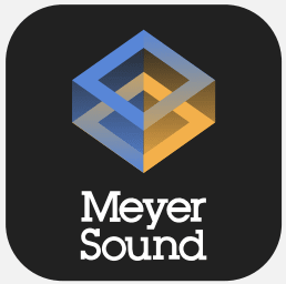
16 Responses to Option A
I like logos that are easy to draw and remember while making a statement so A is the best fit in my opinion
made my choices based on which app icon i prefer the most
I love the 3D elements of both A and C. A stood out to me the most, the cube/box icon is really attention grabbing.
THE MULTIDIMENSIONAL COLORED SQUARE CATCHES YOUR ATTENTION THE MOST.
I like the simple designs, that gives a glimpse into what the company specializes in.
I thought option A and C were by far the best designs as they were creative and looked nice. Option D is pretty decent and the last two weren't my favorites
I like them all. But A is the !pat cooling lookng. Good job on the app icons!
I thought Option A is the most interesting. I liked how the orange and the blue work so well together and look 3D. I think the square could be a little smaller so that the text stands out more though.
Option D is the most likely to be a logo for this type of company.
I like choice A because choice it has a futuristic looking icon and it looks innovative to me.
I CHOOSE THIS RANKING HOW THE LOGO IS ELIGIBLE TO IDENTIFY THE APP ON THAT THIS ORDER SEEMS TO BE GOOD TO MY KNOWLEDGE.
A is by far my favorite because it has a pleasant symmetry and looks the most high quality and well designed. The logo really stands out and looks bold and interesting. E is a little plain but looks straight forward and efficient. D is okay but it is very simple and somewhat lacking in design. B is average to me it looks too blocky. C is not bad but personally I find the pattern to be unappealing visually.
I ranked option A at #1 because I think it is the most visually pleasing. It is also easy on the eyes. I like options C and D about the same because they are interesting. Option B is okay, but I didn't really like the squares in the corners because it seems a little too busy/crowded so I ranked it at #4. Option E is the least interesting so I ranked it last, although it still looks nice. I tried to take into consideration the size these icons would appear on a phone or tablet screen while ranking them.
Choice A is my top pick because it is the design I like the best. I really like the color, shading and symmetry that the box symbol has to it. It just looks really good. Choice B was my second pick because I like how the symbol looks like a sun with rays of light shining on to each of the four square corner pieces. Choice C was third because I like how all of the circles over lap with each other and it creates a cool pattern to it. Choice D was fourth because the logo is just okay. Compared to the first three choices I mentioned it is just so bland, boring and creative. Choice E was last because I do not like it at all. I have no idea what SMG is even supposed to stand for.
I chose option A first because it is the most visually appealing. Option C is my second choice because the design is unique and I think I would remember it when looking for it on my device. Option D is third because I like the logo, but I think it could be executed better. Option E was my second to last choice because it is somewhat boring and I'm unsure what SMG means. I thought option B was my least favorite choice because the logo is a little boring and unmemorable. It would likely get lost among my other apps.
A is unique, B looks creative, E has a cool color scheme, D is very sublime looking, C has a nice simple look.
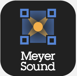
7 Responses to Option B
This box design makes me think of sound like a speaker, so it works well. Followed by the geometric shapes. The letters alone are not very exciting.
B and E I like equally it is not busy looking and I can spot it easily. D, A and C I feel is really busy looking icons and I dont like that kind of style
I picked B as my top choice as I like the box with the lights reflecting.
the logo is perfect and i choose withe color
I like be the best becouase I find that it has the best picture. C, A, and D have nice pictures also. E is to plain.
My first choice is Option B because since this is a sound company, this picture looks like a room with speakers blasting sound from four speakers in the corners of the room. Option C, my second choice, also looks like four speakers that are blasting intersecting sound waves. Option A reminds me a music box and the orange highlights would represent the music playing and the sound warming the space around it. Option D was just okay, but I thought it was more simplistic compared to the other pictures. Option E, with just the lettering, is way too plain of a design; it does not leave an imprint on you like the pictures.
i chose best answer
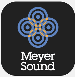
19 Responses to Option C
I very much dig the cool crop circle pattern the best
I like (C) best because it reminds me to speaker icons. (E) seems too corporate.
I would choose C. I like the circles of the app logo.
I feel like all the choices with graphics are better than the one with just letters. I chose C and D at the top because to me those images represent sound and I feel that it matches with the idea of the company more.
I find the icon/logos in choices C and D to represent the name best. I think a circular shape matches "sound" well. I ranked A and B next because they look like well balanced logos and icons but not as good a fit as C and D. E is last because it is mostly just text without much style.
I chose based on which symbol seemed more dynamic and related to sound and made for a more appropriate logo for the name, the last choice had the SMG dominating the top of the logo and no obvious relationship on my opinion to the Meyer Sound Name.
I liked C and B best because they looked the most modern.
I don't really like the tear drop in the option D. I like the circles interconnecting in C. I like the three dimensional object in A. B looks nice.
I love all the colors, but I would be most likely to download C. It’s the most unique design and it makes it stand out from other apps. A and B are both great second choices, as those designs are also kind of intricate. D and E are more subtle and wouldn’t catch my eye.
I feel my top choices suggest a sound oriented app more than the rest
I chose option C because it was the one that most transmit the meaning of the logo. I liked the color distribution and it was quite distinctive.
I went with C and B in the first and second slots, respectively, because I like the idea of the sound hitting all four corners of the room. I also liked Option A because sound here is depicted as layered.
C and B make me think of a sound system so they seem more appropriate. A looks very nice and pleasing. D isn't a very attractive image and E looks generic to me.
The first couple are very aesthetically pleasing and most representative to sounds waves, or the way sound travels. This makes it much more relevant to the type of product or service I am assuming is going to be represented here. Then the next two are ranked for aesthetics (first two are still better looking), and the final one is just not very pleasing and seems very cramped.
they look like much more clever logos than the other ones
I liked "C" and "A" the best because I felt like the graphics used were modern and clear. The logo still stands out and goes well with the graphic. The graphic used on "B" is not bad but I don't really like the 4 squares on the corners, just too busy for me. "D" was a little confusing to me because I'm not sure what the graphic is. That could just be my own ignorance though, so overall I still like the simplicity of it. "E" was my least favorite because I don't really like the use of letters over the brand name. I definitely like the graphics much better than the letters.
app C is a really decent design as well as those of A then B. I like the overlapping the best.
Ordered from most to least attractive based mostly on how clean and uncluttered they were.
I really like the logo designs and that particular order from the one I like most of the one that I like the least
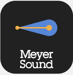
7 Responses to Option D
I like them in the order of perceived sleekness.
I prefer the simple and more subtle designs of my first two choices. The rest were a bit busy for my taste
I think that a simpler, more geometric design for a logo looks neater and more memorable. E is the worst by far, since it's just two sets of letters. B also isn't great, because the image is slightly too complicated. The other three logos are visually pleasing, though.
d looks more professional, I like D the most.
I liked D the most because it is smooth and simple. The ample amount of open space matches my perception of the product. Next I found C to be aesthetic and representative of sound waves. All of the others I thought were overly complicated, except for E which was too plain.
If Meyer Sound is a music App choice D has the best icon for music. Option C catches my eye if I were just looking at the symbols. For choice A that app icon looks more like a professional business app.
I think that option D has the most memorable logo. It is very creative and I would think of them as an sound/audio app from the simple logo. I also like A and C but the logo is a bit more complex and I think is similar to others in the market. I can totally picture having this app on my phone with that logo.
1 Responses to Option E
The top and bottom half segmented style in E looks visually appealing. I like the icon in B also
Explore who answered your poll
Analyze your results with demographic reports.
Demographics
Sorry, AI highlights are currently only available for polls created after February 28th.
We're working hard to bring AI to more polls, please check back soon.

