Poll results
Save to favorites
Add this poll to your saved list for easy reference.
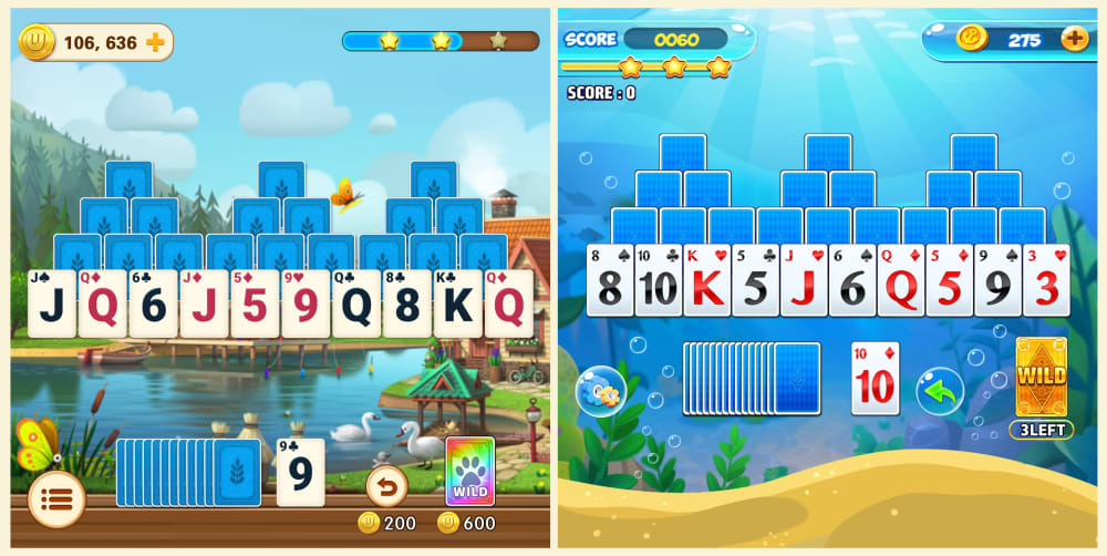
What is the origin of Tripeaks Solitaire game? In terms of the following two styles of Tripeaks game, which one do you prefer?
50 Responses
I like the style on the right more than the left. It looks a lot more animated and enjoyable than the option on the left side. It also looks like there is a lot more to interact with as well.
I prefer the left style, the underwater is a boring background
I like the first photo because it has more detail to it and color.
Tripeaks Solitaire was originally part of Windows game pack, and I wish it still was because it's one of my favorite solitaire games. Of these two, I prefer the one on the right because I like how the number and the suit are in opposite corners at the top of the cards. It makes it easier to read that way. When the number and suit are both on the left corner, as in the photo on the left, they sort of blend together, and it's harder for me to read it exactly.
I don't know the origins of the Tripeaks Solitaire game. I prefer the style on the right. It doesn't have a lot of images in the background which I find interfering with the game images. The style on the right is much cleaner and everything is located close together..
Tripeaks was a game invented in 1989 and packaged by Windows as part of their entertainment pack. I prefer the style on the right, even if the colors are not as vivid and the image is a bit blurry I think that overall it looks better and it's more informative on the wild cards because it stays how many wilds you have left.
the one on the right is actually easier to see - there are less graphics that distract from the game play
I dont know the origin but prefer the version on the left
I am having a tough time deciding which one I prefer. I like how the second one is better. I like how uncluttered it is at the bottom and you can see your cards better. I think the first one is more interesting !ooking, but when you play, you don't look At the background as much as you think about your cards at hand. I think option 2 is the one I prefer.
Tripeaks Solitaire evolved from original Solitaire and uses three towers of play. I like the picture on the left with the clouds better.
I like the one on the right, better front and layout
The one on the left. The one of the right has too much dead space
No clue what the origin of Tripeaks Solitaire game is. In terms of the following two styles I slightly prefer the one on the left due to the better and more appealing background picture.
I prefer the left, it is sharper and easier to read
The underwater background is not too cluttered or distracting.
I prefer th first one, it looks more old school
The o ne on the right. The background is much more simple. The other background is too distracting
I love the pond. There is so much activity around it and in it. I love the butterflies and the swans.
A windows based game. I love the under water version. Always fun to have that sort of view in a game.
I like the second option that is underwater. For some reason it is more calming to me and draws in my attention better than the other one.
I like the second one better, It seems like a more soothing background.
I like the one with the pond more. I like that graphic more and think it is a nicer background to play in. The graphics look a bit cleaner as well. Overall, both are good but I like the option with the pond a bit more.
I prefer the first one. It is more relaxing and visually appealing. The lake with the animals looks peaceful.
I don't really know what the origin is but I guess it has something to do with water. I like the image on the left better because the one on the right looks too much like a cartoon.
Tri Peaks was originally one of the games included in a windows entertainment pack. The idea for the three peaks originally was intended to hopefully have other programmers come up with additional layouts in the three peak style. I prefer the second one due to the sun rays showing through the underneath water background.
I can't choose a side? I prefer the one on the left, cheerier background, also like the ducks in the pond and the butterflies. Also the things on the buttom look appropriately placed. The score on the top left stands out more.
I like the first one better. I like it better than the underwater look.
I prefer the one on the right. I like the graphics better and how the score is displayed.
I prefer the one on the left because it looks like it has more of a variety of colors
I'm not sure on the origin, but if I had to pick one of the games to play, it would be the one on the left, with the pond and wildlife. I like that the wild card is a paw symbol and it's just prettier. I like the swans and the butterflies and it just makes me smile.
I prefer the outdoor background with the more vibrant colors. The undersea option looks a little washed out and the color scheme is too similar to the cards.
I really like the first one because I feel I can see the cards better and less of a destraction
I prefer the image on the left because the illustration is more interesting with the lake and mountains and wildfowl and plants while the other image on the right only shows an underwater scene.
I prefer the second image because I am not so distracted by that background.
I LIKE THE BACKGROUND TO THIS ONE
I dont know the origin of the game. I prefer the one on the left simply because of the background and also that the numbers/letters are a solid colored font and not the highlighted one on the right.
I like the one on the left. I think it looks better.
I'm not a huge fan of busy pictures for game backgrounds, but I prefer the one on the left. It has a more intuitive layout. The one on the right is nice because it is more compact, though. Sometimes when I play solitaire, I cannot have the screen maximized because of other programs I am running. In sum, both are OK but the one on the left is a little nicer.
I prefer the first style. I find the background images appealing.
I like the one on the right better because the background is less distracting.
I like the underwater scene the best, The graphics really pop on that screen. I think the other one looks really busy
I don't know what the origin of the tri-peaks solitaire game is. I think it was developed to pass the time and be different that the original, regular solitaire game that a lot of people play. I prefer the one of the left with the lake and mountains. The under the sea theme seems a little childish to me.
I liked the ocean design the most. I felt the cards were more fun to look at and I think the background might be less distracting.
I prefer the one on the right. the one on the left is too cluttered and 'busy'
The first one because it looks more grown up. I think you did this wrong, you're supposed to give "A" and "B" choice.
The one on the left has clearer graphics.
I'm not sure what the origin of the game is. But I do play, and if I had to choose from the two above, I would choose the one on the left, with the village graphic. Ever solitaire I've ever played has had an underwater scene of some type, so the village and pond seem more unique to me.
I like them both they both seem to be about nature, but I like the one underwater more than the other one.
i prefer the first one because its more engaging with the animals and scenary
I prefer the undersea version to the resort version. It's cleaner and less distracting.
Explore who answered your poll
Analyze your results with demographic reports.
Demographics
Sorry, AI highlights are currently only available for polls created after February 28th.
We're working hard to bring AI to more polls, please check back soon.

