Poll results
Save to favorites
Add this poll to your saved list for easy reference.
Which App would you download when searching for "Meditation"?
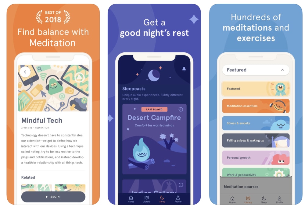
25 Responses to Option A
The colors and artwork on this one are more attractive looking I think.
The variety of color is what made me choose this one.
The different colored backgrounds make it more eye-catching and intriguing.
A's varied colors make it seem friendlier.
I really like the design and color scheme of this one.
color yet muted general colors feel warm and welcoming
I really prefer the artwork of the characters over the photography.
Color differences make it more appealing in look
I like the picture in the middle of the one I chose to be more precise
I would Choose A. This one appears to have more options to choose from.
more colorful look
I like the brighter color palette used in Option A. It appears more friendly and genuine.
the color scheme in A is more appealing to me
Option A because it likely has been built with more options and is a better app since it was considered "Best of 2018" and option B appears to be a year older so possibly older technology.
I prefer the greater variety of colors and more cartoonish look of option A. Option B looks a bit generic and boring.
I like the design and theme more
I think this one is more interesting mainly becuase it is not your normal meditation look to it. Does not have the trees, mountains etc that you normally see and like the one in choice B. So it something different and might stand out among all the other ones.
It says best of 2018
I like the simple, modern graphics
The color scheme is more inviting and it's easier to process the different pages because they are different colors
I enjoy the contrast between the 3 screens in option A.
Both look good, but A looks like it has things organized where finding what I want would be much easier. The fonts on it are also much easier to read than the 3rd shot on B.
I like A because of the variety of colors that keeps it interesting and encourages me to read about all the various features of this app. Although I like the restful, peaceful colors of B, I was not encouraged to keep reading.
I like choice A more than choice B as I find the cartoony campfire, cloud, etc. all gel well together. The cartoons stand out more than option B's pretty but admittedly by-the-books backgrounds.
Hundreds of meditation and exercises. I like all the options.
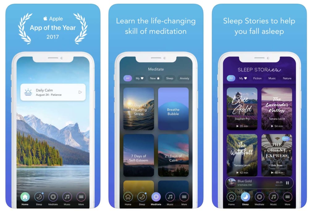
25 Responses to Option B
It looks more appealing and the colors are better.
B is better because it seems more tranquil especially with the nature pictures.
The images are more relaxing to look at in B
I like the nature pictures, they are more eye catching and make me think of relaxing.
The almost monotone design of this app makes me feel so calm already. I think the design is perfect for meditation.
I like the calming colors. It is more meditative. Both seem to have similar accolades.
I love B!!! I love the color layout. Not only that, but I am a fan of nature. I love the mountain layout!!! That is so beautiful to me.
I really enjoy the pictures of nature as I find it calming and fitting to the purpose.
The dark colors of "B" are more soothing and seem to fit "Meditation" better.
I like the greater variety of pictures on the screens. I think they spark more interest.
This App sounds and looks more appealing
I much prefer the look of the blue and how uniform it all is.
The other app seems a bit too much cartoon like, meditation should be more serious.
looks less cartoonish
I like the relaxing pictorials this app provides and that reminds me of calming locations and settings that are peaceful which adds to my goal of seeking relaxation and meditation.
I like the look of this one with the blue
the colors in B are more relaxing and make me more drawn to it.
I like the pictures shown. It already exudes a calming, relaxing feeling
I really like the nature and landscape scenes the best. I associate them with meditation.
It looks more peaceful.
The images in A look more like something you'd see for children. The images in B are more relevant.
B seems more natural and serene something I associate with meditation. A seems more inauthentic.
The art quality looks to be of higher quality, which makes me think the app is more professional.
Option B feels more soothing and relaxing and I think would draw me to it if I was searching for a meditation app. Option A feels loud with the multiple colors and might deter me from thinking it will help me focus instead of stimulate me more.
When i think meditation i think of nature and reality and serenity. While the colors were calm in option A, it was too cartoonish for what i would imagine my meditation being like.
Explore who answered your poll
Analyze your results with demographic reports.
Demographics
Sorry, AI highlights are currently only available for polls created after February 28th.
We're working hard to bring AI to more polls, please check back soon.

