Poll results
Save to favorites
Add this poll to your saved list for easy reference.
Which design do you like more in the context of an idle RPG game?
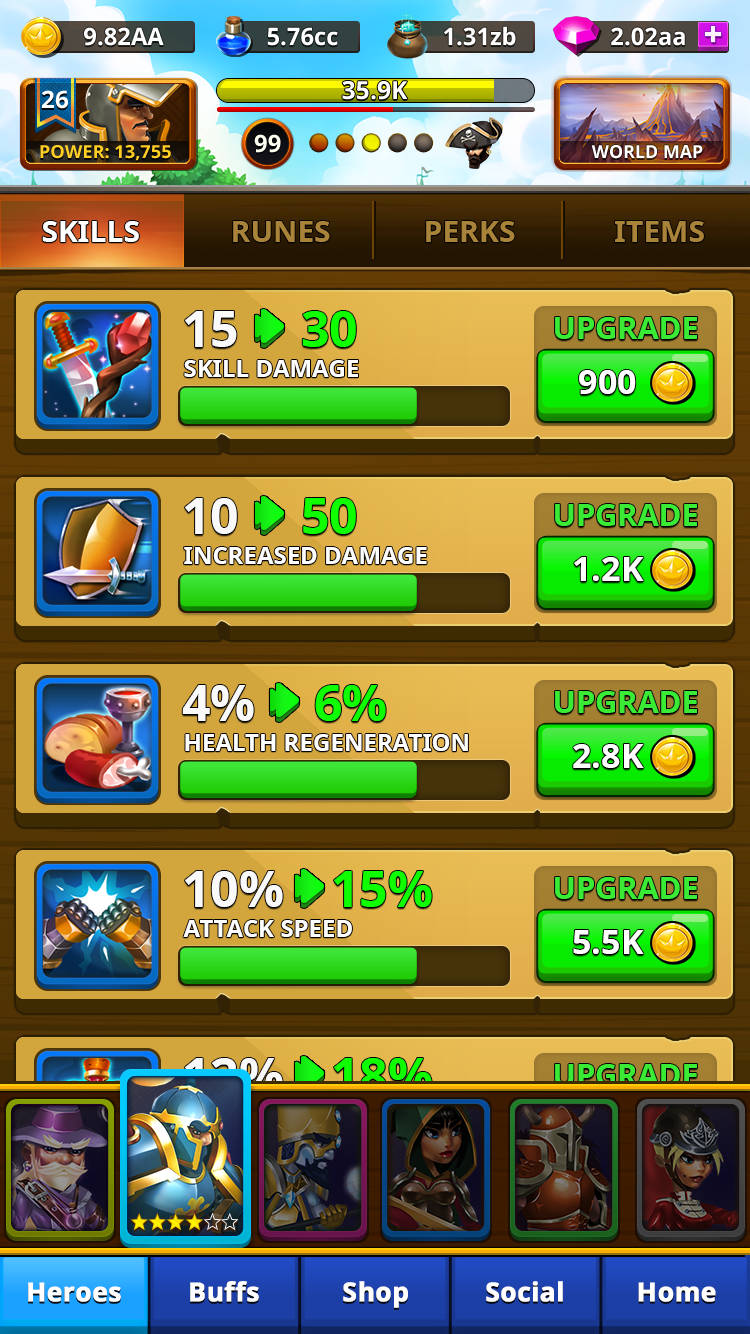
28 Responses to Option A
I like the darker theme, its easier on the eyes.
I like the brighter colors in this one.
Choice A has the better color scheme and the most appealing design.
I like the colors for this one because its very bright and makes me want to play.
The yellow color of the categories in choice A look better than the dark brown of B.
I like the bigger text
The colors of option A are much more imaginative and interesting.
Vibrant colors over dull browns. Plus the icons are better
I like Option A more because it's brighter.
I like Option A as it looks more vibrant and bold. The text is easier to read.
I think the colors look better in A and the font is easier to read.
I like Option A because the design has more color and the layout seems more engaging. Option B uses too many dull colors which makes the whole design look dull. As a result, I like Option A's design a lot better than Option B
the graphics in this game look a lot better. its brighter and more clear.
Choice A is more noticeable with the yellow background, the buttons pop out more. Option B is dull and less noticeable, it's lacking in color.
A reminds me of a Nintendo game. B, not so much.
I like the lighter colors here as opposed to the darker one. makes it much easier to see and understand right away
i feel it looks more modern and appealing
The lettering and colors show up much better in this option.
I like the brighter colors
I like the larger size and brighter colors.
The brighter colors stand out to me and are more intriguing for the interface of this.
The lighter backgrounds are better
I like both options, but I think that the brighter color pallette just looks better for this type of game on a phone screen.
I like the brighter colors
The numbers and scoring is clearer.
I love the way you can read the text and see the pictures better
I prefer green over yellow
A is better from a readability and accessibility standpoint.
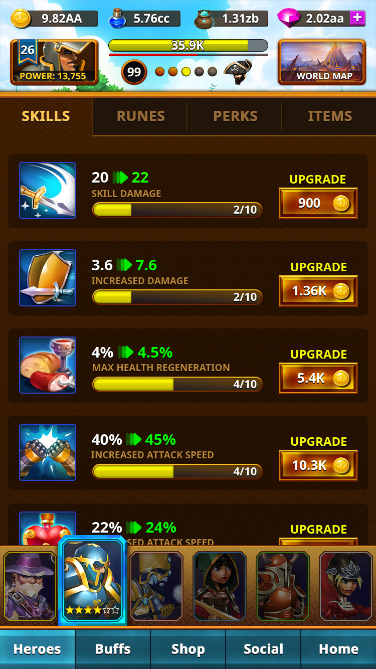
22 Responses to Option B
I like the smaller font in B
A is just too much things popping up at me. B is simpler, easy to comprehend./
Much more serious tone with this font and size for lettering.
I like the color scheme of Choice B more.
Even though the numbers are smaller on "B", they're easier to see thanks to the darker background.
I prefer dark with light text - it is a cleaner look and the text is less glaring. While less colorful than option A, it is more aesthetically appealing to me.
it looks better, because there is more contrast in the different items.
I like the darker background and smaller buttons, it appears more sophisticated.
THERE REALLY DOES SEEM MUCH OF A DIFFERENCE BETWEEN THE TWO EXCEPT FOR THE COLOR SCHEME SO IN THAT REGARDS I SELECTED CHOICE B MAINLY FOR THE COLOR SCHEME WHICH IS NOT SO BRIGHT OR HURTFUL TO THE EYES.
The colors go together better
I like choice B and the more dark look of the background. I also like choice B because the icons looked more realistic and caught my attention more than choice A which looked cartoonish.
Much more elegant and classy color scheme...the green on the other one looks awful
I don't particular like either but Option A looked more childish so I chose Option B
Much easier to read with the darker background.
looks a little less cartoony. the bright green and bigger font make it look like its geared more towards little children. while children will like a wide variety of colorful things, adults need a little more persuading. the look has to be inviting and should appear to show items in details to which they are accustomed to in the games that are currently on the market geared towards them.
B is simple. The dark screen just shows up better. The pics don't fade into the background.
I picked b because I like it having more black
I like the coloring and layout better
This looks more easy to read
I like the more reserved approach.
B looks sharper. I like the dominant colors and the contrast between text and background. I also like the active sword icon at the top.
wouldn't be as bright
Explore who answered your poll
Analyze your results with demographic reports.
Demographics
Sorry, AI highlights are currently only available for polls created after February 28th.
We're working hard to bring AI to more polls, please check back soon.

