Poll results
Save to favorites
Add this poll to your saved list for easy reference.
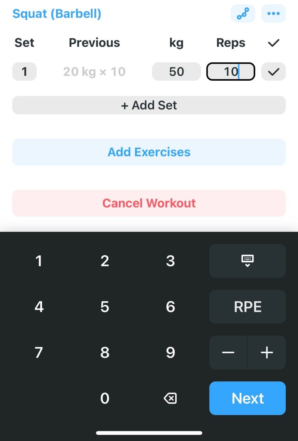
Which keyboard UI would you prefer if you imagine inputting a workout log?
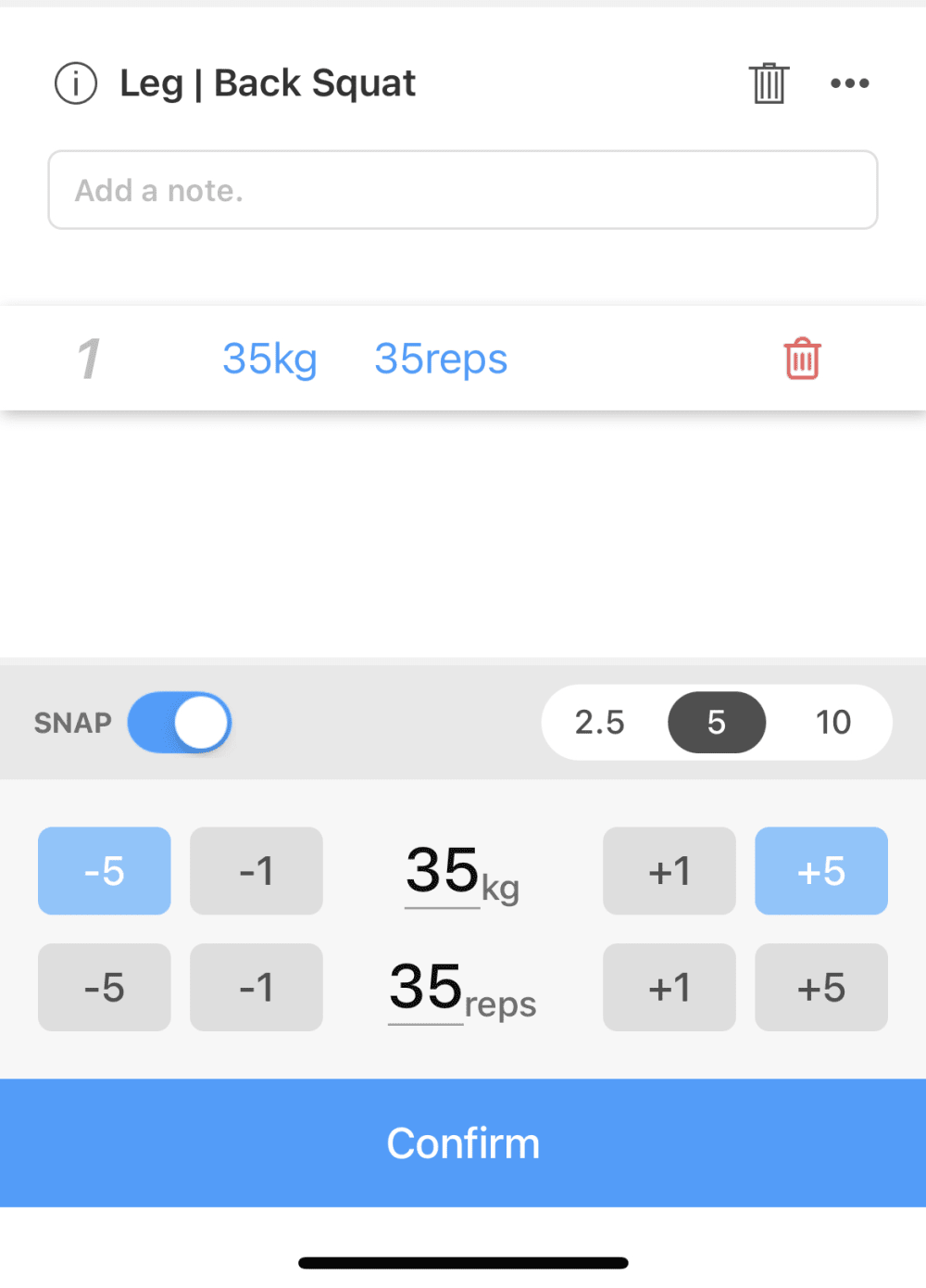
10 Responses to Option A
This looks better for a set and I like the white background and blue look of A here
I am not a fan of dark mode looking UIs, it's a nice option. A is better because it looks fresher and sleeker
It is easier to use. B looks more complicated and confusing.
I would say that I prefer the UI in Choice A. It seems a lot more guided than B does, which is useful since a lot of people aren't really sure where to begin or what goals to set when beginning a workout routine. A looks like it'd be more useful to beginners.
The black calculator like interface in B doesn’t look good at all. A seems much easier to use and user friendly
It's the "add note" option in A that draws me to it more.
I picked option A because it looks more used friendly. I prefer dark mode, like option B, but I don't care for how the keyboard takes up most of the screen.
To me, A looks cleaner and less complicated. The interface seems as though it would be more intuitive to use. B just has so many buttons.
It has a more modern material theme to it. It also looks like a iOS app.
I like the modern look of option A.
40 Responses to Option B
The keys are easier to see.
I chose B because I feel that A does not really make much sense and is really confusing
B looks way simpler and easy to understand. There is way too much going on in A and the interface looks very cluttered.
I choose option B because it looks very attractive than other image.
I chose option B because it seems easier to decipher, more like a step by step process.
This one seems easier to understand.
I think option B seems to be the easiest to use and looks the most modern
Between these two user interfaces, this is the one I prefer on my choice that I made
I like option B because it is clearer and easier to understand.
Option B looks easier to read and I like the setup better.
The UI in option B seems more user friendly.
This option is very useful for me and easy to enter the data.
I like option B. I like the dark background compared to the white in Option A. Also, I like Option B listing the previous set amount that I was lifting compared to what I lifted today or another day.
I prefer B because I'm familiar with a calculator setup, and I would find it easier to use as such.
I think the relatively plain and simple interface that looks kind of like a standard calculator (Option B) may not win any awards for design, but it is very intuitive and practical so that's what I would go for.
Seems easier to comprehend and get done quicker than the other one.
This is way better and precise, whereas the other is annoying and not free flowing.
I like the darker look
It's alot easier to just enter the number instead of increasing it gradually to get it where you want.
I choose option B because most of the working basis using this type of the keyboard. I like this number font also so I choose this option.
Option B was more intuitive than Option A... I was able to read along the different sections of the UI and it all made sense.
I liked the dark keypad of option B and the layout was more user readable.
The keyboard looked really outdated in A. I liked that this option was more sleek and modern overall.
I prefer this option because it looks easier to use and I like the traditional numeric keypad.
Choice B is easier to read and figure out . Choice A would require a little practice .
easy to input numbers and easy to edit data.
B seems easier to use and would be more familiar to people.
I like Option B because I think that the design is more sleek and it looks a lot better. I think that the black color definitely makes it seem more UI friendly compared to Option A which feels like a mess and doesn't look as good. I feel like it's easier to put info and stuff in Option B compared to Option A due to those reasons.
It seems easier at the top to input the weight and reps and so on. Plus, the black bottom half also looks better.
The layout seems more easy to use than the other option. I like how you can customize the workouts you did and input a direct number.
I don't even know how to use A at quick glance. it looks incredibly frustrating
For me, B seems more intuitive for me to use. I like the way the info and area a=of input are arranged. I also like the size and location of the place you can cancel workout and add exercises.
I liked the way the keyboard looks as well as the options set out above it to make it easy to enter the information. I prefer to manually enter my numbers also.
Always have to go with the dark theme as it is much tamer on the eyes after long periods of time.
I prefer the basic calculator looking layout over the +1/+5 options. I like to be precise.
Option B is the best because the interface and design is simple and easy to remember and share with others.
It’s easier to type in the numbers with all the numbers available.
This one seems more thoughtfully laid out and easy to use for me
The color scheme is better, I like the dark background. The UI also seems to be more simple to use than option A.
I'd go for B, since it's a typical pad and that's cool with me.
Explore who answered your poll
Analyze your results with demographic reports.
Demographics
Sorry, AI highlights are currently only available for polls created after February 28th.
We're working hard to bring AI to more polls, please check back soon.

