Poll results
Save to favorites
Add this poll to your saved list for easy reference.
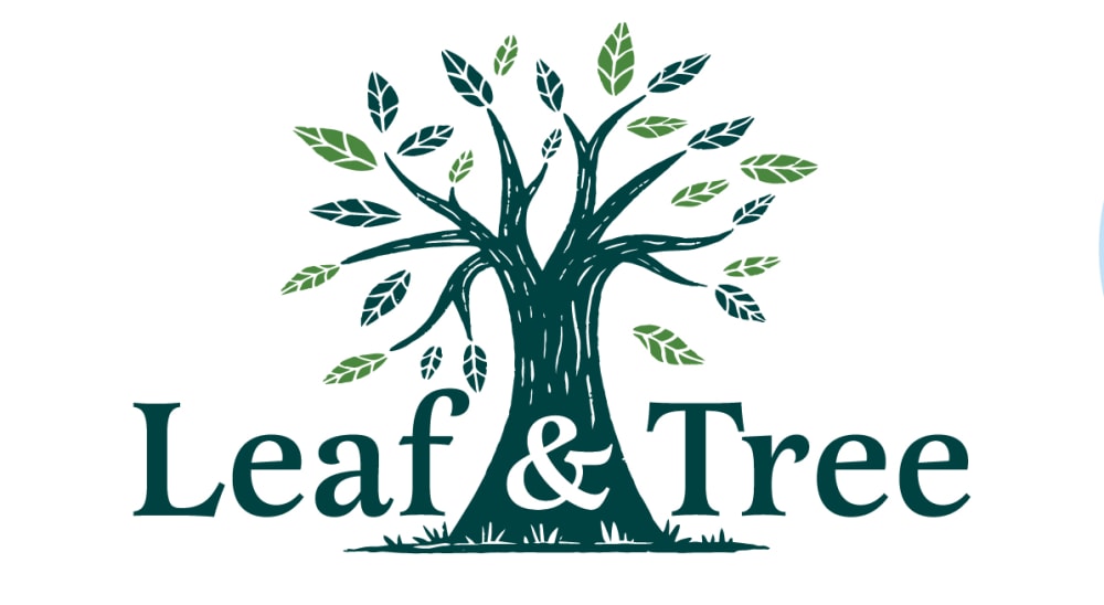
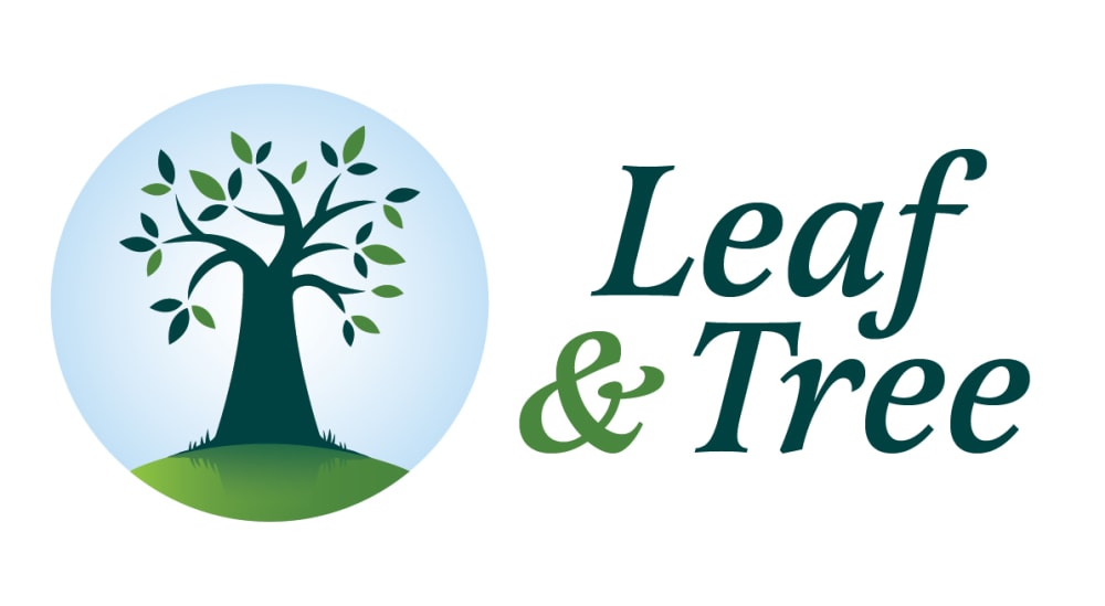
Which logo design do you like best for a business named Leaf & Tree selling personal care products?
There was no majority winner of this Ranked poll after 4 rounds of vote counting. However, Option A and Option C had the most votes (25).
In a Ranked poll, respondents rank every option in order of preference. For example, when you test 6 options, each respondent orders their choices from first to sixth place.
PickFu requires a majority to win a Ranked poll. A majority winner differs from a plurality winner. A majority winner earns over 50% of the votes, whereas a plurality winner earns the most votes, regardless of winning percentage.
If an option does not earn a majority of votes, PickFu eliminates the option with the lowest number of votes. The votes from the eliminated option are reassigned based on each respondent’s next choice. This process continues in rounds until a majority winner emerges.
Scores reflect the percentage of total votes an option receives during the vote counting and indicate the relative preference of the respondents. If there is no majority winner, look to the scores to see how the options fared relative to one another.
| Option | Round 1 | Round 2 | Round 3 | Round 4 |
|---|---|---|---|---|
| A | 30% 15 votes | 34% 17 votes +2 | 34% 17 votes | 50% 25 votes +8 |
| C | 30% 15 votes | 30% 15 votes | 34% 17 votes +2 | 50% 25 votes +8 |
| D | 28% 14 votes | 28% 14 votes | 32% 16 votes +2 | Eliminated 16 votes reassigned |
| B | 6% 3 votes | 8% 4 votes +1 | Eliminated 4 votes reassigned | |
| E | 6% 3 votes | Eliminated 3 votes reassigned |
Age range
Amazon Prime member
Cosmetics and body care habits
Education level
Gender identity
Options
Personal income range
Racial or ethnic identity
15 Responses to Option A
I chose A first because the tree image without the circle around it is very appealing and eye catching.
I like option A because it doesn't have that blue orb around it. It seems more natural and down to earth.
I like the centered ones the most. I prefer the one without the halo around it. I like the artistic quality of it.
I really like the tree and think it should be prominent. I think the text looks way better when it is on each side of the tree.
I really like the woodcut/ block stamp look of A and D. I feel as though the text is more eye catching in the version without the blue sky. A more hand- script text would look really nice with that vector of the tree. B and E are slightly boring... like any other logo you would see.
I like the look of this tree way better. It looks newer, more modern and professional. It flows better. The font is more uniform.
I thought the logo without the sky halo is more attractive and lets the text stand out more than the tree. I liked how easy Option B is to read. I think the texture on the tree is attractive and gives the brand more depth.
A & D- Most creative/visually appealing. I love these two the most, it has dimension. I like the veins in the leaves.
I like that the logo for option a feels like one piece. the others feel cheaper like the tree was a clip art image placed next to words.
A stands out, shows leaves even off of tree, mmore realistic
I prefer A because it is the only one without the redundant looking blue circles around like the others. From that point I chose the smaller designs first. E is smaller than B, which looks over sized a little. I also prefer the two shades of grass in E to the one in B. I think it looks better when the text is on the side of the image so I do not like how it overlaps in D and C. C also looks too big.
I personally like A the most because I like it without the circle. Without the circle makes everything feel "like one" and it is smooth/easy for my eyes to read. B and E are next because i like it besides each other as I feel like i can read it across. B is slightly better because I like that it is bigger. Finally between D and C, D is better because I like the extra detailing on the tree of D.
I like the logo by itself without the circle. Then I prefer the world to be in the circle rather than beside it.
i like option Athe most i think that the tree has more of a unique look and detail that make it better then the other options
I like how open and free choice A is. The rest of my choices get progressively tighter and more restrictive which I do not associate with personal care.
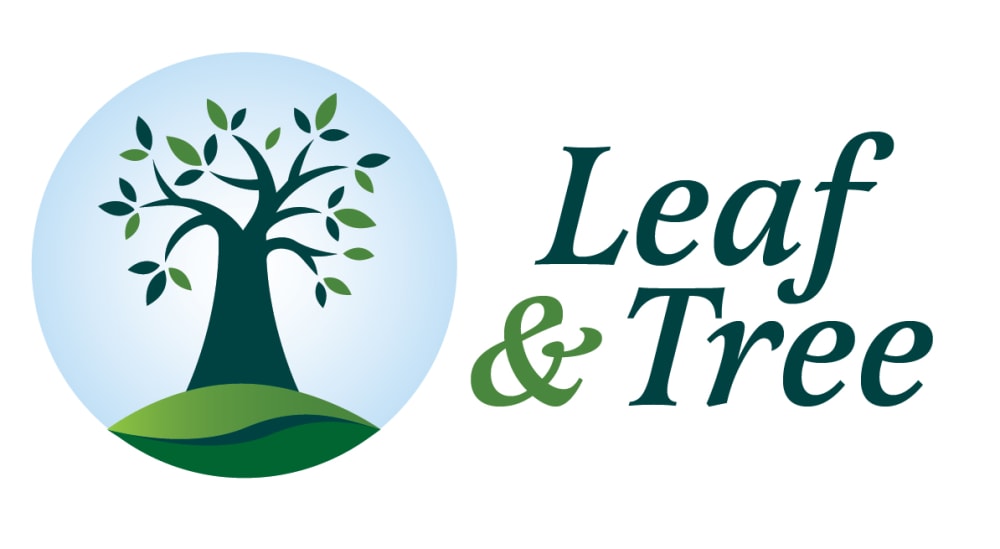
3 Responses to Option B
I believe that choice B looks to be both the most warm and exciting.
My preference is B because it is colorful and attractive, it has a very nice design and will certainly call more attentions to it, while D is cool and attractive aswell but not really my choice and I belief it has a good idea of logo design, also A Is dope and simple and it represent the productand well also E also looks cool and simple but I don't really like the style of design, C is cool and simple but the size of the logo is not really attractive to me
Option 'B' looks the most appealing to me. The design reminds me of growth, natural and improvement. The overall design relates well for a business that sells personal care products. The tree looks refreshing and rejuvenating.
15 Responses to Option C
It looks best when the words are a part of the image, like c,d,a. However C looks the best, becasue it is the most simple, with out texture lines that are kind of unnecessary
I like C, A and D the best because the tree is the focal point. E and B dont really do too much for me visually.
I like the images that have larger text.
Option C stands out the most and has the prettiest design.
The option C is my choice and favorite
My top choice was option C, I liked that the text was italicized and I liked the design of the tree drunk where it's less sketchy. Option D, I liked having the logo be part of the brand name rather to the side. I also liked that like option C, the '&' symbol is in the trunk. I just don't like the artstyle as much as option C. Option A, I liked that it was similar to option C and D, but I would had preferred it had the blue circle around the tree. Option B, I liked the way the hill looked compared to option E. I would had preferred the brand name be incorporated into the logo more like option C, D, and A. Option E, I ranked lowered because I just preferred the look of the hill the tree is on of option B more.
I like option C the best because I like how the leaves are solid and the "Leaf & Tree" text is symmetrical with the "&" perfectly centered over the tree. This logo is perfect.
Design c looks more attractive compared to all other options.
I think these all look really well designed but my gut led me to pick C first.
C is the most appropriate, it has a very appropriate look, D comes next, it also looks okay and appealing, A comes next., it also has an appealing look, B comes next, it has an okay look as well, E comes last, it looks okay but not like the other ones.
I ranked Option C first because it looked the most professional. It was the clearest and easiest to read. Options B and E were next and they really looked identical to me. A and D were last because they looked the most amateurish.
Option C, because its design is memorable, simple and with an easy to read typeface.
Option C is realistic and has a minimised phone, the graphic representation is sizable enough.
C - Bigger is better. I notice it more. That is why this is topD - This is the second biggest. That is why this is 2ndA - This one appears to be the 3rd biggest so this is the 3rd most catchyB - This one has the orb around it. Although it is not the biggest, it is the catchiest imo compared to E due to the orbE - Small and no orb is not as noticeable as the others to me
I like the blue halo behind the tree, as it makes the logo look modern and uplifting.
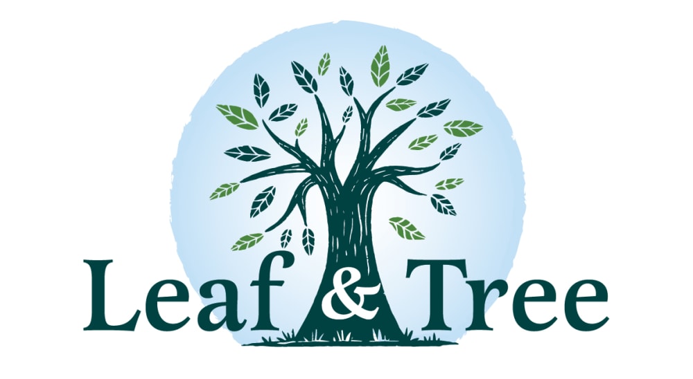
14 Responses to Option D
I think D is the best option by far because it looks the most well put together in comparison to the other options. Although they are all similar, D stands out to me the most and looks the most appealing for me personally.
I chose D as my first choice because I like the detail of the leaves, the tree being set on the blue circle and the business name being run across the whole thing. It's very eye-catching without being too busy. I ranked option A as second because it's very much like Option D but it's missing the blue circle which makes the logo look a bit incomplete, but still good. Option C has the blue circle but not the leaf detail which feels a little generic, but it's still good, so I ranked it third. Option B has the business name on the side which I hate because it pulls my attention in two directions, but since I like the detail on the ground under the tree, I ranked it fourth, because it is not as bland as E which is similar to B but has less detail, so I ranked it fifth.
For my top choice I like how everything comes together. I like the blending of the name, the blue circle and the tree. I feel like the image is in harmony because of the blending together.
The design of the blue circle around the tree looks nice but it is also not too close up like the other choices and does not look too cluttered. Looks very simple and clean.
I like D the best because it has the prettiest layout and the font is easy to read and pleasing. I like all of the logos where the tree is shown in a blue circle rather than the one where the tree has no background (A).
choices d,b,a,e have a more cleaner and more modern look to the leaf & tree text.
I think that this logo looks great for the company as it has the color that pops and the leaf abs tree are nicely placed. I like the abs being in the tree as well.
I like the first 3 choices of D C and A because they make the leaf and the tree look more cohesive looking and it looks more bold. Choices E and B are just okay, they don't stand out as much.
Option D has the most character and stands out the most. Options C,B, and E all look very similar and don't stand out as much. Option A lacks character.
I told my Selections in order that I chose them based on my personal preferences and what I can picture myself purchasing when using specific products with that label. They all look relatively realistic when choosing the order that i did. I like the creative-ness and different ideas. Thank you kindly.
I like the text not being seperate from the image, it makes it look more cohesive and not like an afterthought.
I liked D the best. I think that does a great job at taking the best of all the designs and implementing it into that one.
E and B look the same and do not have any noticeable differences. I like them the least because the logo is separated in space from the text. I really like how the text and logo overlap in D, A, and C. D is my favorite because it exudes warmth, trust, reliability, and credibility. It is the most creative and colorful.
I love D! I really like the overlay of the "&" across the tree. It showcases unity, strength, authenticity, and quality. I love the bright, beautiful blue sky. C is a close second, but the large font takes away from the beauty of the tree. A is less colorful without the blue sky, and thus is not as cheerful as D and C. B and E are pretty and eye catching, but do not make as much of an impact because of the test placement.
3 Responses to Option E
My answers when ranked in order shows the logos that caught my attention the most due to use of design and creative colors
I chose E as number one because I liked the layout of the text the best. I chose a last because I didn't like the way the text was displayed
I prefer the logo without the sphere around the tree just because it's cleaner and it could match better with different colored backgrounds, so option A is my choice.
Explore who answered your poll
Analyze your results with demographic reports.
Demographics
Sorry, AI highlights are currently only available for polls created after February 28th.
We're working hard to bring AI to more polls, please check back soon.

