Poll results
Save to favorites
Add this poll to your saved list for easy reference.
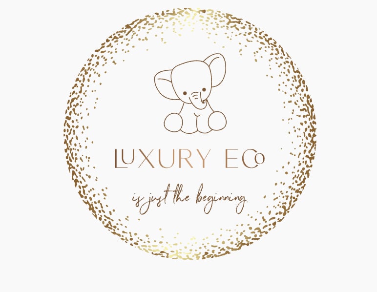
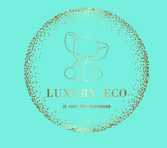
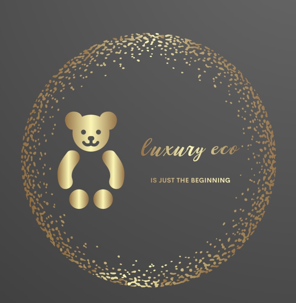
Which logo do you prefer for baby products?

Option B won this Ranked poll with a final tally of 18 votes after 1 round of vote counting.
In a Ranked poll, respondents rank every option in order of preference. For example, when you test 6 options, each respondent orders their choices from first to sixth place.
PickFu requires a majority to win a Ranked poll. A majority winner differs from a plurality winner. A majority winner earns over 50% of the votes, whereas a plurality winner earns the most votes, regardless of winning percentage.
If an option does not earn a majority of votes, PickFu eliminates the option with the lowest number of votes. The votes from the eliminated option are reassigned based on each respondent’s next choice. This process continues in rounds until a majority winner emerges.
Scores reflect the percentage of total votes an option receives during the vote counting and indicate the relative preference of the respondents. If there is no majority winner, look to the scores to see how the options fared relative to one another.
| Option | Round 1 |
|---|---|
| B | 54.55% 18 votes |
| C | 27.27% 9 votes |
| A | 15.15% 5 votes |
| D | 3.03% 1 votes |
5 Responses to Option A
The other three options are harder to read/see the text well. I like the elephant more than the bear and wish it was used on the black and gold.
I am a big fan of blacks and neutrals when at all possible. I think there is an elegance in simplicity that really garners both trust and the chance to charge a bit more.
They all are nice D B and C are qual to me and option A is the best, it's simple solid and complements the name of the brand well.
D and C are hard to actually read, A and B are way more clear. And option A feels the most luxe.
I think the solid circle scribble helps me focus more on the contents within the logo so I prefer option A the best.
18 Responses to Option B
i think choice b is very soft and delicate. i think it would be best.
The colors in Option C are badly matched. Option B is simple and cute for baby products. Option A seems like a logo for adult products.
I really like the elephant. I like the elephant in option C but not the glaring highlight in the middle of the image. It obscures the image.
I liked the logo design of option B the most. Option D and A's design looked nice but the background was a bit too dark. Option C, I liked the color the least which is why I ranked it last.
The elephant in B looks very cute and unique, and the white and gold colors go well together and look high-end.
I prefer option B, because it looks very luxe. Option C has a lovely color. D and A look like greeting cards.
Option B and C ranks first and second because I feel the animal and overall design seems more suited for babies. Option C is second because it's a bit hard to see the gold against a green background. Option D and A rank last because I felt it was a bit too luxurious of a design for baby products.
Option B is the best logo of all. First of all it is very cute and stylish. Very cute and stylish design, style and color mixture.
I love the sparkle aspect of the logo as that feels so unique and special to me personally and feels so much fancier to me which I love. From there, I would say that B is my favorite because the clean white background is calming and feels simple in a good way for me. From there, I put D over C as the color of C feels a bit too bright for me
I enjoy the look of the elephant and the color scheme of B. I did not like the colors at all of C even though they were similar in appearance. I would put more trust in A and D even though the elephant is quite cute!
I thought b was cute and the bear itself could become recognizable by itself
The elephant is adorable but that choice of blue with gold font is tad difficult to read. Dark colors are ok but for kids use brighter colors.
I prefer A because it is simple and looks luxurious. I would then pick C, but I do not prefer the brightness of the blue. Ultimately, I chose D and A last because I find it unsettling that the bear appears to not have a body. I do much prefer the elephant over the bear.
The white and gold combination looks very sparkling and beautiful. I also like the elephant logo. It is less common than the bear.
B and C are by far the best, great design and the elephant is very cute. D and A are okay, but neither is attractive to me.
Option B is the only one I can read; the others are difficult to see and D and C have too many other graphic elements. Option A would be best if the background had a lighter color and the tagline was easier to read.
Option B is easy to read, has nice contrast and looks clean and modern. Option A I think is hard to read the subtext below luxury eco. I think that this label would be less universal on different products, but still think it looks modern and clean. Option D and C I don't care for. The blue/teal color on option c is way too bright for my tastes and don't like it with the gold. Option D I prefer the character above the brand rather than to the left/right. I also think the shimmers look better on the white option B rather than on the black option. Looks less sophisticated on the black.
I love the elephant design comparatively to the bear. I prefer the white and black backgrounds for optimal "shine" effect. The turquois background just clashes with the gold, in my opinion.
9 Responses to Option C
D felt too faded and I disliked how dark A and D were. C felt the most vibrant.
I really enjoy the bright blue and I think most people would be drawn to this design style as opposed to the black.
Definitely Option C for it's brighter colors, the others look depressing. Thank you.
I really like all of these but I love the color in C. I think the elephant is cute in C and B. And I like the dots in C, B, and D. I don’t dislike A, i just like the others more.
I think that this color combination looks the most luxurious.
I prefer C or B because of the colors. I think they are good for baby products because of the light colors.
I prefer silver to gold and teal is my favorite color so that was a fast first pick. The bodiless teddy bear was a bit off-putting for some reason, so those two choices are at the bottom. I did actually have a preference for the rings rather than the dots, which made the difference between ranks 3 and 4.
I think color feels more baby-ish
The elephant is the cutest, and the color in C looks nicer.
1 Responses to Option D
I had a hard time choosing between D and A, but ultimately went with D because it looks like something a luxury line would actually advertise. The closed circle instead of the other one makes it look less busy and more eye-catching. A is better than B because B could be for something else. A looks like it would be for a baby line and I think the white in B makes it look like something is missing. C is too much with the teal color and is too busy.
Explore who answered your poll
Analyze your results with demographic reports.

