Poll results
Save to favorites
Add this poll to your saved list for easy reference.
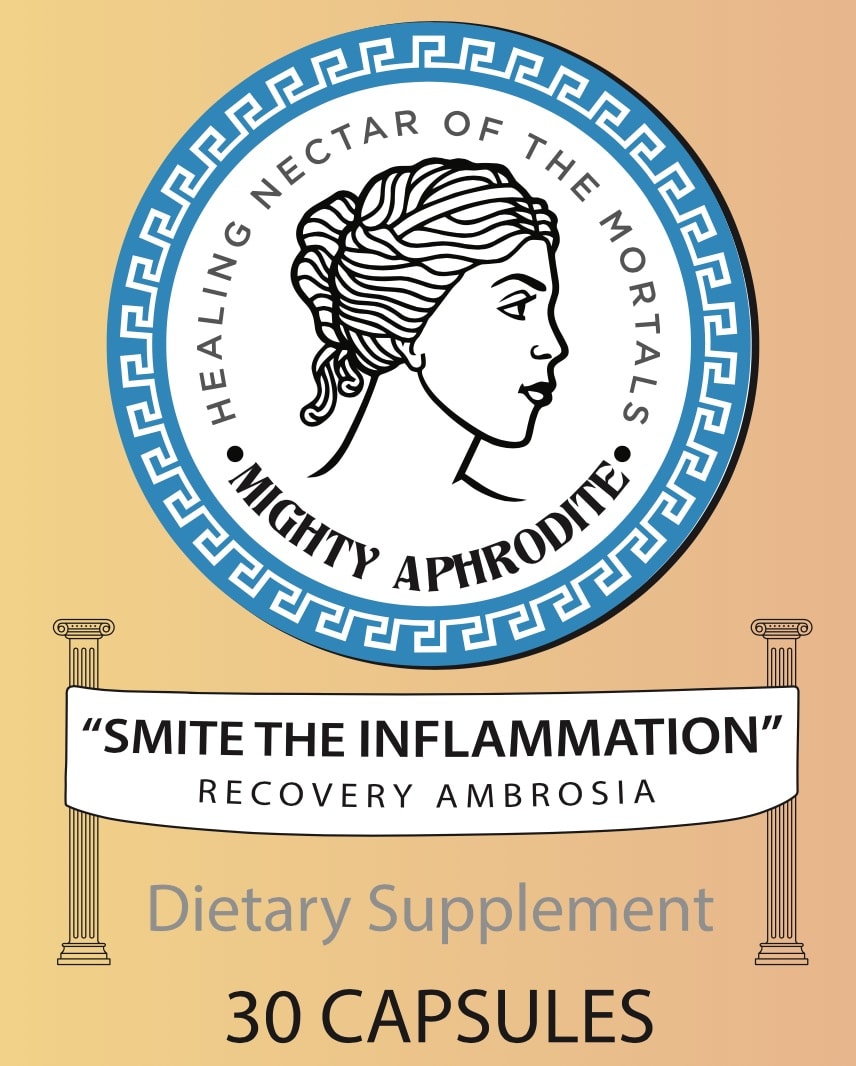
Which anti-inflammatory supplement would you be more likely to buy? Why?
24 Responses to Option A
looks very appealing and beneficial
I like colors in product labels. They pop out towards me and draw my attention to them over the traditional black and white or grey scales images.
I like the greek symbol with the saying on it. It's humorous and would make me more inclined to buy this product. It is much more engaging than Option B.
the colors make me feel more optimistic
I like the mythical Greek style, it's just more fresco and bright and inspiring whereas the other one seems outdated, with the minimalistic urban vibe, it's just tired.
The logo is just wonderful. It immediately catches my eye as it is unique and special. I love the traditional look of it yet at the same time it has an update appeal that looks like today because of the color choice
Option A is more noticeable. Option B looks very nice but I think I would be less likely to notice it. "Smite the inflammation" is cute and funny.
Choice A seems more like a label you'd see on supplements, especially vintage labels. Choice B looks like a stock photo for creating websites.
I am sold on "Smite the Inflammation" and the graphics. You don't see this type of design every day - at least with nutritional supplements. The look and feel make ME feel like this is homemade - and that the brand is looking out for me.
The colorful label with the elegant visual is best.
I chose A because I liked the idea of "recovery ambrosia" and it is more colorful. The words "healing nectar" at the top also suggest something natural. Whereas the artwork at the top of B suggests something chemical and man made, like beakers.
A looks like their is quality behind the product and work was done to create the label. When you look at B, I could probably make it with Word. It does not make me feel like it is a quality product.
I do like Choice B, but the imagery of Choice A is beautiful, honestly. I'm drawn in by "healing nectar". Most of us know who Aphrodite is, why not purchase this anti-inflammatory dietary supplement in the name of self-love? Overall, I chose A because I am more attracted to the labeling. It's more appealing to me than the other option.
Love the graphic of Aprodite
The ad is more eye catching. It is more colorful and has better graphics
I love the cheekiness of the slogan on A.
I like the detail and whimsy of A. Gives me fun stuff to read and I relax my judgement on the product.
I like this one a bit more
Choice A brings to mind the older remedies of the medicine shows. The label is fun and colorful and eye-catching. Choice B is white font on black that is not memorable not is it something I would pick up as easily as Choice A.
I chose A because I really like that logo. i think that it will catch everyones eyes, and will pull them right in. The aphrodite on the front is screaming...look at me! I love it. It's cute, it's feminine and will be something that doesn't look like a supplement sitting on your countertop.
i don't like the black color on the B label at all
I got a smile when I read this label. I felt the thought that went into this label means they really care about the product they made.
I like the label. It's clever and cute and evokes the idea that this cream has been used for centuries.
the image itself is very calming and welcoming, i think it works best to show what the product could be, bring down the craze
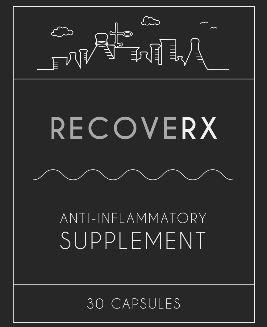
26 Responses to Option B
It looks more clean and spacious. I like the black color and bright text
choice b looks more official
B is basic and simple. It addresses the purpose clearly.
Much more eye pleasing and simple.
Option B looks more like a vitamin and makes the point of the product clearer.
I like the simple design....not too much extra detail
i like choice b better because i like the plain old black and white and the small yet neat font. i also like that it is plain and doesn't have tons of information and look cluttered like the other option has. i feel like when a product is simple and right to the point that it catches peoples eyes.
I like both for different reasons but I would pick B. I like that it looks simple and it's seems more science based. That appeals to me.
The packaging seems less snake oil (ish) then the other presented option.
I would buy option B because it gives a more professional vibe. The black and white makes me feel as though this solution is an obvious choice. The city backdrop makes me feel as though it comes from a more futuristic producer. Option B just has an overall more serious tone.
IT WAS WORKS TO ANTI-INFLAMMATORY
Seems simpler and more professional
The label looks clean. I like the color.
This is the one I would buy without a doubt.
I like because I like the black and white classic deisgn. It is simple and very clearly seems to an anti iflammatory. A is a little confusing with the symbolism of the godess of love
design looks more modern and scientific
Option A looks a little non-professional to me. Option B has some sciency-looking stuff on it that would make me choose it instead.
This option is more professional
This is a simple design which I prefer. I think the other one is trying to be too cute.
Have to go with B here. It looks positive and not smary like A. B is more down to earth shall I say and more positive. And possibly for both men and women.
B stands out a lot more to me. Its simple but yet unique at the same time. The darker background with the white text makes it a lot easier to read for something like me
Option A just isnt appealing to me. I personally thing that all the advertisements on the product actually takes away from the product itself. Sometimes less is more!
i think its easier to understand what the product is here
B seems more modern whereas A looks holistic.
it is a simpler package...I like it better.
I was on board with A until the "smite the inflammation" bit. I thought that was just silly! So I went with B. When I think of smiting in that context, I guess I'd think of Zeus, not Aphrodite.
Explore who answered your poll
Analyze your results with demographic reports.
Demographics
Sorry, AI highlights are currently only available for polls created after February 28th.
We're working hard to bring AI to more polls, please check back soon.

