Poll results
Save to favorites
Add this poll to your saved list for easy reference.
What do you think is the best main product image for Amazon?
Age range
Amazon Prime member
Education level
Exercise frequency
Gender identity
Options
Personal income range
Racial or ethnic identity
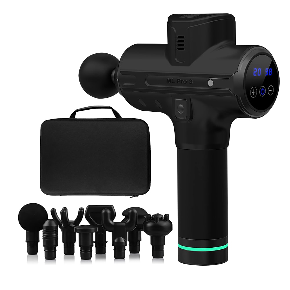
35 Responses to Option A
This just looks less chaotic, more organized, more professional.
It's easier to see the various component parts of the product. The other photo looks a bit jumbled. Looks like a good product!
I LIKE THAT ALL THE PARTS OF A ARE DISPLAYED IN A LINE AND UPFRONT OF THE MAIN PRODUCT
I like the option that shows the device switched on. The lights are a pretty color
The main item is larger
option "a" is better because you can see the components clearly
This picture does a better job of displaying it's features.
A looks more sleek
A looks better organized
A is the best photo because it shows all the accessories in the best way
I chose A because I like the items displayed the way they are the best in this image.
I think it's better to have the product shown bigger than the attachments.
A shows the item better and shows on it looks when turned on.
I still don't know exactly what this is or does, but I think A shows the best angle of all attachments that come with this thingamajig.
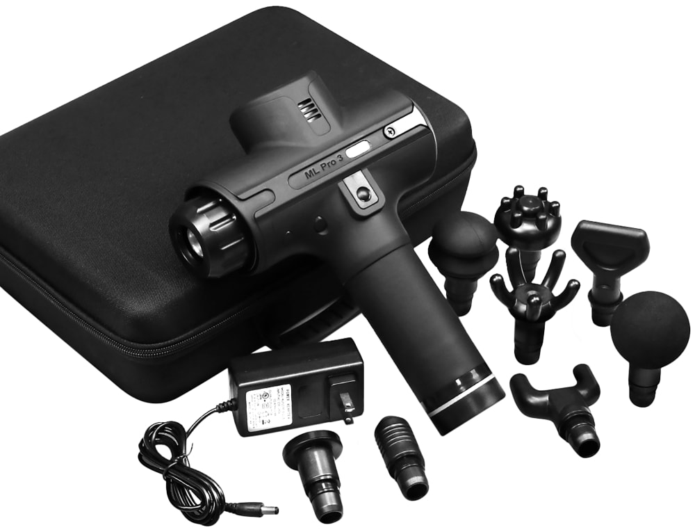
I think B if the best main image product for amazon because it shows the actual sizes better.
it is easy to see all the items that comes with product
The angle provides a better concept of the product and how the different attachments would work.
It looks far more organized and advertisement-ready. B looks like things were just thrown around. It's OK, but A is better.
This image is so much more organized, the other looks overwhelming.
This is a better image because everything is arranged in a way that it's easier to tell what the product is and to view the attachments quicker.
I think it looks even better organized in this photo, and looks like you can see how much you're getting and how all of the parts go together. I like this angle, it's closer to my view, and it just shows all the parts better.
I like choice A much better. It looks organized and is nicer to look at. Choice B just looks very cluttered and not something I would click on.
I choose A because the image is neat and organized and you actually get a better view of the product. B has everything scattered all over the place, not very professional looking.
This one due to you being able to see all the individual pieces much better
Option A is a more clear view of the product and accessories, Option B seems more cluttered and the focus is drawn away from the primary piece of the product.
A looks more organized and easier to see each and every product which is easier for me to process what is in it
Without question option A. It neatly displays the product and attachments and even shows the display in action which is very helpful. Its far more unclear in option B and doesn't look very good.
Option A looks to be the product mostly assembled so I can picture how it will look when I receive and use it. I also appreciate how all the little pieces and accessories are neatly lined up at the bottom so I can fully picture what I will be receiving with this product.
Option A prominently displays the key portion of the product set. The bag and accessories are less important and don't need to take up as much space. The angle of the image in A also shows there is a digital display which isn't as easy to recognize in B.
A is clear, detailed, and symmetrical.
While I like the packaging it comes in, I would rather see the product up close so I can take a better look at it.
I chose A because it looks more organized. It also seems to show the product turned on, and I think seeing the display is a nice touch. It does look like the carrying case in B is a harder case, so perhaps it is not displayed in the best way in A if it is identical. It looks like a soft case in A perhaps because of the handle.
I prefer option A because I like how the product is displayed so you can see the digital display.
The close up view of the main product itself, rather than the accessories, shows it in a more eye-catching way. I particularly like the blue and green colors.
I think option A is the best main product image for Amazon because the additional pieces or attachments for the product are arranged very neatly, they don't look messy which makes the image easier to look at and assess. The main product itself is also much easier to see since it's a more closeup shot of it, so that also makes it the better image.
15 Responses to Option B
This shows the set in a clearer view than the alternative and shows the different items included
Choice b looks to give everything more volume, it looks like it would feel more real whereas choice A looks like a stock image and relatively flat. With A, I can't tell how big everything really is whereas in B, I can picture how I would use it.
I prefer the image with the product and its attachments being leaned on the case because it gives the proper scale for how large everything is.
It's easier to see all the small components
You can see the shape of each individual part better. Choice B also shows that it comes with a power adapter, where picture A does not. People would want to know that it comes with an adapter so having it in the photo helps with decision making.
I'm going with B because the attachments are displayed in a more alluring, interesting angle than they are in Option A.
I feel that I can see all the pieces better in my choice.
Provides more details on the device and the corresponding parts.
I like choice B more. I get a better feel for the size of the products and what is included.
B looks more high quality because of the detail. I can't tell if it's because the product looks different or if the lighting in the pictures is different but B looks more detailed.
I like how everything is displayed
I think this one is better because it gives a more complete view of the total package. I can easily see all the components.
I think Option B shows off more materials than Option A and also is more visually appealing and expensive looking as a product.
B shows a better size comparison with the items laid near and against the case as opposed to A which shows larger images of the items in the case and can be misleading
The way the product and accessories are laid out in B make it easier to visualize how they go together. It's also more artistic and interesting to look at.
Explore who answered your poll
Analyze your results with demographic reports.
Demographics
Sorry, AI highlights are currently only available for polls created after February 28th.
We're working hard to bring AI to more polls, please check back soon.

