Poll results
Save to favorites
Add this poll to your saved list for easy reference.
what image would people click on most?
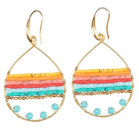
36 Responses to Option A
Definitely this one that gives a better view of the hook.
This one because the shape of the hook looks unusual but appealing because it's shaped in a way that would make them comfortable and wouldn't have to worry about them falling off.
The way the earings in option A appear they seem more vibrant.
The reason why I picked A is because the top of the earrings are sideways and you can see how the top is designed vs the other pair where the picture is straight on and doesn't show the thickness
A is the best one for me because I can see the entire earing and that is what I would want before buying. I would click on this one because I can see everything and I would buy this one
This Image shows the ear hook fully which is important. It allows a person to judge if their particular ear can handle that piece of jewelry.
The top look and position of this images in option A makes me want to select this one
I like A because you can easily see the type of clasp on the earrings.
i feel most people would pick this image because it shows what type of earrings these are as far as post earrings or clip ons.
Choice A gives you the whole image of the earring allowing you to see the hook of it.
Both have a good view of the earrings but with A one can see the hooks and how they may be right or not for one's earlobes.
I think it's because it shows how the earrings hang from the ear better.
Bolder bigger graphics than B.
Choice A has a better picture of way the earrings hook in the ears.
I prefer A because I think it is important to see how the product looks next to each other . It stands out a lot more than choice A.
I like this layout better than the other one.
I chose Illusion A because of the positioning of the earring hook. It is a better looking earring from that view.
People would click more the option A because of the way the image is showing almost every aspect and angle of the product.
The angle of option A is much better to get a view of how to put the earrings on. Much easier to understand the size and depth of the earrings here. The better choice because of angle.
In my choice I would click on that image before the other. I can see how the posts of the earrings is like that is why I chose my choice
Symmetry makes for a balanced advertisement.
I definitely prefer Option A, purely because of its symmetry and the way that the lines flow from one earring to the next. Option B is fine. If I saw it I probably wouldn't think much about it, but seeing them next to each other makes it much clearer to me that Option A is a more aesthetically appealing photo. I find myself thinking the earrings are cuter when I look at them in that photo.
choice A shows a more accurate picture of how the earrings look with the hook. The other choice isn't very clear because the hooks backside is hidden.
Option A clearly shows that these are earrings, while Option B is ambiguous and could be some sort of decoration for your home, with the hook part being turned in a different direction.
Having the colored lines line up is very nice to look at, while te other option looks really jarring
A better shows the curve of the earring hook, which makes it look more appealing to me
I like option A the best. I like to see the claps of the earring. I think option A provides a better angle.
I like choice A because it gives me a full view of the hooks on top of the earrings. This will eliminate questions about the product.
I picked A because they more clearly show they are for pierced ears and how they go into the ear.
I picked A because you can see the entire shape of the earring.
Option A is best
People would click Choice A the most because they can see more detail in the earring especially the top part.
choice A has a more decorative hook to the earrings.
I don't think there's much of a difference but the hoop being laid out flat looks kinda nicer.
For some reason immediately I was drawn to the one where the two earrings are more level with each other. Which is option A.
The curvature of the loop is distinguised and it make Option A stand out more than Option B. It make Option A the clear favorite in my mind.
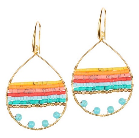
14 Responses to Option B
Option B looks more interesting because it looks like the earrings are moving while Option A looks like the earrings are just sitting there.
The slight uneven look is quite nice here
Probably B because just a little slant in the products give a more dynamic presentation appeal.
they look identical to me but this one caught my eye more
I like the offset images
Attracted more attention
Option B is just slightly more dynamic than A
I chose B because the products are off centered which makes them easier to look at.
The off-centered look makes it more appealing
These sort of look like the same picture except the actual earring part is just turned differently, I prefer A because it actually shows how it would fit in your piercing/ ear
I think having the earring arranged in that way draws the eye and creates visual interest that the other image B does not.
I chose option B because being unlevel made it look more interesting.
I would click on Option B because I like the way it's presented. Option A seems like it's trying to be aligned but it doesn't which bothers me a little. As a result, I like Option B a lot more than Option A.
I picked option B because the placement of the earring which are the same is more appeal. Slightly non symmetrical make the earring seem nicer.
Explore who answered your poll
Analyze your results with demographic reports.
Demographics
Sorry, AI highlights are currently only available for polls created after February 28th.
We're working hard to bring AI to more polls, please check back soon.

