Poll results
Save to favorites
Add this poll to your saved list for easy reference.
Which design do you like?
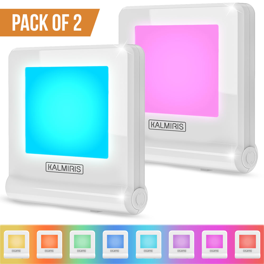
29 Responses to Option A
I would choose A. I like that it is brighter. I like the pack of 2.
The color variation is different
I think in this one the "pack of 2" writing is positioned really nicely so that it flows well with the rest of the picture and is very clear and easy to read.
I don't like the 2 pack logo in B
Looks taller and more sleek
I like A very much because you can really tell it is a two pack. I also like the bottom because the colors are more aesthetically pleasing.
I like the teal one better so I like that it's up front in "Choice A". I also like the rainbow color options background, I find it very appealing.
I like seeing the two pack call out right at the top so I know I’m looking at getting both of the items not just looking at two color options.
i like this design so beautifull of picture so i will selected
In A, the fact that it's a two pack is much more prominently displayed at the top. The other difference between the two is how the color options are shown at the bottom. The color gradient used in A is actually very pleasant to look at and shows off the choices nicely. The colors in B do not follow any real order so it looks a little less professional. I think the angle at which the products are shown is better in B than A, but A is more appealing as a whole.
I prefer option A because it shows the color range better.
A stands out more because of the colors at the bottom. So if I were searching, I would stop on that one first.
I think the color spectrum in the background of the white frame in A enables you to see the color choices better.
option A looks like the most functional model to me
My top preference shows that it is a two pack right above the products so you see it first and understand that fact very clearly. Additionally, there is a colorful box around the varieties on the bottom that allows for the products to be framed nicely. The two pack label fits neatly in a negative space gap in the top left so the entire presentation image looks balanced and draws your eye throughout. This helps you begin to better understand the item itself.
I like Choice A, because Pack of 2 is easier to see and the colors at the bottom are very vibrant and fun. Choice B is static and I feel like it's kind of bland in comparison to choice A.
I think the blue in front really draws the eye into the product and the pink helps to keep my eyes on it. I also liked the rainbow background on the color choices at the bottom. It all created a really interesting image that catches my attention.
I absolutely love that the background colors match the color of the tile. It makes the colors more vibrant, plus the colors in my choice are brighter and more appealing.
The sparkle shine in image A gives it that new/pristine look. The color patterns listed seem more brighter.
I like the top-corner "Pack of 2" better than the smaller badge lower down, and also the colorful gradient strip as a background to the lower section more successfully communicates that these things change color.
I prefer A because the square like box/icon matches better with the item since everything in the image is also a similar square shape
This one is clear overall, you get to see the quantity and the colors.
The use of gradiant colors at the bottom makes the image seem more professional. I also don't like the "2 pack" label in the other option. The dark red doesn't match with the overall bright color scheme.
I chose A over B because the banner explaining that it is a pack of 2 seems more clear, while in B it is not the first thing you see. The angle of how the item is displayed is also more natural in option A over B.
Option A simply because the aqua color is out front. Can't stand pink.
I like the larger banner on top that says pack of 2 and I also like the colored band at the bottom of the page on choice A.
I enjoy choice A more. I like that the color samples on the bottom has a "color wheel" of sorts that looks really clean. I would add "2 PACK" from B onto A and it's perfect.
Option A is more visually appealing and grabs your attention more right off the bat. I think the layout is better and has a much more professional look to it. It allows you to see the different color options more clearly and makes them appear more vibrant and realistic. I think it also portrays that you receive two more as well. Option A would appeal to a wider audience of people, get the message across more clearly and better and would make people more likely to dig deeper into what the product has to offer.
I like this design is more appealing
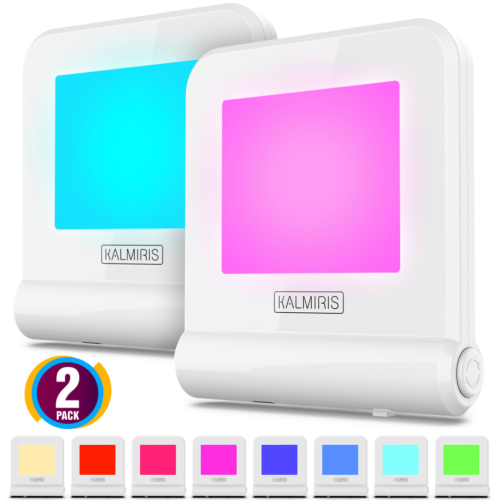
21 Responses to Option B
Would like to buy option B based on the displayed image which is more attractive and awesome, eye catching
The "2 pack" makes a huge difference to those looking. It takes the question out of the equation and will lead to more interest.
This one shows it as a pack of 2 and takes up less space.
I like choice B because it notes that it's in fact a 2 pack. This will eliminate any confusion that consumers may have.
I like the "2 pack" logo better in this option. It's less obtrusive and more visually appealing to me.
prefer B I like the closer image of the product
The rainbow gradient background on the bottom of A was very distracting. Because there was so much color in that gradient, it is difficult to see what colors the product comes in.
I actually think the list of colors at the bottom of B is more distinctive and gives me a better idea of what the colors are that I will receive.
Option "B": This photo display is larger with more detai, the "2 PACK" indication is clear and the individual color selections at the bottom are much easier to discern comparatively (A is a bit too artsy).
I prefer B. The layout is a little more neat and attractive, and the 2 pack label towards the bottom left looks more appealing and fits better with the overall image compared to the pack of two highlighted in orange at the top left of A.
The color bar in Choice A is distracting, I like that choice B is cleaner. I also like the smaller circle 2 pack rather than the banner.
After considering the options, I prefer the Option B. It looks better and it attracts me to it. I love its design and appearance. I would rather buy the product B than the product A. Its beautiful to behold and looks so appealing to me.
i like the color display at the bottom, it is not so busy and you can really see the color options available. the 2 pack sign could be bigge and bolder and up higher like the other option shows
I like option B the best because I like the "2 pack" designation within the little circle and I like the colors that are shown across the bottom of the picture!
I like choice B better because of the 2 pack logo is more colorful and stands out more to me.
Choice B has more fulfilling colors that do not appear washed out. They are vibrant and engaging. Choice A has colors that are bright but appear washed out in the middle of the color square with a circle. Choice B has a strong showing of color available.
The colors in back of the main colors is distracting so I didnt pick it
I chose B because I like seeing the colors on the white background. A is too difficult to look at with all the colors.
I think the small circular purple 2 pack with the colored computers at the bottom look great.I think it stands out more and is vibrant and pretty.
i chose the ones with the brighter colors they looked more lively to me
this gives me a better sense of the actual colors
Explore who answered your poll
Analyze your results with demographic reports.
Demographics
Sorry, AI highlights are currently only available for polls created after February 28th.
We're working hard to bring AI to more polls, please check back soon.

