Poll results
Save to favorites
Add this poll to your saved list for easy reference.
Which image are you more likely to click on?
Option A won this Ranked poll with a final tally of 26 votes after 2 rounds of votes counting.
In a Ranked poll, respondents rank every option in order of preference. For example, when you test 6 options, each respondent orders their choices from first to sixth place.
PickFu requires a majority to win a Ranked poll. A majority winner differs from a plurality winner. A majority winner earns over 50% of the votes, whereas a plurality winner earns the most votes, regardless of winning percentage.
If an option does not earn a majority of votes, PickFu eliminates the option with the lowest number of votes. The votes from the eliminated option are reassigned based on each respondent’s next choice. This process continues in rounds until a majority winner emerges.
Scores reflect the percentage of total votes an option receives during the vote counting and indicate the relative preference of the respondents. If there is no majority winner, look to the scores to see how the options fared relative to one another.
| Option | Round 1 | Round 2 |
|---|---|---|
| A | 38% 19 votes | 52% 26 votes +7 |
| C | 36% 18 votes | 48% 24 votes +6 |
| B | 26% 13 votes | Eliminated 13 votes reassigned |
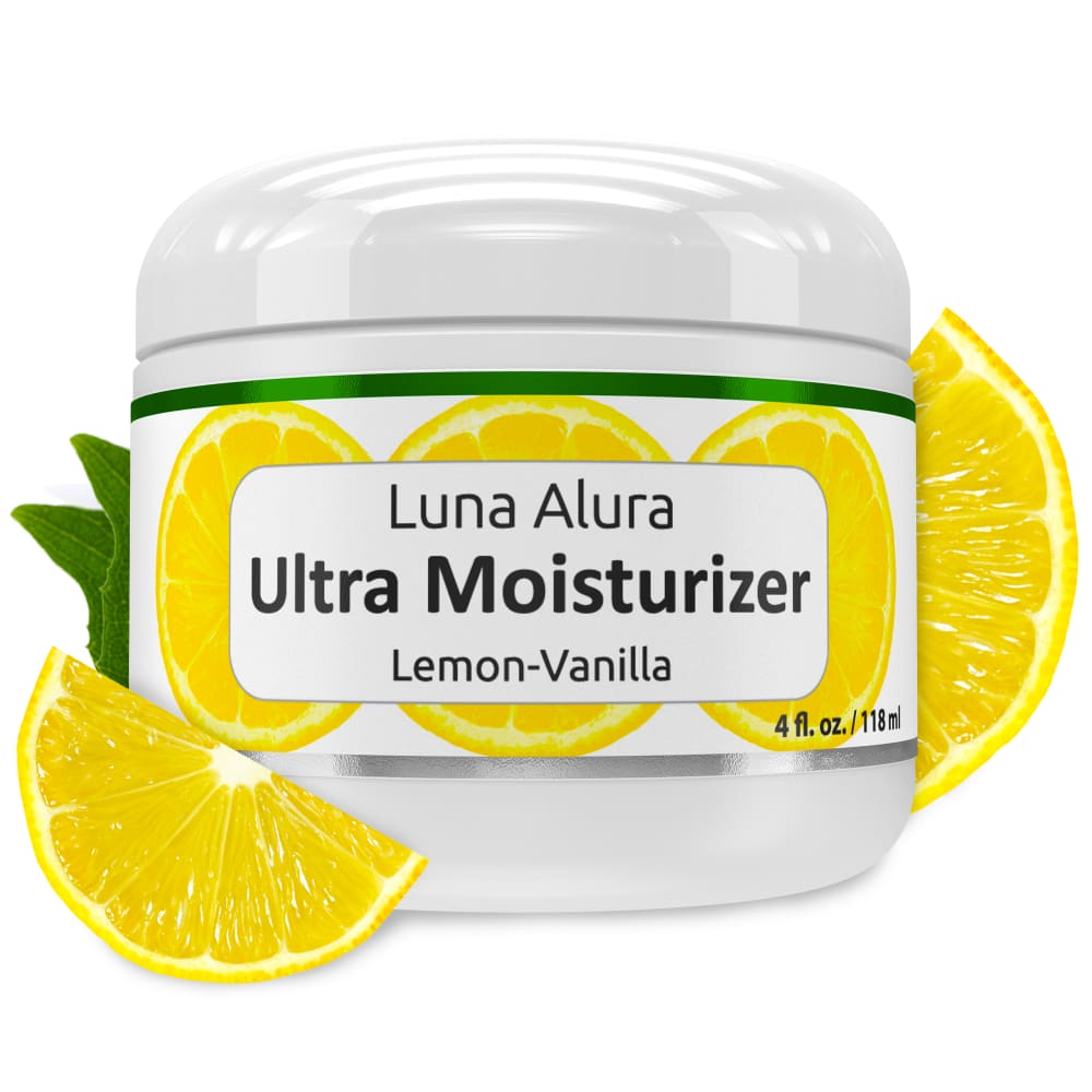
19 Responses to Option A
A is the most eye catching because of the bright yellow lemons.
#1 is the best by far, i like it the most.
I like the way its centered better than the other
i like adding the fruit, makes one think automatically of the smell and gives a boost to those who want natural things
I like the boldness of the first one.
I really like the images of the scents next to the package. I like the lemon best because it matches the color on the packaging.
The lemon images leave me feeling clean.
I like option A. The wedge of lemon is a great eye catcher for me. I would be interested in this product.
I like the lemon in the front of option A, called more attention, although the vanilla flower in C is nice to show it isn't just vanilla. B looked a bit gross when I'm not specifically expecting moisturizer.
I like the lemon images
additional lemons make it look fresher
Out of the three, I immediately saw option B as being the worst of the three. Lotion generally looks the same, so the open container is unnecessary. It also doesn't attract as well as the others since the container isn't shiny and it's angled. The other two were more difficult to choose between. I like the flower on the second choice as well, but in the end I just chose the other image because I thought it looked more balanced with the two lemons and I like the contrast of the green leaves with the yellow lemon and the white of the container.
NUMBER 1 IS MORE COLORFUL WITH 2 SLICES OF LEMON.THE LID IS SHINY AND EYE CATCHING.NUMBER 2 HAS A LEMON BLOSSOM WHILE ATTRACTIVE DOESN'T GRAB MY ATTENTION LIKE THE LEMON SLICES. NUMBER 3 SEEMS VERY STARK AND PLAIN.
I like the lemon better than the vanilla flower. I'm least interested in seeing the open jar, which is why I ranked it last.
I like lemon so I prefer the lemon pictures that show off the lemon more, I don't like the "glop" of moisturizer picture where we see it over flowing from the top, needs more lemon
The image A and C look best.
A: The lemon in the forefront reminds me of something fresh-- something I'd like on my skin. It also balances the image. C: I like the inclusion of both the lemon and vanilla images, but it feels unbalance. B: That just does not look appealing. Mostly white, with no pop.
I chose A first, because I like the lemons in the presentation, and C second, because I like the appearance of the lemon slice and flower. B is good, because you can see the cream, but I like the extra "garnishes" best.
The jar open doesn't look appealing, but seeing the images of the lemons does make it look appealing.
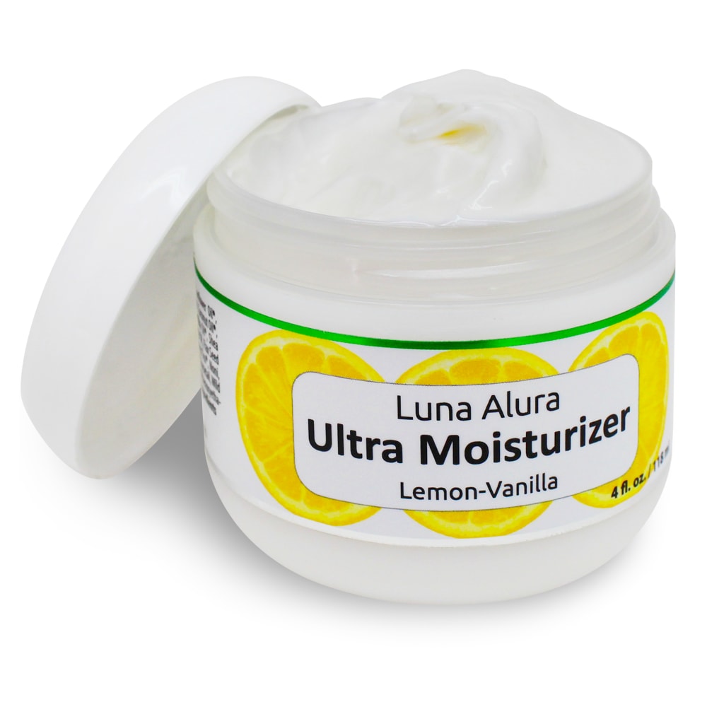
13 Responses to Option B
you get to see what the creme actually looks like
Can see the actual product, and on C you see the vanilla flower
I like being able to see what is inside the jar.
Just having it opened does it for me, then I like the contrast of the 2 ingredients
I really like seeing the inside of the bottle. It's a clean white cream so it's appealing. I prefer the yellow in the lemon versus the flower.
B is the most dynamic, with it being opened. Between A and C, I like the lemon more than what I assume is a vanilla flower.
Option B, because it actually shows the contents and makes the container look like it's full. Option A, because I prefer the lemon to the flower. Option C, because it has a flower instead of a lemon and I didn't like it as much as the other two.
I prefer the option that is opened and shows the product. My second choice is the one that has lemon and vanilla showing, as opposed to two slices of lemon.
This image highlights the product and the packaging without any unnecessary distractions.
to see the actual cream is better. Also it's nice to see the flower and lemon since it is the scent is lemon-vanilla.
First, I like the view of the product inside. Next, the vanilla and lemon slice next to the product is attractive.
Simply luscious! I really like B because it shows the product clearly.
I like seeing the actual product in the container which is why I like option B the most. A was next because I like the lemons visually over the flower.
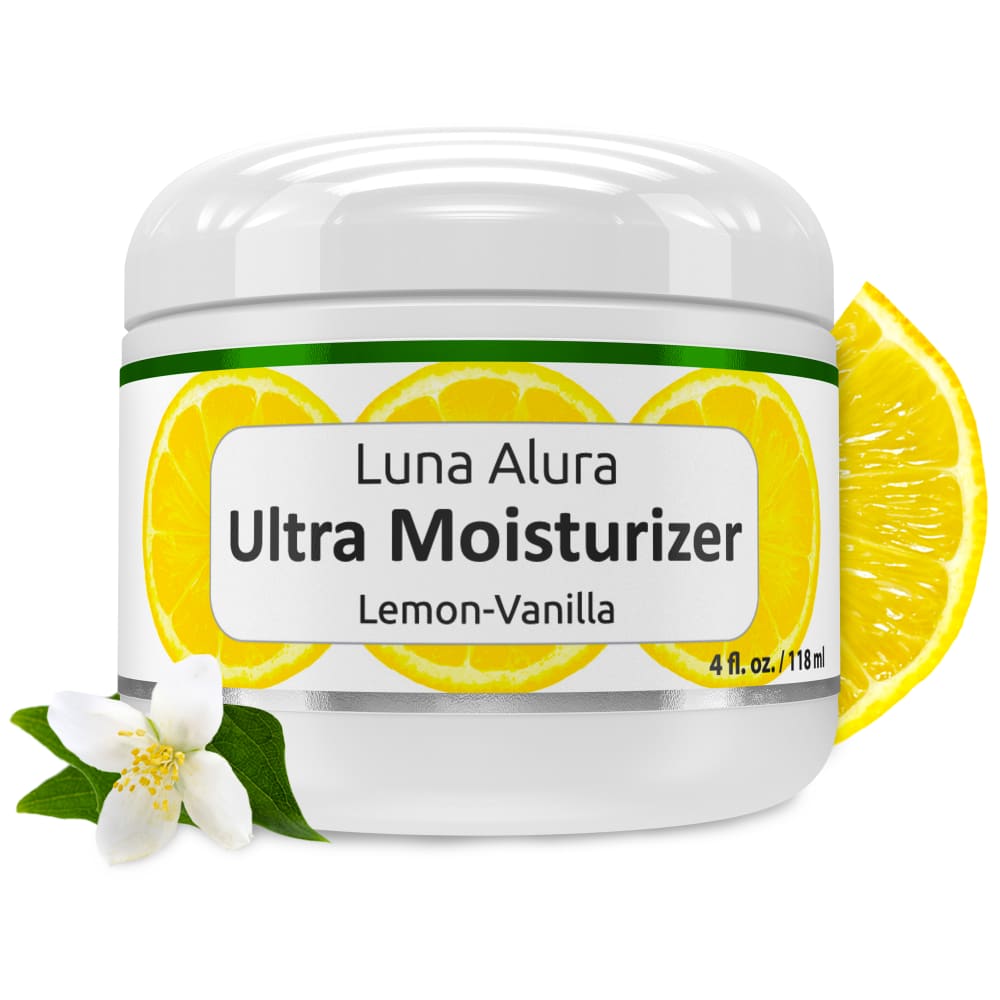
18 Responses to Option C
Option C has the most pleasant layout. The graphics are not excessive.
The container doesn't look that great open so the flower and lemon is more attractive and would make me interested in the scent of the moisturizer because there aren't many lemon vanilla products.
I like 2 and 3 I like to see the lemons makes it look like a natural product. I also like to see the jar open shows the product. If you had the open jar with the lemons it would be perfect in my opinion.
I would be more likely to click on image C because it includes a vanilla flower on it and it makes the product look more natural. I wouldn't have had to read the label to know it had vanilla in the scent which I love. I chose A secondly because it includes the lemon in the picture unlike B which is just the jar. Only including a photo of the product packaging isn't very appealing for advertising.
Lemon does not appeal to me so that is last. I love flowers so that is first.
I choose C first because of the product pictures of the lemon and vanilla. Second was B because of the open lid on the product. Last was A because it didn't show the vanilla like in option C.
Normally, I don't like extras in a item photo, but this is actually kind of cool. Go with the lemony one.
Option C just looks the cleanest and most appealing with the flower instead of the over saturation of lemon that Option A has. For whatever reason, Option B with the open top looks off.
I picked the order according to how refreshing they looked.
I like the label that has the lemon wedge and the vanilla flower on it, it gives a graphic representation of what the scent is. My second choice just has the lemon wedge, so that's not as clearly illustrating what the scent might be. The lemon wedge is maybe a bit extra since there are lemons also behind the text on the label. But I'm thinking about people who don't speak English or can't read English. My first choice would definitely suggest what the scent is like.
Voted based on image that showed the object the easiest without distracting from it.
I kind of with I could combine the deisgn of the shoot on option C and the angle of the shot of option A
The image in option C presents the best looking bottle. That container and the vanilla and lemon look good together. Option A is similar but I before seeing the vanilla flower there. Option B is somewhat silly as the lotion itself we don't need to see, and it's not a very aesthetic look. Option C for the best image for selling!
I can quickly look at the image and know what it probably smells like.
Option C's label shows the vanilla (via the flower) and is the most attractive label. Option A (with the chunk of lemon beside the jar) looks more like it belongs in the kitchen than in the bath as a high-end moisturizer. I do really like Option B (showing the cream in the open jar) -- if it would have also had the vanilla flower next to it then it would have been my top choice.
Option C provides a good mix of images with the white flower signifying vanilla and the lemon behind the container. A is similar in that it emphasizes the lemon scent.
I chose option C because I like the vanilla flower to show that it is a lemon/vanilla scent
My top choice is the best because the lemon and vanilla flower showcase that the project is natural and smells great. The 2nd choice is nice, but not as bold and the third choice is blah.
Explore who answered your poll
Analyze your results with demographic reports.
Demographics
Sorry, AI highlights are currently only available for polls created after February 28th.
We're working hard to bring AI to more polls, please check back soon.

