Poll results
Save to favorites
Add this poll to your saved list for easy reference.
Which photo do you like as a main image for Amazon
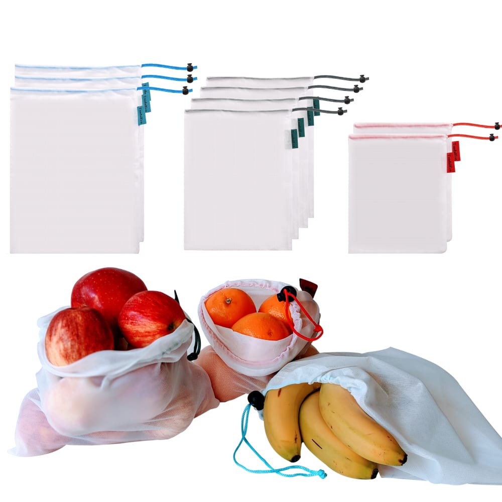
13 Responses to Option A
The larger demonstration of use images are better.
this image looks more appealing to me
larger presentation of the fruits catches my eyes more
I like the closer look at the quality of the bags in this image
The one I picked looks cleaner and less cluttered.
I think accentuating the colorful fruit makes the image brighter and more appealing.
I like A more. I think it displays what the product does better and also displays what it can hold better as well. I think the green bag in B is confusing.
fruits look more fresh
I personally like this because the images of it being used are bigger and this image just feels a lot more organized.
I like how it goes biggest to smallest.
The fruit being bigger is better because it gives you a better chance to see the product in use.
shows off the product nicely at all angles
The fruit is more prominent.
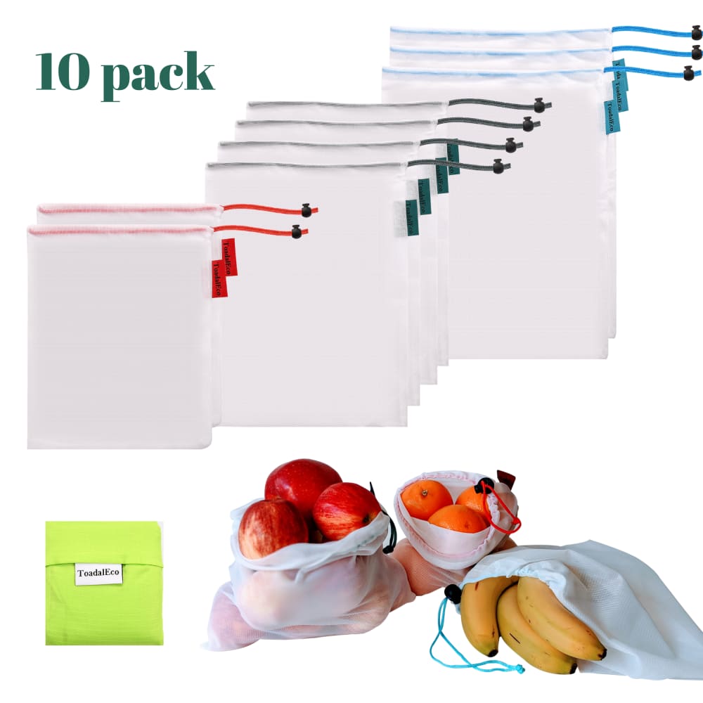
37 Responses to Option B
It's helpful to know that this is a ten-pack. More details and specificity are always good!
i like how B shows the qty of the pack. I think it helps to explain it better, i would go with B
I like that it says 10 pack so I don’t have to count and I can see it right in front of me. I like the font used as well.
Choice B has more detail to the images and it seems like it comes with more (the green pouch on the lower left). I also like the inclusion of the text "10 pack" since it makes it very clear how many bags you will receive.
The lime green bag is eye catching and i like that it's labeled as a 10 pack which isn't the case for the other image.
This one tells you a little bit more in the picture without taking up much extra space.
I like the image with the carrying bag that comes with the produce/fruit bags. I also like that option B lists how many bags come along with it.
I like how the bags are lined up and that it comes in a 10 pack.
i really like to be able to see all components of products, so i liked that the green bag was included, feels like i will be getting more in my purchase
The presentation of B just looks better than the other.
B because it says how many is in the pack and also shows more of the product with the neon bag in there.
I like choice b because it shows you the quantity number.
I like B more because of the little tote bag.
I like seeing the complete packaging in this image
It is helpful to see the green package.
I like the closer up image, also showing the storage bag is a nicer touch.
Option B is very informative. The storage/travel bag really caught my attention and I liked that the quantity is written out also.
additional picture of a bright green bag adds more substance
This image is more descriptive and also shows the holder than the items come in. It provides more information.
I like B better for a couple reasons. First, I think that showing the bags layered shows that they're similar and related. When they're apart in A, it just seems like separate products. I also like that the fruit is smaller in B; it seems like it gives a truer perspective to the size of the bags. In A, it doesn't even look like a banana would fit in the largest bag. I'm not sure what the little green pouch is in B, but that also seems like a bonus item, even if it's just a storage pouch.
I like this photo the most as a main image for Amazon. I find it more appealing and enticing. I prefer that it appears as though I'm getting more by showing the green bag. Also, I prefer the size of the bags that the image portrays.
This product presentation has the quantity of product and makes me feel more attracted to this brand.
Seeing the neon green, as well as the "10 Pack" makes it more attractive.
Option B emphasizes the product. The other one make the fruit primary. I am buying the product, not the fruit. I am buying the plastic bags. That is what I want to see.
I chose B because the photo layout is more cohesive, and it gives me more info on what I'm purchasing. I also like that it shows the carrying case, which not always included but is kind of vital with bags like these, and tells me how many bags I am getting.
It shows everything better
I like this option much better because I feel that shows a more complete view of the product. Also, it shows more of the variety of colors on the bags.
this image shows a tiny bit more
B looks like it has a more helpful size comparison than the way it is situated in A. The product looks small and tiny in A as well, with the fruit near it as comparison.
Option "B": Simply more visual information in this presentation, captures the products individually and in detail. If searching for similar product, I'd click that ad for details.
I liked the phrase "10 pack" and also the little green sack. But honestly I think that the picture with the bags on different heights in the image was more appealing and made it look like they would hold more, somehow (don't ask me how that works, because it seems weird, but it's what I see!)
'10 pack" with the green bag looks appealing
I like the one that says 10 pack.
I think showing the quantity and the extra bag is useful. The images of the bagged fruit is good zoomed in but not as helpful in making a decision.
It indicates that it has 10 packs. There is a photo of the container pouch included. The images of the bag are clearer.
While it's easy to count, having the number there for you is helpful. Plus there's an extra pouch thing in B
I like knowing the count without having to count them myself.
Explore who answered your poll
Analyze your results with demographic reports.
Demographics
Sorry, AI highlights are currently only available for polls created after February 28th.
We're working hard to bring AI to more polls, please check back soon.

