Poll results
Save to favorites
Add this poll to your saved list for easy reference.
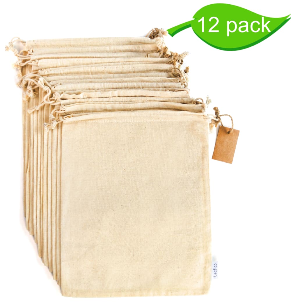
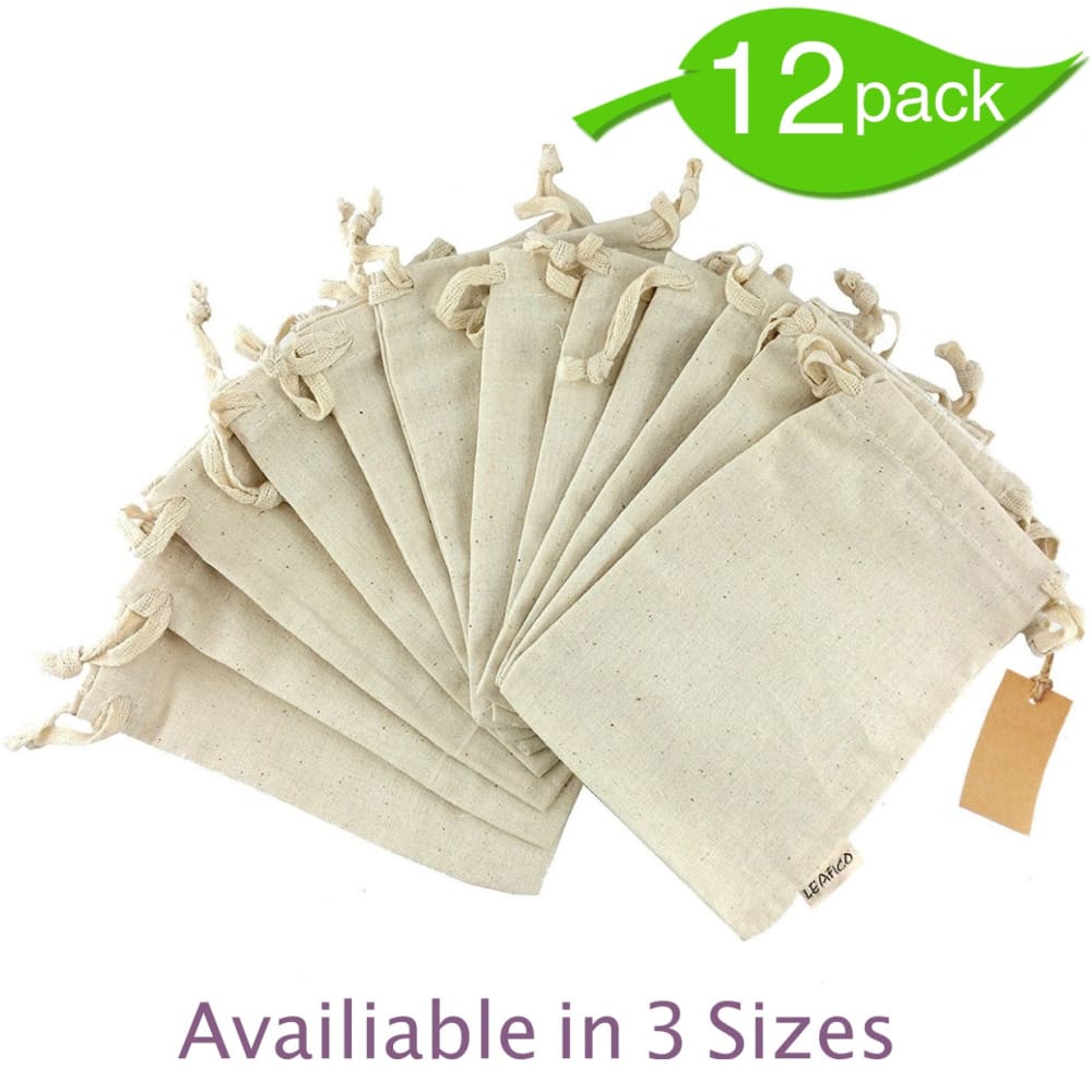
Which image is more appealing? On which product image would you click more likely ?


10 Responses to Option A
I like the looks of this one the most of all
Choice A is more appealing, the picture is brighter and more captivating.
i like more this presentation look more organized
I think I like the color better here
The bags are more neatly arranged and has better colors
This one with the bags together looks much more professional and the picture is higher quality.
the color is more appealing
This image makes the product look neater.
The image is a lot brighter, the items are a little bigger for better inspection and the way they are arranged is more pleasing to the eye. "A" is better for me.
i like that you can see all of them are the same size, I like the color better, and I think that "available in 3 sizes" is perfect from B but placed below A
40 Responses to Option B
I think they are better displayed in B
The bags that are shown in a spread are more appealing then the bags that are shown in layers.
This arrangement is cute to be honest
The color is less harsh , you get a better idea of the amount you are getting and it highlights different sizes are available
prefer this option because it is more descriptive and gives you a better view of the product.
More descriptive and shows fan out
more info, better to see details of product.
You can see the product better
Think these are largely similar but I like the text for the three available sizes here. They both can be used for the product images but use option B as the main introductory image.
I more likely to click Option B because I like the way the product is displayed and it also comes with the notification that it comes in 3 sizes. Option A doesn't look as good which is why I like Option B a lot more than Option A.
This option just makes it a tiny bit easier to see the individual units in the 12 pack.. plus its a bit more of an 'artistic' shot, if that makes sense :)
The coloring of A is more appealing, but the layout of B is better.
B seems like it shows me more of the product.
I guess it just looks nicer when they're spread like that.
I like this picture better because it is more descriptive.
I like option B because I like the way the product is spread out
I like the 'fanned' presentation of the bags in this photo. It makes them look a little fancier.
I chose Option B as the more visually appealing selection of the two because of the way that the bags are creatively arranged in the display. Both options are quite acceptable but I feel that Option B has the best arrangement.
I think that this picture is a better representation of how the bags are constructed. The bags look stronger in this picture.
I like that I know that I know more info in availability. It was more informative
I prefer seeing the bags spread out in B although the color of the bags looks more appealing in A. Also "available" is misspelled in B. It is also good information that it offers different sizes.
I like the way it was displayed better than the other one. You see more of what they look like and you get a better description of the product
B has a more appealing display.
fanned choices better display the number in the order.
I like knowing multiple sizes are available if it fits my needs. Also just a more dynamic picture.
The fanning out is just so much more appealing visually, and also makes it much clearer how many you are receiving. The other one almost looks like a canvas accordian file you would have at the office. Also like that it indicates there are sizes available. No question on this one!
B has more information and better displays the product
Option B is more eye-catching and you can better visually see what the item is. The indication that it comes in 3 different sizes is also helpful.
Shows better quality and laid out in a neater position.
The image is more appealing spread out across than down like in the other image. It also says available in 3 sizes.
I like the fan out of the bags as opposed to the stack. It also provides more information, like that they are sold in multiple sizes.
I like this option because of the fanning of the product and the green lettering that expresses available sizes. I also like that the leaf is larger and positioned towards the right.
I chose B as the option I am more likely to click on. I liked the option B product image better because the bags are arranged in a fan-shaped display, rather than simply stacked on top of each other. Also, the ties on the bags are larger and look more sturdy and like they would be more effective in keeping the bags shut. The B product image also has a more legible tag stating the brand name, and it indicates the bags are available in three sizes. B simply has more information and information that is more legible than option A.
better color and layout
I think this image reveals a little more of the way the bags look at least it seems that way to me.
A says nothing about size variants so i go with B
Having them spread out is more eye-catching and appealing
i prefer the way b is displayed with bags fanned out
I'd be more likely to click on option B, because I can see the product displayed better, and because the image tells me that it comes in three sizes so I can see more about it.
by fanning the bags out, it gives me a better view of them
Explore who answered your poll
Analyze your results with demographic reports.
Demographics
Sorry, AI highlights are currently only available for polls created after February 28th.
We're working hard to bring AI to more polls, please check back soon.

