Poll results
Save to favorites
Add this poll to your saved list for easy reference.
Which set of images do you prefer for a mobile word game?
Option C won this Ranked poll with a final tally of 29 votes after 2 rounds of votes counting.
In a Ranked poll, respondents rank every option in order of preference. For example, when you test 6 options, each respondent orders their choices from first to sixth place.
PickFu requires a majority to win a Ranked poll. A majority winner differs from a plurality winner. A majority winner earns over 50% of the votes, whereas a plurality winner earns the most votes, regardless of winning percentage.
If an option does not earn a majority of votes, PickFu eliminates the option with the lowest number of votes. The votes from the eliminated option are reassigned based on each respondent’s next choice. This process continues in rounds until a majority winner emerges.
Scores reflect the percentage of total votes an option receives during the vote counting and indicate the relative preference of the respondents. If there is no majority winner, look to the scores to see how the options fared relative to one another.
| Option | Round 1 | Round 2 |
|---|---|---|
| C | 42% 21 votes | 58% 29 votes +8 |
| B | 38% 19 votes | 42% 21 votes +2 |
| A | 20% 10 votes | Eliminated 10 votes reassigned |
Age range
Education level
Gender identity
Options
Personal income range
Racial or ethnic identity
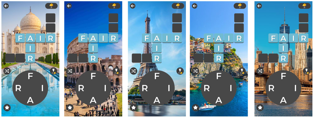
10 Responses to Option A
I like the photographs that give me a sense of adventure more than the cartoons.
I thought A looked the best because it had a consistent background color scheme that felt calming and clean. My second choice was C because I liked the outdoor theme it had. My least favorite was B because I seemed kind of random and non coherent to me.
I love architecture and buildings, so option A is definitely my favorite set of images.
The images that contain famous landmarks is a really great idea and it makes the game seem more interesting. I like option C as well, but option B is a really poor option.
I think this is just boiling down to personal preference. I prefer the cityscape. It's the background I would want. The other two aren't bad, but A is my favorite by far.
I feel choice A images are visually appealing. Choice C does not look attractive. Choice B it is distracting.
option a and b look the most appealing to me
I prefer the simpler background. The cartoony images of locations and things distract from the game itself. They also make it harder to read the letters and play the game
I like how similar the blues are in A. B is more colorful but still harmonious. C doesn't seem to really match itself, it's kind of all over the place.
I liked option A the best because is the one less crowded. All of them, to be honest, look really crowded and it's really hard to tell what's going on in the pictures. Option A you can see that there are some famous buildings in the photos, the other two options you really have to focus to see what's in the background.
19 Responses to Option B
These are the most bright and dynamic pictures.
I want the game to be fun and add a splash of joy to my life and that's best conveyed through brighter, splashier colors. B delivers on that, followed shortly by the bright blues present in A. I find the colors in C to be quite dull and gray
I like B because the colors are the brightest and the images are the most interesting. A and C are very similar but I ranked A first because the colors are slightly more bold.
I like the natural landscapes for backgrounds, however the famous landmarks look slightly better on a small screen as backgrounds, so I would choose option A.
choices B & C have brighter and more richer color backgrounds to the gameplay.
I ranked these choices in order of color vibrancy and personal appeal
I prefer B because it's the most colorful and eye catching. I also liked the nature images in option C.
I made these choices because the brightness of the colors called out to me in this order.
The first one is the most colorful which I like.
I would say that for some reason I like my first choice aesthetically the most that was just a gut feeling that I got after that it was more than intellectual choice whereby I associate my second choice which is the backgrounds famous locations I thought of that is more than intellectually oriented thing which would match up with the theme of an intellectually oriented word choice game and the third choice would be the landscapes that are nature-related that although they are very pretty I wouldn't initially associate those things with a word choice game or the problem-solving game of them I would associate more that with rest train calm peace and being relaxed.
The colors are the most bold in my first pick and this makes me think it will stand out more as a whole.
The color scheme, of blue and pink , are the most exciting and appealing of all the choices.
It looks the most fun
i prefer the brighter colors they are more attention grabbing to me
Option B definitely deserves to be a first choice, because of eye catching vivid colors with high contrast.Option A & C almost identical, but little extra blue color makes option A more appealing.
These images are just so interesting and unique to look at. I think they would make the game more fun by being something fun and different.
B looks very appealing, C also has an okay look, and A comes last because it looks the least appealing.
I like the blurriness of option B, because that helps me focus on the actual game more. I like C because images of nature are pretty relaxing. A is the last because I think backgrounds of cities are really busy and kind of are too distracting.
option B will be the best for the mobile puzzle game since it so colorful. Next option C is less colorful than the option B ranked to below to it
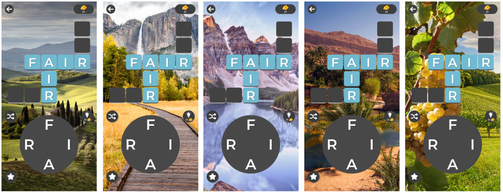
21 Responses to Option C
I have vacationed in NH and Vermont ever since I was a kid so my love for mountains is like no other
I picked the options that have the most variety.
I like C and A best as they give me something interesting to look at when playing - B is okay but not my favorite as its a little distracting.
I prefer the outdoor scene images
C was my first choice because I like the nature scenes.A was second because I am also fond of interesting places in the world.B was third because I didn't really care for the food images.
I like how the game part contrasts with the background. For my top pick. Plus I like the background images better than the other two.
Since it's a card game, I prefer the less cluttered backgrounds of C and A. B is just too cluttered with stuff and takes my eyes off the game.
C - Get captured in the beautiful scenes of nature. The letters do not get in the way of the background too much to where I can still enjoy the scenes of the background. B -- too much of the images is covered by letters, you cant see certain details, this is my least favorite
Displays the game nicely. You can see the details of the game. And this is important to the consumer so they can see what they are going to be playing.
I picked the order I did because the clarity of the words themselves. I want to be able to read the words in the game against the background.
I think the choice C looks quite relaxing and Choice B looks colorful and Fun. Option A is ok but I'm not all that interested in international stuff.
The images of outdoor scenery are much more attractive and peaceful to view
I like C's backgrounds the best. I think the famous tourist attractions make a nice background for the game. I also like A's mountains.
I like C set the most. I like them because I love nature and I like the different nature scenes depicted on them. I like B also and chose it second because I thought the colors were vibrant in the pictures and were really bright and pretty. I thought A was okay but I would choose that last because they are colored dull in a lot of them are places in Europe I've never seen so they weren't as interesting to me.
Options C and A are the best looking images I like the blue and earth tones these images provides. Option B is ok, but there is a lot random images in the background and I don't really like them.
I have a stronger preference for the darker shades and a greater amount of contrast is ideal for promoting the mobile word game.
I much prefer the natural landscapes over the city scapes as the background to the game.
I ranked the theme based on how calm the background looks and I much I believe it would help the player to think.
I'm more partial to nature but I live in the mountains so I'm honestly a little tired of them. I like the brighter colors in the second picture even though I'm not really into the picture but I'm not a fan of those famous landmarks in #3.
Choice C was my favorite because all the images were outdoor nature themes, which is calming and promotes performance. The landmark theme of choice A was also calming. Choice B had cool images but they were very distracting.
C I like the natural landmarks. B I like the dynamic colors. A good looking cities
Explore who answered your poll
Analyze your results with demographic reports.
Demographics
Sorry, AI highlights are currently only available for polls created after February 28th.
We're working hard to bring AI to more polls, please check back soon.

