Poll results
Save to favorites
Add this poll to your saved list for easy reference.
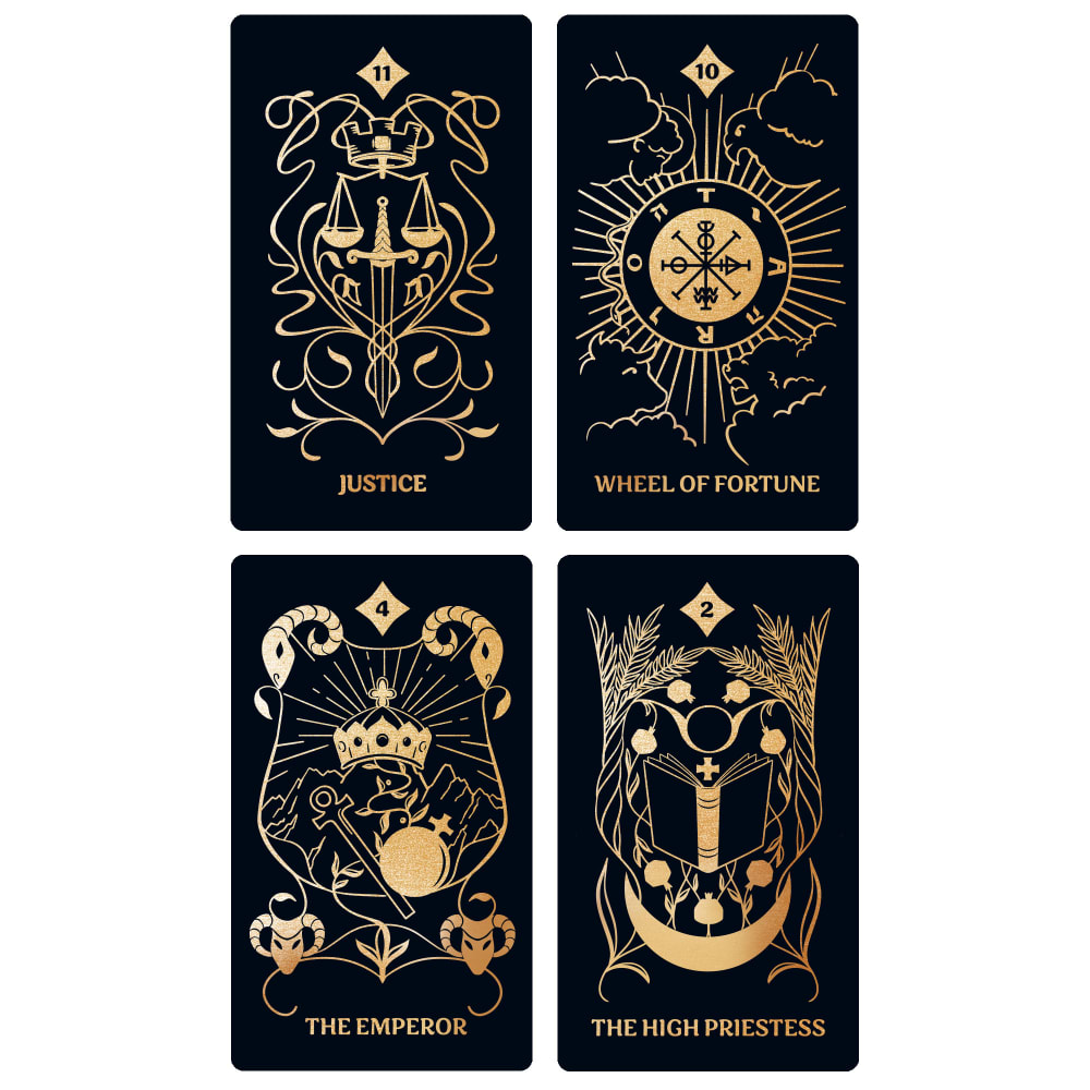
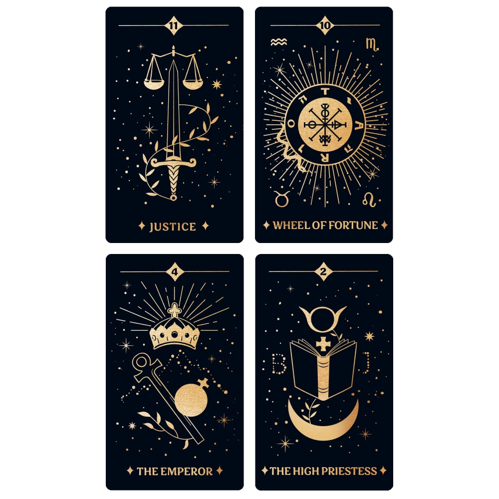
When shopping on Amazon, which tarot card deck would you be more likely to buy based on the design, and why?
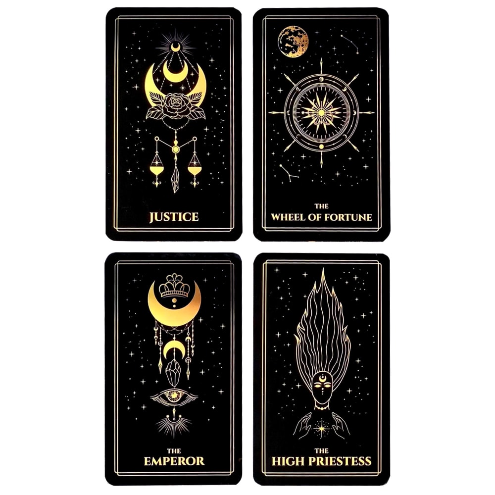
Option B won this Ranked poll with a final tally of 27 votes after 1 round of vote counting.
In a Ranked poll, respondents rank every option in order of preference. For example, when you test 6 options, each respondent orders their choices from first to sixth place.
PickFu requires a majority to win a Ranked poll. A majority winner differs from a plurality winner. A majority winner earns over 50% of the votes, whereas a plurality winner earns the most votes, regardless of winning percentage.
If an option does not earn a majority of votes, PickFu eliminates the option with the lowest number of votes. The votes from the eliminated option are reassigned based on each respondent’s next choice. This process continues in rounds until a majority winner emerges.
Scores reflect the percentage of total votes an option receives during the vote counting and indicate the relative preference of the respondents. If there is no majority winner, look to the scores to see how the options fared relative to one another.
| Option | Round 1 |
|---|---|
| B | 54% 27 votes |
| C | 28% 14 votes |
| A | 18% 9 votes |
9 Responses to Option A
None of these appeal to me, not my think. so I just picked A for this survey.
A has a more intricate design. More detailed, more interesting. C/B pretty good as well.
I like that the designs in A take up more of the card. The "B" and "J" on "The High Priestess" card are kind of odd.
A: I like the large size of the pictures on the cards.C: medium sized pics, lots of stars (dots) fill out the restB: smallest pics
I think that A has the most bold and intricate design, followed by C. B doesn't look very cohesive to me in the different illustrations.
I prefer choice A because they are more detailed.
I prefer the designs on A. They are more detailed and feel more solid.
I would never buy tarot cards. But if I'm just evaluating the designs, I'd choose A because I like the boldness of the designs.
I chose option A first because of the design, it's far away from the norm, and I've seen a lot of tarot cards but option A is unique, can't say the same for the other options. I'll stick with option A.
27 Responses to Option B
I like how simple B is.
I really like the image centered around the book in C but the moons in B are the best I love those designs.
These are all quite lovely, but I feel drawn toward 1.
B is very cosmic, C is very mysterious and A is very detailed. all really good designs.
The set of four has a pleasing appearance.
My first choice is B....I like that it is less busy.
I REALLY LIKE THE BLACK OPTION IN OPTION B
I like B and C, but I would buy B. I think this one looks nice, elegant, vivid and nice. it just looks more refined and precise than the others.
I enjoy B and C a lot because I can instantly identify what the image is. The stars in B look very nice as a background behind the motifs for the tarot symbols. The symbols seem pretty readable and succinct in how they describe their card. A looks a little too busy to me. It is also a bit too abstract when it comes to the symbolism. C as well is a little abstract to me but I feel like the motifs stand out well compared to A.
I just like the less bold versions better. It looks more artistic with lines that are less bold. I think it makes the design look more intricate.
I prefer Option B because it is the simplest and the most minimal in design style, less fussy is better.
I don’t know anything about Tarot cards, so my decision was based completely on how much I liked the designs. I chose B first because the images seemed uncluttered and appealed to me. I simply liked looking at them. I chose C second because I liked the images better than A. A had too much going on, and were huge and silly looking.
My first choice would be option B because it seems to me that it has a more esoteric design, mixed with mandalas, it is very striking.My second option would be C because it seems elegant to meAnd finally option A because it seems to me that it has many elements and it looks crowded and a bit messy
I liked the options with more subtle and elegant and classy designs over the options that looked more clunky.
I like option B the most, it just has the best images and looked the most original.
Option B has the beautiful golden color that stands out so well against the dark black background. I like how bold and bright the gold color is. This color makes the card deck look expensive and of high quality and that impresses me as a consumer
This one looks more cosmic and all knowing. It has a more mystical and spiritual vibe to it. The stars are beautiful.
I chose B first, because the bright tones contrast well with the black and get my attention the most. I chose C over A next, because I prefer the more complex background with the stars.
I liked the art-style of option B the most. Option A, looked more interesting and intriguing than option C.
I think these look more simple and easier to understand.
I like the border around the card; it looks more cohesive. The line at the top of my second choice does something similar.
I like these design styles because they're more intricate. I also like the shiny gold font.
I like B the best because it looks the most cool. I like C over A because it takes a lot longer to figure out the shapes for A.
I like the simplicity of the card patterns
I like option B because of the border on the cards. The borders make it look so much more attractive.
I think option B has the most interesting looking cards. Option A looks good too, the cards have a good design. Option V is okay, I only like the top 2 cards.
I like B the most because I like the balance between the main part of the image and the small images in the background. I also prefer this color of gold for the parts that are shaded in more and I think this one has a good balance between gold lines and gold filled in areas. The border around the cards is also nice. C is second because this one also has a nice balance between the main images and some small background images, but this one is a little bit busier looking than B. I like the border line on the top of these cards as well. A is last because these designs seem a little busy because the images take up so much of the cards and a lot of the designs are filled in with gold. The brightness of the gold is nice but I prefer how B looks with pops of gold filled in areas instead of it being a lot of gold filled in areas.
14 Responses to Option C
I think C is easier to see than the other two. And A has too much going on.
I prefer the cards that have smaller details that fill up negative space. I also think C and B have a sense of elegance, and celestial vibes that A does not bring.
I would choose option C. All of the cards look noticeably different. They all have a nice design on them related to what each one is.
C or B because I like the stars in the background. They look more celestial and mysterious.
I chose C because the drawings on the cards are the most delicate and detailed. A is the worst because the drawings on the cards are too big.
I would choice C because the pictures on the cards of very representative of the words. I feel that the images for the words are appealing and easy to identify. I feel that C is a little better then B because the graphics on C look better and represent the word better. I do not like A at all because the graphics are not appealing and do not represent the word well.
Option C has the numbers placed better and has imagery that goes better with the words.
I like the designs of option C the best. I think this one is the most appealing. Graphics are great
I like the simple elegance of Option C.
They all look pretty nice
I like the overall design of Option "C" best. I like how it's laid out, with the number on the top, anchored on either side with the thin line, and the name of the card on the bottom with the stars on either side. I find it pleasing to the eye. The images are concise while still being detailed, but without being overdone. I also really like the little pin pricks of stars in the background, which is why I chose Option "B" second. The border of the cards on Option "B" made it feel kind of closed off though, which I didn't like. Option "A" is missing the mystical feeling of the stars in the background; it makes the cards feel a little plain.
I chose C because the colors looked very vivid and drew my eye. B was second choice although the images seemed fainter. I didn't care as much for A because the amount of detail was busy and a bit overwhelming.
I really like how the images in the Option C cards represent the words on each card without overdoing it. The amount of graphics on each card is just perfect to get the message across. Next, for similar reasons I would go with Option B, but I'm not as fond of these graphics. Option C is my least favorite because the larger images are more confusing looking to me. In these options, less is better.
I really love C and B because the design looks a lot more detailed and I love the stars in the background and more of the intricate lines. C is my favorite because it stands out more with the sparkles of gold and stars
Explore who answered your poll
Analyze your results with demographic reports.
Demographics
Sorry, AI highlights are currently only available for polls created after February 28th.
We're working hard to bring AI to more polls, please check back soon.

