Poll results
Save to favorites
Add this poll to your saved list for easy reference.
Which design do you like the most and why?

Option B won this Ranked poll with a final tally of 27 votes after 1 round of vote counting.
In a Ranked poll, respondents rank every option in order of preference. For example, when you test 6 options, each respondent orders their choices from first to sixth place.
PickFu requires a majority to win a Ranked poll. A majority winner differs from a plurality winner. A majority winner earns over 50% of the votes, whereas a plurality winner earns the most votes, regardless of winning percentage.
If an option does not earn a majority of votes, PickFu eliminates the option with the lowest number of votes. The votes from the eliminated option are reassigned based on each respondent’s next choice. This process continues in rounds until a majority winner emerges.
Scores reflect the percentage of total votes an option receives during the vote counting and indicate the relative preference of the respondents. If there is no majority winner, look to the scores to see how the options fared relative to one another.
| Option | Round 1 |
|---|---|
| B | 54% 27 votes |
| A | 26% 13 votes |
| C | 20% 10 votes |
13 Responses to Option A
I like A as I can read it the easiest also it looks very high quality
The font was too chunky in C. I liked that A featured a more delicate and feminine design for the font.
Option A looks most sophisticated and is a modern simple look for a great wine gift bag.
It's a toss up between choices A and B as I like the script font of Cheers on these bags. Don't care for the font design on choice C which is why it is last.
Option A - Looks the cleanest and the material doesn't look chip like option B and C. I also like that I can see the whole text without it being cut off somewhat like option COption B - I like the color and the test on it, it makes it look somewhat unique and fun to use and look atOption C - The cloth color make it look old and the text on the front made it look boring and flat.
The use of cursive gives the product a classy look. The text isn't too big or too small. Just the right size.
I like the closure on A best, the font on B best and the color of A and B best. C looks cheap and reminds me too much of someone with liquor in a paper sack.
I liked the color of option A and B more. Option A, I liked the draw string. Option C, I liked the color the least.
Option a is the only choice that is elegant and does not look cheap but i would use a bow not a drawstring or make the drawstrings a different color.
I like A because I like that you can see this easiy. It is large and towards the front of the image, making it better to see what the product looks like
A has a light and clean look that I find appealing for this type of product.
The smooth white background and the fancy black cursive font made Option A the very best one for me.
I like both the color of option A , the design of the word cheers and the drawstrings the most in option A
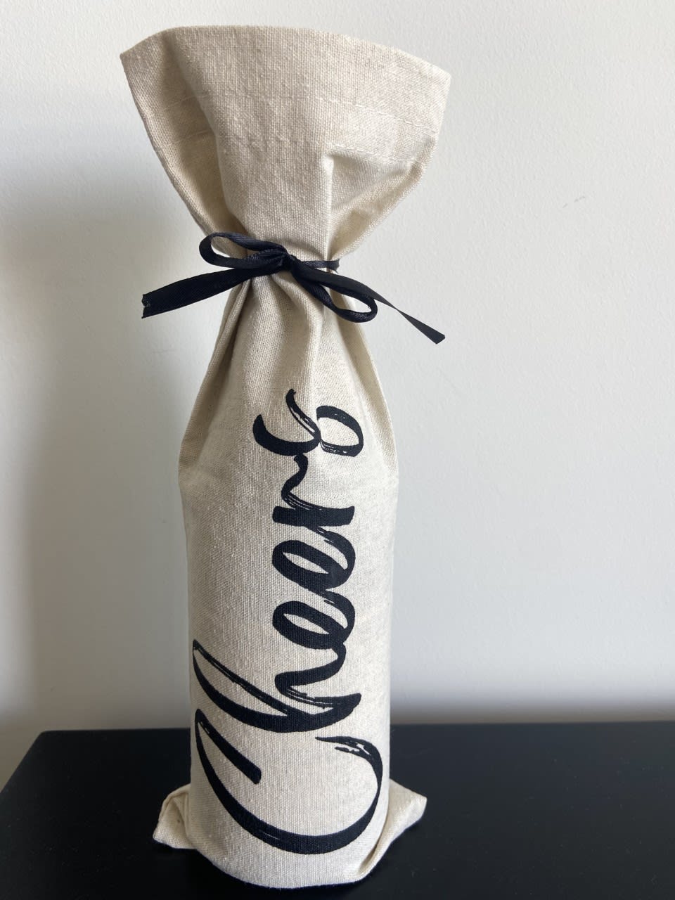
27 Responses to Option B
I like the font in B because it adds some excitement to the text and it is still legible, unlike the font in A.
I like the plain white but without the exclamation mark.
I really like the style of option B. It looks like the word "Cheers" was painted on, very elegant. I also like option C, I just with the typeface was different. Option A looks very basic to me.
I prefer option B because I think that it is the most interesting and visually appealing bag design out of the three options above.
I picked B because it looks the most fancy and it has a nice black bow to accent the white bag, perfect to match with a bottle of wine. I pick A after because it doesn't look cheaply made and it still has the personal charm with the fancy cursive lettering. I pick C last because it doesn't look as good as the other choices and more commerically made.
I like how the text curves around the bottle in B, and the cursive writing looks more festive than the sans serif.
Option B is the best option because of the text, I like that the design is in script and I also like in the direction the word "Cheers" is. The other options look weird to me.
I like the font style on this option. It is fancy, but still easy to read. I also like that it makes the bag look customized, especially when you add in the black ribbon that closes the bag.
I like the white bag and the dark ribbon.
I like the white bags the most. They look higher quality. I like B the best because the font is the boldest which I like
I think the cheers looks better in cursive, and my top pick shows it off better.
I prefer option b because the distance from the camera is comfortable as the other options look too up close.
I think the font and the black ribbon help make B stand out well compared to the others.
i really like choice B cause i like the writing on that choice the best and i like that the tie on it matches the writing. it was the first one to really catch my eye. choice C is my second choice only cause i do like the color of the bag better than just the plain white.
I like seeing the realistic look of the bottle holder with the ribbon tied.
B/ The bow is a nice touch to the bag. A/ The font is professional looking and the type of bag looks well made. C/ Seems to generic to me and font and bag is basic.
B - It has a celebratory font and it's angled upward so you can read it better. A - The font is good, but facing downward looks weird. C - Font looks hilariously dull for what it's saying. Hello. Cheers.
I like the Black Ribbon. I think B is the classiest, but C is kind of rustic and has a certain welcoming feel to it.
Choice B is the most preferred because of the white material and black bow in the middle. The bow in the middle looks better. A is second because of the white material. I'm not of fan of the two ties on each side. I like the bow like in choice B. C is last because the beige material is not as appealing as the white. B is most preferred to purchase.
I like how the bag shows everything neatly packaged up in option B.
I find C to be a little bit too boring. B has a great font. It almost looks like it was done with a paintbrush so it has a nice little "handmade" feel to it.
I like seeing what it looks like with a bottle in it.
I choose option B because it seems to me that the contrast of black with beige of the bow and the word "cheers" looks more elegant.My second option would be A, I like the bag material but the cord doesn't look good.Lastly, option C does not look elegant, it looks ordinary, considering that its use is to carry bottles of wine inside
B this looks a little nicer. I like the black tie better though.
It's hard to explain why, but I think it's strange to have the writing start at the top of the bag. It should start at the bottom in my opinion, but I have no basis to justify that opinion. The cursive writing looks more festive and celebratory, so B over C.
I love option B the most because it has black string to tie it up with and looks the classiest and the fanciest.
I like seeing how an actual bottle would look inside of it, so it makes this one a much better choice.
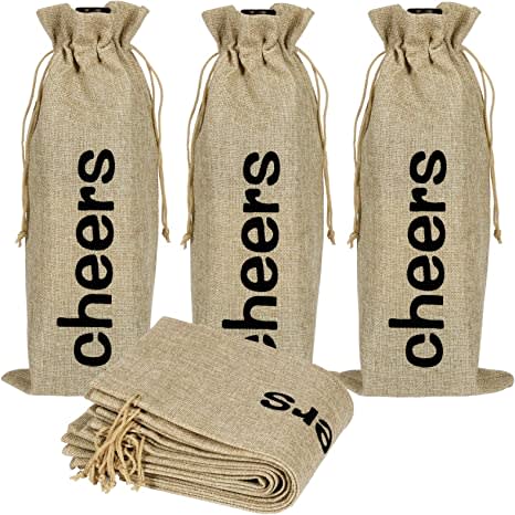
10 Responses to Option C
I really like the fun, modern look of C.
I think the burlap sack style looks the most interesting visually. I don't like the cursive writing much, but I do like the texture of B. A looks very vanilla and boring and also has an ugly cursive font.
C seems like the only durable option and like something I would use for multiple different things.
My choice is C I like that you can see everything your purchasing to gen an idea.
I like design option C the best because I prefer the font. It looks unique and it is much easier to read than the others and it stands out!
C has a nice texture of the packaging and looks good with bold letters. Also, its easy to open the packaging as well.
I think print looks much better then cursive. I like the black string better then white.
I think that this simple font somehow works better than the more complicated ones. And the color is much more appealing.
I rather prefer the option C wine bag product design because I like the darker brown color and how the cheers text is written using an easy to read bold font here the most. I chose option B second because I like the larger font style used here even though it is cursive and prefer the black ribbon rather than the strings for this white bag design. I chose option A last because I do not really like the difficult to read cursive font used on this option A white bag design.
I like C because the fabric is more rustic with the texture and color, and the font looks more unique (script writing on wedding stuff is so common these days). On A and B I like the brushy font on B a little better, but I don't like bag tied with a ribbon as much as the drawstring on A (if you get to choose the ribbon color to match your theme it might be good).
Explore who answered your poll
Analyze your results with demographic reports.
Demographics
Sorry, AI highlights are currently only available for polls created after February 28th.
We're working hard to bring AI to more polls, please check back soon.

