Poll results
Save to favorites
Add this poll to your saved list for easy reference.
Which design do you like the most and why?

There was no majority winner of this Ranked poll after 3 rounds of vote counting. However, Option D and Option A had the most votes (25).
In a Ranked poll, respondents rank every option in order of preference. For example, when you test 6 options, each respondent orders their choices from first to sixth place.
PickFu requires a majority to win a Ranked poll. A majority winner differs from a plurality winner. A majority winner earns over 50% of the votes, whereas a plurality winner earns the most votes, regardless of winning percentage.
If an option does not earn a majority of votes, PickFu eliminates the option with the lowest number of votes. The votes from the eliminated option are reassigned based on each respondent’s next choice. This process continues in rounds until a majority winner emerges.
Scores reflect the percentage of total votes an option receives during the vote counting and indicate the relative preference of the respondents. If there is no majority winner, look to the scores to see how the options fared relative to one another.
| Option | Round 1 | Round 2 | Round 3 |
|---|---|---|---|
| A | 30% 15 votes | 32% 16 votes +1 | 50% 25 votes +9 |
| D | 40% 20 votes | 48% 24 votes +4 | 50% 25 votes +1 |
| C | 20% 10 votes | 20% 10 votes | Eliminated 10 votes reassigned |
| B | 10% 5 votes | Eliminated 5 votes reassigned |
15 Responses to Option A
I like the hexagonal designs best. I think they have an elegant look and are not too over the top. I do not like the pink one at all.
A first because I like the edges surrounding the title of coverC second because it’s the same as C/ I’m not sure what the difference isD third because I don’t like the colors of the imagesB last because it’s the least appealing
I like the design on the front of A and C and I like the gold binding and trim. I don't like the color pink or the way B looks. I think C showing how the inside is organized is nice, but I think the cover make A and C better.
A and C look identical. I prefer them over the others because of the green on the cover. It looks nice
All of these are very nice. I chose option A. I really like the wreath of green with the small white flowers.
All of them are great, but options A and C are really appealing, artful, creative, and modern.
The look of the wedding planner that is used with option A is appealing to me for the aesthetic that is brought here, it looks pleasant to me the style!
Options A and C look the most professional and well-rounded. I like the font and I like the ring around it with the flowers and whatnot.
I prefer the cover design on my top choices.
I rated the wedding planners in order of preference. The first two convey simple elegance which I appreciate.
A I like the design on the front center. C I like the design on the front center with the greenery. D I like the divided tabs and the front cover design. B I don't like the cover for the wedding planner.
Option A is the most professional and pretty in the though of planning a wedding
I think both A and C are gorgeous and very appealing and appropriate for the occasion.
I really like Option A and C's framed wreath. I'm guessing these two are the same because I couldn't locate any differences.
Option A because the font and design looks a lot more clean and better
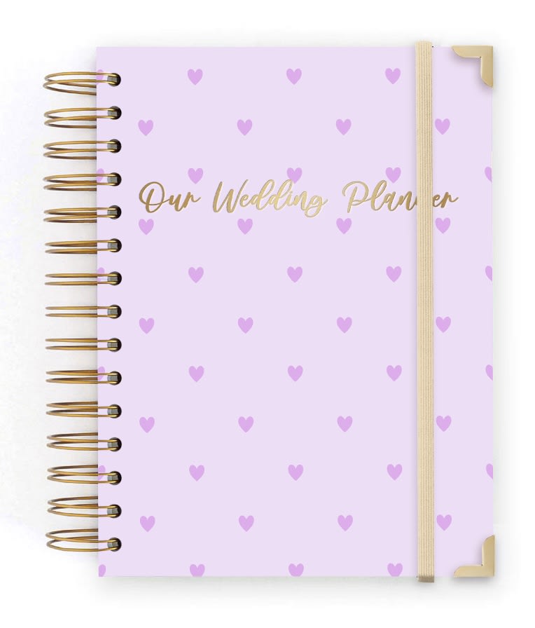
5 Responses to Option B
I liked the options that were more subtle and simple in design.
Usually the brides are the ones planning the weddings so option B is the cover I really like. I love the light purple and heart combination. I also love what a unique color combination purple and gold is, the two colors are very pretty together. My second choice is D, because I really like the flowers in the corners, I just wish the last corner would have some more flowers. I don't like A and C because I don't like how these two has so much white background, I wish there was a design pattern on the background so there isn't so much white space.
I like option B the best. I really like the bright pink color
I would buy Option B because I think the cover is adorable.
I love option B the most because it has purple hearts on it making it the most beautiful and the most lovely.
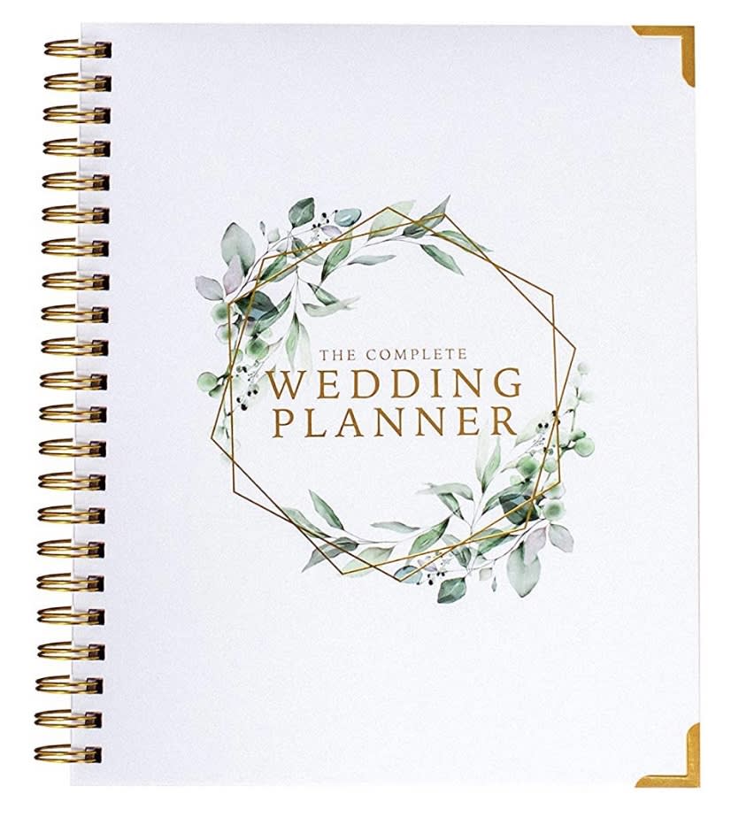
10 Responses to Option C
Option C is the best option because of the design of the cover, the shape, the text looks great, and the gold that is present in the cover. The other options do not look as good.
I chose option C because its simple, modern and romantic which is perfect for a wedding planner.
As there is no real difference between options C and A, I would likely buy either one. I like the gold accents and typography as well as the ornate border around "Wedding Planner."
Choices C and A more visually pleasing and the display is nice to me with a good color choice as compared to choices D and B for me.
I like choices C and A the most. They both have great designs because I like the flower design with the white background and the gold color. It has a very classy look.
C and A are the same. I like their overall image. I don't like the brown of D, though people might like that if they have a fall wedding. B looks like a child's diary.
I think the wreath looks good and it's more simple than the others.
Less is more for a product like this in my opinion. I like the circular, centered design - looks super clean and the text compliments it well too!
I like option C because to me it looks the most extravagant and lavish. Option A looks quite appealing too. Option D and B look less desirable to me.
I prefer the white background with the centralized artwork and text.
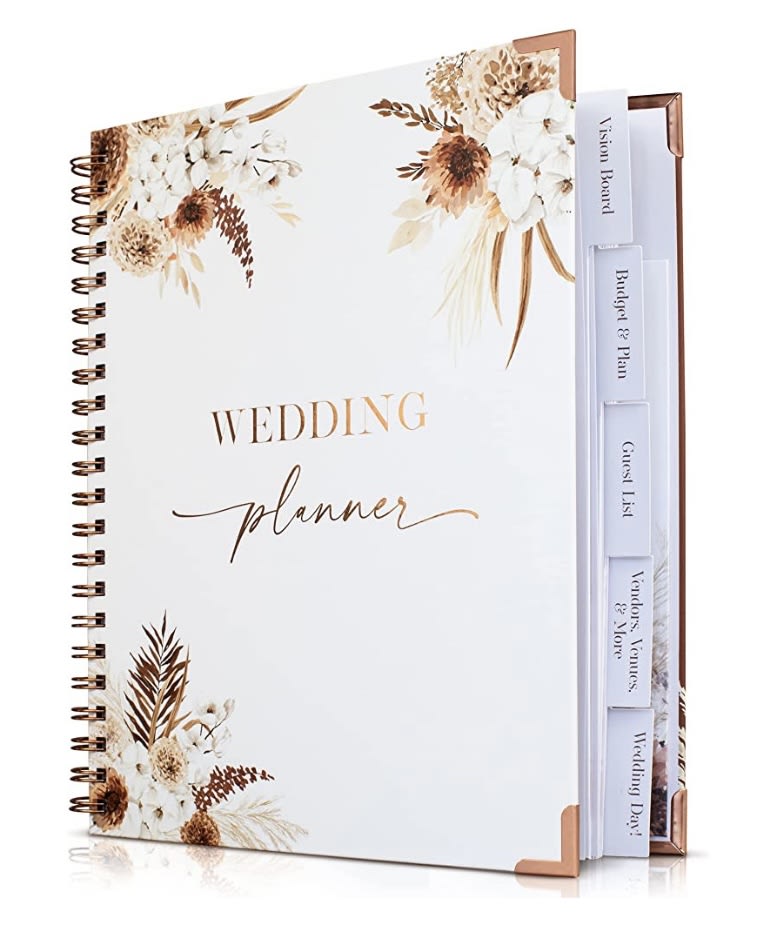
20 Responses to Option D
Really like how it uses the entire cover and graphics are real nice
I like the simple illustration on the cover and I believe the tabs in the book will really help organize everything
I prefer and would be most likely to purchase option D because I think that it has the most interesting and visually appealing wedding planner cover design out of the four options above.
Fir me I picked it because I feel this font is just so stylish and unique.
I ranked them this way based on color, as well as functionality.
B seems a bit cheap to me. D looks really elegant and the design is very nice and pleasant. A and C i dont like the angles but like A a bit better.
I went with Option D because it stood out as being a newer design and more classy than the other options. I see designs like C and A every where, they are overdone.
I like the design, and the little tabs that option D has. Its very gender neutral when compared to option B as well. It would be my top choice here. Options C or A would be my second choice.
I chose D because I like this design and like that it shows the tabs of the planner.
I liked that option D had tabs and I liked the overall design. Option A and C looked the same to me. Designwise they both looked nice. Option B, I thought the design looked a bit childish and lacked a more mature look to it.
I think the font and floral/wreath designs used in Options D, C, and A all look very good and professional. The only one I dislike is Option B, which looks like a poor choice for a wedding planner.
I prefer option D because I like the colors and the details the most
Option D is the one that is prettiest to me. Maybe it's because I can see the tabs for organizing, but the image itself appeals to me more than the others as well. Even if the description says it has tabs, seeing it is different.
The white and gold is very elegant and nice overall I'm a huge fan
I like this one it is a simple look and stands out really clean it does draw my attention the fastest,I would buy this one for a wedding book
Option D looks the best as I want a fall wedding. Options C and A appear to be identical. Option B is the worst, the heart print is childish/.
I like Option D because it's not only beautifully done, but obviously useful. I like the design of Option B over the design on Options A and C.
I prefer option D because this planner design looks the most elegant and sophisticated, serious yet beautiful.
I will never plan another wedding again, but I do like the cover of choice D. Choice B is playful. Passing on choices C and A as they are the same and boring.
D has a nice classy style and the tabs seem helpful for organization
Explore who answered your poll
Analyze your results with demographic reports.

