Poll results
Save to favorites
Add this poll to your saved list for easy reference.
Which design do you like the most and why?


Option C won this Ranked poll with a final tally of 28 votes after 1 round of vote counting.
In a Ranked poll, respondents rank every option in order of preference. For example, when you test 6 options, each respondent orders their choices from first to sixth place.
PickFu requires a majority to win a Ranked poll. A majority winner differs from a plurality winner. A majority winner earns over 50% of the votes, whereas a plurality winner earns the most votes, regardless of winning percentage.
If an option does not earn a majority of votes, PickFu eliminates the option with the lowest number of votes. The votes from the eliminated option are reassigned based on each respondent’s next choice. This process continues in rounds until a majority winner emerges.
Scores reflect the percentage of total votes an option receives during the vote counting and indicate the relative preference of the respondents. If there is no majority winner, look to the scores to see how the options fared relative to one another.
| Option | Round 1 |
|---|---|
| C | 56% 28 votes |
| B | 24% 12 votes |
| A | 20% 10 votes |
Age range
Amazon Prime member
Education level
Favorite book genres
Gender identity
Options
Personal income range
Racial or ethnic identity
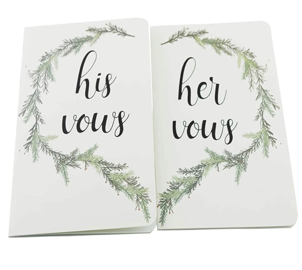
10 Responses to Option A
Option A that is so unique! I've never seen one like that and that's why I like it the most and that's why I would pick it! That is really creative!
a/ I like how elegant and professionally made it is also it creates a heart when you put them together which is romantic. Also the design and font is well made. C/ I like the font and that its laid in gold but i do not like the simplicity of the book sorta like a bible is what it reminds me of so unless its for a religious couple i would not get it. B/ Its cute for the heart shape but the color is off, it is ok for a valentine wedding but any other time maybe a different color and font design or it seems cheaply done.
I love how the the cards go together and it looks like a heart. It's like two joining to one.
While I basically liked all 3 designs I chose a first because i loved the design that forms a heart and how the look of the branches looks. I chose b next because the magnetic heart shape is adorable and unique. I chose c last because the books seemed very formal and basic looking.
Between the three different options, I really enjoyed the design for option A the best. I thought that this one was extremely creative and also that it was very simple, which I really enjoyed. For things like Valentine's Day, it seems like the designs, cards, and marketing, is always really over the top and I appreciate it this simple design. Next, I decided to go with options c as the next option that I really enjoyed. I thought that this one was also very simple, and I really enjoyed how the colors were not traditional at all. I thought that the text on the writing was also very high class looking and I really enjoyed it. Finally, I decided to go with option b as my least favorite of the three different options. This one was extremely typical to me and it just looks like something that I would have seen over and over again before. I really did like the design though, but it also did just seem a little bit juvenile in my opinion.
I like the use of leaves/branches and how when both sides are put together is makes a heart. It feels earthy and natural and romantic without being too precious. Option C feels more modern, classy - and it's nice with the bookmark. I like the way the text is split between cursive and plain but I am not crazy about using pink on both the man's and the woman's. Option B is too, too precious (dare I say, too Hallmark). The magnet is clever - but it being a heart (and a reddish one at that), is just too much.
Option A looks more specialized and specific plus the design is great. Option C is a basic version of C. Finally, B seems too niche.
Without a doubt option a, it is clever and I've actually never seen anything like it. Unique and something nice to keep around. Option b is clever too, but a bit too small, or at least appears that way.
Option A was very simple, but elegant. I liked how the two came together and they formed a heart with the brush going around the outside.
After carefully studying and comparing all three vow images displayed above, I selected Option A as my first preference and the one that I would definitely click on to purchase for my own marriage preparation. I felt that this image had, by far, the most eye catching appeal to me based on its unique design and quality of the image. Option C was my second choice followed finally by Option B with all three rankings based on my own personal opinion of the relative attractiveness of each product image.
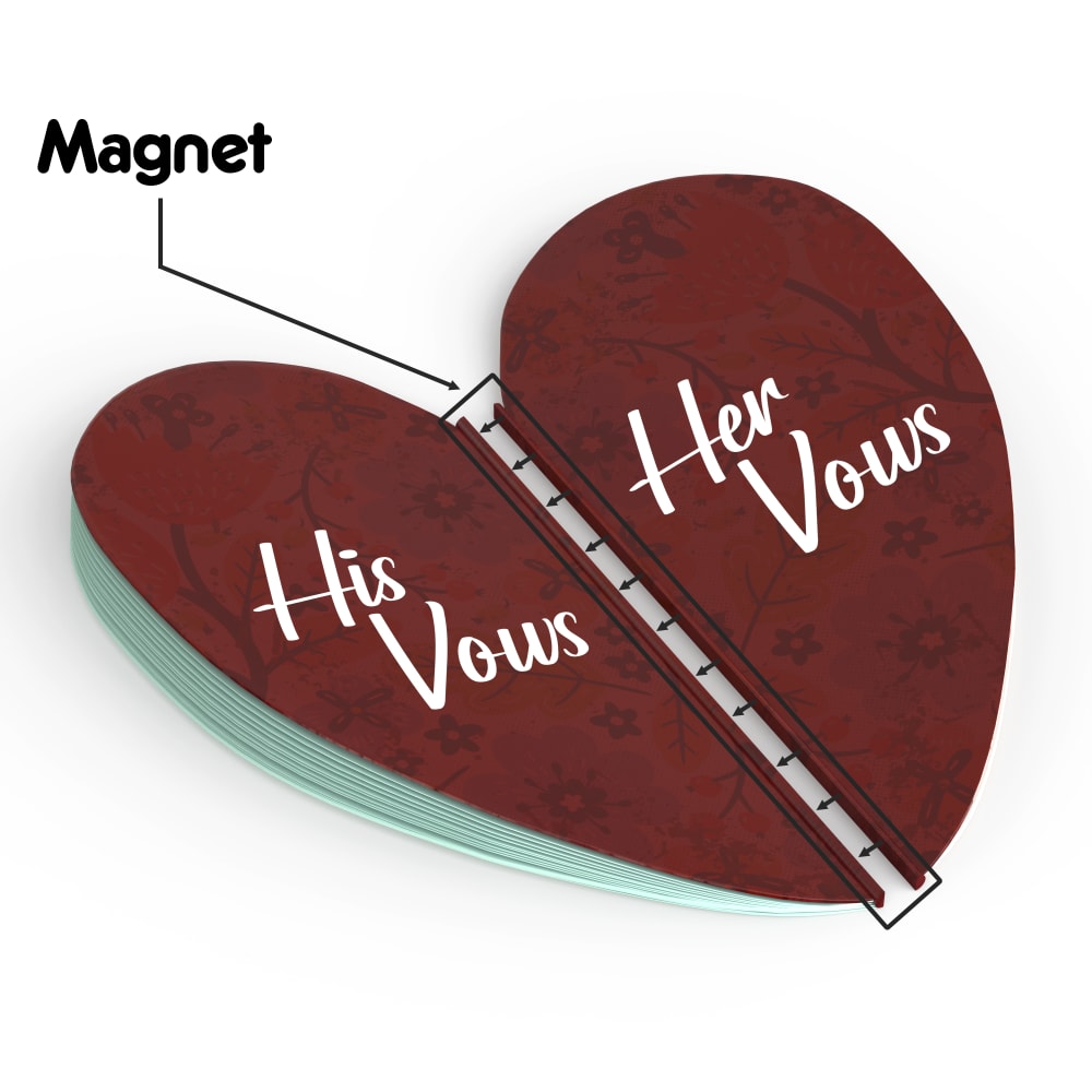
12 Responses to Option B
The heart is a fun way to separate the his and hers parts of the book seen in B.
I like option B the best, I like the romantic heart shape and I like that there is a magnet in the middle attaching them together. Option C looks good and has nice font but I don't really like option A.
I think with the heart shape in Option B it just screams love. The color and shape of the heart looks like two being combined to one. This would be perfect for vows. Option A also has the heart shape and would be great, but reminds me of a Christmas wreath or similar. Option C just seems bland when compared to the other two.
I think B is the most creative and I like that they combine with a magnet. I like the font and simplicity of C, but I don't care for the leaf design on A.
I'm partial to the heart shape. It's cute and I like how it opens and has a magnet.
I like option B the best. I like the shape of this one and the colors being used. I think it’s cute
B I like the halves, design color and easy to read text. C second but Her should be in pink would look better.A don't like. It looks cheap compared to the other two which are higher in quality.
I prefer this one it is the one that feels the most romantic to me, I really like that it stands out and I like that it is a magnet and that both the vows could be contained here.
I really like the heart design in Option B, especially with it also being painted red. It's a nice touch that's traditional yet also a bit creative. It shows the idea of "love" to me. Option C is second because I think it's good to show two distinct colors for "his" versus "her." Option A is last because it's a bit too plain for my tastes, especially with the all white background color.
Option B' is my preference because it appears to be the most interesting and has the most pleasing design.
I actually love the designs that fit together like choice B and A. I have never seen that before and I feel like it would be a really cute thing to have and keep forever.
I love that the actual thing looks like a heart, it is cut out in the shape of the heart, it looks great! it is a unique shape, even if it makes it harder to write on. I also like that the magnet will keep it shut, very nice design.
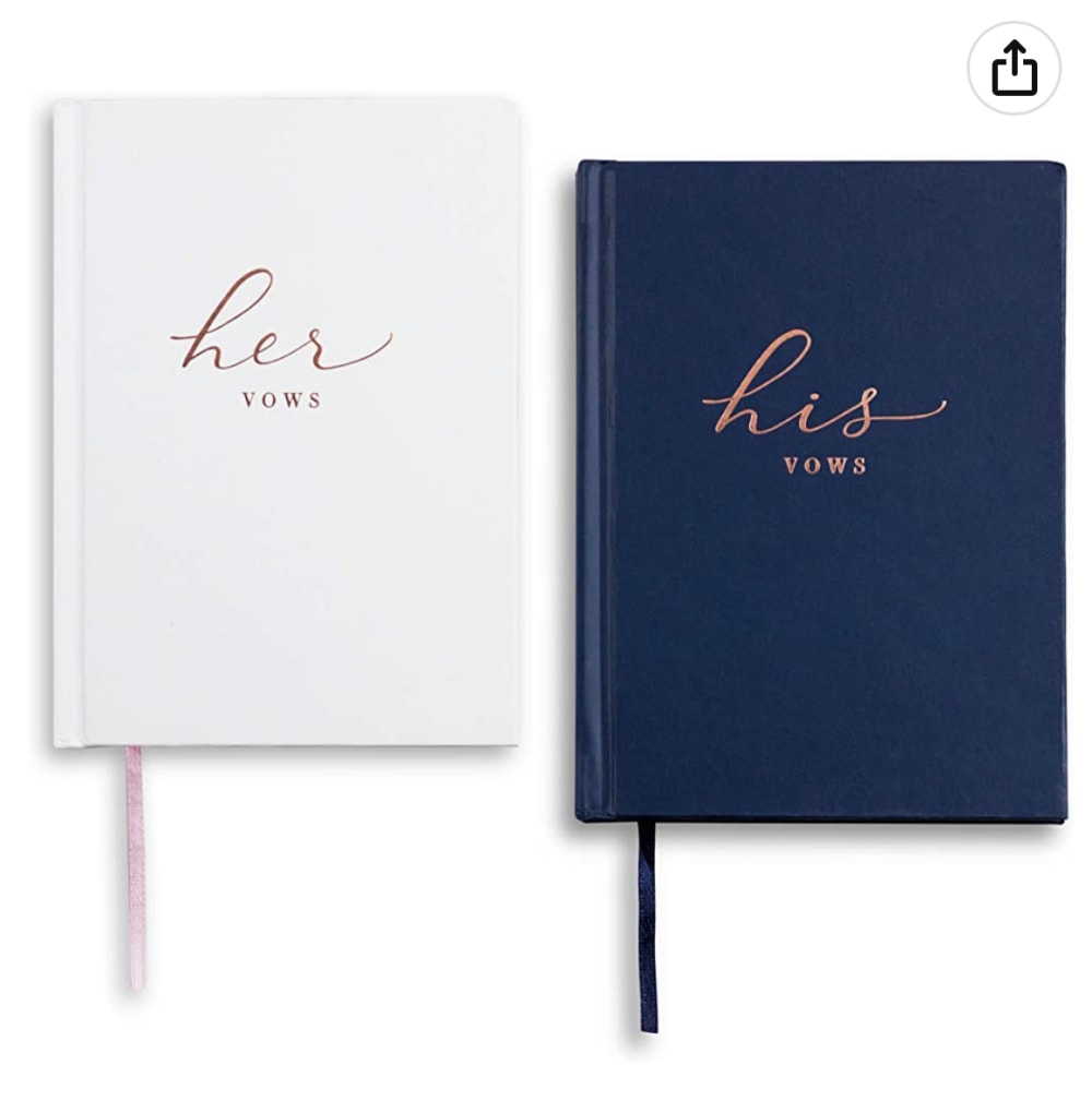
28 Responses to Option C
Option C seems timeless. As clever or neat as the other option are, I feel option C would never go out of style or would I ever tire of looking at it. I think this would be the most endearing looking book of them all.
I LOVE option C. It's so cute and simple and not too much. Option B is very very tacky and I don't like it at all.
I like C because I like the blue color and I like how simple it looks then B because I like the red color of it more than A which looks a little plain.
I prefer option C. I like the simple design. It is unpretentious.
C has a more professional and classy look to it. This looks more serious and sophisticated to me.
I chose option C because I think the small books would be more durable and last longer than options A and B. I also think the navy blue color is more suitable for men than the colors / styles of the other options.
While I do like the red, I don't think it's very feasible for use. That's why I picked the two that looked more like books that can be written in comfortably.
C is simple yet beautiful. I think hearts are way too cheesy. I don't like the design of the leaves in A or the color of the leaves. It might be better if it were beautiful flowers.
I like option C the best, because it looks the most professional and fancy of all the choices. I like the color schemes; pink and white for the woman, and dark blue for the man. It is very sleek and attractive looking. Option A is next, because while it doesn't look as fancy as option C, it still has a nice design with the leaves encircling the text. I don't like Option B, because the heart doesn't look very good to me. It is not really shaped much like a heart, and the color is too dark, like blood. I also don't like the pattern printed on the heart, because it looks chaotic.
I like the clean look of the solid colored books with the simple script. These look like they would last a lifetime.
vows sound serious, the books in C look fitting the purpose. then A. B looks too much like little kids toy
The magnet format on B (as well as the heart shape) felt juvenile and tacky. C felt the most classy and elegant.
I think A looked a little plain so I ranked it last. A had a neat concept with the magnets but I think the overall design is a little cheesy which I don't personally like. I liked that C had two separate books which I think is cool and the colors were nice. So ultimately I went with C as my pick.
I like option C because it is simple. I would want something that doesn't stand out.
I like Option C because they look nice as stand alone pieces or great together. Very timeless design.
I like the classic and traditional look of my first choice. My last choice looks too complicated for what it needs to be. The second choice is okay but it does look a bit old fashioned so I would prefer the classic look of my first choice.
I like A and C more than B because they are standard rectangular books. I like C more than A because I really like the color of the font and I like that the books are two different colors.
I prefer the books acting as separate things and not as something that has to come together which is why I prefer option C. I think that option A is less cheesy than option B because it isn't a weird magnet connecting the two halves to become a heart.
C is classy and timeless. I'm not particularly fond of either of the other two, but I do prefer A to B. A looks a little dated but B looks like a broken heart.
I prefer Option C because since it's a notebook it would be easier to keep it in a place and not lose it. I like that there are multiple pages so you can always write down more things over the years and be able to look back on the things you wrote for each other.
I like option C most because it looks the most practical. It looks like a little booklet that is more sturdy than the others and has enough space to write in the vows and keep them as a keepsake. It also looks classy and classic. B is next because it is a nice idea to be able to keep the vows on a magnet. This way it is easily accessible and easy to be reminded of the promises while looking in the fridge. Option A just looks like a flimsy card and wouldn't be a nice keepsake or anything special. It might easily get damaged and wouldn't be a special reminder. It would just get lost among other cards.
I first chose option C because I like the blue color very much. I then chose option B because I like the heart shape and I chose option A last because it does not stand out to me.
When it comes to items like this I tend to like simple better than anything. I also like the dark blue tones of my choice as well, because the offset white goes well with it together.
When it comes to paper designs I prefer a simplistic design. Therefore with these three options I choose option C as my choice. The design or format is clean, simple, and inviting.
I love C the most because it is classic. Its elegant simplicity draws attention in a way the other options fail to do. Love the colors and the font as well.
The heat looks nice, but I don't think there would be as much room to write and it looks like it would be awkward to read anyway. I like the other two as they both fit well and look more professioanl.
The option C looks expensive and for a long term. The second option B is very creative and eye catching. The third is pretty, too, but it steps down for uniqueness and creativity.
Option C seemed the best because something as important as vows feel like they deserve a journal style entry. Option A was second because it looks very classy and I like how the branches form a heart. Option B was last because it feels really tacky and more like something young kids would use while dating rather than something to use when married.
Explore who answered your poll
Analyze your results with demographic reports.
Demographics
Sorry, AI highlights are currently only available for polls created after February 28th.
We're working hard to bring AI to more polls, please check back soon.

