Poll results
Save to favorites
Add this poll to your saved list for easy reference.
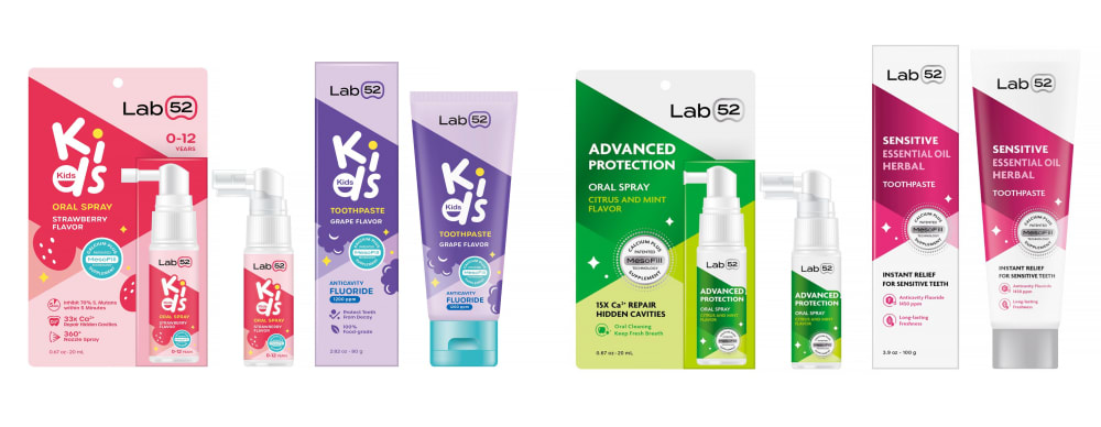
Which product packaging do you prefer to buy on Amazon? (Oral Spray and Toothpaste)
Option C won this Ranked poll with a final tally of 26 votes after 3 rounds of votes counting.
In a Ranked poll, respondents rank every option in order of preference. For example, when you test 6 options, each respondent orders their choices from first to sixth place.
PickFu requires a majority to win a Ranked poll. A majority winner differs from a plurality winner. A majority winner earns over 50% of the votes, whereas a plurality winner earns the most votes, regardless of winning percentage.
If an option does not earn a majority of votes, PickFu eliminates the option with the lowest number of votes. The votes from the eliminated option are reassigned based on each respondent’s next choice. This process continues in rounds until a majority winner emerges.
Scores reflect the percentage of total votes an option receives during the vote counting and indicate the relative preference of the respondents. If there is no majority winner, look to the scores to see how the options fared relative to one another.
| Option | Round 1 | Round 2 | Round 3 |
|---|---|---|---|
| C | 38% 19 votes | 40% 20 votes +1 | 52% 26 votes +6 |
| A | 32% 16 votes | 34% 17 votes +1 | 48% 24 votes +7 |
| B | 22% 11 votes | 26% 13 votes +2 | Eliminated 13 votes reassigned |
| D | 8% 4 votes | Eliminated 4 votes reassigned |
Age range
Education level
Gender identity
Number of kids
Options
Personal income range
Racial or ethnic identity
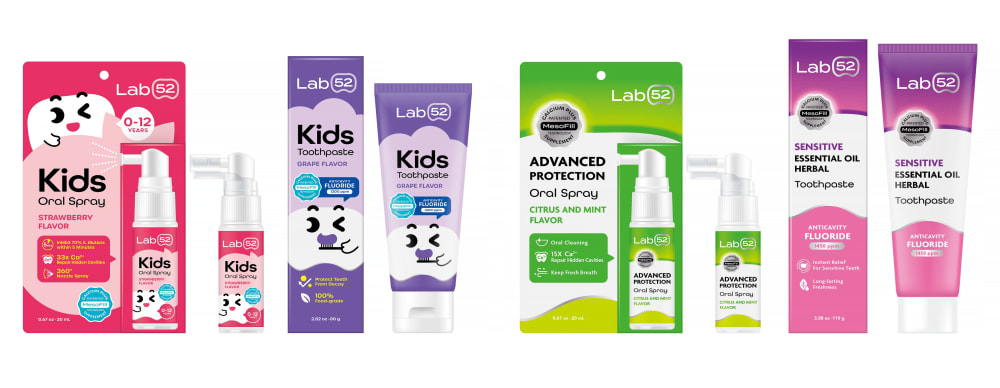
16 Responses to Option A
The colors were too dull and faded in B and D and increasingly so; I liked that A felt the most vibrant.
A & C feel more modern. They use colors well. D's colors are dull, and the issue is similar with B
I absolutely love the look and the bright colors in Option A. They're pretty much perfect.
I would choose choices A and C first because they are more visually pleasing and the details of the product are easy to read through as compared to choices B and D for me.
I like the darker colors over the pastels. I think the darker colors make the packaging more defined.
I like option A as it has the best way the "Kids" word is highlighted. Its easy to see that and is written in a funny childish fonts manner so I think kids will recognize this and like it more. If the package had the same kitty face that is in the Option C that would be the best. Option C is the second because of the kitty face but the kids fonts are written in a common fashion and looking at A and comparing it with C I think A still looks better. Options B and D look a bit dull
I think A is the most vibrant and eye catching. I think the more saturated colors would be more appealing to kids.
I love the bright color of the packaging and the fun jovial font in option A, you can tell that this product is marketed towards kids in this option.
I like the brighter packaging just because it grabs my attention more than the muted colors. I also like the more fun text because it fits better with a children's product.
I chose the order based upon how appealing each one was.
I prefer to purchase option A' because the packaging has a really appealing design and attractive colors.
I like the deep, rich colors of design A, as well as the fonts, followed by C and others
the vivid colors of A and C make it stand out more to me
All are great. A is the most clearly for kids. D and B are a little too subdued.
I think on a the packaging is a little brighter than the rest, and if theres one thing i enjoy its a nice bright packaging.
These packages are more striking in general and more colorful in addition to having a better presentation.
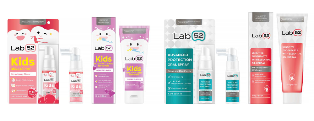
11 Responses to Option B
I like the color of the blue one the best for choice B. I also like D, the colors are light and pastel. The other two are good and bold too, but I like the first two better anyway.
All the products are ranked sequentially as per the color brightness and attractiveness caption design and font which is easily readable.
B and C both have the cute pictures of teeth but B looks more serious of a brand.A looks more fun
i prefer the packaging in option B because of the professional and effective look of them
I liked the art style on the packaging in Option B; the teeth looked cheerful and fun. Option C had fun art on the packaging, but it wasn't as well-drawn as Option B. The colors used for the packaging in Option C were vibrant, but lacked the character/teeth designs used on the previous options. Option D's colors were too muted.
B and C have the most fun, friendly, atractive images that capture your attention.
I prefer the darker options as they pop out to me and just look like better quality
I LIKE THE SOFTER PASTEL COLORS IN OPTION B AND D BETTER THAN THE OTHER OPTIONS
I prefer the cute images on B and C, and that the font is horizontal and easy to read.
The package design of choice B is so cute and a lot of fun, i'd go for that one. Choice C was a close second. The colors are choice A are alright, but no characters which is kind of boring. And choice D isn't as appealing that I am passing on this one.
the color design here are quite attractive, they are nice and beautiful, i really do love them
19 Responses to Option C
I like option C the best because I like the solid vibrant background colors that are used because it makes the packaging stand out more to me compared to the other options. I also like the tooth caricature graphics, which are catchy and I think would motivate kids to use the tooth paste and the spray.
I think kids are more drawn to characters and bright colors. They would be more willing to use products that they think are fun. Option C is the best option that shows that.
I like the vibrant colors of this option. They help distinguish themselves from other products that may be on bathroom counter, and that’s useful for people like me that wear glasses and don’t wear them while getting ready in the morning. I also like that the children’s products have cute kiddie images on them, so the kids know what products are theirs.
I like the dark and vivid colors of C and A. C is first because the graphics would appeal to kids more. Option D is last because the colors seem too light and washed out.
Kids like the bright colorful products by seeing the advertisement in the television. So I have ranked by the bright and popping product packages as in options C and A. Options B and D is very dull and not appealing
I chose the bolder, more vibrant colors with the little faces first because they are the most eye catching and cutest. They will appeal to kids the easiest I think. Then for the last two I chose the pastels with the faces first for the same reason as above, but chosen third because the colors are washed out and not really memorable. Then the pastels without the faces last because they are the most boring and dull, and least memorable out of the bunch.
The colors on the packaging are bright and they have the words "kids" spelled out so I know it is for them. I like it being bright so I can find it in the cabinet.
I like the bold colors in C, plus I can read “kids” as kids easily, which I could not in A. B the labeling is still clear but the packaging isn’t as attention grabbing. D’s packaging looks like it should go with an air freshener or feminine hygiene product.
rank c : i like the simplified art work that would appeal to kids and adults and just makes me think it is a brand that specializes in making brands for kids , option A had fun fonts that draw the eye to it making you know which is for kids and which isn't making it simple to choose from.option b has really cute art work on it that split adult and kids but it doesn't quite tell you plainly without reading it which is which . Rank D while is very simplified and plain which is nice to look at , would not help anyone not knowing and a child could grab the adult version or the other way around .
Option C is my top choice here because the label information is much easier to read in terms of understanding the benefits and features of the product.
I like the brighter and more saturated colors.
I like the little tooth character. I think my kids would appreciate it. I would pick C because he appear most in those options
I really like the look of all of them i picked the ones that i would go to first
I like how the colors pop on C, A, and B. Option A is a bit hard to read, but it's a friendlier look than option B. Option C is in between those so I liked it the best.
I like the brighter packaging for kids. The bold and vibrant colors will likely be more appealing to a child. I also like how the colors would make these items really stand out on the shelf (or in the drawer) so a parent can easily identify and grab the item for their kid.
I like ones that look like they are or kids but also haveinforation that shows or looks like it is a good quality product. C D did best job of this I dont like how kids was made with animation in the other two particualry A
I like the bright colors on the packaging. It makes the products really stand out
I think the brighter colors work better so option C and A. I like that the bright colors make these stand out more
The label on C looks cute and very kid-oriented so I think it would make using it fun.
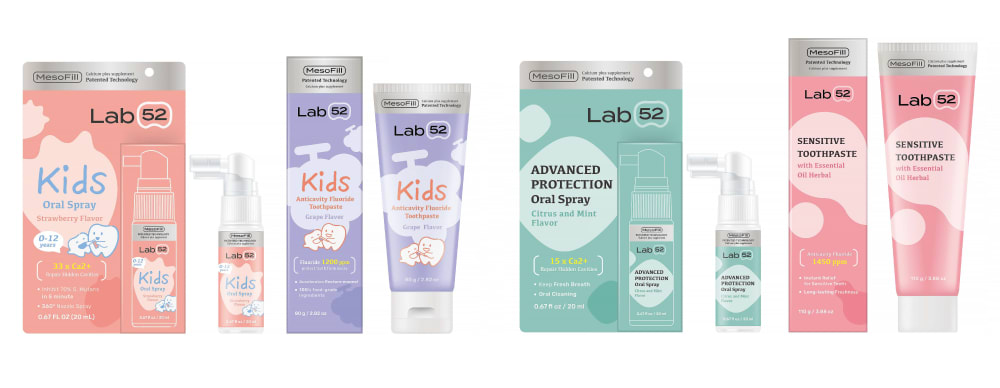
4 Responses to Option D
I choose option d first because I like the color and the font combination the best. I rank the other options from what I like the most to the least as far as color and font combination.
Definitely D, the colors are different to what the medicine usual colors are. The product looks better quality and effective
I like the color scheme on this set the best. I like the lighter look on the colors. I think they look refreshing and they look the best visually as well
I think it looks the most kid friendly and easy to read/understand packaging
Explore who answered your poll
Analyze your results with demographic reports.
Demographics
Sorry, AI highlights are currently only available for polls created after February 28th.
We're working hard to bring AI to more polls, please check back soon.

