Poll results
Save to favorites
Add this poll to your saved list for easy reference.
Which product would you rather try?


Option C won this Ranked poll with a final tally of 51 votes after 3 rounds of votes counting.
In a Ranked poll, respondents rank every option in order of preference. For example, when you test 6 options, each respondent orders their choices from first to sixth place.
PickFu requires a majority to win a Ranked poll. A majority winner differs from a plurality winner. A majority winner earns over 50% of the votes, whereas a plurality winner earns the most votes, regardless of winning percentage.
If an option does not earn a majority of votes, PickFu eliminates the option with the lowest number of votes. The votes from the eliminated option are reassigned based on each respondent’s next choice. This process continues in rounds until a majority winner emerges.
Scores reflect the percentage of total votes an option receives during the vote counting and indicate the relative preference of the respondents. If there is no majority winner, look to the scores to see how the options fared relative to one another.
| Option | Round 1 | Round 2 | Round 3 |
|---|---|---|---|
| C | 31.91% 30 votes | 38.3% 36 votes +6 | 54.26% 51 votes +15 |
| A | 28.72% 27 votes | 32.98% 31 votes +4 | 45.74% 43 votes +12 |
| D | 25.53% 24 votes | 28.72% 27 votes +3 | Eliminated 27 votes reassigned |
| B | 13.83% 13 votes | Eliminated 13 votes reassigned |
27 Responses to Option A
I would choose A first because of the design and flavor over the others. I woul dchoose C next because I like lemonade. I would choose D over B because I do not like the spiked label on B.
I picked option A as the first choice because the can looks enticing and high end. All of the other options are okay, but not as eye catching. Option B and D look like they'd be sold in Mexico.
I'd be interested in Option A, C, or B. They all look interesting with some cool graphics. I picked Option A because I personally love anything mango. I will try any new product with Mango at least once. I also liked the chill beach scene and the graphic style of the can. I picked Option C second but I actually liked the graphics on this one the best. The flavor wasn't one that stood out to me but if I saw this on a shelf I'd want to check it out. I liked Option B because it reminds me of some Mexican sodas I used to get as a kid. It definitely invoked some nostalgia in me. I liked the label color also and Prickly Pomegranate sounds like a new flavor to me so I'd give this a try. Nothing about Option D really stood out to me. With the other options available, I'm not sure I'd give it a second glance.
All right, so all of these looking really interesting! I love the design on all of the labels - they're all so cool! But flavor-wise option A comes first for me. I like mango, so this one wins in that regard. After that is option D with the watermelon. I've never had prickly pear, but I know I like pomegranate, so option B comes next, and finally there's option C because I'm not super crazy about lime. I'd try them all though! They all look awesome and tasty! Really, it would be so hard to choose a favorite based on design. They're all so different and so cool! All of the designs make me want one of each!
I chose A because I really prefer the taste of mango to the other choices and there aren't too many mango drinks, I think it's something unique.
Options A and D make me feel nostalgic. Also I'm more likely to think to myself that "I've tried this before so I'll get it again". than the other two options. Option B is kind of unpleasant to look at. While option C's design is downright strange.
A is the best. It has a very attractive can, large size too, so it's reminiscent of Arizona Iced Tea. The name is bold and puts Spiked right at the start. I love it. C is great too. It's got an interested and quirky can, and it's big.
Mango is better than pomegranate which is better than unknown with beats lemonade.
A because the imagery is appealing and it clearly states it is alcohol. Next is B because I like pomegranate slightly less than mango. I think C is more manly. I’m afraid D looks too close to just sparkling water and could be confusing to kids.
Of all the flavors, mango is my favorite.
The bright orange rally catches your eye
Mango is my favorite flavor so i would definitely try that one first. C i would give the lemonade a shot but am unsure about it. Im not sure how prickly pear tastes but i know that i do not like Ds flavor at all.
I selected them by the flavor of the beverage and nothing else; I prefer mango, limade, pomegranite and watermelon in that order.
While all cans look fine, Option D has the most common look from the rest. It is absolutely something I can see getting lost in the shuffle while looking for drinks in the super market. Option C actually has a very stand out look. The break in colors from silver to green is nice, and it gives a very smooth looking impression, enough to look good. However, Options A and B are just so much more unique and good looking, that Option C is not as good. I like the unqiue look of B, something that I do not see often. It also just looks like it would taste good with a mix of flavors. A very good job on blending colors like that. However, A is the best of the bunch. Very good colors, familiar look, but completely unique at the same time. I can look at it and think "refreshing." Tough choice between B and A, but A would be something I like more.
i feel that the word spiked makes it very self explanatory and allows people to know what theyre getting and already have an idea or even a memory in their head.
I like A the best as I feel the flavor would be my favorite also the colors on the can really make it stand out and make me want to try it.
A has the best combination of packaging and flavor. Like I don't even drink alcohol very often nowadays but that looks like something great to try. Past that D looks alright although the can makes it look like a soft drink rather than a harder drink given how colorful it is. Love the art in C and use of purple for the pomegranate but I don't think I'd like the taste. Pretty sure the art on C's can would cause me to bounce right off of it.
I chose option A as my first choice because out of all the fruit flavors offered, I like mango the best. I chose C as my second choice because my next favorite flavor is lemonade/lime flavor. Lemonade/lime is also very good as a spiked drink. I chose D as the third choice because the fruits displayed on the can (slice of (watermelon/lime) would be a good spiked drink flavor. I chose option B as the last choice because pear and pomegranate do not sound like they would taste well together.
My top choice, Option A. I made this decision based on the flavors available. I tend to like drinks that contain mango and have had other alcohol type mango drinks and they have all been pretty good. My second choice I chose as Option D, the watermelon lime, but in all honesty, I would not try any of these other drinks as they do not appeal to me personally. I think that the "prickly pear" pomegranate sounded good until I noticed that these were alcoholic drinks and my stomach turned because they would be good as a juice, but in my opinion not something alcoholic, but again, just my opinion. As well, the other two choices did not appeal to me in the same respect.
I chose A first because Mango is one of my favorite flavors, as a fruit or flavor. I chose B second because prickly pear pomegranate sounds like it would taste very good, but not sure. I chose C because it is a safe flavor, depending on the mix the taste can go either way, great or too tart with an aftertaste. I chose D last because I do not prefer the taste of watermelon flavored beverages, not saying I couldn't be pleasantly surprised, it just wouldn't be my first choice when presented with the others.
My first choice is option A because the colors are perfect together and I like the design including the beach and palms trees.My second choice is option C because the colors are bright; I think the small water bubbles are very clever and everything looks fresh. The only reason why this is not my first choice is because of the main picture, I don't understand very well the purpose of the mouth and why it is open like that.my third choice is option B because I really don't like the solemnity of the colors, they are kind of boring together; they don't look bright and fresh.My last choice is option D because even though I really like bright colors, I feel this is already too much. The colors don't go together and it is a kind of exaggerated design.
If I based my choice on appearance alone, I would choose B and C because they are more colorful. However, I chose option A because the Spiked label caught my attention first and option D because it says Shiner. I would want it to be refreshing as well as make me feel sociable on a good Sunday afternoon. Options C and B are last because my eyes weren't drawn to the "spiked" or had words like water in it.
Option A is the most attractive choice because the colorway is much more attractive and reminds me of Summer. I like C as number 2 because I think the design is very modern and cool. Option D has colors that pop and engage. I don't like option B as the colors are too dark and not very summery.
I like mango the best because its my favorite food
Visually, #1 caught my attention right away. The image of a beach and water lends to me imaging fresh water and a hot day where a cold drink would be refreshing. #2 looks cool, different, I like the lime and the colors chosen, looks like a new product that I would be interested in trying. #3 has a lot of wording going on, I wasn't sure what to focus on first, I like the coloring of the can and the flavor. #4 looks basic, I think I read Shiner and though, what would this brand know about Agua frescas. The art is a little kiddush.
Honestly, I would try all of these. I'm a huge fan of trying new flavors and beverages. (The only thing I don't drink are dairy-based beverages since I'm lactose intolerant)
I like all the options. Option A is the better looking to me. I like the way the label is laid out on this one and the colors
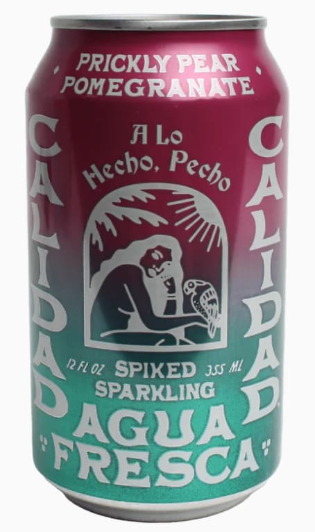
13 Responses to Option B
B has more appealing colors
I prefer choice B because it is a more unique flavor.
There's something about the design in option B that has me curious about the taste - as a plus I also love prickly pear and pomegranate. C looks cool, I'd love to try it. for D, I like Shiner and usually try their limited and seasonal flavors. It's hit and miss for me. I'm not interested in buying A at all. I don't see a brand name and it looks very generic - I'd drink it if it was handed to me, but wouldn't buy it.
Love the colors on this can and prickly pear is a unique and interesting flavor for people to try
I like choice B because I feel that the colors shown looks most eye catching and makes me feel like i'm drinking something cool.
I largely focused on the flavors - I love pomegranate and mango - those were my first two choices. The lemonade option seems too common.
I was not at all interested in drinking D. Watermelon and lime does not sound tasty. Plus, it was hard to figure out what the flavor would be. I really liked B and C because they both were flavors that I would really enjoy—B especially is my favorite. The cans also looked really cool. A was just kind of there. I would drink it if offered, but it wouldn’t be my immediate choice.
I completely hearted the design in B. It was unique and eye catching and distinctive. Something I would both drink and use as decor. I loved the pop color of D and the imagery just not as much as B. A was pretty and fun to look at it but it felt a tad mixed for me and the C just felt too loud and jarring.
B sounds the most appealing, D im not sure but it looks like strawbarry so i like that also, A could be good but mango is hard to get right, C i have no idea about
I really like the color choices on B and the logo design looks nice and simplistic. A is my second favorite choice due also to the nice summer colors and modern design, but I feel it's a little less unique compared to B. C is my third favorite choice because I do like the picture deign on the top of the drink but it's a little less attention grabbing. D is a decent design and I like the color shown in the drink shown but I think the lettering doesn't work so well.
I chose B as my first choice because I really like the color gradient and the art work. It makes the beverage look like it will taste authentic. I chose C next because the graphics look fun and modern. I didn't really feel anything for beverage A, it's nice enough but nothing special. I selected D last because it looks kinda outdated and makes me think the beverage will taste old too.
B had the flavor that I would most like, pomegranate is so good! I also think that A might taste good because mangos are pretty sweet. I am not a fan of watermelon at all so I put D last. C was just second to last because I also am not a fan of lime. Out of all the can designs, I think C looks worst and I love the colors on A. B looks a little hard to read because of the text.
I'm a HUGE fan of the first can and would absolutely buy a 6 pack of that in a heartbeat; the idea of prickly pear cactus fruit with pomegranate just sounds so good. B is simple but gets the job done, I'd definitely try that flavor out. A is pretty basic and a flavor I've seen many times, so I wouldn't be too interested in that one. As for C, I'm really not a fan of the label, and feel like it could do away with the cartoon mouth.
30 Responses to Option C
I ranked them by what flavors I feel is best and would taste good. That is why C is my top choice as I really like lemonade.
The designs and the colors of each individual product were appealing, but the most colorful and professional designs and information got my attention the absolute most.
I picked this one because I like the flavor that it comes in and I also like this one because you can easily see that this is a spike drink that contains alcohol.
The artwork on C is really unique and eye catching. Assuming all of these were in a refrigerator at a gas station, the artwork of C would get me to notice it among all the canned drinks they have, and having noticed it would give it an increased chance of being purchased.
I made my choices based on which picture and colors I felt were refreshing and would make me feel good and energized.
I like C first because it looks the most artistic and unique, then D because I like the shade of green more, then A because it looks like the flavor is better and the can looks like a better brand than B.
C looks the most refreshing/ B is pomegranate which I enjoy/ D is agua fresca which is good/ and A is mango which I also enjoy
C looks to be the most refreshing but also the most interesting package. I like the mix of colors and cool design of this one the most. The lime looks like a mascot in a way, I like it a lot! D is also cool and will definitely get attention on a store shelf. A and B are more dull in comparison to the first two.
I think my top 3 choices are all really good looking. My first choice is because of the unique design. It drew my eye the most and I think it stands out a bit from most drink can designs.
I ranked C and C as the first two because they sound the most refreshing. I enjoy mango so I put A next, but I am not a big fan of the flavors in B, which is why I ranked it last.
Definitely C, love the design of the product. It looks tasty, fun and refreshing
Although option "A" I like because the design gives me a relaxed feeling, option 'B' seems to me the most striking, because you can feel cold just looking at the label.
I think choice C is the one I would go with, it looks tasty and I think out of all the choices it seems to be marketed the best and draws me in. It looks more like a party drink than the others, the others just look like soda to me.
In my opinion and based on the images i could say that the products i would try are the ones shown in options C, D and A, because they have a really appealing design in their cans, making them interesting and fun to look at they could be even stored as decorations, on the other side i find their flavors appetizing and i would really like to try them, also i can say that the design shown in option B and the flavor this drink have isn't of my taste, being boring and simple.
I chose C as #1 because the south western street artstyle and shape of the can stand out to me more as a low alcohol refreshment, the iced lemonade flavor also sounds the most appealing.Options D & A are close seconds from the bright "summer" color scheme used, D "Shiner" would have been the top choice if not for the flavor as the can itself is the most brightly colored of the options available which would be the most eye-catching to me. Option A looks great but the structure of the illustration on the front (font + cursive subtitle) appear generic when compared to other products marketing the same spiked refreshments. The color & flavor are optimal though.Lastly, option B's gradient didn't catch my interest although I'm sure it's a great beverage. The art is simplistic which may actually work to its benefit but pales in comparison to the other options provided.
option C has the best looking label
the first choice i ranked i am digging the design of it got my interest to try this product i would purchase it if i see it at the store
The watermelon and lime flavor looks really nice and has a good graphic design! I like the mango flavor too.
1. I liked because it's that kind of alcoholic drink you'd drink in the heat so it just looks refreshing even though I'm not a fan on lemonade. I'd preferred mango. That's why I rated the mango one number two. Even though I love everything mango it doesn't look too appealing. Maybe with a more refreshing look on the can I'd be more excited about the mango flavor. Lastly I choose the watermelon because the picky pair just looks like it would be too sugary ... maybe with a light purple it would look more appealing to me. I hate watermelon but I'd much rather drink that than prickly pair which looks extremely sugary. Ei. I have sugary drinks.
I chose C because the cool graphics caught my attention and made me interested in trying this product over the others. It also seems to be fun, thirsty quenching, and delicious to drink. My second choice was A because I liked the colors, the alcohol and the mango flavor which made the product tasty to me. My third choice was B because I was interested in trying this flavor combination which is new to me and I also liked the attractive colors and graphics. Finally, I chose D as my last choice because it seem delicious but not as cool looking as the other choices.
Number just looks amazing it reminds me of the old school tattoos , number two color scheme is good aswell the other two are just bad in my opinion.
I would like to try them all but I am more interested in option C which is the lemonade flavor
Option C had a really cool design that would draw my eye to the drink immediately and the flavor sounds good. Option B is my second choice because the can has pretty colors but the design isn't as unique as option C. Option A has a nice design but it's not as unique as Option C but the flavor sounds delicious. Option D the word Shiner throws me off and the design looks like common sodas or sparkling drinks.
Option C has the most eye catching packing as well as condensation on the can which looks very appealing to try. Option A also looks very appealing to try, but doesn't have condensation on the can so looks slightly less appealing than Option C. Options B and D have a more old-timey look to their packaging which I do not find as appealing, but would try if Option C or A was not available.
I like C the most as it has a great design that draws me in and makes me curious about the drink. D is a close second because I am familiar with the Shiner brand. A has a bland design that puts me off, but I like how it displays calories as most alcohol does not show you the calorie intake. I don't like B as it has a bland design and the flavor doesn't sound good to me.
The graphics on can's C and D are very eye catching where can a is a little mellow but still interesting. Can B is very monotone in color and somewhat uninteresting.
From my personal experience limonada/lemonade is the best neutral flavor for spiked drinks, other fruits taste too fruity and then immediately too bitter from the alcohol
C looks fun, artsy, fresh, youthful and different. D is bright and has some fun personality but a little more gimmicky. B looks very authentic and no frills, not necessarily charismatic but seems like it would be the real deal. A is nice and bright and uplifting but it looks a lot more like a wine cooler type beverage to me or some sort of cocktail more than an agua fresca.
C has the most appealing artwork. The colors stand out and the artwork itself is interesting, and the flavor sounds good. D and A have decent looks and decent sounding flavors as well. B sounds like a good flavor, but the visuals on the can are a bit much, and look a bit awkward overall.
Option C is my favorite. It is easy to remember and has nice colors. Option B its kind of what you expect on a can but has attractive colors Option D tells you more about the type of product than the brand and option B I think has too much information
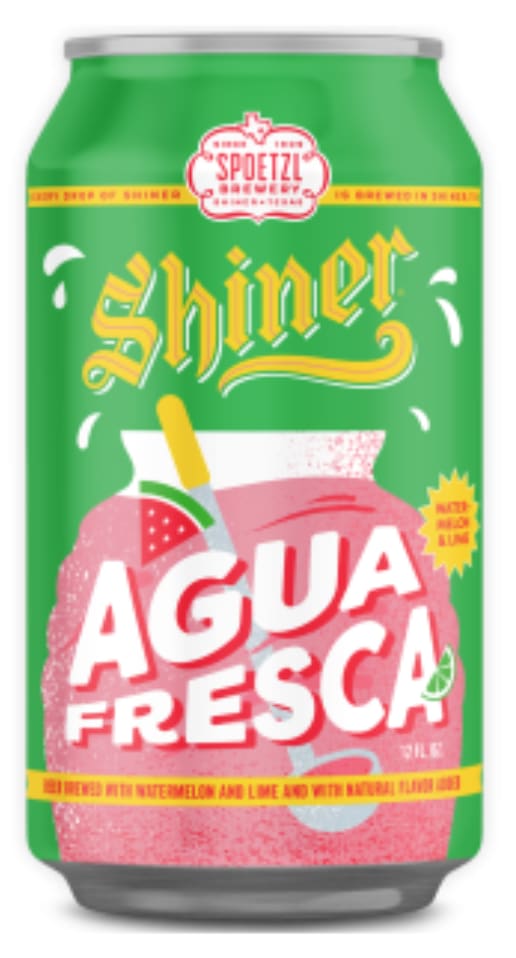
24 Responses to Option D
The only reason why B is last is because of the fact that it seems rather sexist and objectives women. I like D because it is a very neutral pallet, and would draw the attention on the drink, and company of Shiner itself. C showcases that as well, but I feel that its color scheme is too muted, and thus that it is why it is second. However A is too loudm, and I feel that it screams look at me! Which may or may not be good, but I would personally would love to try all these flavors they all seem to be different enoug\h from the adult beverage industry.
I think that D looks bright and that the design catches my eye right away. C and B are nice to look at but they feel a bit generic. A doesn't really appeal to me and I don't really like the design.
i prefer watermelon and prickly pear compared with the rest of the flavors
I chose Option D for its packaging design, ingredients, and because I saw no mention of "spiked" or alcohol.
I would rank them in this order. Choice D is my top choice because I am familiar with Shiner. After that I ranked them based on flavor I would most like to try.
Option D has the best image...an agua fresca in that container as seen in Mexico. The other choices were based on flavors.
I ranked choice D as the highest because I like the green color of the can and I really like the flavor, I also like the aesthetic of the can. I chose choice A second because the colors are really cool and the can has an attractive look. I chose choice B third because the can looks cool but not as good as the D and A. I chose choice C final because I didn't like how the can looked and the color and I'm not a fan of the flavor.
I just picked based on what looked the most appealing and what I’d be more likely to grab myself.
When choosing which one I would pick I went by the eye test first. The eye test to me is which one brings my eyes to the product ( can) and pulls me in to look more at it and read more information.
Brighter colors always seem to work better for the customer at attracting and getting the younger or in getting childrens attention to thier product ,But option C will work better in hispanic or latino communitys and option B makes a better choice for the older adults.
I really like the colorful illustration of the mouth and lime in option C. However, I find the font really difficult to read. For that reason I rank option D at the top. Option D also has a bunch of pink and green which makes it both eye catching and makes it feel refreshing.
Shiner is the absolute best. Prickly pear is great!
Made my choices based on which product I would be likely to buy and taste. The one I am most likely to buy and taste is the one in D. It looks like it would taste good,it's packaging stands out to me and grabs my attention
I picked d, because of how well the can looked, with the bright colors popping off the favor of the drink. I picked C because I am also a fan of how the can looked, from the colorful image as well as the description of the drink. I picked A because while the image looked good, there was a little bit lack of form, with that of the font sizes. I picked B because there is the lack of color when it comes to the image, with the text being all white.
The bright colors in D and then A made the product seem more refreshing, which is what I would want from an agua fresca. C is too dark and foreboding to appeal to me.
It's mainly based on preference. Pear flavor is the least tasteful to me, while a combination of watermelon and lime sounds so interesting.
My favorite is option D. I like it best because according to the can it’s watermelon flavored, that is my favorite of all the flavors. My least favorite is option C. I dislike C because it’s lemon flavored which is my least favorite of the 4 options.
I chose option D as the first option because it has a very attractive color scheme with the use of bright green and with yellow. Option D is also attractive because it has a very refreshing image of a watermelon which attracts me personally. I chose option C because it has a very interesting image of a mouth and it is clear that true dedication went into the creation of this design, more so than the other designs. Option A was chosen next because I prefered the flavor of mango more than option B's flavor, which is pomegranate.
D -has the words larger and looks more desirable, A - Has great colors and appearance, C - Looks good with the white at the bottom but gets weird graphic on top. B - Colors and logo don't look appealing.
Primarily I picked based on flavors i prefer. Watermelon sounds the most refreshing! Mango seems heavy and too sweet
The first option is just so beautiful. The color of the cans is bright and yells out "drink me". I do not like how the other options are designed and look bland and not attractive at all.
The flavors included in each one. I picked by which ones I already like the flavors of. I don't particularly like Mango for example, so it is last. I think the Watermelon/Lime and Lemonade ones would taste best.
D is my first option because I like that they added the barrel that they usually serve agua frescas from! Watermelon lime sounds good as well! C is my second option as I like limeade, and I can tell they put a lot of effort into their design for the can. A is my third option, they go for the paradise theme which is appealing. B is a nice can, but the wording just seems a little too all over the place.
The marketing plays a part in my choices, I think the coloring on the first two look refreshing. And then I ranked it by my personal preference of flavor.
Explore who answered your poll
Analyze your results with demographic reports.
Demographics
Sorry, AI highlights are currently only available for polls created after February 28th.
We're working hard to bring AI to more polls, please check back soon.

