Poll results
Save to favorites
Add this poll to your saved list for easy reference.
Wich design do you like the most and why?

Option B won this Ranked poll with a final tally of 30 votes after 3 rounds of votes counting.
In a Ranked poll, respondents rank every option in order of preference. For example, when you test 6 options, each respondent orders their choices from first to sixth place.
PickFu requires a majority to win a Ranked poll. A majority winner differs from a plurality winner. A majority winner earns over 50% of the votes, whereas a plurality winner earns the most votes, regardless of winning percentage.
If an option does not earn a majority of votes, PickFu eliminates the option with the lowest number of votes. The votes from the eliminated option are reassigned based on each respondent’s next choice. This process continues in rounds until a majority winner emerges.
Scores reflect the percentage of total votes an option receives during the vote counting and indicate the relative preference of the respondents. If there is no majority winner, look to the scores to see how the options fared relative to one another.
| Option | Round 1 | Round 2 | Round 3 |
|---|---|---|---|
| B | 28% 14 votes | 38% 19 votes +5 | 60% 30 votes +11 |
| A | 22% 11 votes | 32% 16 votes +5 | 40% 20 votes +4 |
| D | 28% 14 votes | 30% 15 votes +1 | Eliminated 15 votes reassigned |
| C | 22% 11 votes | Eliminated 11 votes reassigned |
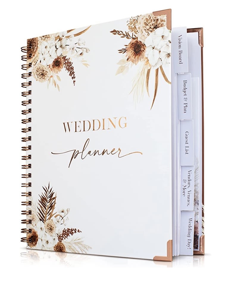
11 Responses to Option A
I absolutely love the color and the overall patterning. It's so unique and gorgeous. I wish the angle of the book was different though.
I liked the options with lighter and more subtle designs.
Option A I love those color choices that are used and how the design is on the corners. The word "planner" the script that is used looks really nice and professional.
I chose A because I feel it is the most simple of all the designs and it looks more classic.
I like A the most, I like the plants with the flowers on the edges of the planner, it frames it really well. B is next, I like the geometrical design with the watercolor flowers. D is next, the ring with the flowers in nice, but in prefer the one in option B. C is last, I think it’s too floral and bright. It doesn’t feel dainty and well framed like the other options.
Option A my first choice for the design like the most because I think it is stunning with the flowers at the corner which seems to send concept of presenting:Second is opt D because of the flowers at the outside of the golden circleThird is C because it is beautiful with the abundance of flowersFourth is B because it is less attraction but also beautiful
Option A is very pretty. I like the usage of flowers, the gold lettering and the font used.
A, B and D are simple, discrete, elegant and timeless. I like the square shape of A better than the round shape of B and D. C is overly busy in comparison.
I like the neutral colors on the cover of option A.
I chose A because I like the colors.
I love the rustic look of the first one, but I almost didn’t pick it because of the way the book is placed, for a first image, I think it should be straight forward, the second one is also beautiful, delicate and graceful, the third one as well but I didn’t like the way it was placed. The last one is pretty but a bit too busy for me, too much going on.
14 Responses to Option B
B first because I like the floral surrounding the titleC second because I like the different florals on the sides of the bookD third because I don’t like the angle the book is displayedA last because the colors are kinda plain
I prefer the cover art designs on my top choices.
I like the title in a shape and I like the shape of B best. I think the flowers on A are ugly.
I'm always looking for the least "ornate" products available. I wouldn't buy any of these.
B I like the center design on the Wedding Planner. C I like the style of the words and the flowers and colors. D I like the divided sections and the greenery. A I don't care for the cover. I like the divided sections.
I picked option D because I like thebloght white background and geometric shaped designs.
I like all the designs but the pink is my least favorite. Options B and D are really pretty and I like the simplicity.
I chose option B because I like the look of the greenery around the frame. I like that this has a classic look.
I like the subtly done colors and art on this planner , it's the one I'd want to carry around with me and open often.
I,picked b because I get a good view of the front cover.
I like the simplicity of this option. People have to remember, men also help plan their weddings, so having something not so girly would be great. My husband walked around with our book only because it was a plain white binder.
I ranked these based on the cover designs/colors I liked best.
I prefer option B because it is the most simple and color neutral.
I like the simplicity of the greenery in option b but with the hexagon twist. Option d is also nice, option a is better than option c which is a little too flowery.
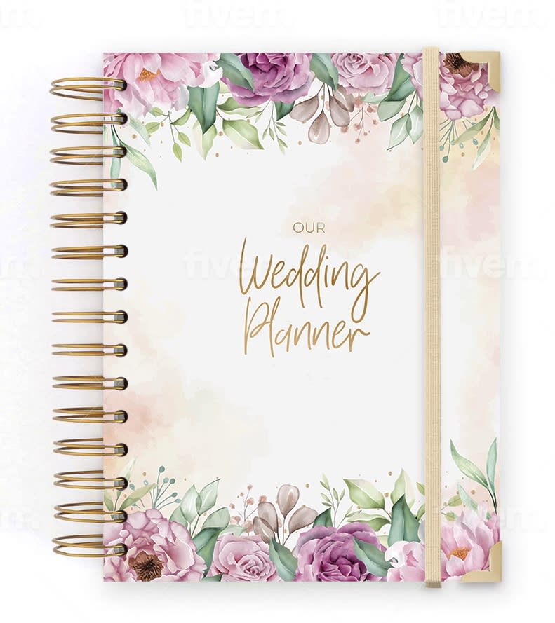
11 Responses to Option C
I put the Wedding Planner books in C, B, D and A order. C is my favorite. I love the design. I would buy C.
Loving the floral wreathes
I love C the best because I love the colors in this one. The gold and pink look so perfect for a wedding. I also love the design because it's full and not as sparse as the other, the whole page is beautiful and filled up with the design. I love it!
These are all so beautiful, but I just love the roses on C.
I like the color very much and the ribbon closure is nice.
I love the flowers accenting the cover of the book.
This one really stands out. The flowers are very bright and noticeable.
I would buy Option C because the colors of the flowers are attractive.
Option B was my last pick because I think the design is a bit boring and overdone and you also only see the front cover. Option D was my third pick because I still think the design is inferior, but at least you can see the thickness of the book and how its arranged. Option A was my second pick because the design is more pleasing that Option D and Option B, but not as attractive as Option C. Option C is my first pick because I think the design is super cute and aesthetically pleasing.
Love the flowers across the top and bottom borders
For me, I love having a bit of floral around the outside of the notebook as it feels high end and fancy to me when I see it. It also looks a lot more detailed which is such a plus for me to see. My favorite is C because I love all the colors that I see and how elegant it all appears to be when I see it
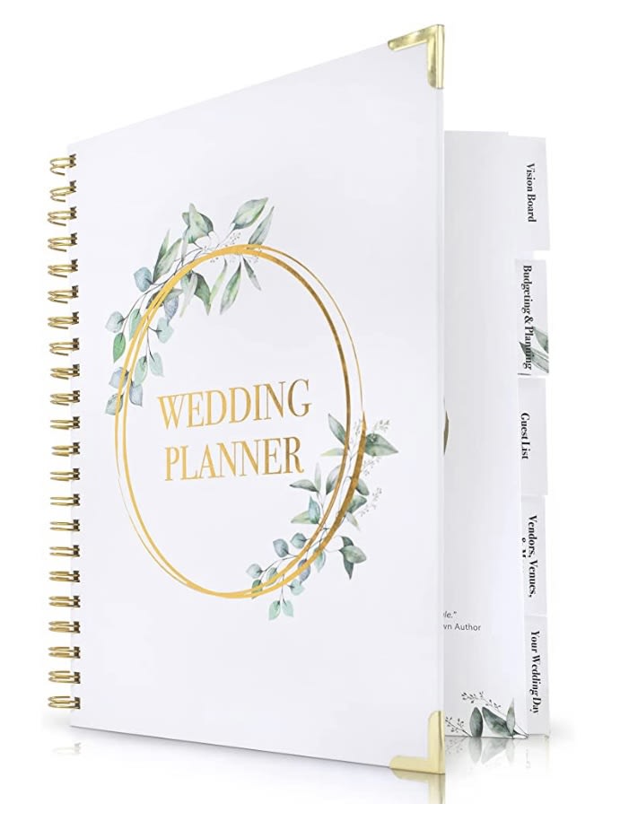
14 Responses to Option D
D was first, I like the simplicity and elegance of the design. A was second, I wouldn't choose this one for myself, but it would be beautiful for a fall wedding. C and B were tied for las place.
Option D is the best with the ring on the cover. Option A is great for an autumn wedding. Options B and C look very plain.
Option C just looks old fashioned. I liked D because it was mostly white, but still had some flowers and the gold ring, which is like a wedding band. The colors are modern for the modern bride.
I liked that option D and A had tabs. It made the two stand out more. I liked the design for option D slightly more. Option B, I liked the more sleek look to it when compared to option C.
I love Option D because the gold ring reminds me of an abstract wedding band which seems fitting, I also love how elegant it looks.
I like that it's white and crisp and has a wedding feel to me.
I chose by options that look the most clean and bright.
Options D & B are the simplest in design and with easy to read font; they could go with many bridal party themes. Option A is a bit floral and the "planner" font is too much. Option C is way to flowery and the font is difficult to read.
I prefer option D. I like seeing the book partially open. I like the greenery on the cover.
I voted D B C A because Iike the more simplistic designs of options D and B.I also prefer the coloring of the front cover flowers.
Although I love my #4 choice, it has some very specific colors that are not always in weddings. My top choice was versatile to many color schemes and groups of people.
I like the design on the cover in Option D the best. Specifically, I like the gold bound spirals and gold circle with the leaf pattern incorporated into it surrounding the title. My least favorite is Option C because I'm not fond of the larger sized spirals.
I like D & B most, sans the "complete" moniker. I don't think it's necessary.
I picked D first because I like that it is kind of simple.
Explore who answered your poll
Analyze your results with demographic reports.

