Poll results
Save to favorites
Add this poll to your saved list for easy reference.
Based on the image, which product image would you click on?
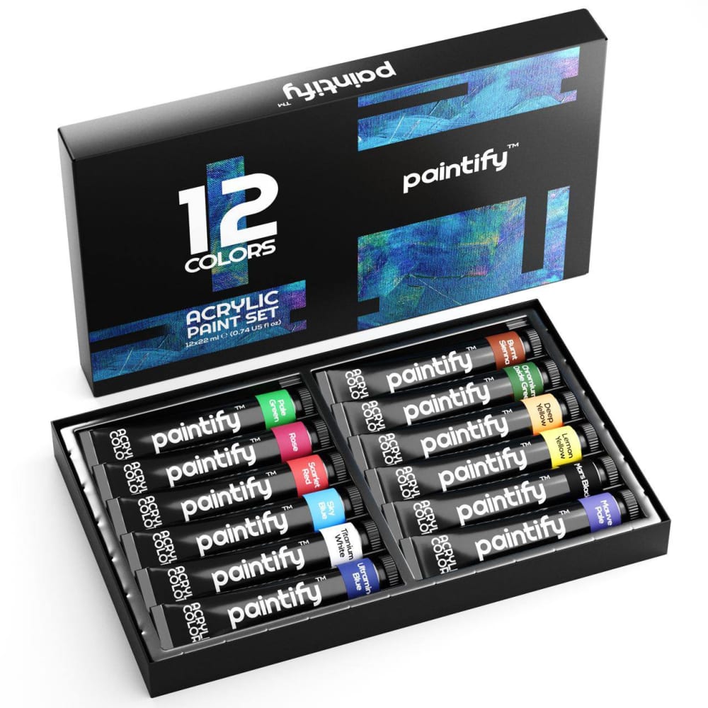
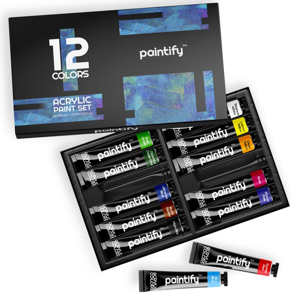
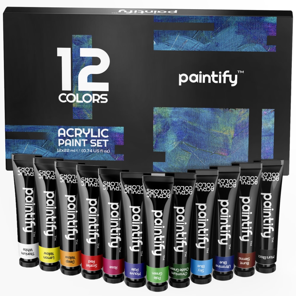
Option C won this Ranked poll with a final tally of 30 votes after 1 round of vote counting.
In a Ranked poll, respondents rank every option in order of preference. For example, when you test 6 options, each respondent orders their choices from first to sixth place.
PickFu requires a majority to win a Ranked poll. A majority winner differs from a plurality winner. A majority winner earns over 50% of the votes, whereas a plurality winner earns the most votes, regardless of winning percentage.
If an option does not earn a majority of votes, PickFu eliminates the option with the lowest number of votes. The votes from the eliminated option are reassigned based on each respondent’s next choice. This process continues in rounds until a majority winner emerges.
Scores reflect the percentage of total votes an option receives during the vote counting and indicate the relative preference of the respondents. If there is no majority winner, look to the scores to see how the options fared relative to one another.
| Option | Round 1 |
|---|---|
| C | 60% 30 votes |
| A | 24% 12 votes |
| B | 16% 8 votes |
12 Responses to Option A
A because the positioning of the objects is very nice, C because I like how the paint is lined up in front of the box. B is last because the paint tubes outside the box, which is overlapped by the cover, just looks messy.
I like the angled view because it gives the product a good sense of dimension. Doesn't seem as flat and two dimensional. Looks very natural this way.
Choice A looks more organized and attractive. Choice B is very close as is C, all 3 look good
I like the one of them all lying out in the tray. The one where they are standing vertical is odd and I cannot really tell what they are.
I like the offset of the packaging I think it adds to the image.
My top choice looks robust and exciting, which is appealing. Looks like a nice product for sure!
I like option a. The layout was very natural. It's very much how I would see it when I open it to use it. It was the most relatable and informative for me.
I prefer option A. The items are very clear to see. I can see which colors will be available to use.
I like seeing them in the box - stacked neatly - that's because that's what it will look like when I get it.
I like option A most because it fully displays the product and I think it is the most appealing image of the product.
I would click on the image on option A as it is appealing.
I like that option A is a simple photo that shows everything. Option C is a little distracting
8 Responses to Option B
I like my first choice because it shows a more dynamic angle for the product, and it also shows what the individual pieces look like removed from the container, as well as the "shelves" within the box. The other two are fine, but my first place choice has the most eye-catching view.
I like the slightly more atypical and open arrangement of B, with some of the products isolated so we can get a better look at how they look.
I like the best of both worlds, having some of the colors inside the container and some outside so I can get an idea of how they look.
B has a very appealing layout and presentation, A looks very appealing as well, C looks good.
I would click on B as I feel this image gives me a better idea of the size of the product. I like that they have pulled out a few tubes to compare to packaging. I also like that I can see the empty spots to see size.
I like B the best because with the two tubes out, you can really tell what it is. I like the look of the paint in the box over being out so A over C.
I think all three are fine. I slightly like option B better because it just feel more natural.
I definitely like the layout and viewpoint of Option B the best, the composition, the angles and that you can see what you get clearly and in perspective makes it my top choice.
30 Responses to Option C
I like that I can see the colors and names easily with the paint being more prominent than the packaging
I like seeing them stood up infront of the box showing the full size of the tubes.
I love option C the most because it best shows the product making it easier for me to evaluate it and it's the most aesthetically pleasing to me.
I like the first two because they clearly show the colors of hte tubes of paint included. Option B partially obscures the colors. I like the first image because the tube colors are right up in front
C has a nice strong look to it and I like the straight forward layout. I like that I can see the product a little closer.
I like the way the paints are lined in C, it makes for a great eye catching effect. B is interesting with how the colors are organized, I liked that it was completely matching all of the colors as one, but matching with colors that they might work well with. A was just normal, nothing particular stood out to me.
The paints outside of the package make me think there are less paints in the package. Even though each picture has the same amount.
I chose "C" first because I like the arrangement of the product in that one. I like "A" and "B" equally but not as much as "C."
C looks very interesting from the layout. A gives a nice look at the packaging and the total package. But B has the box slightly overhanging over the package that obscures view a little.
I love how they are display
Option C is my first choice due to the way the paints are displayed, followed by Option A then B for the same reason....the display.
I like the way the colors are shown, you get a slightly closer look at the bottles and straight on. I wish the text were flipped as they appear upside down.
Option C is the most visually pleasing of these three choices; the centering of the product in front of the package really accentuates the product. Options A and B are both less exciting and fun to me.
I thought A was more organized than B since the paints were in the box and appreciated that C showed the tubes in the largest size.
i like the paints arranged as they are in C, I would go with C based on the display
I picked C and A as my top choices as I like how the layout of the paints are done.
The presentation of the top two seems the most orderly
The image for B looks a little messy. The image for A is a neat looks but C is my favorite with the ranks of paint, it's a snazzy look.
I just like the organization of the first one more. The colors show better in 1 and 2
I like C the best! I like that it looks super organized how the paints are set up. It is very eye catching.
Option C looks like you would want to take the paints out and use them, where Option B is similiar. Option A is the least inviting.
I like them out of the box the best.
I like the paints arranged in a "V" pattern in front of the box. It's a very pleasing layout, catches my eye, and also allows me to easily see what colors are included in this box of paints.
I like seeing all of the paint colors up close.
C is the most visually interesting and shows the product best.
Choice C looks like it has the most paint in it
C- this one is displayed in a unique and eye-catching way, A- I like how the colors are easy to see and neatly lined up, B- this one is ok too, just my least favorite
My favorite is Option C image because it`s very well designed, clear, concise and with all the necessary information. Other options follow in the mentioned order.
C is the largest image of the product, making it easier to view. B is nice but needs to be closer up. A feels scattered.
I like this one a lot. I can tell that the art product is in tubes. I can see what I am buying clearly.
Explore who answered your poll
Analyze your results with demographic reports.
Demographics
Sorry, AI highlights are currently only available for polls created after February 28th.
We're working hard to bring AI to more polls, please check back soon.

