Poll results
Save to favorites
Add this poll to your saved list for easy reference.
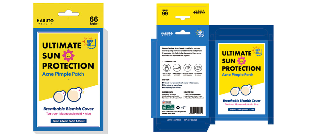
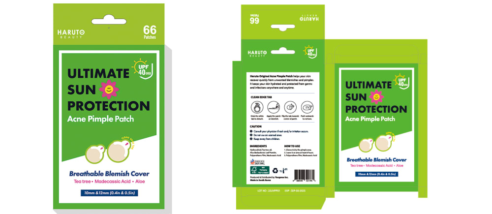
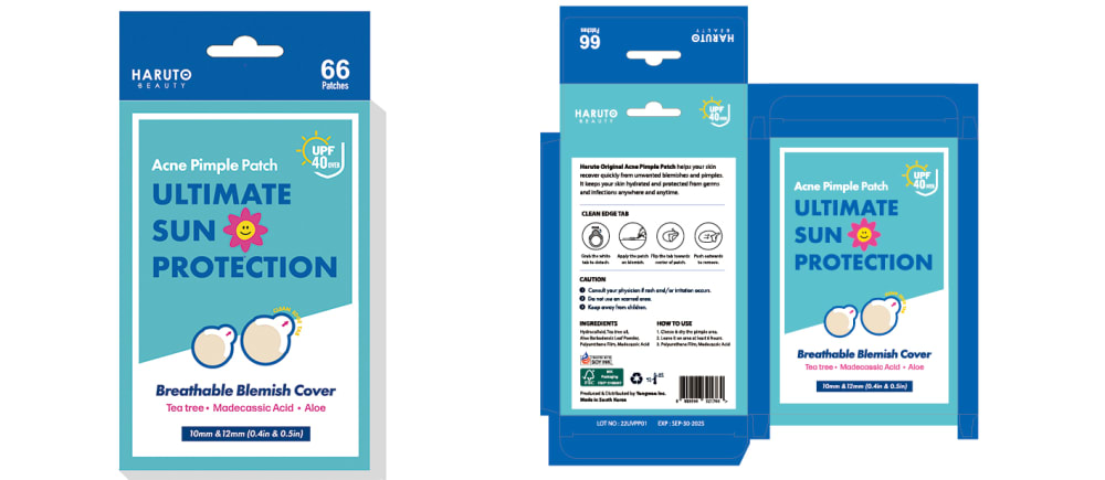
This is an acne patch with UV protection. Which packaging design do you prefer?

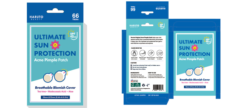
Option B won this Ranked poll with a final tally of 60 votes after 4 rounds of votes counting.
In a Ranked poll, respondents rank every option in order of preference. For example, when you test 6 options, each respondent orders their choices from first to sixth place.
PickFu requires a majority to win a Ranked poll. A majority winner differs from a plurality winner. A majority winner earns over 50% of the votes, whereas a plurality winner earns the most votes, regardless of winning percentage.
If an option does not earn a majority of votes, PickFu eliminates the option with the lowest number of votes. The votes from the eliminated option are reassigned based on each respondent’s next choice. This process continues in rounds until a majority winner emerges.
Scores reflect the percentage of total votes an option receives during the vote counting and indicate the relative preference of the respondents. If there is no majority winner, look to the scores to see how the options fared relative to one another.
| Option | Round 1 | Round 2 | Round 3 | Round 4 |
|---|---|---|---|---|
| B | 39% 39 votes | 39% 39 votes | 47% 47 votes +8 | 60% 60 votes +13 |
| C | 17% 17 votes | 28% 28 votes +11 | 31% 31 votes +3 | 40% 40 votes +9 |
| A | 17% 17 votes | 18% 18 votes +1 | 22% 22 votes +4 | Eliminated 22 votes reassigned |
| D | 15% 15 votes | 15% 15 votes | Eliminated 15 votes reassigned | |
| E | 12% 12 votes | Eliminated 12 votes reassigned |
Age range
Amazon Prime member
Education level
Gender identity
Online shopping marketplaces
Options
Personal income range
Racial or ethnic identity
17 Responses to Option A
I really like the dark blue color with the touches of yellow on the top and for the writing, especially since it says ultimate sun protection, so the yellow feels really fitting without being overwhelming.
Option a a grabs my attention quicker I like that bit of yellow and gold on it it makes it stand out better than the other ones so it would catch my attention quicker
I think the dark blue color stands out more and looks more attractive.
My pick looks the most like it is top quality and has the look of a medicine package.
The blues and yellow make me think of medical things while being professional, the others feel more consumery
I picked option A because I like the blue packaging with the gold accented letters.
i think its easiest to read the label of option a, and i liek the color pattern. The blue box looks a lot like mt makeup wipes, and i wouldnt want to get the two confused
I really like the choices that have the blue and yellow. They remind me the most of sun and I feel like it fits the purpose of the patch well and stands out.
A and B feel the most appropriate and natural for color choices for a product like this. I feel like the yellow is important to the image of the branding, since the acne patch protects against sun. Our mind as humans will make that color association whether we want to or not. The blue is reminiscent of the sky, the yellow sun. And this product protects against just that, while making your pimple friend kick rocks. Best of both worlds. Best use of both colors, is image A. B a close second.
I out the acne patch with UV protection in A, B, C, E and D order. I really like A and B. I love the yellow on the packages. I think it helps give it away that its fun the acne and the sun.
I like the ones with the yellow because of the sun protection, the color scheme works with the type of product it is.
I don't really like green, so I chose the blue option A because blue and yellow are complementary and they look good together. I didn't see a big difference in these items besides color, so I liked every design option except green. The contrast of light and dark goes better as a color design.
I like the hint of yellow to emphasize uv protection. I don't like the green because it looks like insect repellent
I think this one is the best balance of color contrasts. I like how minimalistic it is.
I like options a and b because the yellow bring the sun imagery to me more readily which makes me think more of the sun protection qualities.
My choices are based on the acne patch I would choose to purchase. My decision was based on design and color scheme shown on the packaging. My top choice is Option A.
Both choice A and B have the blue and yellow colors which represents sun and sky which is what the product represents. They are also very attractive and eye-catching. E and C have a blue color scheme which is a better representation of what the product is than D which is green.
39 Responses to Option B
it stands out more and is easier to see what is written
This color scheme reminds me of the Banana Boat kids sunscreen. I would automatically know what this is if I am walking down an aisle in the store. I also like the bright color, it grabs your attention quicker than the other options
I prefer option B because this design seems the most fitting due to yellow color considering what it emphasizes about sun protection.
I would pick option B because the yellow coloring is eye catching and reminds me of the sun.
B is most appealing for advertising
Option B is the best. The distinctive colors go well with each other.
I like Option B. The yellow and blue are eye catching. It's easy to read.
I feel like the information stood out better on B
I do not like the green at all, having to do with summer and sun makes me think of algae, but I think the yellow and blue combination stands out compared to the others, was defiantly what caught my eye first with the contrasting colors.
Due to the fact that I have to do with the sun and Ultra raise I prefer the lighter colors for the packaging because it stands out more and it's more appealing
I like the yellow package the best because it resonates with the theme of the sun the best and the lettering has the most contrast. The green is okay because it also has good contrast and seems summery. Option A is good because the letters contrast well and are yellow which seems to play on the sun concept of UV protection. The last two options are forgettable.
i chose based on the brighter packaging first because they are fun
I want to see colors that 1. look like sun, and 2. bright skies. While one may indicate green as feeling like grass, not all landscapes have it.
The background color makes the text stand out more. I associate yellow with the sun.
I think B looks the best compare to the others because it has more different colors and it stands out more. The blue and yellow also go well together. The others are decent as well, I just think its better to have a little more color.
Because the product relates to Sun protection, it should has yellow/ sun on the package design, so B & A are priorities.B is the 1st choice because it has more yellow than A, yellow package also makes it prominent. 2nd is A with fewer yellow.C & E is pretty much the same. However, C is my 3rd choice because the phase "Acne Pimple Patch" is put under. The reason is consumers tend to read big texts first, then follow next lines under those big ones, so the phase put here is able to recognize what the product is used for.4th is E because it's quite similar to C.Last one is D because I just don't like green
Definitely B, I like the overall look of the package. The colors are associated with the sun and its more eye catching
SINCE IT HAS SUN PROTECTION IN IT I LIKE THE YELLOW OPTIONS IN OPTION B AND A
I prefer options B or A because they remind me of leading brands of sunscreen (color scheme).
I found Option B most appealing because of the pop of yellow color on the packaging. I think this is a perfect way to grab attention while also paying mind to the fact that it is meant for sun protection. Option A offered a similar appeal, but the color was not as attention grabbing. Of those 3 options that remained, I was somewhat indifferent. I put the green one next because I think that is more unique as many packages end up reflecting a blue scheme. Between E and C, I struggled to find a difference but put E first because it seemed like the text was bigger and it was easier to read.
I like options A and B with the yellow on the packaging because it makes be think of the sun.
The yellow details go well with the word sun in the name. As does the blue kind of because of its relation to water and the beach. The green seems too far off theme. B is bright and bold and has two attractive colors that are eye catching.
yellow and red accents make me think more of the sun as well as caution and danger so they grab my eye better
I like my first four ranked options and would consider any of these four. I only don't like the last green one. The colors don't fit to me.
The packaging for B really stands out for me. The bright yellow color would get my attention on the shelf or if I am scrolling through a website. The yellow background also makes it easier to read the text on the packaging.
I voted for option B as the yellow color is pops more and reminds me of the sun, since these are considered as having sun protection.
I the picked the design that stood out the most to me first, and design option B stood out the most out of all the choices. The bright yellow on design option B stood out the most to me.
I think the yellow is the most eye catching and stands out the most. It almost makes sense considering there's sun protection and the sun is yellow. I thought the green stood out the second most. The blue colors are nice but not as eye catching.
I really like the design of B because it reminds me of the sun and also the blue and yellow really go well together and are eye-catching. I'd also choose A as well as the blue and yellow design go well together there, too.
i like that choice b has a the yellow border. it grabs attention and i think it goes along well with the fact that it has uv protection.
Option B is selected due to the color combination, Yellow signifies the color of Sun Rays from which it gives protection
The yellow is more eye catching and fitting for something related to sun protection.
I like b the most because the yellow is going to be eye catching and visually Appealing and connects with the yellow of the sun with sun protection.
I selected them in the order that they stood out to me. When the packaging gets my attention I will look at that product before others.
B looks like a sun care product, it has some summer color. All the others are uninteresting and average.
I think the yellow is really good pick for drawing attention to it having sun protection vs just being another pimple patch
I like the bright yellow coloring it grabs my attention and is more appropriate for sun
The yellow in B and A is bright and eye catching. The blue in B, A, E and C is usually correlated to health. The green in D is an eye sore and is out of context for health products.
The packaging for B is the most eye-catching and I associate the yellow color with sun and thus SPF. A is also nice and eye-catching. I think the green D would stand out on the shelf. C and E are about equal to me and don't catch my eye as easily as B or A.
17 Responses to Option C
I really like the light and dark blue packaging. The yellow and blue is kind of nice too, not too interested in the green packaging.
I am pretty sure C and E are the same. Nonetheless, this is the design that is most appealing to me. D just doesn't seem to go with sunscreen at all.
C and E are the easiest to read and provide good information on a clear background
I like the light blue background of the packaging that I chose.
Other than the blue, the other packages are eye sores and almost hurt to see the colors and the color combos, which is a huge turn off.
That is a weird product. Right? Is sun not good for acne anymore? :/I like the paler blue with the "acne pimple patch" below the "ultimate sun protection". The smaller words should go below the larger words.
I prefer this one the label is easier to read and it isn't so in your face, it makes me want to read all of the claims and check it out. The blue colors makes me feel more calm.
I prefer C and E because the blue on blue looks soothing, calming and medicinal. When I see blue, I think of healing, soothing and peaceful. I like this color scheme the best.
I like the colors better. The combination of colors look more attractive.
Option C was the most quality looking pictures.
Of the pakcaging designes that are presented here, I feel as though the color options shown on options E and C are the highest end and will catch my eyes the most.
I prefer the all-blue designs of C and E over the others. When I think of acne patches, I think of soothing things and blue makes me think of that more than yellow. Green comes next in the soothing colors theme and yellow is last.
Option C. I think that the packaging is more eye catching due to the color and design patterns used, it is more unique and more likely to purchase. It is also very descriptive making it more ideal.
I honestly couldn't tell a difference between two of the options, both of which I put first. Ultimately, just the differences in color preferences determined my ranking.
I chose based on personal preference for color and what would attract my attention the best when I'm choosing a product.
Option C is the best choice because the spacing of the words is clear and the order in which the words appear makes sense. As for the other options, I think it comes down to a matter of color preference. I prefer the all blue packaging, hence option C and E are my top choices.
I like the blue on blue ones the best. they look like cloudless days and fun. B and A look like sun and sky and D looks like grass.
15 Responses to Option D
A and B felt tacky with their yellow colors which looked like dirty urine. D felt the most natural and refreshing given the bright green hues.
I liked the green packaging best.
Green is a great color and is appealing.
The green and blue versions are the most coherently designed — the yellow makes me think of the sun but looks strange next to the blue in this context.
The bright green stands out to the consumer to pick the product up and read more about it.
i go with option D because Plus, when you have a patch over your pimple, you are preventing yourself from picking at it. If you go out into the sun with an acne patch on, you are also protecting your acne from the sunlight. All of these factors can speed up the healing process. An acne patch is best for acne that is closer to the surface.
I would choose option D because color combination is good and suitable for this productproduct description and uses are clearly mentioned which might help the customer
The green color will stand out and grab my attention compared to the other options
I chose D because it catches my attention more than the others and that makes it look more knew and I would be willing to try a new product
I really like option D. The combination of green color make it look nice, stylish and safe. B is good too. Yellow there represents the sun, it is important for this product. Both B and A are eye-catching. But I like when there is more yellow (B). C and E looks a little bit boring
D looks the least "medical" of the five, which while you would think you wouldn't want, actually helps it stand out better. I think it would stand out more on the shelf compared to the typical yellow/blue color scheme, and would thus catch my eye faster.
I like the green design the best it feels most user friendly.
the green packaging looks the most clean and professional looking to me, I'd trust this more than the blue hues which look more like cleaning products rather than facial care
I chose d as number one because I liked how bright and eye catching the colors were
I chose option D because green makes me think of nature and products that protect the skin.
12 Responses to Option E
I ranked in the order that I like the packaging design.
I would buy option E. My eye was immediately drawn to this packaging.
The two shades of blue are the nicest color combination.
I prefer options E A and C the most. I like the color schemes and patterns of these options. The colors on the package help it to stand out on the shelf it helps with easy organization skills when I have it amongst my daily skin care. The colors on these packages also make it look more legitimate and safe looking they match with the brand and the colors blend well with the product. I feel safe choosing one of these options and I like the colors on the package they feel very light and not abrasive. I do not like options B and D and I would not choose them because they look off with the product these colors are non-matching with what the product is supposed to be and I would not try it because of that.
I liked the look of option E and C the most. I liked the blue tones. Option B and A, I thought the color combo matched with the name but doesn't look as nice as the blue tones. Option D, I wasn't a big fan of the green look.
I like the teal colored ones the best. The dark blue font against the teal is easy to read and the boxes look crisp. I see very little difference between E and C, but overall like E a little better. The dark blue, A is my next choice. It looks nice and the yellow font is very easy to read. But there are so many blue packages on the shelves, that it is not my first choice. I am not a fan of the shade of green that D is, and the yellow is too bright in B.
I like E and C the most because the blue and white looks very nice and I like the shade of blue. I then picked D as I like the green and white as well. I then picked A as I don't care for the yellow. I picked B last because it is mostly yellow and I don't like that.
I picked the packing that looked the least loud in color scheme. The first two , then the one more with blue than yellow , then yellow , then green. The green one does not fit with the idea of pimples to me.
Something about the lighter blue/turquoise is really calming and approachable. The other color options I think are a little aggressive and doesn't fit the vibe of the product.
I like the lighter blue color like in options E and C. I don’t like the yellow in options A and B.
I like blue and white for packaging on this, it makes the most sense for the product.
I don't notice much a difference between E and C, but they are clean, appealing looking packagings. The rest of them were just not my preferred colors.
Explore who answered your poll
Analyze your results with demographic reports.
Demographics
Sorry, AI highlights are currently only available for polls created after February 28th.
We're working hard to bring AI to more polls, please check back soon.

