Poll results
Save to favorites
Add this poll to your saved list for easy reference.
Which Baseball Binder design do you like and why ?
Option A won this Ranked poll with a final tally of 28 votes after 1 round of vote counting.
In a Ranked poll, respondents rank every option in order of preference. For example, when you test 6 options, each respondent orders their choices from first to sixth place.
PickFu requires a majority to win a Ranked poll. A majority winner differs from a plurality winner. A majority winner earns over 50% of the votes, whereas a plurality winner earns the most votes, regardless of winning percentage.
If an option does not earn a majority of votes, PickFu eliminates the option with the lowest number of votes. The votes from the eliminated option are reassigned based on each respondent’s next choice. This process continues in rounds until a majority winner emerges.
Scores reflect the percentage of total votes an option receives during the vote counting and indicate the relative preference of the respondents. If there is no majority winner, look to the scores to see how the options fared relative to one another.
| Option | Round 1 |
|---|---|
| A | 56% 28 votes |
| B | 38% 19 votes |
| C | 6% 3 votes |
28 Responses to Option A
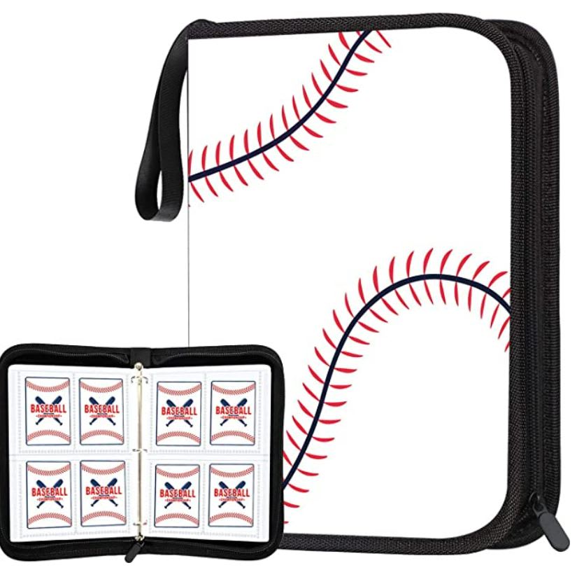
Option A was the most realistic and had the best overall baseball pattern design.
A has the most unique and appealing design. B is average. C just looks kind of cheap and boring to me
I like Option A because of the simplicity of the design. It conveys the concept and is sleek/modern.
I like that this option has the baseball stitching. I feel this is very different, creative and cute.
i really like how the whole notebook looks like a baseball.
i like the simple, yet creative design of choice a. i think kids would like that. choice b is nice also. i think it has enough class for an older collector, and young, the same.
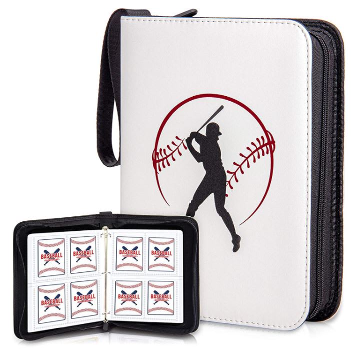
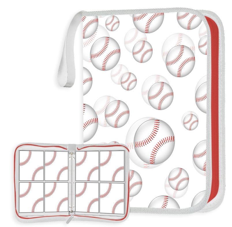
I really like the design of choice A and if my boys collected baseball cards would get this binder for them. I do like the balls of choice C. I don't care for the baseball player on the cover of choice B which is why it's last.
Option A. I really like how it is the design of the baseball itself on the cover it's impressive looking it's unique and I would buy it for sure
The close up of the stitching is somewhat abstract and right now I like simplified abstract designs. The second one with the inside binder design looks like an Andy Warhol type of design. The last one, meh, nope.
I like option A. It's simplistic and tasteful. Option B is also nice, hinting at the MLB logo. I'm really not a fan of option C as it's busy and cluttered feeling.
I have to go with option A on this one. I think the binder looking like a baseball looks unique. I really enjoyed how the red looked on the baseball in option A. I didn't care too much for the silhouette of the baseball player on option C.
I don't like the pattern on C. I like the ball design on A.
A would be easier to give as a gift. I would probably get it for any cards i might be collecting versus the other two. The character on the front makes me think the use of the book is to keep little league photos rather than keeping collectable cards
I like that it looks like a baseball, very neat!
I like the simplicity of the first one and the second the third is overwhelming
C looks really weird, I dislike it. A is the best of the three, with a minimalism that works and looks modern and cool
I like option A the best because it feels like the most original design. To a baseball player its instantly recognizable, but takes a minute to register for anyone else. Option b feels like a cheap knock off of the major league logo with a batter.
I liked choice A since the design looks more eye catching and appealing with the baseball stripes. Choice C looks too busy and isn't as appealing to look at.
I feel like Option A is most simple looking and easiest to look at, the other ones look cluttered and also kind of cheap because of it .
I think it's really fun that A looks like a baseball. For C, I think the red zipper really catches your eye. B comes across as really generic.
A. Nice big baseball design. Looks bright and catches the eye. c is okay but the fading is bad. Option b looks very generic and not the best.
Option A is the best as while it is the most simple design it is also is very classic and will last forever
I prefer option A. I like that it looks like it is covered with a baseball exterior. It is very classy.
The baseball that is shown with choice A is a unique way to show off the binder.
I like the simplicity of A and the concept of it looking like a baseball I think is clever. I like B next because the design is good. I don't like C. The pattern is too busy and I think it if that pattern was used it needs to be offset with a black border and zipper instead of the white and red.
I like how it looks like a baseball, and prefer it over the other designs because of the simplicity.
Option a is less busy and I like the design the most
I liked the large baseball design on option A the most because it is eye catching and unique. Aside from that, I like the design with the color black because it makes them more bold.
19 Responses to Option B
I like B as it has a nice simplistic design with a cool graphic on it.
I like option B the best. I think the graphics look good and area appealing to me vs the others
I picked option B because I Like how it incorporates a baseball player and baseballs.
I think the simple image of the player on the front would be more appealing.
I think that A is actually pretty good but that it could almost look like a floral desing. C is just too busy like it's hard to look at.
The baseball player silhouette is really cool
Option B makes me want to buy the product. I don't like C because it doesn't show any creativity and for A I can't really tell that's a tennis ball if the other two wasn't there.
I definitely like the better on it with the ball around it. It has the most detail and is very unique
C is too loud and too much for me. I like the simple design of B and it could be a little more retro. A is minimalistic and it's just fine
I picked B because it's the most distinctive out of the three other binders. It has both the baseball player on the front and a baseball design on the inside, making it stylish. I picked C next because the baseballs have a type of 3-D effect on the outside of the binder, which is pretty cool. I picked A last because there was nothing standing out compared to the other choices.
I like the fact that not only is there a baseball on the cover but also the batter is a very nice fit and gives more character to the book then just a plain baseball
I liked the design for option B the most. Option A, looked a bit better than option C. Option C, I didn't like the repetitive nature of the pattern which is why I ranked it last.
I prefer this one because I can a better getting ready to hit the ball
I like B and A a lot because they have an official look. They look nice and clean. C looks kinda silly and I don't like the all white look.
To start I want to say I love all three and could easily see myself buying all three. That being said I would pick B as my favorite because I like the look of both baseball in the background but also the person up to bat. It gives it a little more of effort or look to me compared to just the baseballs. I do like C over A for the multiple looks at baseballs compared to just one.
Option b is the most appealing because of the baseball player on the cover
I like the design of my top choice. I find it appealing and fits my style.
B I like the photo of the baseball player on the front of the case.
I like option B the best because it depicts an action shot. The design on binder option A is very unique and has almost a subliminal design.
3 Responses to Option C
I prefer C as the baseball is more simplistic yet takes center stage more.
The ball is a classic design. I chose C first because the single blown up image was not the best.
The design is very cute and universal for both boys and girls, whereas the other designs are a bit expected and boring.
Explore who answered your poll
Analyze your results with demographic reports.
Demographics
Sorry, AI highlights are currently only available for polls created after February 28th.
We're working hard to bring AI to more polls, please check back soon.

