Poll results
Save to favorites
Add this poll to your saved list for easy reference.
Which design do you like the best and why?

Option C won this Ranked poll with a final tally of 29 votes after 3 rounds of votes counting.
In a Ranked poll, respondents rank every option in order of preference. For example, when you test 6 options, each respondent orders their choices from first to sixth place.
PickFu requires a majority to win a Ranked poll. A majority winner differs from a plurality winner. A majority winner earns over 50% of the votes, whereas a plurality winner earns the most votes, regardless of winning percentage.
If an option does not earn a majority of votes, PickFu eliminates the option with the lowest number of votes. The votes from the eliminated option are reassigned based on each respondent’s next choice. This process continues in rounds until a majority winner emerges.
Scores reflect the percentage of total votes an option receives during the vote counting and indicate the relative preference of the respondents. If there is no majority winner, look to the scores to see how the options fared relative to one another.
| Option | Round 1 | Round 2 | Round 3 |
|---|---|---|---|
| C | 36% 18 votes | 40.82% 20 votes +2 | 59.18% 29 votes +9 |
| A | 34% 17 votes | 34.69% 17 votes | 40.82% 20 votes +3 |
| B | 16% 8 votes | 24.49% 12 votes +4 | Eliminated 12 votes reassigned |
| D | 14% 7 votes | Eliminated 7 votes reassigned |
17 Responses to Option A
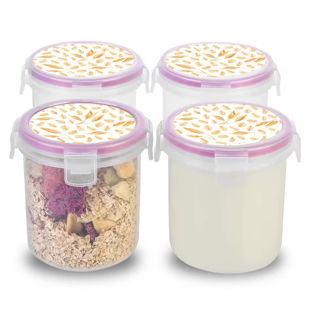
I like option A the best and it looks really pretty to me. I love pink and it's my favorite color.
I like the plain clear lids. I don't like the others.
I prefer option A because you don't really need some design on the lid and I also think that option A does a better job of presenting the product in a way to make it easier to tell how tall it is. Option D has a better lid design that has a bit more going on than option B. Option C has an advertisement on the lid which I find to just be very annoying.
I prefer a plain plastic container over having a lot of cheesy prints, so for me A is the best. After that, I wouldn't buy any of the other three options.
Red lids look better.
I like the plain tops without design as shown in A the best, although I like the purple band more than the red. I don’t care for the wheat print.
i would choose a first bc i feel like the more plain the container is the better, it appeals to more consumers .. d would be my last choice bc i feel like the graphic on it doesn’t fit the use of the container
only reason i chose a first is cause red is my favorite color. other than that, its the plainest. options b and d look very similar to each other. d looks somewhat more appealing and b looks a bit more appealing than d.
Option A looks deeper and would fit more. I do not care for the pattern on the lids of options D and B, I just want it clear.
I like being able to see all of the items included, including the size of the item.
I personally like the plain clear lids with the red ring around them the most. I just don't really care for this particular product to be extra fancy or cute, just functional and I think the lids in option A would be easiest to see into which I think would be good
While I normally prefer to see the product in use, I do not like the design on the lids of C, B or D at all.
I like the clear lids better -- it just makes more sense for something like this.
Bigger is better, and I don't need to see the prepped food
A is the best as it is clear to see thru. I also prefer the red tops instead of the pink. C is second becasue of the tops have a less busy design. B and D look somewhat the same but the view in B is better than D. D is last because too busy design on top and a further view. A is the best choice!
I liked the way the red lid stood out more
I prefer a plain cap. I don't like the designs on any of the caps but had to rank D, B, and C so I just randomly ranked them.
8 Responses to Option B
I liked the more natural graphic pattern of the lids in B and D; the labels on C didn't match the product lid color, and A seems a lot less durable as well as more boring.
Option B I really like the design on the top of the lid. I really think that is adorable and such a cute idea
i ranked these from the best value to the least
I like the pattern on the lid. It really is an interesting design.
I like the containers and the design of choice B that I would pick those first. Choice D is a close second and if choice B wasn't available, I would go with choice D. I don't care for choice C's design and I don't like the containers of choice A at all.
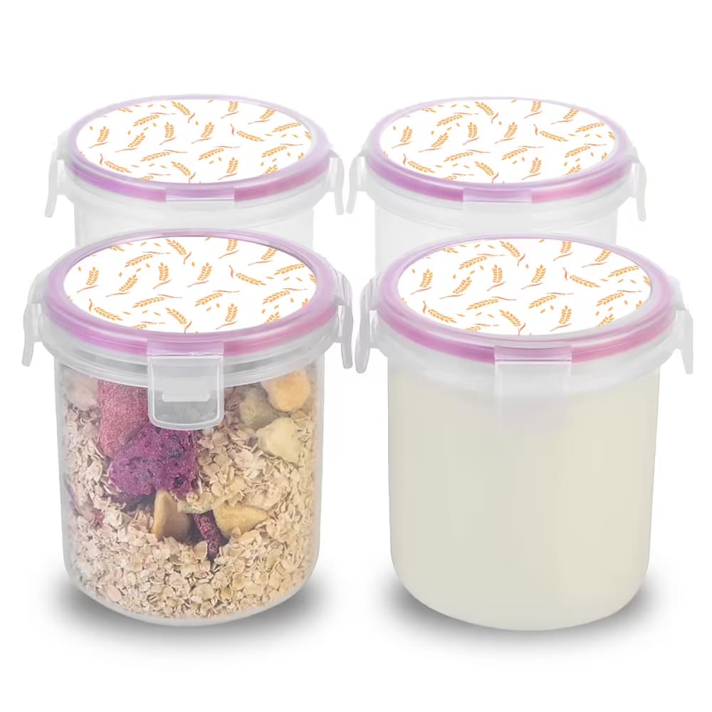
B and D both show that these are oatmeal containers as well as having oats on the lids. C is helpful but not as cute. A looks like just containers.
B and D show empty containers plus one with something in it. I like the top design and gives an idea of what may be stored. I like that it has a little color.
I love the more natural colors of B, D and C as the red is way too bold for me and too eye catching so that is why A is last. From there, I love b and D as the lid designs are cute and fun and something I can see in my own kitche
18 Responses to Option C
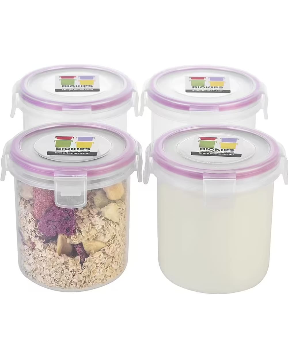
Option C is my first choice strictly because I am not sure what the image on the lid for option B and D is. It doesnt looking too appealing. However, I do like the fact that here are food contents inside the jars as it helps me see what the product is typically used for. In this case it is food products.
I prefer Option C because I like the use of the lavender and also the design on the lid. The design is simple and modern.
A looked too plain without any content in the jars. I liked that C had a lid that wasn't visually busy or distracting.
Lid looks as if it will keep the contents freshest best in this order.
I like C because the lid is see through. I think this is helpful for people who will be using these items to meal prep.
I like C, D and B because I like seeing food in the containers. Of those, I prefer the lid/top of C, which has some clear space around the edges so I could see in from the top. The tops of D and B are fully covered.
I picked option C because I like the product's size and less cluttered looking lid.
I like Option C because of the color of the lid. It's attractive. I like the angle of the image so I can see multiple angles of the containers.
Option C is the first choice that I like the best because I like how the brand name is visible on top of the container lids. Option A is the second choice that I like the best because I like how the image shows that the containers can be stacked and how the containers can be used for any occasion due to the lack of imagery or design on the containers. The third choice that I liked best is option D because I like the design and pattern that is used on top of the container lids. The last option that I liked best is option B because I like how the design and color is subtle.
I prefer option C because the size feels practical and I like the see-though clear top lid
I like the clear sides and top of A, but C looks shorter and wider so it's the most practical. I don't see a difference between B and D, but the design on the top blocks the view inside.
I like to see the containers with contents included in them, it gives me ideas of what I can put in them.
I like design C the best because I like the size of the containers and the colors that are being used in it.
I chose by options that look like a good brand name but are also simple and easy to evaluate. I like images for this that are more clean so I can see the detail of the container best.
D and B lids appear busy, and uninteresting. C is simple and aesthetically pleasing, while A is clear and simple as a choice.
C: I like the colors on the label and the word Bio. A: I like simple and no label. B: The wheat pattern does not neccessarily match with what I will put inside. D: The pattern is even more prominent than in B.
i like the way that chocie C and D are showing the product and i think choice B is close to the same as well. i think it shows the product at the right angle and i like that you can see the way the lids lock nicely.
After carefully studying and comparing all four images of cannister storage container sets displayed above, I selected Option C as my first preference and the one that I would definitely click on to purchase for my own personal use. I felt that this image just jumped out at me as having the most eye catching appeal based on its coloring and the arrangement of the cannisters. Option A was my second choice followed by Option B and finally Option D with all four rankings based on my own personal opinion of the relative attractiveness of each product image.
7 Responses to Option D
I liked the shape of option D, B and C the most. Option D, I liked the lids. Same with option B. Option A, I thought the photo and design didn't look as appealing as the other options.
I like option D the best. I like that it’s close up more so than the others. Makes it more appealing to me
The shape of the closure looks easy to use. The pattern on the lid is attractive.
I like the images on the top and this shows it the best. It gives me a kitschy feel
I picked option D first because of the whimsical, playful print of wheat on top. It makes it stand out compared to other containers and gives it a personality and style. I picked option B next because the design is more muted than option D, but it still retains the overall outgoing ambiance and artistic top on the containers for storage.Option C is next. Although it doesn't have any design on top, it does describe the containers and has more information and details. Option A I picked last because there isn't anything outstanding or eye catching with the container with it's simple colors and style.
I like the design and presentation.
I prefer the options that have the canisters full of food but I like the top of option D the best
Explore who answered your poll
Analyze your results with demographic reports.
Demographics
Sorry, AI highlights are currently only available for polls created after February 28th.
We're working hard to bring AI to more polls, please check back soon.

