Poll results
Save to favorites
Add this poll to your saved list for easy reference.
Which image do you find easier to read and understand, on a mobile device?
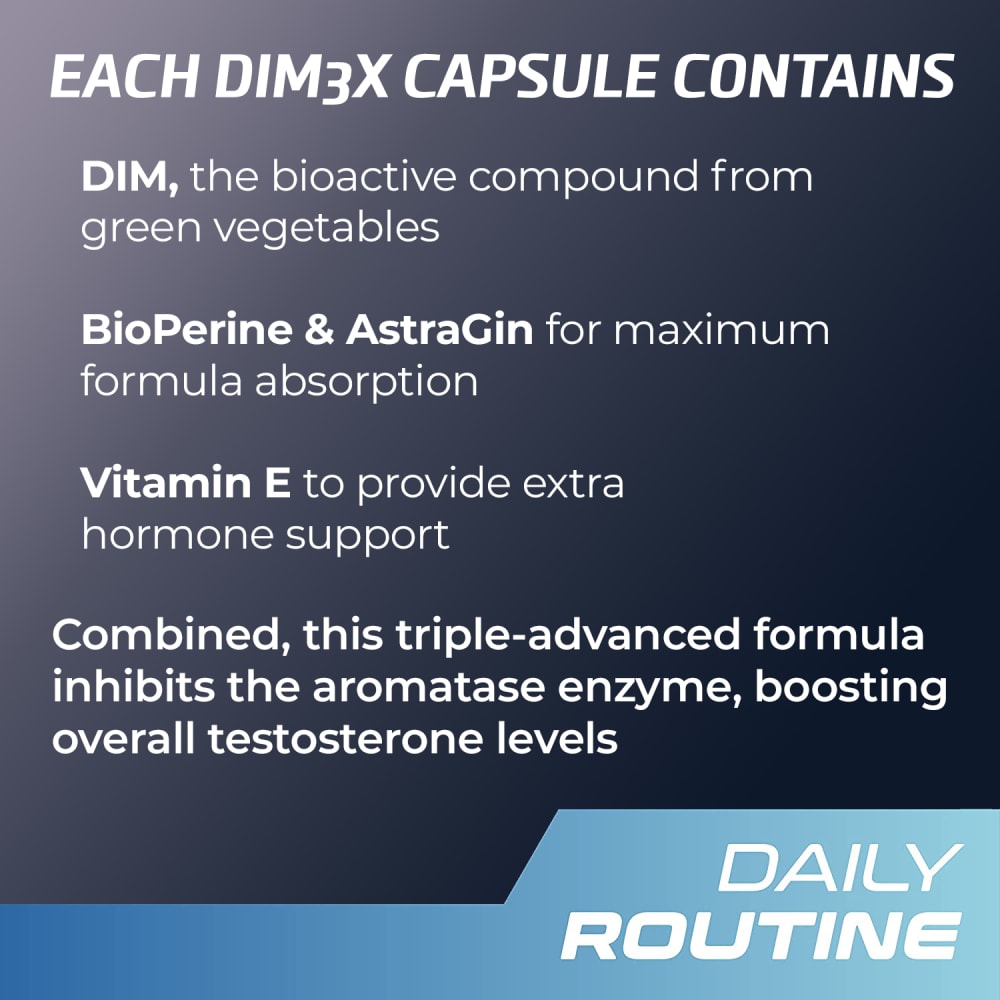
35 Responses to Option A
The words and letters do not seem to be crowded together on Option A. It is also easier for me to read the white letters on the darker background on this option.
The information on the page is bold and would be easier to read on a mobile.
I find Option A easier to read and understand, because the text is larger and more plain to see without any distractions. Option B looks pretty but the image distracts you from what the text says.
"A" is much clearer.
Option a the words are bigger easier o read the description is straight and to the point.
Chose A because it is easier to read with the larger font. otherwise I see little difference between the two.
There’s no contest! On a mobile device, Option A is easier to read, brighter.
Certainly A. The text is bigger and there isn't as much to absorb.
A has bigger text and is easier to read. B is nice with the graphic though. Either is acceptable.
For me, I chose Option A as the text appears to be larger and easier to read on a mobile device.
Option "A": Font size against this background color is much more readable even before magnification making me believe it will translate to mobile devices more clearly as well.
The bolder text and less words make it easier to read on a screen.
This one is more direct thus more simple and easy to read.
THe key with seing things on a digital device is the size of fonts. i like the size of the information you present. I can read it very easy. the picture of the bottle would be nice but is not necessary
I have a smaller iphone and my eyes aren't as good as they used to be, the larger font is appreciated.
I would pick choice A because the wording is larger so it is easier to see & the statements are brief and not as wordy.
Despite liking the image, the larger font in A makes for a much easier read and quicker absorption of the info.
The Font colors are easier to read.
A is easier to read than B . A is more clear .
mobile screens are small so bigger text helps.
I chose a as the font and writing is larger and would work better for a larger group of people and still conveyed the essential message as the smaller font package.
Option A seems easier to read as the print is bigger. It is also more straight to the point, what I like simple and descriptive. Option B also is more complicated, it states”inhibition of the aroma taste enzyme” nobody knows what that means……
Option A was the easy choice. The font is a larger point size and is heavier compared to option B. Option A also contains a lot more white (in this case, maybe black) space and that helps with legibility. The graphic in option B does not help me understanding the message.
The text is easier to read because it's bigger and has a solid black background.
The letters are larger and easier to read. Thy are also not blocked by the picture of the bottle
The text font is larger and the details of the descriptions is shorter. Overall it would be easier to read.
It seems to explain the product easier. It seems like something I would use due to the description.
The font is bigger and without the picture of the bottle there is more room on the screen so just aestetically it's easier to read but also the explainations for what the ingrediants do has been condensed and simplified compared to B so that's another reason as well.
Much easier to read with larger text
With my old eyes, I definitely like and prefer the larger sized fonts with less information for reading on my phone.
Getting older, the text on Option B would be much harder to read.
Option A without a doubt. The text is larger with fewer words to read. When reading on a mobile device minimal is due to the smaller screen size. Option B looks good, but the bottle is unnecessary and would take up a lot of valuable ad space on a small mobile device screen. Everyone knows what a pill bottle looks like... the main essentials the company wants out to the consumer is the information. Option A delivers the information better in a more concise format. Lastly, the contrast is better in option A between the background and the text. Easier to read.
The added graphic and information in B are not needed, and the larger text in A makes it way easier to read.
Larger fonts with less information per line is easier for me to read and understand because of my age.
The messaging in option A is less-crowded and more concise, and much easier to read.
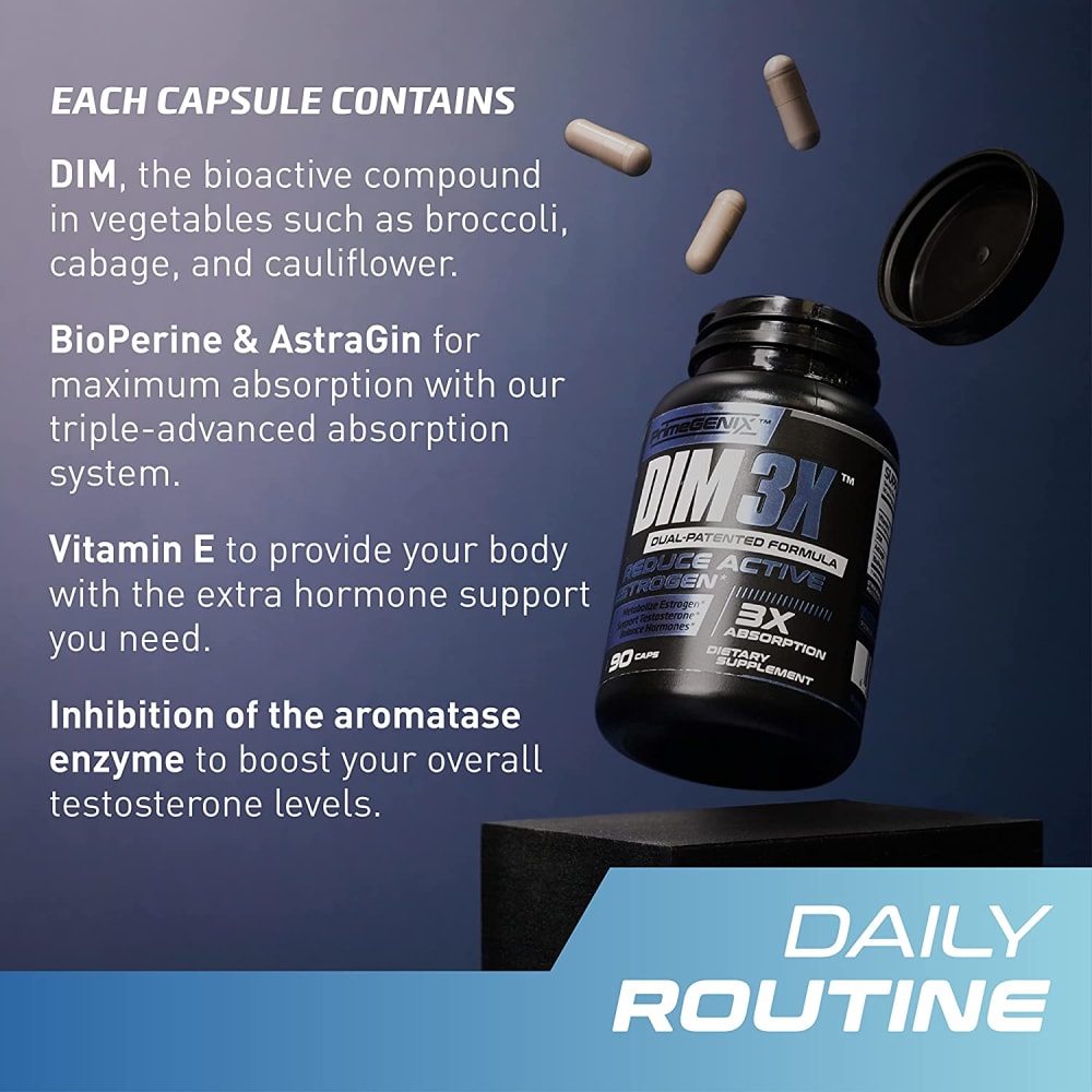
15 Responses to Option B
B is more informative and the graphic helps me understand what I'm looking at.
I think the higher levels of detail are helpful here; I don't really know what this stuff is, I should be told as much as possible so that I can make an informed decision about whether it's something that I might want to take, and purchase.
Seeing the pills and the bottle helps out and gives me an idea of the product!
I prefer this option. I like that this ad copy referenced a real food connection. I believe most people could make the connection better when broccoli, cauliflower or cabbage are referenced vs green vegetables. It leads one to believe the pill is the same as eating these foods which will likely increase sales.
"B" is a bit easier to understand; both are very "wordy" but "B" is a little clearer.
In my opinion, Option B has clean details and an image that sound good for the product.
I like B, everything looks spaced better and is easier to read on a smaller screen.
I like the presentation on the label much better. I need the separate ingredients spelled out for me and then told what their individual benefits are.
It's always better to mix information with a visual as it keeps the user engaged and enticed more into the product.
For sure B. The image makes all the difference.
I think with the photo on the package people are more curious to what the product is, Without a photo most people wouldn't take the time to read.
I can easily read both but I like B better. I think the size of the text is easier on the eyes.
The font is a little smaller but the wording goes a little more into detail about what the product is and about.
The Dim3X listed sort of makes the text harder to read. The option B is more straight-forward.
I chose option B because instead of just a wall of text, there is some graphics and makes it easier to look at.
Explore who answered your poll
Analyze your results with demographic reports.

