Poll results
Save to favorites
Add this poll to your saved list for easy reference.
Which label design do you prefer and why? Based solely on design (brand aside), which one would you be more likely to buy?

Option A won this Ranked poll with a final tally of 52 votes after 1 round of vote counting.
In a Ranked poll, respondents rank every option in order of preference. For example, when you test 6 options, each respondent orders their choices from first to sixth place.
PickFu requires a majority to win a Ranked poll. A majority winner differs from a plurality winner. A majority winner earns over 50% of the votes, whereas a plurality winner earns the most votes, regardless of winning percentage.
If an option does not earn a majority of votes, PickFu eliminates the option with the lowest number of votes. The votes from the eliminated option are reassigned based on each respondent’s next choice. This process continues in rounds until a majority winner emerges.
Scores reflect the percentage of total votes an option receives during the vote counting and indicate the relative preference of the respondents. If there is no majority winner, look to the scores to see how the options fared relative to one another.
| Option | Round 1 |
|---|---|
| A | 52% 52 votes |
| B | 25% 25 votes |
| D | 19% 19 votes |
| C | 4% 4 votes |
Age range
Education level
Gender identity
Homeownership
Options
Personal income range
Racial or ethnic identity
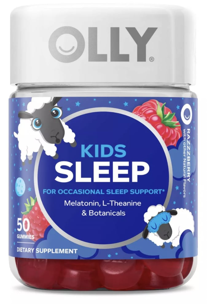
52 Responses to Option A
I chose just based on how eye-catching the color scheme and pattern on the bottle was.
I would have to go with A simply because it is the brand that i always use. I am bias and know that my kids react well to them.
The sheep and the large fruits on the label make it much more fitting for children.
A has the cutest and most eye catching packaging. B and C are also cute, but don't stand out as much. D is last because it looks kind of dated with it's layout and image chosen.
A has a stronger display and more wholesome format
I like that you're able to see the gummies. I like the little sheep that are on it also. It makes it really stand out
I liked A the best, because i've seen the brand before and I know it's a good brand and I can trust it
I find the sheep really cute. The child, less so
I like the ones that are clearly for kids and have cartoonish characters on them.
Counting sleep has a relaxing and safe connotation. The lowest rank seems like it will knock the kid out - feels too strong.
I like the images of the berries and the cartoon sheep in choice A. I think my kids would appreciate it and make the more open to taking whatever supplement is inside
I really like the label design of option A. So much so that would be the one that I would most likely purchase. Overall I feel the design is very eye-catching and stands out.
The sheep grab my attention first and I find them cute in A. I like the dark purple in B. I also like D okay, and the dark blue label/background. It looks peaceful. C was my least favorite, it does not look as nice or high quality.
Based solely on design, and not gummies, vs drops, I went with the more child-friendly imagery on the packaging
D's picture is super weird and the kid makes it creepy. B looks a little too clinical. C is professional and friendly, but on the boring side. A is nice and friendly with the graphic, very kid friendly.
I think the graphics on both A and D make them stand out the most. They are pretty equal in my eyes but much better than C and B. C and D just have little generic clip arts on them and could be better with more creativity.
I like that the design is whimsical and fun to look at.
I ranked the choices depending upon the description of the product.
I like my first answer its a clear number one. First off it mentions OCCASIONAL sleep support. Thats a big thing to have right there on the label, and it makes me want to lean that way in a big way. For number two i like mommys bliss, its a nice label, and a nice name.
I like the large logo in A, I think it is appealing to parents trying to find something fast for their kids
I liked that A and D featured bolder and brighter colors than C did. C's colors were lighter and thus more dull and didn't catch my eye or attention as much. A's gummy flavors also looked more flavorful since it featured a richer red color.
I voted based on how appealing the images were to me compared to the others and which ones I would click on in the real world.
Option A, the design is simple and cute, would definitely buy
based on what looks better to me
I already use A so it caught my eye first
I chose A first because I love Olly. They are tasty and the label is adorable. C has a cute name and i like the graphics. D and B are just boring but i think I like D better because its a dropper.
I like A because the sheep are cute. C also has a nice design because it looks calming. B and D aren't really my style.
Option A has a very cute label with the sheep and the colorful raspberries.
I think the sheep look really cute and everyone knows that you can count sheep whenever you are trying to fall asleep. I also like the colors. I would choose D as my second favorite because I think the blue bottle looks good and also like the design of the little kid sleeping on the moon better than the remaining options
Option A is more colorful and more kid like. Option C is kid like and cute. Option B is nice and colorful. Option D is not really all that colorful or kid like, its actually kind of boring.
The more colorful and enticing it is, the more likely it is a child will consume it without complaint.
I like the peaceful colors and the sheep tell me quickly that it is a sleeping product for children.
i think option a look like something that a child would want. it is very informative and also child friendly.
I like knowing that the product comes from a reputable brand.
A was first as it was the most obvious that it was for children and had a fun design. Also I would prefer the gummies to the liquid. B was second as it was more descriptive of what was inside the product than the remaining two. C was above B because C was more lighthearted and fun looking.
I think A looks the cutest and would be the most memorable. The sheep would be really great characters for the brand. It just looks the cutest and most interesting to me.
A is my first choice because it is both the most colorful and whimsical. C is whimsical but not quite as much nor attractive as much. B is very basic, but to the point and easy to read. D is my last choice because it just looks creepy and weird seeing a random child curled up, as if it were something for pedos to drug children.
I like option A the best because I think that having a sleeping sheep is a fantastic image for a sleep medicine for kids. I love that the one sheep has a sleep mask on. Option C would be my second choice because I like the idea of a sheep being on the bottle. Option D would be my third choice because I think that the imagery of a little boy sleeping on the moon is pretty good and it's better than the plan boring label of option B.
I think the top two choices are the cleanest looking and easiest to read for a parent.
For kids its very Sweet also referring that are gummies a thin is more kids friendly, D for the image of the kid I think is cute, C I like the label kids like funny and cute things and B not a kid friendly to me
I chose A as my first choice because I like how the sheep go from being awake to being asleep. I like the colors, the images used, and text. I chose D as my second choice because I like the image of a child sleeping in the moon. I like the darker colors and the brighter accent color. I chose C as my third choice because I like the clouds and the outline of a sheep. I like the colors used. I chose B as my final choice because I like the moon and the darker colored label.
Options A and D of a tablet/capsule/gummy formulation is easy to measure out.
Options A and D have labels that are well designed and don't look cheap at all. Options C and B look cheap.
The cartoon sheep makes for the most kid-friendly bottle.
I think this bottle is the absolute most adorable. It has a nice color scheme and the sheep which remind me of counting sheep Before I Go to Sleep.
I like option A as it has sleeping sheep on it which resonates with kids.
A - my favorite, fun a whimsical presentation. B - second favorite, the label is professional yet fun
I like choice A the best. I love the packaging and love the sheep on the bottle.
I think that option a does the best job of grabbing my attention and the overall design is solid in telling me what i am getting but also the cute cartoon sheep help it to feel more comfortable
I like this option because it is a gummy which resonates likely with kids and the branding is definitely memorable.
This has the most professional and well established looking branding and packaging like it is a tried and true product
Gummies are so much more kid friendly. It makes me thank they are safe and candy like.
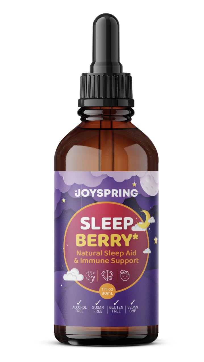
25 Responses to Option B
Option B has the most attractive packaging from a childs perspective but option D has a better design from a parents perspective.
More friendly so it wouldn't be off putting to a child to see the bottle.
I like the "Sleep Berry", it is very soothing just to look at the bottle. The one with the overly cute sheep (A) is not appealing at all. Get rid of that!
#1 design looks professional and the drink itself seems tastier with berry in there. #2 has some cute sheep and berries alongside them so it's probably tasty and is kid friendly. #3 is alright. Design is quite neutral overall. The last one looks like it was designed by who it is marketed for, kids. But in a bad way
The colors of the product are ideal for marketing and I'm attracted to the darker shades, which are mostly appealing.
I really like the purple label with the bubble letters it gives me a feeling of warmth and comfort at a glance
I like the droppers the best, I think that it would be easy to give to my child. I do not like the one in the bottle, it could be confused with other medications.
I prefer the option B label design because it has nice illustrations of cloud and the moon, and I like the color purple. I chose option A second because I like the funny and artistic illustrations of sheep on this label design. I chose option C third because I like the blue color and the clouds. I chose option D last because I do not like the illustration of the kid dreaming on a crescent moon. Based solely on the design, I would buy the option B label before any of the other options.
I just like the simple design of this one and the bottle shape. It seems easy to use and seems the most professional. I love the colors.
Option B is the best label and least tackiest without all the kid graphics to make it look ridiculous.
I like the designs of BCA the most.
I like the label on B. And I think the liquid is better for kids.
The bottle design is nice. It is very child friendly.
B has a good look and design and seems interesting. I love the overall feel it has.
Choice B is my preferred option. It has the most professional look out of the four. I also like the color scheme a lot as well. Choice D would be my second favorite option because I like the design with the kid on the moon, but I prefer choice B overall.
My first thought is that medication should be stored in dark bottles so I think the darker bottles are the better option.
The Sleep Berry formula in JoySpring's brand is nice. I love the design and that's a great look. I would buy that first and love the sleep aid and immune support. This looks wonderful in purple. Option D is a good brand in Mommy Bliss. Great design there too. I think the fun design is a good way to promote the brand. Option A is nice and very popular. Not as a big a fan of that brand in Olly. I think the Wink Naturals brand is a bit too plain for me.
I ranked the designs of the children's melatonin supplements that I liked the most. I found the design of the packaging of option B to be the most appealing followed by the design of option A then option D and then finally option C/
I like the simple design and the use of multiple colors.
Option B seems to be not marketed towards kids and I am not sure i like the idea of sleep aids and children. Option A is a brand I know and recognize, option d seems more credible than C
I prefer Options B and D because the labels are much easier to read and understand the benefits and ingredients.
B describes itself as a natural product that contains no alcohol,sugar or gluten and is Vegan GMP, it also doesn't describe itself as a child's sleep aid, because if you have no kids then you won't need to be buying childrens stuff.
B PRESENTS THE INFORMATION IN THE SIMPLEST WAY TO UNDERSTAND
Option B's color is calm and inviting and looks natural. Option C also looks comforting with its soft blues and clouds.
I prefer the label and color of B, I like the pill form on A
4 Responses to Option C
I chose based on the color choices I liked best.
I selected option C & A because both containers appear to be plastic which is good when it is for a child. Option B & D appear to be glass containers that can be unsafe when around children.
My top two choices are based on the symmetrical, dreamy artwork and functionality of the bottle. My bottom two choices had either a very old-fashioned look or sporadic theme and the containers don't seem as versatile.
I think the cloud one looks nice, I think it is inviting and kid friendly. I could see my kids wanting to take it.
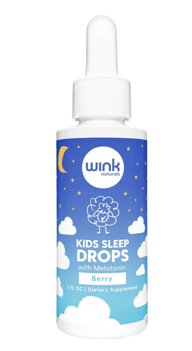
19 Responses to Option D
I went with my instinct and chose the options that looked conducive to sleep and calmness and the colors that made me feel relaxed and would make the kids relaxed.
D is my top choice because it is done really well and draws my interest to it the most.
I made my choices this way because I felt that I should be able to pick something that looks child friendly and would not scare or worry my kids. I felt that it was important to pick something that looked high quality rather than cheap and unlikely to work
The blue colors denote sleep in my mind.
I prefer option D because labeling is very clear on the properties of this supplement as well as who its intended for. I also like the color and design of the packaging. It seems very relaxing.
First I prefer the droplets over the gummies. I like the text, description and the packaging graphics of choice D the best.
I like the blue design the best because it stands out as the most modern.
I like the look of D. It seems the most legitimate and the label is most calming.
I prefer option D because it looks the most potent and appealing to me. Option B and C feel pretty decent as well. Option A feels lacking and underwhelming.
It is much easier to understand what the product is intended for with the graphic of the child sleeping
Option D is the more attractive design, the color scheme blends together well. It provides a comforting, artistic type of theme.
I like the design and image
I chose d as number one because the design was not too simple or complex. I also liked the image on the front.
Option D design was attractive in nature. I personally like that design. A's design comes next as that has more graphics compared to B and C. Remaining were selected accordingly to my choice of attractiveness.
I like the design of number 3A lot but I think drops are much easier to put in a drink for kids and I like the design of number 1A lot too
I like option D and A because they are easy to read and look more kid friendly. The other options look a bit plain.
Darker containers/labels are always better. They allow the text and colors to jump off the label. The white labels are too plain and a dime-a-dozen in stores. The product needs some personality so the dark container is best.
The child sleeping on the moon is my favorite and I'd be most likely to purchase B. I'd also consider A and C, both look high quality as well. I could take or leave B, doesn't catch my eye much.
The gummies could easily be taken is overdose, and a child could eat them as they do candy. I prefer vitamins to not be in gummy form after my eldest has snuck extras in excess due to the appeal of gummy form vitamin supplements.
Explore who answered your poll
Analyze your results with demographic reports.
Demographics
Sorry, AI highlights are currently only available for polls created after February 28th.
We're working hard to bring AI to more polls, please check back soon.

