Poll results
Save to favorites
Add this poll to your saved list for easy reference.
Which packaging cover do you find more appealing? (This is a game that adds a "fish" to the classic hide and go seek game "Sardines.") Note that these are drafts; please focus on which one you like overall. Thank you!

35 Responses to Option A
I like A better because it is just more representative of the places my kids normally hide.
I find option A to be the better package design. The models appear to be more realistic in having a good time in this one, and the poses they are in are better. In option B their reactions are so overdramatized that it looks really fake. The boy holding the fish in option B does not even appear to be happy, and looks like his smile is forced.
This packaging cover is damn good compared to the other one, and I would prefer to this as it is so appealing.
This packaging looks more dynamic and I like the playfulness of it
Option A is the best because the product is well designed and simple to follow.
Option A has the best packaging cover and makes me feel more connected with this classic game and I think my kids would have fun with it.
Actually, both game covers are great. I went with Option A because the game seems just a bit more fun with the kids peering out at us while underneath the table.
I think option A better communicates and shows how the game is played and what to do.
Choice A clearly shows the hide and seek element visible in it. The family is all smiling and feel naturally enjoying the game while they play it. Banner colors and theme coincide with the image in the background and it just sits well together. In Choice B kids are not smiling as much as there is no hide and seek element being displayed or easily visible. Some of the kids are making smug face which isn't necessary. Choice A is the best one here.
The kids are actually hiding. It is cute and would draw my attention while looking for a game for the family.
I like option A the best. I like the picture of the children hiding under the table. It is very attractive and entertaining
The product package design and the content of the product is very attractive to buy the product and the concept of the game details also very attractive
I like option A better, I think that it makes the game look like it's a lot of fun.
Choice A shows a scenario where it's in-game and more fitting.
This visual looks like the kids are having more fun, which would be more appealing for my kids.
a seems like it would be more fun
These kids look like they're having a much better time as they're all smiling.
The image is more fascinating, beautiful and enticing.
The image shown shows a group of kids at least trying to "hide", to better show how the game is to be played.
I would choose choice A first because it has a good display and it makes more sense as compared to choice B which is not that attractive as choice A is.
I prefer the mood and reactions shown in option A.
I prefer this ad photo. I think this is a better representation of 'hide as a group'. It looks fun.
I like image A best. It is the most realistic of how kids play hide and seek. They look all cozy together like the name of the game sardines. I think image B looks like they are not really hiding . Image A looks like they are having more fun.
Option A looks more fun and engaging. Right away you get an immediate sense of what it must be like to hide. It's also clever to show a small child looking in the background. It's a fun image and I feel it reflects on how fun the game would be.
This picture emphasizes the "hide" element.
Option A is a higher quality image which is more attractive compared to option B.
I find option A more interesting compared to the other option , the picture is a better representation of the game in the fun way
"A" looks like fun. Every is hiding whichis the point of the game.
these kids look like they have genuine expressions, the others look fake.
I chose option A because it shows the kids hiding and in the tagine for the game it includes the words hiding.
I vote for A because it looks like they are actually playing. B looks posed and not like they are having as much fun as in the picture for A
A Has a much cuter image and fits what the game is about.
I like A it shows the kids getting more into the game there is even a kid obviously still finding a place to hide in the background & it even shows dad getting into it so I just think of more fun when looking at it.
I like option a better. It actually shows the kids hiding, makes the game easier to understand.
I liked choice A since the game looks fun and entertaining while also grabs my interest. Choice B looks more bland and not as entertaining.
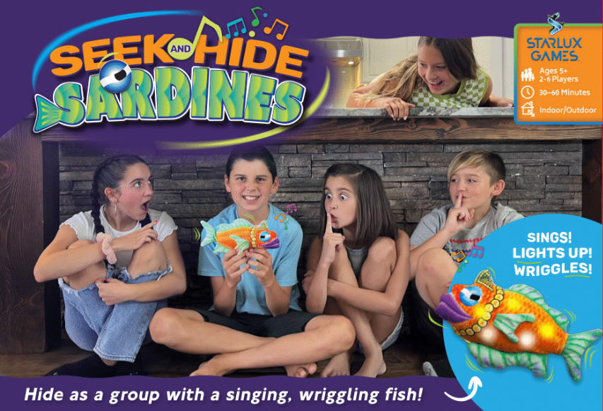
15 Responses to Option B
I thought the kids expressions on B were great, that would definitely draw my attention.
I like B better because I like how it shows the kids in a row. A looks kind of odd and confusing with the hand in the lower left.
I think this grabs my attention more for the placement of the kids and it is easier to surmise what they are doing
Option B is a much better image. The facial expressions on the kids faces are dynamic and spontaneous. The image makes you feel the excitement of them playing the game.Option A is not balanced well. It has a big dead purple spot in the upper left hand corner and a horribly distracting arm in the lower left corner. That arm just does not make sense to be in the image. The whole image in option A feels off. Option B looks great, is balanced and offers happy faces playing the game that the ad is trying to sell. It is a great ad image.
I like option B the best because I like hat the full space is used with the name, images and test. I would make a change though and take the main image of option A showing the arms of the adult leaning down and the giggling kids hiding (and running in the background) and make that the main image for option B.
I prefer option B because it look smore cleaner and more appealing.
the fish being held is more clear in B
I think the arm is a person looking for the kids in A, but it doesn't look appealing.
Neither is particularly good I think but B is better than A. The photoshop kid faces in A are more creepy than endearing and the pose is really odd, also the girl with the fish doesn't appear to be wearing pants. I feel like the concept in A is better but the image quality ruins the idea. If the kids in option B posed for the picture in option A that would be the best.
Choice B has a much better look to it with were the graphics is placed and the way the children are sitting.
Both covers are cute and communicate the game. Pearly, but a is much busier than b, which is both simpler and photographed in a more symmetrical and visually appealing way.
I love option 'B' as I like the children sitting on the floor as they are much easier to see versus hiding. I feel option 'B' tells a better story.
I think the package without the adult in the image looks more playful and fun.
I find the packaging of option be more appealing because when I looked at it it was completely eye-catching as opposed to option a
Option B' is more appealing, showing all the faces of the children on the package makes more attractive and cute.
Explore who answered your poll
Analyze your results with demographic reports.
Demographics
Sorry, AI highlights are currently only available for polls created after February 28th.
We're working hard to bring AI to more polls, please check back soon.

