Poll results
Save to favorites
Add this poll to your saved list for easy reference.
Based on the cover, which book about the Gospel would you rather buy?
Option A won this Ranked poll with a final tally of 54 votes after 3 rounds of votes counting.
In a Ranked poll, respondents rank every option in order of preference. For example, when you test 6 options, each respondent orders their choices from first to sixth place.
PickFu requires a majority to win a Ranked poll. A majority winner differs from a plurality winner. A majority winner earns over 50% of the votes, whereas a plurality winner earns the most votes, regardless of winning percentage.
If an option does not earn a majority of votes, PickFu eliminates the option with the lowest number of votes. The votes from the eliminated option are reassigned based on each respondent’s next choice. This process continues in rounds until a majority winner emerges.
Scores reflect the percentage of total votes an option receives during the vote counting and indicate the relative preference of the respondents. If there is no majority winner, look to the scores to see how the options fared relative to one another.
| Option | Round 1 | Round 2 | Round 3 |
|---|---|---|---|
| A | 44% 44 votes | 48% 48 votes +4 | 54% 54 votes +6 |
| C | 26% 26 votes | 32% 32 votes +6 | 46% 46 votes +14 |
| B | 18% 18 votes | 20% 20 votes +2 | Eliminated 20 votes reassigned |
| D | 12% 12 votes | Eliminated 12 votes reassigned |
Age range
Education level
Gender identity
Options
Personal income range
Racial or ethnic identity
Religious affiliation
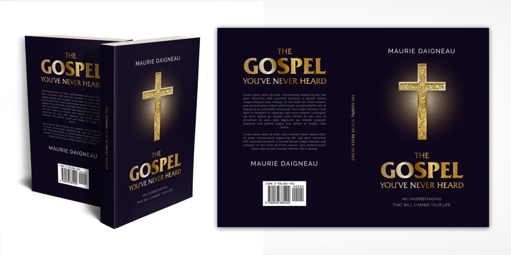
44 Responses to Option A
i picked the darker colors.
The dark book looks the most bold.
I would rank them in this order with choice A being 1st. I like the black cover with the gold cross & lettering. I think it looks good and you can clearly see the title and other writing on the cover.
These are all beautiful, but for me it was a really hard choice between A and B. Both A and B pulled me in with their beauty. I chose A because the dark black with the cross highlighted in gold just looks gorgeous, it's like light in the darkness and it just really grabs your attention. I chose B next because I loved the serene photo of the ocean and it made me feel like it would be calming. I thought C and D were nice, but not nearly as much as A and B.
The dark color gives me a sense strength. The green is almost as strong. B is an okay color. The white is church like but not very strong.
I'm not a fan of white covers, or white anything as I feel it discolors easily which is why D and C are last. C less so because it has a lot of green. A has a dark cover and looks like a bible. B is a bit bland.
Black and gold really make it stand out well, contrast enough to make it interesting. next one fairly simple which is good. Bottom two the colors dont blend well and make it hard to tell apart and there is too much stuff on the cover to really get details on first glance.
I chose option A. I really love the black book cover with the gold cross. I think this would make a fantastic gift.
I love the black cover featured in Option A. It looks the best and is the most visually appealing compared to the others.
My top choice really fits the book's point. It fits well and sticks out to me
I like Choice A because it looks the most modern. The dark color makes it seem more mysterious. The use of a cross on the cover is perfectly in line with the religious theme.
I liked choice A the best since the cover makes it easy to understand what is being offered and keeps my interest. Choice D looks the most plain and doesn't grab my attention with the images on the cover.
I think that all of these options are great and they all stand out but I feel that Option A is the best choice to me personally. Love the coloring love the design I think they are both beautiful. Option B I think is great as well love the coloring stands out so much and I would love to own this product. Option C I think is nice as well but I dont like the coloring as much for this one as the other two. Option D is nice but I think just the plain white is a bit non exciting to me
I just like the look of my top pick. It has the same color scheme of a bible which fits the subject of the book.
The one with the cross looks the most professional. Probably the best by far. I like the one with the clouds as well. The key and the trees aren't as easy to read.
I like option A the best because the black design stands out the most to me and grabs my attention.
A is my favorite because i notice the cross symbol instantly and know its a book of the gospel and it makes me want to view more of the book and learn more about it as its very appealing and love the colors
I prefer Option A. It makes me think of the bible and I instantly know what the book is about. After that, I think Option D is the best. The cover makes it look like a secret.
A is my first choice because this is a beautiful cover, and when I think of the gospel I always think of a cross. I love the gold against the black background of the cover. B is my second choice because the gospel makes me think of heaven and the sky and ocean as this cover depicts. C is my next choice because the gospel certainly makes me think of nature and green trees. D is my last choice because the white cover is no very compelling, the key and lock is okay, but it wouldn't make me want to read the book.
I ranked the designs of the gospel book that I liked the most. I really like the black and gold color of the book of option A the most followed by the blue color of option B followed by the tree of the book of option C and then finally the book design of option D.
I am attracted to the covers with realistic backgrounds and those with solid colors. The darker shades are more appealing as well.
I prefer bold colors. I choose the order of the books that stood out to me and captivated my interest.
The cross is important to have
Based on the cover, I would buy A because it has a really traditional vibe which appeals to a traddy like me.
I choose them in the order that appealed to me more, I prefer the pure black and white to the other ones.
A is my favorite for the cover and the cross which brings me comfort that Jesus died for all of us to be saved.
OPtion A focuses my eyes and heart right on the cross, where it should be when I purchasing a product like this.
The black and gold cover in A is the most appealing. B and C's cover's are also calming and nice.
If I wanted a book about the Gospel, the one with the cross would stick out the most and be the most attractive option. C and B look like self help, generic books to me.
I prefer choice A because of the black background. It is easier to read.
those were the designs i ilked in order
I think the black and gold in option A looks really classic. The tree in option C reminds me of the tree of life. It reminds me that god is the provider of our life. The blue in B reminds me of the ocean and walking on water. D is rather plain looking.
just went for visual appeal here for me
I would not buy any of these but IF I did the black cover with the cross is aesthetically pleasing.
When talking about the gospel it's almost always related to a cross. Having the cross front and center someone looking for religious books will be focus on that image more than any other image.
I like option A because it is the most visually appealing.
It has clear and easy readable font on the cover.
Choice A is my top choice because the Gospel which goes along with a Cross image and they are always tougher in religion so I think they fit well and i would buy it knowing right away its for spirituality. Choice B is was pleasant to see the cover of that book and it drew me in which is what I want in a gospel book. Choice C had a tree and nature and that too makes me associate he Gospel to that book cover. Choice D was my least favorite because I feel like it looked more like a spy or mystery novel.
I really like the black/gold colors - just seems more spiritual.
I feel this book has great contrast that it makes it really stand out to me.
I really love the cross.
Option A solid black is a bold and strong color to go with and really helps this cover set itself apart from the other covers. Options C,D and B are good covers that have a nice design and great color palette, but they don't measure up to option A.
The golden cross stood out the most to me.
Option A more clearly represents the Gospel. B is beautiful, and fits the topic well. I would pick up or click on both of those titles quickly.
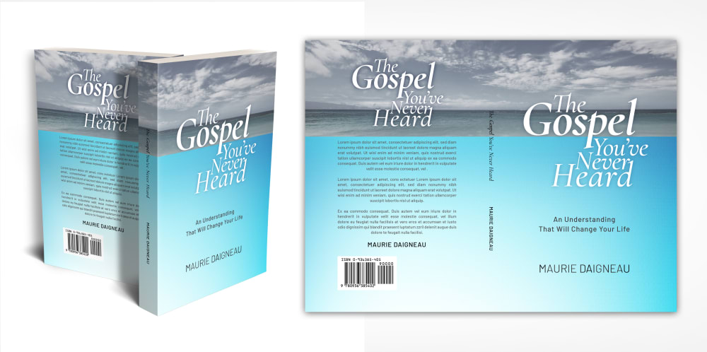
18 Responses to Option B
The baby blue and the earthy green colors of my first two choices really drew me in.
B is the only one without a cheap looking cover. The rest of them look cheap to me which makes me not want to buy them.
this cover is easier to read and would draw my attention
Option B was better than other. I like to choose it
The cover looks very peaceful
Option B looks to be calm and serene and has the title that is very noticeable.
I like the blue sky in B. I like the gold standing out against the black in A. C is okay with the tree. D is my least favorite.
B or C, both covers are more inspiring than the others
Liked the blue and grey color scheme. Black was awful.
I think the two tone cover in option B issimple but very pleasing to the eye. The font is classy and easy to read. I feel like the tree on C is out of place and doesn't make a ton of sense to the subject of the book. The black background on A is stuffy and uninviting to me. It wouldn't stand out on a bookshelf for me.
I like that B has a sense of mystery with the design. Water. The sky. The combination of light and dark. That seems to fit the spiritual theme the best.
The cover B fits the book and its content perfectly, where it is simple, clean and straight forward to the title.
I believe that choice B is the best choice because the book cover design is simple, yet inviting to the consumer. I also believe that the color of the book will help to draw consumers into taking a closer look.
1st choice was easy to read, 2nd choice had Biblical pic. That last two were nice but not as revealing to the subject.
I like option B the best because the cover best represents what I think of when I hear anything about the gospel. I always look to the sky with hope and inspiration during those times I think about anything gospel related.
I love the color scheme on option B the best. The light blue is very uplifting. I like A next because theBlack background really makes the golf cross and title pop out and hit you
I love the blue color cover
The blue/gray colors on B are very attractive. The scene on C is also eye-catching. The other two are boring.
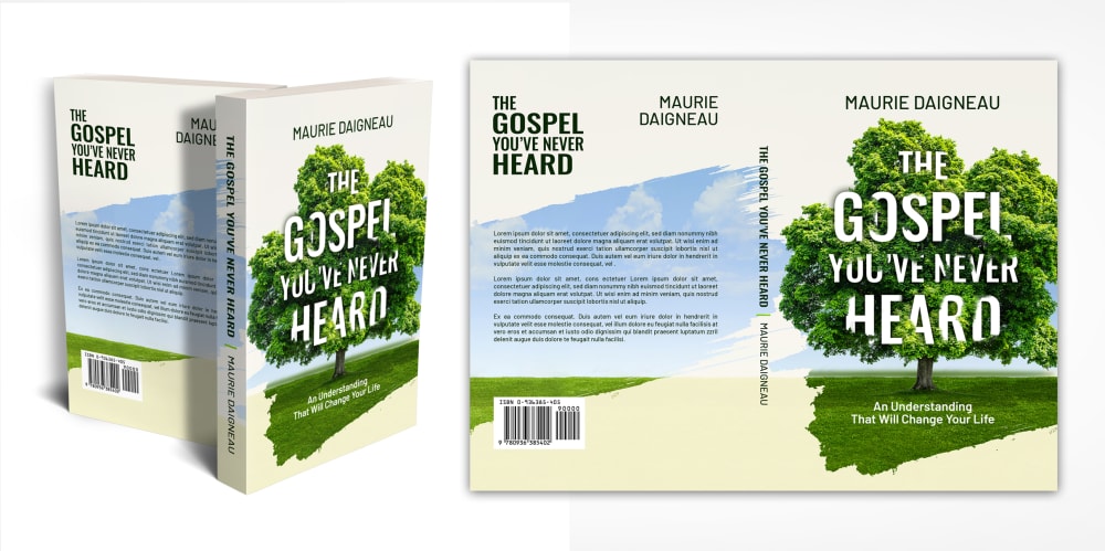
26 Responses to Option C
I really like choice C the best because I feel the tree background on the cover will really appeal to a lot of people.
I really only like option C, it looks like an appealing, approachable book. All the rest look like typical Christian money-grabbing books.
C is perfect, reminds me of creation with the tree and Adam & Eve. Same way with the water on B and the solid black and gold of A. Very good with those 3 no matter which one you pick. D doesn't do a whole lot for me.
A looked really depressing given the dark background. The gospel is supposed to bring light and joy. I liked that C featured the tree of life. B's sky looked pretty cloudy and dull.
Option C is the most visually appealing and you take notice of it more right away. It also has a more modern and unique look to it that makes you think it new and fresh and would have something different to offer. It would stand out as unique against books of a similar vein. It draws you in more and makes you want to know more about what it contains. Option C would appeal to more people and would make them more interested in learning more about it.
I like the picture of the tree on the front, it kind of hides the letters in the tree like you have to discover them. This ties in nicely with the title of the book
I like the design of the cover in choice C a lot. It puts me in a positive frame of mind and it makes me interested in what the book is trying to convey. The other options do not give me the same feeling as choice C.
Made my choices based on which cover of the gospel book makes me likely to buy. A is the one that i am least likely to buy its cover design does not stand out to me like the others do
Options C and D are more unique, and A and B are old and tired styles of religious covers. I've seen too many like that already.
C is the most appealing, because of the tree. A is the next best, because the cover is attention-grabbing. B is ok, but it looks kind of ordinary. D is the worst because it looks dated.
I picked C as my top choice as I love how the green trees makes it feel like it's gonna make you refresh. I picked A as my next choice as I like the glowing cross.
I like the lighter covers more than the dark one because the gospel should be good news, not menacing. Option A looks too much like it's a Da Vinci code sequel or something. The worst is Option D, though. It looks like it's The Secret or something like that. It trivializes the gospels and is offensive. Option C and B are the only two I like. Both are bright and positive, but I like Option C more because it's more aesthetically pleasing. The tree looks nice and it's detailed and interesting. The design of Option B is a little too dull and look like it's home-published or something.
I like the sky and tree images, makes me feel like it is a book of peaceful images
I choose the C option because i find the design and color is more appealing to me for a book about the Gospel. I rank them according to how appealing they re to me.
I like the trees. They seem to be more aligned with my environmental aspects than the other covers. Then the weather. Seems powerful and in motion. The cross is not very appealing.
Option C: I like seeing the tree as whenever I see a tree, I remember about the circle of life (plants provide oxygen that lets us live), his Kingdom. Option B reminds me that although we don't live forever, the natural habitat (land, seas and skies) that God created feels like an eternity. Option D: A key is a good symbolic picture of looking into something we have never heard of. Option A: The picture of a cross is too common.
I like the image of the tree on the cover of the book in C. It is colorful and appealing
Base on the cover, I would buy the book of option C. The book of option C is well designed and creative. The book of option Cis well titled and well described, the description of the book of option C is easier to understand.
I picked c because the other ones were to dark and serious. This cover was little more light.
C stands out most to me because the color is so vibrant. In addition to that, the format of the words and images go together well.
I avoided the dark color and went for something that was more colorful and bright. And the tree on my choice looked good and outdoorsy, which liked. God's creation put out in front for anyone to see.
i rated them by how easy is to read the FULL book name
The option C is my most preferred since it is the most unique with an amazing colour and would definitely chose it over the others as my favourite gospel book
The tree cover implies newness..new life, literally rebirth. So I rated it the highest. The white and gold imply purity and royalty, so it is the next highest. The other two look relatively conventional
I think my first choice looks the most appealing and attractive. That would be most eye catching to me.
I prefer option C the most due to its cover. Since I can't see what's inside, I can only go by which cover I like best. B has my 2nd favorite cover, then D and A.
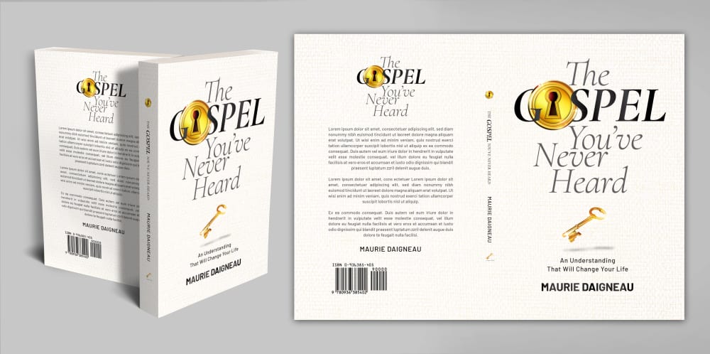
12 Responses to Option D
plain white is timless and classy, I like the green tree and ocean because nature reminds me a lot of God
i like the more simple and lighter colored book covers!
D has a smooth design and a good neutral color that most will enjoy.
I like the colors and designs of the book covers in this order.
Seems the ones I picked are more desirable and more descriptive and friendly as well as they have more appeal
I am not wild about any of these as they look kind of tacky. I think D looks the most professional like the book may actually provide helpful info and not be ridiculous.
I liked the color of D more. It looked more interesting.
Options D and C have the most engaging covers for this subject as a result of the art work and fonts used and the overall design
I like this one beacise it shows a key and a lock. It makes me wonder what secerts will I unlock with your book
D caught my eye first. maybe its the gold? i am not sure.
Somehow I think that if it's a gospel we've never heard, then it's a modern concept and I would go with the modern design, such as the white cover or the blue cover - the one with the cross is last.
I like the design with the lock and key on the cover the best as it provides me with the most interest in what the book would be about
Explore who answered your poll
Analyze your results with demographic reports.
Demographics
Sorry, AI highlights are currently only available for polls created after February 28th.
We're working hard to bring AI to more polls, please check back soon.

