Poll results
Save to favorites
Add this poll to your saved list for easy reference.
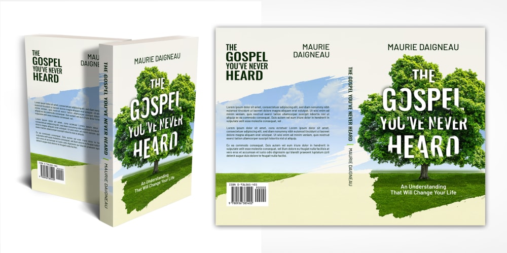
Based on the cover, which book would most likely get your attention?
Option B won this Ranked poll with a final tally of 119 votes after 2 rounds of votes counting.
In a Ranked poll, respondents rank every option in order of preference. For example, when you test 6 options, each respondent orders their choices from first to sixth place.
PickFu requires a majority to win a Ranked poll. A majority winner differs from a plurality winner. A majority winner earns over 50% of the votes, whereas a plurality winner earns the most votes, regardless of winning percentage.
If an option does not earn a majority of votes, PickFu eliminates the option with the lowest number of votes. The votes from the eliminated option are reassigned based on each respondent’s next choice. This process continues in rounds until a majority winner emerges.
Scores reflect the percentage of total votes an option receives during the vote counting and indicate the relative preference of the respondents. If there is no majority winner, look to the scores to see how the options fared relative to one another.
| Option | Round 1 | Round 2 |
|---|---|---|
| B | 50% 100 votes | 59.5% 119 votes +19 |
| A | 31.5% 63 votes | 40.5% 81 votes +18 |
| C | 18.5% 37 votes | Eliminated 37 votes reassigned |
Age range
Education level
Gender identity
Options
Personal income range
Racial or ethnic identity
Religious affiliation
63 Responses to Option A
A would be the choice that would easily have gotten my attention. I like that A has a bright layout and a solid foundation including a bold text too.
Love the colorful cover of A, green definitely catches my attention. C looks very bland and b looks kind of typical.
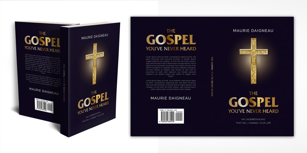
What does a tree have to do with the Gospel? When I sold ads, I told my cusotmers that the visual elements needed to tell their story without the words. If you take away the words, could your customer figure out what your ad was about? Option B is closest to that objective but it's ugly as sin! No one wants to buy a book that's all black unless it's a horror book.
After carefully studying and comparing all three book cover images displayed above I selected Option A as my first preference and the one that would make me most interested in purchasing this book. This image had by far the most eye catching appeal to me because of the color and design of the cover. Option C was my second choice followed finally by Option B with the final two rankings based on my own personal opinion of the relative attractiveness of each book cover.
I find choice A book cover is eye-catching. I prefer this book cover is simple and clean.
The image of the tree captures me by relating to the life giving message of Christ. C is not bad because it's a little different, but B is not likely to attract people who aren't Christian because of its blatant imagery
A is colorful, bright and cheerful. A is intense and intriguing. C is boring and plain.
I would be option A because when talking about the Gospel or any book related to religion it is best to have a book cover that is filled with light, hope as this is what the book will be about.
I like the green color because it's pretty unique but I also feel like the black and gold cross was just too much for me
A is the best book cover. I like the tree and nature scene. It is calming to me.
A and C seem interesting and would pique my interest or at least get me reading. B is too overtly religious.
I like the tree motif, the bright green pop catches my eye. The black of B is slightly more appealing than C.
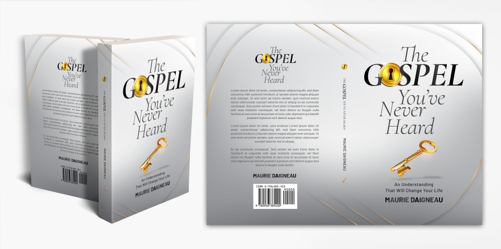
If I wasn't looking for a religion book specifically I would be more likely to look at the tree book or the key book vs the book with the cross. Once the book caught my eye and I read the cover I think I would be curious & flip it over and read the back to see what it was all about. The one with the cross just looks like another throw religion on your face book whether or not it was something I have never heard before or not.
I like the naturalness of A. B and C are a little futuristic.
Option B isn't very unique, there are a lot of religious books that look like that. Option A and C stand out the most among books of this genre.
The green tree gives me the impression of hope
Option A: I love seeing nature (trees) which God created and interested in reading on what I have overlooked in this beautiful world. Option C's key is a smart symbol to represent what doors have been locked from us and our understanding of the world. Option B looks too rudimentary.
i like the bright colors on this cover and it feels like it has a fresh or new perspective with the use of the tree
I really like the tree on the front cover - it reminds me of Gods power with nature. The blue cover very bold. The white cover is not that compelling.
A looks a little less preachy and more natural...nature like
I like the color and design of the book. The tree in the background is really nice. Then I chose C for its nice design as well. B was last.
The option with the tree feels natural, fresh, and growth-oriented. That would be my top pick. I also like the lock and key option on the white background - feels clean and confident. I don't like the black option - text is hard to read.
Made my choices based on which book cover best and most likely catches my attention. Cover in B does not stand out to me like the others and it does not catch my attention
C looks really plain and generic since it's so gray and dull. I liked that A offered hope and optimism with its depiction of the tree of life.
A is the best one for me because the tree shows me growth and new ideas. I want to learn more about that. i would buy this one for that.
Option A has the brightest colors and is the most eye catching.
I chose the ones that appeal to me most
Option A looks more relevant to this generation. I would easily pick that option off the shelf and peruse it should I come across it. Option C looks like it was designed in the 1990's, and is something my grandmother would have on her bookshelf.
The tree really spoke to me, it reminded me of nature and getting to a peaceful place.
The cover art is very creative in option a
The first choice option has a relaxing cover (tree, shade underneath) that has some bearing on the title. The second choice is a distant second. It is not relaxing, and there is a dubious relationship to the title. The third choice has an obvious relationship to the title, but is anything but relaxing.
This gets my attention because of the colorful cover and the bold title on the front of the book.
A feels different, like I might be hearing something new. A and C feel very typical of the genre.
Option A because it's pretty - not that I would even consider this kind of book.
The book cover in Option A is most likely to get my attention because it looks catchy and interesting.
I would ignore a book with a cross as the focal point on it so I put that last. A just seems more likely to grab my attention so I put that one first.
I prefer A- it gets my attention most because the imagery is not the predictable cross, or the white and gold. The tree and type treatment make it interesting.
I like option A the best because the tree graphic really grabs my attention because I think of something peaceful like the tree when I hear gospel mentioned.
it has simpler packaging
A's cover is very pleasing with the green tree on the forefront, C and B are sort of forgettable
I think that tree really stands out against the white cover. I like the cross since it is a religious book and it stand out good against the black cover but a lot of times when you see a black book with a cross you just think Bible. I think the cover of book C is very boring.
I selected choice A because the bright colors and fresh images look modern and refreshing. It looks like a book about health, growth, and the overgrown tree into the titles makes me feel like there is more to be discovered.My second choice was the navy blue book. It is a classic look for a certain kind of religious book that I think would be comforting to pickup-- it looks familiar and safe.I didn't really like the option C because of the colors, shading effects, and it just looks dated. If you ask me which of these I'd read in public, it would only be the first one. It looks interesting
I like the one with the tree because it has biblical significance. It also emphasizes the word "heard" and makes clear that this is something other than what the typical version of the "gospel" might be.
The white and green look great in A. Grabs my attention quickly.
The cover of my first choice has an organic touch.
I like the white and green book. It's very visually appealing and I like that it's a lighter color. After that, I'd prefer the silvery look to the black.
A, because the green tree is attractive and gets my attention. C, because the gold key and the lock looks interesting. And b, because the black cover doesn't go well with a book about the Gospel.
The tree on Option A is very bright and grabs attention. Option B is very dark and Option C doesn’t have much of a focus.
I chose option A first because it would get my attention - it looks reminds me of a gossipy setting as well as if something could be wrong. I chose C next because it has the lock and key so it indicates something secretive. Option B was last because the cover with the cross is most related to the subject of the gospel, while options A and C covers are less related to the subject of the gospel... that is why the other two get my attention more.
Option A has a good look and design that is quite nice looking, I like the look of the tree quite a bit which is drawn very well. Options B and C are good looks also with great cover art and color scheme.
A because I would not look at the other because they look too much like hymnals from a church.
A has a pretty cover that I like a lot. I really love it. It looks so sweet. C is really nice. The cover makes me think that it would be serious and I could learn something from it. B has a decent cover. I figure it would tell me something I did nt know before.
I like option A because the brightness and happiness that the picture on the cover has.
The colors of A feel really welcoming and make me want to pick it up and look closer. The colors of B, being so dark, make me feel a bit closed out. I feel like I would be the least likely to pick B up to look closer. C is in the middle: the lock & key design is okay but not particularly original, and the colors are also kind of "whatever"—I don't feel put off but I also don't feel pulled in.
the design of the cover got my interest the most compared to the other options pick from i think seems appealing to the naked eye to view more of it
The coloring of Option A is the most eye catching. The design also makes me look a lot closer at the item. This will make me look into the book even more than usual.
I liked option a best because of the trees and forest design. Option b was my last choice because the cross on the front seemed intimidating.
I chose these in this order because option A makes me take a closer look at the book, option B seems like a normal religious book, and option C seems very bland.
The tree makes it seem like a better mystery or novel. I would less likely pick the one with the religious symbol.
Option A is the most visually appealing and grabs your attention more right off the bat. The color sets it apart and makes it stand out. It also doesn't look like the normal bible book and looks like it might be different and have something more to offer. You get a higher first impression that the book is unique and would be something new and interesting. It also lets you focus more on the wording and you get a fuller idea of what the book has to offer. Option A would appeal to more people and would make them more likely to check deeper into what it has to offer.
I chose option A since I associate the tree with a calming, sturdy presence. Which is probably what the book is going for.
With the tree, A is the most attractive cover and it would make me look twice to see it was about. C and B are just okay. I probably would not give either a second look.
I like the colors and designs of the covers in this order.
100 Responses to Option B
The gold cross against a black background caught my attention first. The 2nd option (A) makes me think of the Joshua Tree and Option C is too plain to be noticed.
I chose the book covers that most captivated my attention, intrigued me and made me want to pick the book up off the shelf.
I picked B as my top choice as the glowing cross in the black makes it look like God is reaching out to the person. I picked A as mt next choice as I love the idea of nature being part of God's world.
Choice B is likely to get my attention the most because the color scheme makes it easy to read the text and will help to draw consumers in to take a closer look.
I'm not sure what trees have to do with anything. The cross and colors of my top choice really stick out and fit the book's meaning.
b and c looks modern and clean
the darker book really emphasizes the cross and the words on the cover
I think the black cover with gold cross sticks out a lot more and is more appealing than the rest. I like A next because the bright green tree sticks out and grabs my attention more than the other cover
The black cover with the bright text looks great here!
I like the dark colors more.
i like the black background on option B. makes it pop
Defintely the black and gold then the white and gold. Much more calling!
B does it for me. I like the high contrast colors used. Black and gold looks classy, expensive and fits the religious theme.
B is bold and inspirational. C is peaceful and bright. A is intriguing.
I think the black in B looks classier than the other two options. I like the tree in A.
b seems very flashy, and a stands out pretty good too. i find c to be a boring looking cover
Option B is the best because it is dark, which implies mystery, and the cross grabs my attention to tell me this is a book about religion. Option C is second best. The cover is fine, but nothing really jumps out at me. It is just an average cover. The last option is too cartoon-ish. I don’t feel like the image relates to the topic.
I chose option B as the first choice because the black cover is a classier option.
I like the black cover the most. It sticks out to me. I also like the gold key.
B gets my attention first with the black and the gold cross on the front. I like A somewhat with the title in the tree and I think C is okay but they don't grab my attention like B does.
B has a more compelling and symbolic cover
Black is unusual for a book, unless it is a Bible so I'd look at it first. Next the green is eyecatching, just not unusual. The white doesn't reach out to me.
I'm drawn to the one with the beautiful gold cross shimmering on the black cover. It makes it stand out so much, it's like it's highlighted. It also is symbolic of darkness, but the cross being in the darkness and coming out as light. I think its' beautiful, symbolic and a great design. This one is my favorite. A is also nice because from the green tree, life springs forth, but I still like B the best.
The book looks like a typical Bible so it would grab my attention first. Plus the look goes well with the subject matter.
Option B grabbed my attention because of the imagery and color selection and also the message in the text.
Prefer the darker colors in the gray. Look how high-quality they all look
I think the cross image is the strongest design element of the lot, so that would grab my attention most. B.
B had the better colors to it. I liked the design a lot for it. It had a great appearance.
I chose panel B. The black with the gold is very elegant and this would make a great gift of keepsake.
The title of the book indicates the storyline of the book is mysterious. The cover design in B gives me the exact same impression. The cover matches the title perfectly. The cover designs in C and A are indeed commonly seen and nothing special. I put C in front of A because the title is clear to read. The tree-image in A is not a good design. It blocks some texts actually.
i like B because i like dark backgrounds because it makes it look higher quality
the large gold cross really grabs my attention in option B
The bible needs to have a great cover not just plants.
what caught my eye visually
This color is the most captivating.
Honestly the book cover that I prefer really depends on the teachings of the book. However, just going from the title, I like the black background with the gold cross.
I chose Option B because the background color and font color and image of the cross are the most striking. It immediately got my attention when I saw the image.
The black cover with Golden cross is the most appealing.
The contrast of dark and light grabs my eye.
The black and gold was the one that caught my eye immediately.
I like the colors and the images on this one.
I like the cross on the cover
i chose option b as my first choice because the cover is black with gold on it. option a was my second choice because the green tree and grass stand out from the lighter colored background. option c was my last choice because the wording doesn't really stand out from the white background.
I liked choice B the best since the cover grabs my interest right away with the the black background and gold cross. Choice B looks the most appealing while also not looking as generic unlike choice A and C.
The first book caught my eye because of the colors black and gold,the second was the silver and the last was plain.
The cross on the dark background immediately catches my eye.
Simple designs and dark colors usually get my attention first.
Black and gold contrast really gets your attention. Second one looks a bit more simple and self help style. Last one its okay looks a bit more biography like.
I think that the black background with the gold lettering pops out more than the other options.
The dark cover on option B attracts the eye more and stands out. The tree on option A is bright and draws a bit of interest as well.
The book cover that would most likely get my attention first is option B because it looks like a bible.The second book cover would be option A because gospel, life and nature goes together.Third option is C because gospel is the key to life but option B would be more like the bible that I take to church.
The one that would get my attention is definitely B with the black cover and the glowing cross. It would stand out among all the other books on the shelf. I think it's the most awesome looking one. The black really draws my eye.C is too plain so it comes in last which puts A in second. The green really helps it stand out.
B stands out the most if I was looking for something religious. The cross is clear. Option A is very colorful and warm. C is very bland and uninteresting to my eyes.
My eye went straight ot the black cover with the gold cross.
My choices were based off which book would get my attention.
Option C just looks like a simple white cover book that in the book store would blend in with thousands of other books. The Option B one stands out immediately
I generally prefer more "clean" looking covers and Option B jumped out, there's not a lot of "clutter" on the page and the black background makes the gold text and image of the cross/crucifix really pop out. Sort of a similar thought for A but white and gold. I think the lock and key is less "eye grabbing". Choice C looks a little busy and I wouldn't expect the tree motif for a book about religion or Christianity which I would be expecting from the title.
B is the most eye-catching, with the gold cross against the black background. A is ok, with the tree in full leaf. C is kind of plain and mundane.
The black and gold cover really stands out amongst the others, and would immediately get my attention.
The black cover makes the cross stand out. It gets my attention and I think would stand out on the bookshelf in a sea of white colored book covers.
B keeps it simple, religious, obvious, and easy to read. C is cool with the key, but the weird "o" in gospel makes it hard to read. A is just too hard to read, and a tree makes no sense
The black book with gold writing looks attractive.
The dark colors with the gold cross stick out most to me
I prefer choice B for the darker option.
Ranked in order of personal preference.
The nearly black background seems to be the most interesting profile for a book whereas the ordinary white or gray version are a bit less appealing. I like the usage of natural objects like a crucifix, tree, or metal key to add dimensions to the cover.
I feel like from a distance, this imagery is most recognizable from a far. This would capture my attention most.
B the most because of the big cross as i notice that right away and its very vibrant and looks high quality and would make me want to pick it up and learn more about it
I picked b as the one that catches my attention. The gold stands out on the black background.
I like option B the best because the black design stands out the most to me and grabs my attention.
B has a great contrast between the black and the gold colors. It stands out immediately.A has a beautiful tree on it that catches my attention.C just looks okay. It's not really that special looking. It wouldn't stand out in a a book store at all.
b - the black and bold is a bold color. plus, a cross symbol is universal and gets attention and communicates a lot with no wordsb - i like the nature aspect, the single tree feels powerful, yet nondemonationalc - the white background feels "cheap" and for some reason perhaps too obvious
The color scheme in this version stands out, especially the golden cross and word "Gospel" in front of the black background.
I picked them in the sequence of color scheme attractiveness.
The black cover with the gold cross stands out beautifully and it was my first choice, option B. Option A is also lovely with the green coloring. My last choice was the grey cover, option C.
The black cover looks very eyecatching and mysterious. It fits perfectly with the religious theme. The same qualifies for Option C, the muted colors go along well with the there. I don't like Option A because it looks generic and I would be surprised to see its theme looking at the cover, at first glance it looks like it could have been a nature book or a historical novel.
I like the black cover with the cross.
The black cover sticks out more than the white
I like B the most because the color contrast is really attention-catching.
The dark background makes the light colored letters stand out much more and would grab my attention first. Then the plain white background. The last one makes the cover just seem too busy and I wouldn't even stop to see what it said.
I think the seriousness of the color detail is what would get my attention. The first option I ranked colors are masculine and bolder than the other two options. The last ranked option looks like something in regards to gardening; wrong color choice for this title.
I like Option A, with the cross on the cover, by far the most because the symbol of the cross lets me know that this book is about Jesus, and that it would be something I would like to read. I like Option B second best because the tree on the cover reminds me of the tree in the Garden of Eden. But I like Option A, with the cross, by far the best.
The gold and black theme stands out quite well as does the white and green. The silver or mostly silver motif, not as much.
I think if I were looking for such a product or not, the black colored one sticks out the most to me on a store shelf, it's striking in my personal opinion. My second choice would be the solid white for it's simplicity. The third I would pick last although it is still very nice. Thank you.
B is my first pick as it "is holy" looking and I love the gospel. C is my next choice as it is still elegant in design and coloring. A is good as it elludes growth but just isn't my first choices.
I need for it to appear as a serious book, not just another novel
Option B is my favorite cover. This cover would capture my attention, I love the gold cross against the black background. The cross is the main religious emblem when thinking about the gospel. It is a beautiful cover. A is my second choice because when I think of the gospel and God, I always think of nature, and this is a very nature oriented cover. C is my least favorite, I don't like the key theme, it just feels a bit corny.
I think the gold grabs my attention more, and I really like the design and color scheme of this cover.
the large cross on the cover of option one, got my attention as my last choice was lost in obscurity and very bland.
I like B the most because of the cross on it and the solid black cover.
Graphics and colors attract my attention to learn more about the topic of the book. Choice B and the black powerful cover makes this the most attractive option.
Option B is easiest to tell what the subject matter is from the small images. The gold cross and word provide high contrast and increases comprehension.
I like the image of the cross.
For me the one that gets my attention is choice B. The black cover with the gold gross and gold lettering stands out to me. If I saw this on the shelf I would take notice. The other two don't have that same effect.
Liked the cross on the option B because it stands out
Option B is my number 1 option because of the striking cover design. The gold cross on black background is simpler than the other covers but more artistic. It feels a bit mysterious and secretive, which makes me want to learn more. The cross image tells me immediately that the book focuses on a Christian teaching without even reading the title. Option C is ranked 2 because the lock and key design makes me want to unlock tthe secrets in the book to improve my life. To me, this cover is less striking/artistic than option A, but it still inspires curiosity and intrigue. I want to learn what the book has to offer. Option A is ranked third because it doesn't excite or intrigue me. The image of a tree could be the cover of thousands of other books. There's nothing interesting there in my opinion.
I like the simplicity of Option B
I chose B first because the color black immediately drew me in and made me want to learn more. I chose C next because I like the color and the key. I chose A third because it just doesn't do anything for me. The green reminds me of a book about health, not the gospel. There's nothing interesting or mystical about it.
I think the black makes it look better
The gold cross gets my attention, and tells me that this is a religious book. The next one that caught my eye was the tree and made me think....the tree of life, Jesus. Love that inference.
37 Responses to Option C
Both B and A title gets lost in the cover with the dark black background and the greenery trees that you have to focus to much to see the title.
Gospel is the salt of the earth and that is conveyed very well in the picture depicted.
I voted option C as #1 because it has very light colors coupled with some intriguing symbols on the front cover. I voted option A #2 because it also has light colors and comforting nature themes with the tree on the front cover. I voted Option B #3 because it has overbearing dark colors that are not comforting or relaxing.
I ranked the faith based book cover that I liked the most. I really like the image of the key in option C the most. I then liked the black book cover of option B and then finally the green and white color of option A.
Looks most appealing and has the most value for what I am looking for, as well it looks the most trustworthy
I really like the classy and clean look of option C. I think that fits in well with a religious topic as that is what religion is, beign simple and focused more on the words or messaging.
I like either Option C or Option A the best because you can read the title easily and see what the book is about without too much trouble. I don't really like Option B...it's too dark.
C, seems like unlocking a secret...to something never heard!
Option C. The title alone is very intriguing. The artwork depicting a key that unlocks the lock leading to a more thorough understanding of the topic is is visually appealing
I chose C as my first choice because I like the background color, the text color and how it contrasts. I like the gold and how it pops off and is very attention worthy. I chose B as my second choice because I like the black background and I like how the text and object pops off the background. I also like that it is a symbol of religion that goes with the theme. I chose A as my third choice because I like the sense of nature and the tree represents life.
I like the all-white background, leaves more to the imagination.
Based on the cover, B gets my attention the most because of its simplicity.
Option C, the cover looks clean and appealing
I prefer the lightness of both Options C & A. They both seem easy and not ponderous or overbearing. Option B seems like all the prayer books at Mass you hated as a child cause they were so boring and dull.
I chose C because to me the gospel is pure (thus, white cover). I love the gold key (opening the information about the gospel). Black and gold definitely stand out but I do not connect black with the gospel. And A (the cover) did not pop out at me whatsoever.
I like C because of the Key and Lock motif - like reading this book is going to unlock some secret for me. I have a slight preference of the cross over the tree (B over A), because B feels like it's going to be a book about religion, while the tree doesn't have much of a meaning in this context
I prefer the white cover when it comes to the bible but the black cover shows the gold cross and wording off nicely
I think the white with the black print is more attractive. I don't care much for the one that has the cross on it - I think that's misleading.
I like the design and color of option C.
C was easiest to read the title and it was an elegant design. A was to be expected and B I really couldn't read the text due to the colors and would pass it by.
It looks like it has a gold hand transmitting from heaven.
I like the idea of the book looking more nonreligious. The cross on the cover seems too churchy.
I voted on how I best liked the color scheme.
The color of Option C seems more upbeat and positive. I like Bibles and religious texts that have a more positive spin.
I think that option c gets my attention the best and a i like the placement and focus on the title of the book on that cover as well as i like the lock and key design scheme
The design on C is easier to read and has a clean look, B is a too dark though the colors go well with each other, if the book is about trees the design on the cover would seem appropriate
I chose C first because of the innocence of the color. I chose B next because it is appealing and A last because it is to busy.
The symbolism in C is the most striking. It makes you think of the truth of the gospel being unlocked. A is next because the trees in a forest sound like a metaphor though not as clear as C. B is last because it seems the most conventional and does not stand out so much.
Option C shows a nice and clean cover. The text is clear and I can immediately see what the book is about. The other covers are a bit noisy and harder to read.
I am intrigued by the title and the title is the most clearly seen on my first choice. I can read and see the title very easily and I also find the color of the book cover appealing. The book looks intriguing and the look of my first choice matches the subject matter the best out of the three choices
None would but C if I had to choose.
I like the white in C. It looks other worldly and intriguing.
I think that c looks the most professional which makes me think that the writing will be most accurate.
B looks a little dark and scary. I like the white color and key on C. A is a bit busy and cluttered even though I like trees.
C is more what I might expect about a book on the Gospel. It's bright, white with gold, all the things that might make me feel like it's angelic in a way. "A" is ok, might make me think the book has to deal with nature. "B" is dark, looming, evil and scary. I don't want to be scared about the Gospel.
I picked these options in this order according to which option was the most appealing as far as color and graphics. I picked the ones with the best title wording that was easy to read and gave me an idea of what the book was about.
I would rank B #1 with the clean appearance. Option A has a nice natural image. Option B is a bit too in your face with the glowing cross.
Explore who answered your poll
Analyze your results with demographic reports.
Demographics
Sorry, AI highlights are currently only available for polls created after February 28th.
We're working hard to bring AI to more polls, please check back soon.

