Poll results
Save to favorites
Add this poll to your saved list for easy reference.
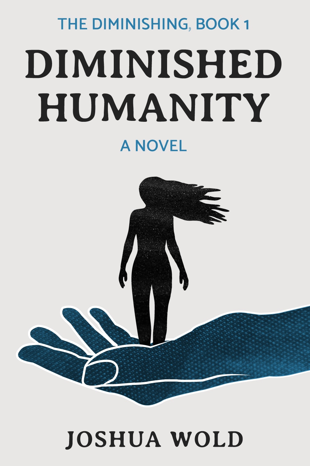
Based on the cover, which book would you rather buy?
12 Responses to Option A
I really like the drawing in B with the stenciled person but the images in A just pop out.
I prefer Option A. I think the coloring looks much better. I don't like the coloring in Option B and think it makes the novel look less interesting.
Based on the cover this the one that i would rather buy. This cover stands out to me and caught my attention a lot more than the one in B
The cover for A has a much more interesting and exciting cover design based upon color and font.
The dark figure against a light background is intriguing and mysterious, which is appealing. Looks like a really cool and interesting book for sure!
Choice A is my pick because I like how she is in the palm of a flat hand as opposed to one that is bent up. I like the light background against her dark contrast. I also like how she appears to be naked on the cover as opposed to wearing something in Choice B because that fits better with the title of the book to me in a way.
A looks more interesting and professionally done. I can expect to see it on the shelf at the store. B looks more like only a book I can order online.
I LIKE A B/C YOU HAVE THE AUTHORS FULL NAME SO YOU CAN RESEARCH HIM.
I think the title is hard to ready with the fading font in B, so I chose A instead.
Stronger book cover when it is a light colored background and dark colored foreground, everything stands out more and is more powerful.
I really love the way her hair is wild, and I love that it's got just really good ambience.
I find her pose way more striking and cool
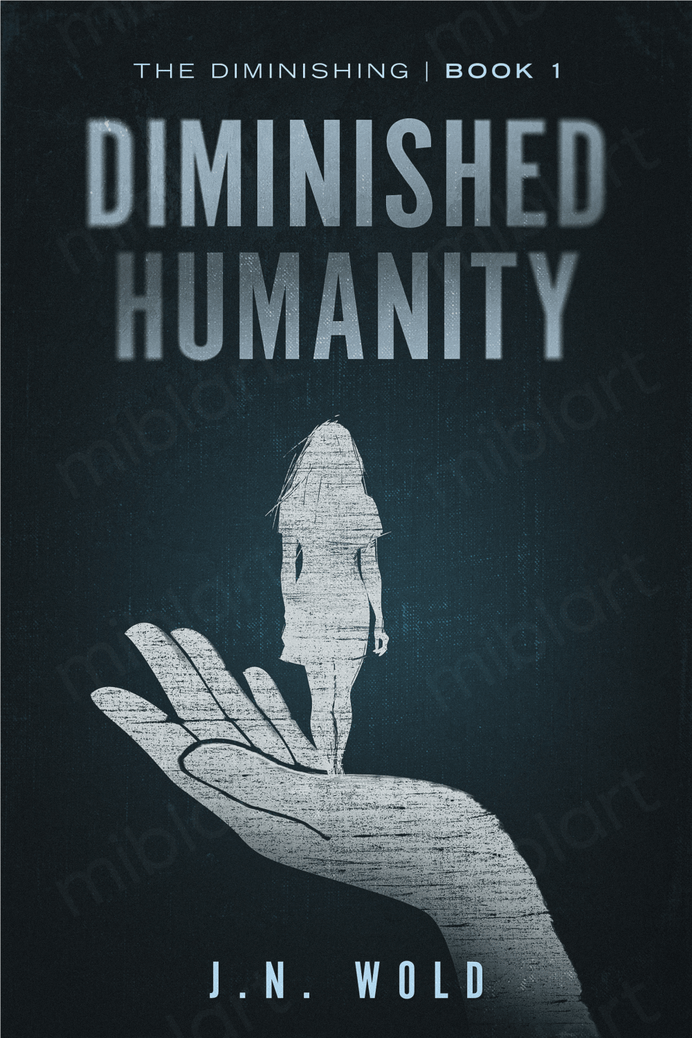
38 Responses to Option B
I think the sort of scratch design of this option with a dark cover makes the most appealing and intriguing combo
i think some of the text on the other is better, like the authors name. but i like this one more because of the coloring and design. the black seems to go with the title better. although i like the way the woman is facing and her hair in the white one more, but the color trumps that because it seems to match the overarching theme of the book.
The rough texture matches up with the 'diminished' wording in the title.
This cover has a more stark and dramatic style to it that makes the story look more exciting.
This design fits the title of the book of diminishing or vanishing
i like the darker background here, it makes it a bit more visually appealing
The colors of the girl fits the image of someone struggling and makes it seem more interesting.
option B: I really like the dark background, with the hand and the girl being in a faded out white. makes me feel there is a bit of hope, but work has to be done to maintain that light alive, before the dark takes over. very bold and heart felt color scheme. makes me want to know what this book is about. option A: makes me think that she is leaving the darkness into the light as a solution was found already. I am unsure if the color scheme embodies the title.
I like the darker look of B. I am not a fan of light background book covers. They don't stand out very well.
The cover is mysterious and surprising. In comparison, the drawing is attractive.
I like the image on B better. I also don't need to be told that it's a novel.
I like the art style more in this cover, and it seems to go well with the title.
The dark cover seems to go with the title better
The cover just stands out a lot more and is very pleasing to look at.
I like the light text on the dark background.
I think that this cover is very bold and interesting looking.
B seems more mysterious and more like an interesting book
The art seems to be of higher quality. The colors are better. The typeface looks more professional for a book.
Option "B": This cover is more striking by comparison. The central lighting which fades (diminishes) outward towards the cover edges fits very well with the title; additionally, the figure held by a hand is purposefully less clear, as if fading away from view. All these element along with the title tie-ins make this my favorite choice.
I prefer the darker tone of the book cover of option B.
I like the dark colors a lot. The darker color adds a better theme to the book.
The cover design goes really well with the title. I feel a more of a despair with this cover.
This cover looks much more mysterious to me than the other one, and probably more interesting.
the dark background looks more intense and interesting
The darker background is more ominous which fits better with the title.
I liked choice B since the cover looks more mysterious and grabs my interest right away. Choice A looks a bit too plain and the white background looks generic.
I don't like either cover. That said, at least B doesn't make the woman look naked. Frankly, I would never pick a book based on the front cover alone.
I chose B because the cover art feels more fragile and fleeting to me, which I think is a good emotional appeal for the book.
Wow, I really really like both of these. I think the static on B is probably what sets it apart as better though.
I think this book cover goes best with the title and color scheme.
With such a depressing topic, the darker background is more preferred.
The hair on the character in A looks really awkward.
I liked the fading away of the title "Diminished Humanity" and the color coordination matches.
I prefer the darker color background.
I like B because it makes me think that the lady in the hand is walking away from something in B which makes me wonder what she is walking away from.
If diminished is an important part of the title, the color of the book cover should be dark, not bright white. The design on B is better too
This one looks more serious
the black and white looks really interesting and spooky at the same time
Explore who answered your poll
Analyze your results with demographic reports.
Demographics
Sorry, AI highlights are currently only available for polls created after February 28th.
We're working hard to bring AI to more polls, please check back soon.

